U-Pick Tomato Day at Mariquita Farm

Yesterday I drove from San Francisco to Hollister for the last Tomato U-Pick of the season at Mariquita Farm. It’s run by a couple who decided they’d rather sell direct from the fields than pay rent at the Ferry Plaza Farmers Market.

San Marzano tomatoes on the vine.

If there is anything better than standing in the autumn sun and plucking a warm ripe tomato off the vine and popping it in your mouth, I would like to know about it. I had planned to pick 10 pounds of San Marzanos for sauce and 5 pounds of Early Girls mixed with a few heirlooms. But my emotions got the best of me and I ended up with 25 pounds of Marzanos and 30 plus pounds of everything else.

My 25 lbs of San Marzanos.

The tomatoes, other than the Marzanos, were so ripe that many of them got squished and overripe on the long drive back (punctuated with a stop for Bun Pho Hue in San Jose) and they ended up in the sauce. I made a classic red sauce, which I wanted for comparison to the “red sauce places” I’m encountering in my new home in Saratoga. I adapted a recipe from Marcella Hazan which goes like this:

Classic Red Tomato Sauce for pasta or pizza


10 pounds San Marzano tomatoes

1 ½ cup each finely chopped onion, celery and carrot

Extra Virgin Olive Oil (mild, not overly “grassy” in taste)

Salt and sugar
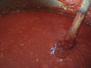
 

San Marzano red sauce following Marcella Hazan recipe

Dump the tomatoes into a sink or very large bowl full of water. Take them out slicing each in half lengthwise and cutting out any bad spots and transfer to a large pot. Bring to a simmer, covered; the water from washing will be enough liquid so they don’t stick. Once the mixture is bubbling away remove the lid and continue simmering about 90 minutes more until the tomatoes have lost their individual identity. Allow to cool to a safe handling temperature, then put them through a food strainer. I did this twice: at a coarse setting to remove the skins, then a finer setting to remove the seeds.


Meanwhile, sauté the onion in about ¼ cup olive oil until translucent. Remove then sauté carrots 5 minutes, then add celery and sauté 3 minutes more. Puree the carrots, onions and celery in a food processer and add to strained tomatoes. Cook 30 minutes then taste for seasoning. I only added 1 T of salt and 1 T of sugar and thought about using even less than this; the tomatoes themselves were that good and complete.

The result was fabulous, rich and tomato-y. Out of curiosity, I’d initially cooked the other squished tomatoes separately. Heirlooms are pretty, Early Girls are sweet, but San Marzanos have the robust flavor profile this sauce demands.
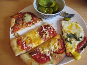
Pizzas and green zebras for dinner.

Dinner was an assortment of pizzas made with the red sauce and with individual tomato slices, accompanied by sliced green zebras (they were getting ripe faster than anything else) in a vinaigrette with garlic and basil. All in all, a pretty good day—assuming you like tomatoes, of course.

User Interface Design: Dual flush toilets look out for Number One

It’s not often you get to see a completely new user interface come on the scene, but that’s what we have today with dual flush toilets. This affords us a rare opportunity to look inside designers’ heads as they figure out the process of making consumers comfortable and confident as they use the product.

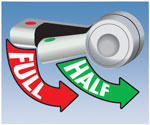
A dual flush toilet has two settings that use differing amounts of water depending on what is being flushed. The designer’s challenge is a/communicating this fact to the user, who possibly has never seen such a device before; and then b/letting them know which switch is for which function. Let’s look at a few examples of how this challenge has been met.

Dual Flush toilet instructions at UNC.
Dual Flush toilet instructions at University of N. Carolina.

The University of North Carolina installed a very institutional toilet with a handle that goes up or down depending. Since you don’t know which is which way does what they put up a sign to explain. I would say this is not very good user interface design: if you have to include instructions for a toilet handle, it’s non-intuitive and too complicated.

A couple of companies offer retrofit kits that add dual flush capability inside your existing tank. To make this work, they replace the operating handle on the outside of the tank. Dual Flush also has a handle that goes up or down, and they include a decal in the package that you can stick on the toilet next to the handle to educate users.  Again, not ideal but we’ll give them the benefit of the doubt since this device is a lot cheaper and more environmentally friendly than buying a new toilet.

Dual handle flusher from Flush Choice.

Another retrofit kit comes from Flush Choice.  This one has two handles, a little one for a little flush and a big one for a big. I think I would figure this out without a guidebook, but it would look a little circusy in a home bathroom and might not be sturdy enough for institutional settings.

Other designers have abandoned the handle and flush the toilet with an entirely different mechanism: buttons. Making such a radical change in the interface is pretty unusual, and it can only work because people really, really want to flush that toilet, and will take the initiative to figure out how. Buttons can be attractively designed, and they’re sturdy because they connect directly to a plunger in the tank. And in fact, all the dual flush toilets I’ve actually seen in the wild have buttons.

Dual buttons in a public restroom.
Dual buttons in a public restroom. (SEE UPDATE AT BOTTOM OF POST!)

Of the three photos here, the big wide buttons are from a toilet in a public restroom. The buttons are of equal size but they have images on them to tell you which is for which. The image of the solid circle implies “all the water” but it also reminds of solid waste. Maybe too graphic? And using same-size buttons for different-size flushes doesn’t seem like an elegant solution; the designer missed an opportunity to communicate by making the buttons also different sizes.

Kohler's new moon/outhouse button.
Kohler’s new moon/outhouse buttons.

That’s what was done with the new-moon shape, which is my favorite. It hearkens back to outhouse doors and once you study it, it’s clear that one button is larger than the other and I think most people would figure out that small means less. I kind of wish they would make the “less” button green but maybe that calls too much attention to itself to be a successful home décor product. (Interestingly, the plunger underneath this inside the tank IS green; also interesting, the home fixit guy who installed it got the parts reversed so the green low flush plunger ended up on the high flush side. In the end, some human errors can’t be solved with design.)

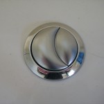
High end Kohler flush buttons.

The much, much more subtle split circle is from the same manufacturer, Kohler. This toilet is much more expensive than the one above and works a lot better. And I can easily see what went through the product manager’s head when they saw the new-moon configuration: “I’m not putting a picture of an outhouse in MY customer’s bathroom.” But it would have been an improvement.

Gotta go.

Dual Flush 3 years later
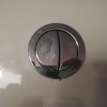
Which button should I push?

UPDATE: 4 1/2 years after writing this post, I revisited one of these toilets, located in a public restroom at my local coffee hangout. Take a look: with regular use, the legends on the two buttons have worn off so you can no longer tell which is which. D’oh!

how to make money with Twitter

I’m wondering why I and so many others were so ga-ga about Twitter at SXSW earlier this year. Maybe it was the new TweetDeck app that allowed us to chirp back and forth about the session that was happening in front of us in the same room. But anyway, I was expecting Twitter to change my life and it hasn’t.

If you want to make money with Twitter, what marketers are realizing is that it’s a great platform for communicating with your EXISTING customers—the same discovery we all made about email. Example: the Korean taco truck telling followers where it will show up next. A company letting its best customers in on a “secret” sale. And an organization like Zappos which has discovered Twitter is an effective vehicle for internal communications. I guess this isn’t really making money per se… rather, you’re saving money or expanding your base with an efficient means of targeted communication.

Best way to make Twitter relevant in your own life: go through your tweets and ruthlessly unfollow anyone who tweets frequently with info that is not fantastically interesting. If you are disappointed with what you read in Twitter, do this immediately then replace the unfollowed by going to http://wefollow.com/ and following a few media sources or people that seem interesting. Repeat on a regular basis, unfollowing those who aren’t interesting after all. Yes, this is work, which is the antithesis of what Twitter is supposed to be.

Twitter founder Biz Stone calls it “curating” your tweets, as if we all had a roomful of Hundertwassers instead of inane tweets about needing to go to the gym. Okay…

Hidden money in your advertising (the direct marketing topic)

Last weekend I visited friend and fellow copywriter Dan Shaw and we were bemoaning the tight creative budgets in this economy. The issue is this: if a client can get an email or a web page written for $100 or $200, why in the world would they hire someone like us at several times that amount?

The answer is that you’re not just paying to get a project completed and checked off in your to-do list. You’re paying for results. And if a page costs 5 times as much to create yet generates 10 times as many leads, clicks, sales or whatever you’re looking for… then it nets out 50% less expensive. That’s hidden money in your advertising which is there for the taking as soon as you look beyond the basics of “how cheap can I get it”.

Writers and designers who do direct marketing well are compensated on results. If we interview with a prospective client we expect they will ask us to show us our “controls”—these are campaigns (the term usually refers to direct mail) that beat out competitive tests or previous controls so thoroughly they become the standard that is used again and again.

The more controls you have under your belt, the better you are likely to be compensated. Because your client is paying for results, they know that a writer who has the skills, instincts and experience to win repeatedly is likely to do better for them on the bottom line.

For example, Dan does some marketing to prospective college students who are choosing a school. He was telling me during our visit about a usability study he attended where he watched students as they interacted with web pages to see what elements appealed to them and were easiest to use. This translates into better results when he does his own pages for clients.  And his clients are quite happy to pay for that knowledge and insight.

With budgets tight, it’s very tempting for a marketing manager to just hire the cheapest provider and it’s tempting for a marketing director to review their direct reports on the basis of “how much money did you save me this quarter?” But it’s a cheap fix and in the end it may cost you more if your true goal is to get more customers, leads, donors, sales dollars etc. which of course it is.

Next time you bid out a project, take the extra step to hire somebody who’s good enough to charge more—and can prove it. If your management asks why you did not choose the cheapest possible solution, tell them you’re paying for results. And that’s how to find hidden money in your advertising.

Saratoga Chips

Early morning workout at Saratoga Racetrack.

My fellow blogger Daniel Berman is a former San Francisco ad guy who, like me, found himself in upstate New York through a twist of fate. We met on Yelp through our reviews chronicling the quest for good food in Albany and environs. Daniel has now taken this a step further with a quixotic campaign to persuade Albanians to chef up and be more like Austin, a city of comparable size. He’s been driven a bit mad by observing that “Our top food blogger is promoting free beef and cheddar sandwiches at Arby’s. And our top food critic is spending her time in converted pubs and pizza parlors.” This sturm und drang caused me to reflect on what my own food experience has been since moving here.

As all things should, we’ll start at the track. One of the wisest and most economical things you can do in the Capital District is go to Saratoga Racetrack early on a summer morning and watch the horses exercise while the dew melts and the steam rises off the grass. It’s free and you can sit in a box seat which will subsequently be occupied by a celebrity or racing nabob, while you sip your coffee or nosh on the breakfast you’ve picked up on the way in.

Coolers claiming picnic tables at Saratoga Racetrack, 10 am.

They clear the grandstand at 10 am and you have to go out, pay, then come back in again. On the way out you will see: most of the tables in the $3 picnic area already claimed by folks who have brought in coolers and tablecloths and will return sometime before the 1 pm post time. I personally can’t think of a better way to spend the afternoon since you can watch the horses and jockeys go by in the paddock, on the way to the races, see the races themselves on closed circuit TVs everywhere, stroll over to a betting station, and potentially splurge by spending a big $2 additional to see the races live by moving to the clubhouse.

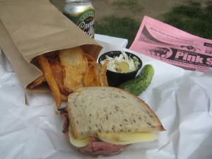
So my first look at a quality Saratoga dining experience consists in peeking at what’s inside my cooler. It is this: half a pastrami and swiss on seeded rye with Saratoga chips and Cole slaw from Ben and Bill’s deli, accompanied by a can or more of Genessee Cream Ale.

My trackside lunch from Ben and Bill's Deli, Saratoga Springs nY.
My trackside lunch from Ben and Bill's Deli, Saratoga.

Ben and Bill were the original Golub brothers, a distinguished Jewish family which owns the Price Chopper chain of supermarkets upstate. Their descendents chafed at the lack of local deli food and resolved to create the best deli between New York City and Montreal, which happens to be placed inside a supermarket in a strip mall. No matter: the pastrami is lean, the cole slaw is excellent and the included pickle is authentically fluorescent. They’ve licensed a few things from Carnegie Deli such as the cheesecake and the gut-busting Woody Allen mile-high sandwich but the $5.99 half sandwich special is really all a reasonable person needs to eat.

This includes a generous bag of potato chips which, as Wikipedia will tell us, were invented right here, across the Northway at Saratoga Lake:

The original potato chip recipe was created by chef George Crum at Moon’s Lake House near Saratoga Springs, New York, on August 24, 1853. Fed up with a customer who continued to send his fried potatoes back complaining that they were too thick and soggy, Crum decided to slice the potatoes so thin that they could not be eaten with a fork. As they could not be fried normally in a pan, he decided to stir-fry the potato slices. Against Crum’s expectation, the guest was ecstatic about the new chips and they soon became a regular item on the lodge’s menu, under the name “Saratoga Chips.”

Ben and Bill’s Saratoga chips are fried up fresh each morning and are miles apart from the uniformity of a bag of Lay’s. Some are burnt, some are a bit flaccid, but that’s the idea. Each one unique, these chips are made to be noticed and savored slowly over a race or two till the bag is gone.

The ideal liquid accompaniment for this would be a growler (64 ounce jug) of IPA from the ever-changing tap at Eddie’s Beverages on Excelsior, except that the track does not allow glass containers to be brought in. On a warm summer day, the light, refreshing and slightly sweet Genny Creme is a fine substitue. It’s a benefit that many upstaters regard this as a working person’s brew, a bit déclassé, so I’m rarely (actually never) asked to share my stash.

When I go back to San Francisco, my treat of choice will be a special from a Chinese lunch place, most likely shrimp in garlic sauce from Taiwan in the Richmond. Except with great difficulty, I’m not going to find anything like that here. Nor will I get Texas brisket or a perfectly simmered pot of turnip greens. But my trackside lunch works well enough, and I feel proud and resourceful regarding my competence in foraging in my new haunts.