Early Prius owners get screwed on battery warranty

I wasn’t too incensed about the dead battery on my Prius, just surprised, but after a bit of research I’m getting my dander up. Turns out, according to this article in the Toyota Pressroom blog, that the Prius battery has a 10 year warranty… EXCEPT for the first three model years that have only an 8 year warranty. (Mine died at 8 years and 8 months.) In other words, the earlier adopters who put their faith in Toyota and spread the word and built the Prius brand potentially get a $3700 repair invoice while later adopters would get a free replacement for the same problem.

I predict there is a bit of trouble ahead for Toyota if more owners see their batteries go south* and discover the company isn’t going to replace them. This is a classic example (getting back to marketing which is what this blog is supposed to be about) of taking your best customers for granted and treating them worse than your marginal customers.

Speaking of marketing, there are some other not-to-do’s worth learning from the Toyota Pressroom post. They acknowledge that “battery replacement in a Prius is neither as simple nor as inexpensive as replacing the battery in a conventional car.” That’s disingenuous because the massive and complex hybrid battery has no basis for comparison to the battery in a conventional car; in fact the Prius ALSO has a “conventional” battery. And they quote a bargain $2,299 for that replacement battery without mentioning that installation and tax at your Toyota dealer are going to add another, oh, $1400.

In a day when anyone can and does have access to your press releases, glossing over the pesky details is not a good idea. What exactly is this article trying to accomplish?  How could anybody who actually has a battery problem not feel pissed? And how could any news source that picks it up, then later discovers the truth, avoid feeling duped?

* Fortunately for other early Prius owners, mine may be a fairly rare occurrence. According to the Driving Sports blog only 306 Prius batteries had failed as of 6/09, out of 750,000 installed. “The life of the battery pack is generally about the same as the life of the vehicle,” said Toyota’s Jeremiah Shown. Well, that’s good to know.

Ok, now I’ll stop. No more about Toyota. I promise. Maybe.

[UPDATE for new readers: Toyota has now paid for the replacement battery. Details here.]

Is this realtor guilty of cybersquatting?

As I mentioned, I am in the process of prepping our SF house for sale. Lots of realtors advertise with a website that is the street address of the home. Out of pure curiosity, I went my home’s URL… and discovered the domain had already been claimed and parked by one of the realtors I interviewed. NOT the one that got the business, by the way.

A colleague who referred this realtor says they do it as a matter of practice, in order to set up a great presentation. Apparently they were going to set up a website for me and surprise me with it, but I made my decision before they could do this. She says as a marketer she admires their moxie and intent.

I disagree. First of all, there is no need to have a live URL to develop a website. Millions of websites are under development right now using local files on the developer’s desktop which will eventually be ported online. At any rate, the URL was parked, not active. The only thing this accomplishes is to keep another realtor, or me, from getting rights to the domain. (This realtor later said they’d relinquish the domain name at no charge.)

We know that in the early days of the internet there were entrepreneurial cybersquatters who grabbed domain names of recognizable brands such as Panasonic, Hertz and Avon, in hopes of reselling them for a fortune. The Anti-Cybersquatting Consumer Protection Act of 1999 put an end to this practice. But how is grabbing somebody’s meatspace address any different?

I think by rights the domain name that corresponds to a street address belongs to the entity that owns the physical location. Am I all wet here?

Trends of note from Fancy Food Show 2010

This show didn’t have the excitement of June in NYC, which may be due to the fact that the west coast was harder hit by the recession than the Northeast. (Though many of the same vendors exhibit at all the shows in SF, Chicago and NYC, merchants tend to go to the show closest to them.) There were some empty booths, but good floor traffic. Three trends I noted:

Gluten-free candy... who would have thought?

1. Gluten-free everything. People with celiac disease can’t eat gluten, but for most of the rest of us it’s the wheat protein enhanced during kneading that makes rustic bread chewy and delicious. But marketers seemed to have sensed a trend that “free” of anything equates healthy goodness, so there are many booths advertising “gluten-free” products that would never contain gluten in the first place.

2. Pizza. Lots and lots of frozen gourmet pizzas are on hand, designed to be sold at $6 or more for an individual-size pie. Also a lot of flatbreads that are advertising themselves as pizza foundations.

3. Old-timey packaging. There are an increasing number of packagers trying to make their product look like it has been around for 150 years, with accompanying benefits of heritage and nostalgia and old time values, even if it just came to market. Correspondingly, there’s less of the light and bright “lightbox” look (I call it that because the products are designed to look great when lit from below on a shelf) that has been popular in recent years.

I did a taste comparison of high end vodka pasta sauces, which were easy to find on the floor. I’d had the real thing, more or less, at Rao’s in Las Vegas last week, and the ones I tasted (included jarred Rao’s as well as Mario Batali) suffered in comparison less from being preserved than from being dumbed-down in flavor and salt. Marketers, no doubt with lots of consumer research backing them up, have decided that the product’s personality should come from the face on the label, rather than the actual taste.

This show is not blogger-friendly, by the way. I registered as a media “trade affiliate” which I won’t do again. Maybe guessing I am not a serious buyer, some boothers tend to pull back the sample tray as I approach. Or maybe they’re just worried I am going to suitcase them.

Prius hybrid battery fails at 70K miles, Toyota won’t pay for $3700 repair

[UPDATE for new readers: Toyota has now paid for the replacement battery. Details here.]
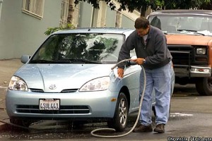
Last week our 2001 Prius started acting strangely, and today SF Toyota gave me the bad news. The hybrid battery is shot and a replacement will cost just under $3700, tax included. We’re a year and half 8 months out of warranty, it turns out,  so the repair cost is 100% our responsibility.

Our Prius in happier days. Photo courtesy of sfgate.com.
Our 2001 Prius in happier times. Photo courtesy sfgate.com.

This is a vehicle that was on the front page of the SF Chronicle in 2001, as a poster child for early adopters of green technology. We’ve bought another Prius since then and I’ve been looking with interest at the lithium-powered next generation coming in 2012. But this changes the equation. If you can expect to pay for a $3700 repair at 70,000 miles, the car suddenly becomes much more expensive as well as less reliable… what happens if the failure occurs elsewhere than in a major city?

I remember the naysayers when we bought it: “the battery’s going to die and it will cost you a fortune.” The reviewers scoffed at this: batteries don’t last forever, but it is unlikely to fail in the driving life of the vehicle. Too bad that’s not true. The $3700 new battery is warranted for 12 months. I guess that tells you something.

News like this could have a chilling effect on hybrid sales, just when we need a nitty-gritty, ready-right-now antidote for energy waste and climate change. (I love seeing the MPG on our 2006 Prius creep over 50, combined with the fact that the car has actually been made less efficient in order to come close to zeroing out the emissions.)

Toyota needs to fix this. I’ll update if they do.

Web marketing tips for realtors

We’re putting our house on the market in San Francisco and I’ve been interviewing agents all week. Each neighborhood in San Francisco (ours is the Lower Haight) has its own personality and a corresponding base of people who want to live there, so a realtor’s knowledge of our area was very important. I prepped for this process in part by looking at names on “for sale” signs and visiting nearby open houses… which, it turns out, is a strategy almost nobody uses any more.

I learned that today most buyers start their home search on the internet and that the vast majority of sales in San Francisco are originally researched direct from the online Multiple Listing Service. That would be different in some areas, but in SF there is strong cooperation among agents and nobody has proprietary listings.

So, it follows that two things are critically important in choosing a realtor: a/the way in which they actually utilize the web to present their homes and b/their overall comfort level with the web in the way they market their services and the homes they represent.

Agents that don’t put multiple photographs of the property online, so prospective buyers can see what it looks like before they go to the house, are putting their sellers at a big disadvantage. I’d say the more information the better—floor plans, detail photographs, go for it—so long as they are organized so I know what I am looking at. And, don’t do it with a slow-to-load flash presentation on a third party website accompanied with a music track. One of our top choices did just that and it hurt them in the final decision.

Romancing the home is fine (and it can and should be done with good staging and good, well-lit photography—and of course a great verbal narrative!) but it can’t be at the expense of accessibility to the basic information that a buyer is looking for as they click through many listings.

As for web savvy, the realtor we went with didn’t have the flashiest (nor Flash®-iest) website but it was solid. He was one of two, out of 7, who was following me on Twitter prior to the appointment. (The other one sent me an email announcing that they were following me, which is not cool.) He had also researched me personally and knew, for example, of my lack of success in selling a screenplay. (Fortunately he did not offer opinions as to why that was.) And, after we met, he was one of the few who followed up with a PDF version of the presentation.

But this was also the only realtor who sent a personal thank you note via snail mail after the meeting. And he was totally and immediately attentive to follow-up contacts from me or my wife (who was 3000 miles away, making email accessibility essential). In the end, the day was won with smart selling using all the tools available, both old and new.

Bing Photosynth demo at CES (video)

Bing is the Mac OS of the search world. (Yep, that’s ironic.) It only has a small market share, but those users have become so loyal that it has to be considered in any search marketing plan. Succeeding against all odds when other search engines were becoming an afterthought, Bing did it the same way as Google: an innovative software algorithm.

Now, Bing is taking on another Google property with its enhanced Streetside which was introduced at CES 1010. This is like Google Maps combined with Google’s directory features, but with more information and better organized. If you’re looking at a restaurant, for example, you can see ratings from a variety of sources and an aggregate quality score.

Yet what is most cool is the Photosynth feature, which allows multiple users to contribute their own visuals of a landmark which are then stitched together to enable a 3D view that can be much more information-rich than Google’s Streetview. For a heavily documented site, like the Rome Coliseum in the example, you can zoom in on a detail and do a virtual walkaround.

I shot a video with a demo of Streetside by a Microsoft boother. The really cool stuff, demoing Photosynth, is toward the end.

Dude, it’s CES, where’s your product?

foneGEAR non-booth at CES 2010
foneGEAR's non-booth. Some teaser signage on those mirrored walls would have helped.

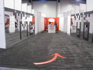
Can you create buzz at CES without showing any product? A couple of companies tried exactly that. First up is a company called foneGEAR. They decided sometime before the show to completely revamp their product line and positioning so, rather than show their current product, they elected to turn their large and expensive booth into a giant “coming soon” sign. The curious were funneled down a mirrored passageway where a single booth rep swiped their card and gave them a key code to unlock a product preview on their website. Booth traffic was pretty light… it might have been a good idea to put a few teaser messages on those long blank walls.

The case of PowerMat is more interesting. Their booth was jammed on Friday and I couldn’t get a demo because they were tied up with Good Morning America. All this with no product on display, just a loop of TV commercials in which hipsters place their iPhones and other portable devices on a pad and it goes bzz! and starts charging. Wireless charging, that’s cool!

But since I didn’t get the demo I read up in the press kit, and discovered PowerMat’s secret: you can’t just fling the device down, it has to be in a special inductive power sleeve that’s not obvious in the commercials. And early users and reviewers have lots of complaints like: it’s hard to get the sleeve on and off; it’s too bulky; it interferes with the compass in the GPS.

PowerMat booth at CES 2010
All hat, no cattle? PowerMat booth at CES.

I returned Saturday and asked a booth staffer why they aren’t exhibiting product. (Meanwhile, traditional media guys are circling waiting for their demos like hungry sharks, sensing they’re really onto something. After all, everybody knows the pain of plugging in to charge your phone. Oh, to be free!) He said they did have product out the first thing on Thursday and there was such a mad scramble for it they put it away.

Now, this isn’t a stealth product. You can buy it at Amazon and Best Buy. I’ll take him at face value, even though creating mystery around a buggy product rather than showing seems like a pretty cool marketing strategy. Pay no attention to that man behind the curtain..

Packaging perspectives from CES 2010

Last month, like most consumers, I fell victim to “wrap rage” as I attempted to pry various gifts out of the theft-resistant clamshell packages in which they were packed.  MeadWestvaco’s Natralock® is getting some attention at CES, a tradeshow featuring thousands of consumer products manufacturers, with a packaging system that is less paranoid but still secure. The secret is a cardboard backing containing an impossible-to-tear inner layer of film that can also include a security chip. Thus the plastic clamshell overlays attached to the card can be simpler and cheaper, display the product better, and because they are smaller they are less expensive to store and ship and gentler on their ultimate destination, the landfill.

Speaking of landfill, I asked Todd McDonald of Tegrant, the partner that manufactures the card backing and the system used to attach it to the package, what if I wanted to make my clamshell out of cornstarch plastic (which I learned is technically called PLA) so it would decompose? Consumer electronics companies wouldn’t do that, he explained, because it isn’t as transparent so the product doesn’t look as good. More important, PLA melts at high temperatures such as inside a warehouse in Texas in summer.

Also, he went on to explain, virtually no PLA actually gets decomposed anyway because it goes right into landfill where it is undesirable to have decomposition. That’s because decomposition produces methane, which can make the soil unstable and is also a greenhouse gas. Methane produced in a controlled environment, where it can be converted to fuel, is a good thing but landfills can’t do that. Landfills don’t decompose. When one is occasionally excavated, the headlines on 50s newspapers are still readable.

Todd, who is a Certified Packaging Professional (CPP) went on to describe his reservations with PET, the plastic now used universally for food containers because it is recyclable. The problem is, again, that virtually none of this plastic actually gets recycled; unless it’s got a deposit on it, it goes into the landfill. And PET takes twice as much petroleum in manufacturing as the PVC it replaces. A complex tradeoff.

Cardboard speakers from OrigAudio
Cool idea, but the sound isn't all that great.

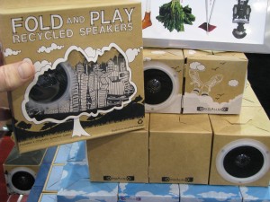
Meanwhile, across the hall in the digital lifestyle pavilion, www.OrigAudio.com (“the origami of audio”) is going in the opposite direction with an audio speaker made out of recycled cardboard—a cardboard box, in other words. You can get two of them for $19.95. Or if you prefer you can make your own speaker from any old resonant trash you may have lying around with the $49.95 Rock-It, a vibration speaker system that attaches to a cereal box, a milk carton or an inflated plastic bag and creates vibration in the object to generate sound. No clamshell packaging is used for either product.

“Don’t tase me, dad!”

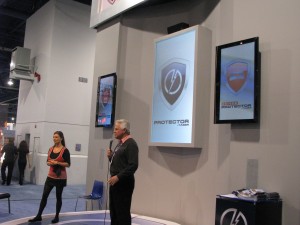
Yesterday at CES I got a demo of a soon-to-be-released product aimed at parents concerned about their kids. There are two modules. Mobile Protector is a phone app they receive along with their first mobile phone. It allows the parents to control what numbers they dial and receive, whether or not they can text and under what restrictions. If they like, the parents can serve as a switchboard: incoming calls come to them and they can answer, decline or forward to their kid’s phone.

When the child reaches driving age, a vehicle mounted console called Driver Protector is added. Parents will now know where the young driver is at all times and they can set up a “Geofence” to be sure the kids are staying within an approved area. If the kid strays, or texts while driving, the phone can shut down automatically. They can tell if the kid is driving too fast, and if they are in an accident there is an alert triggered by sudden deceleration or the deployment of an air bag.

Taser demo at ces
Mobile Protector demo at CES. Afterward, a woman from the audience allowed herself to be tased for our amusement.

The interesting thing is that these products have been developed and will be released by Taser. Yeah, that Taser. I asked the booth guy how this fit with the weaponry and he said Taser’s motto is “protect life”—as in, using our product will help you protect the things in life that matter; as in, if you mess up we’ll tase you but hopefully not kill you.

I see this cutting two ways in the marketplace depending on how it’s marketed and received. Best case is that kids think it’s cool: mom and dad have given me my own Taser, sorta, to keep me safe. Worst case is they think it’s an onerous form of parental subjugation. Let’s see how it plays out.

New rules of PR at CES 2010

This year I pre-registered as a blogger at CES, and as a result I’ve received hundreds of press announcements via email over the past couple of months. Coincidentally, I was reading the just-released new edition of David Meerman Scott’s The New Rules of Marketing and PR
on the plane coming out. Scott’s premise is that the internet has changed public relations because, instead of hawking their message to the media, businesses can now promote themselves by speaking to the public directly—via blogs, content on their own website, posts and responses on networking sites and viral media.

I did an evaluation of the PR emails I’d received with this in mind. The pitches that grabbed me were the ones that were written like news stories and tied to a course of action I could take at CES to find out more and bring it to my own readership. Find out why Apple is up but Sony dropped seven spots in the Greenpeace rating of green manufacturers. Team up with Dr Dre, Lady Gaga and Monster to fight AIDS in Africa. See how Natralock ends “wrap rage” with the end of hard-to-open clamshell packages.

The interesting thing is, many of these are the kind of made-up stories or manufactured events that used to be easy to make fun of: a marketer whipping up fake news because they couldn’t find a legitimate product benefit. Now I’m reading them as a recipient of information, not a conduit, and they become relevant. I’m eager to blog about it and add my own spin, and then the flack’s work is well rewarded.

By comparison, landing side by side in the inbox, traditional press releases just didn’t cut it. (“FOR IMMEDIATE RELEASE: La Cie announces new server for business.”) And some of the senders show a lack of finesse in using email as a medium. No-nos in my book include emaiing the press release as an attachment rather than including it in the body of the email (with this sea of info, why would I take an extra step to read your release?); addressing me as your bud because, you know, it’s email (e.g. starting with “hope all is well” or “hope you had a good holiday”); and sending a graphics-heavy announcement without ALT tags which is basically illegible unless I download the visuals (I’m looking at you, Vizio).

Scott’s theory is that there is a huge sea of traditional flacks who are trying to hang on or just don’t get it, and I guess this would be evidence. Meanwhile, I’ve got a couple of upcoming posts in the hopper, based on those pre-show emails I received.