We’ve talked before about verisimilitude—the principle that, in addition to actually being true, an advertising message must appear to be true or the skeptical public won’t trust it. A parallel concept is context… in any given environment the audience expects to receive information in a certain way and you can either fit in with this convention, or startle and gain attention by doing the opposite.
Ads or banners that look like editorial content go down like butter. Direct mail packages that look like they are official notices get opened automatically. Of course, you need to stay in character or the audience may feel duped if your message turns out different than it appears.

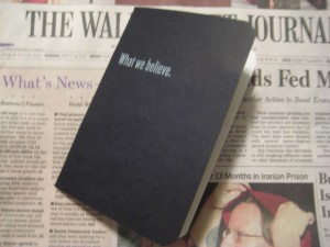
For the “startle” approach, a good example was inserted with a recent Wall Street Journal (home delivered in Dallas, where I was traveling): unfold the paper and a bankbook falls out. Whoa, a bankbook! But it’s not really a bankbook because it has a headline on the front: What we believe.
Inside, we have ten spreads containing statements of belief, most of them no more than a sentence. Example: “We believe you get what you pay for.” It’s not until the very last page that the advertiser is revealed along with a CTA: We believe there is only so much you can learn from a book. Call (tollfree). WhatFrostBelieves.com Frost (logo)
Now, there’s nothing terrible about any of this… for a corporate website, or an annual report. But this isn’t marcom, it’s ADVERTISING and quite expensive advertising at that. I can see the boardroom wheels turning: Wall Street Journal readers are well heeled influencers. Let’s impress them with our sincerity and maybe they will become our customers.
Not likely. There is just too great a leap between a statement of purpose and high mindedness, and the actual activity of deciding to do business with a bank. A few readers may pass the bankbook around their office as a curiosity but very few are going to do the thoughr process of “these guys seem decent enough, they’ve proved it by not trying to sell me too hard, therefore I will get a loan or open an account with them.”
The thing is, there is a way this promotion could have potentially been VERY successful: make it look like a real bank book. With nothing on the cover so you don’t give away that it’s marketing… or, wait a minute, let’s put the Frost logo on. That’s realistic and establishes brand up front.
Inside, some stage management—fake transactions. The account holder has built up a huge balance, earned some nice interest, then withdrawn it all. (This is Texas, remember.) Tell a story with the numbers. The Wall Street Journal reader will like this. Then on the last page, a call to action: save a point on your business loan when you return this bankbook to Frost. That’s how you buy business by being out of context.