There’s always a nice buffet at the ShowStoppers press event at CES. This year it included a beautiful arugula salad with orange slices. Trouble was, the long strands of arugula fell off the tiny plates they gave us. So by the end of the evening the kitchen was chopping the arugula into pieces that didn’t fall off the plates. User interface problem, solved.
It is not so easy for a consumer electronics company to change direction with its user interface, and I think that a lot of worthy products never get a foothold in the market because of poor or simply unfamiliar choices about the way the consumer interacts with them. This is allegedly the “Year of the Tablet” at CES, and indeed it is with hundreds of models on display. Tablets don’t have keyboards, so you have to design a way for consumers to manipulate the on-screen icons that is intuitive.

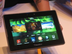
Most copied the iPad model with a grid of apps icons that you can select by touch. BlackBerry’s new PlayBook did something different and I liked it. There is a horizontal band of icons actual running applications [thanks to Peter Hansen, below, for this correction] across the middle and a dock of smaller favorite icons at the bottom. It’s a cleaner interface with much less on the screen. You can flick the band to left or right to expose more icons. When you want to activate an icon enlarge an application’s window you tap it and it fills the screen, but you can get back to a desktop by “rolling in” the edge from any of the four inner edges of the bezel. After a minute I was using it with ease. I wish RIM success with this device, although I’m a little nervous that they have not announced a battery life.

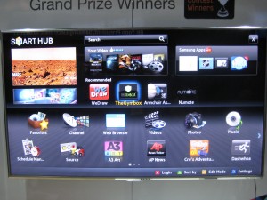
Less successful are the TV Apps I saw from Samsung and LG; I’m sure they are available from other brands as well. High-end “smart” TVs have a menu screen that looks like an overgrown iPad with big icons for sports programming, partner channels, and their own version of apps, mostly games and kid activities. The whole idea seems like a non-starter to me. How many people fiddle around with their TV menu instead of going right to the menu of the TiVo or set top box they’re familiar with? And tabbing among the icons with a handheld remote was awkward and reminded me how much more intuitive a touchscreen is.
A giant electronics company can absorb a mistake, but the same may not be true of Anti Sleep Pilot, a device that mounts on your dashboard and monitors the driver’s performance and alerts you if it’s time to take a break. This is a very serious subject and a worthy thing to do but I wondered how they went about deciding how exactly to alert you and nobody at the booth could inform me.
The demo video shows a melancholy Dane who looks like he’s quite willing to cooperate but I wondered how it would be sold to Americans who are distracted to begin with. Here’s where the user interface makes a real difference. I’m told the warning sign, after you fail a certain number of tests, is a “chime”. Did they test that vs a buzzer or siren? I hope so. This is a product that truly will live or die by its interface. I watched it at ShowStoppers while munching my arugula.
You may want to revise the description of the PlayBook user interface as you got it rather wrong. Those “icons” in the middle are not icons… those are actual running applications! The ones at the bottom are the icons, the ones you click on to launch apps. Anything in the middle is live, running, in realtime, and when you tap it and it expands what you are doing is switching focus to it, just as you do with different already-open windows on your desktop OS.
Speaking of the PlayBook, it’s now on the market and getting heavily panned because it has to be tethered to a BlackBerry phone for full functionality. Why didn’t I mention this feature? Because the booth staff at CES was doing a very good job of obfuscating this fact… there was not a BlackBerry phone in sight! Either they did a dramatic switch in product strategy after the show, or they were doing some serious misrepresentation to gullible souls like me.