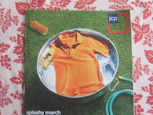
I’m not a JCP customer nor prospect. I didn’t watch the Oscars so didn’t see the Ellen ads though I just now YouTubed them and thought they were great (unlike the majority of the TV audience apparently). Thus, like a lot of folks, my first exposure to the “NEW” JCP was the insert in today’s Sunday paper. If you have one, pull it aside before your partner or spouse puts it in the recycling because it’s worth a study.
JCP’s competition in my local mall includes Target, Old Navy and Kohl’s, all value brands that are trying to look cool and hip (Kohl’s less so than the others) while maximizing floor space. What’s going to make me take a fresh look at the “new” JCP now that former Apple (and Target) guy Ron Johnson has had a few months to get settled in?
How about an opening spread that announces the new “Fair and Square” pricing and uses a universal commodity, like polo shirts, to illustrate it? Red is everyday, white is month long values, blue is a markdown. Got it. So let’s show one example of each. Let’s also make a great offer to get people back in the store, like a free 8×10 family portrait with no strings attached.
This isn’t what happens. The opening spread sells nothing except the picture of a mom in heels (presumably purchased at JCP, but with the intent of looking like Manolo Blahniks) who is gearing up her toddler for a splash in their inground pool visible through the open doorway. Goofy, yes. JCP customer, no. We do get to the polos but not until the next spread, and without the pricing explanation. Further, they’re not on models and they’re still shots, wrinkled. Questionable choice since JCP’s new image seems to focus on “fun” people and models work very well later in the book while also showing off the product with bright hide-no-detail lighting.
I actually sat down to talk about the copy though. I wrote retail fashion early in my career and it’s hard. But at the core of the “look” there is always a human benefit to be found. The book title, “splashy march”, simply doesn’t make sense unless it’s an in joke about “merch”. The double meaning instinct moves into high gear a couple of spreads later: “when we say we’ve got you covered we really mean it… talk about a spring break!” (As in price, apparently. But wait a minute. Doesn’t JCP’s new positioning focus on the fact there is NOT always a sale going on?)
Adult supervision finally arrives at the soft goods section in the back: “This shower curtain is not only washable, it also resists mildew. What is it about spring that makes you want a fresh, clean start?” On message and it sells. What’s so hard about that? Watch and learn, JCP fashion copywriter.
And that free portrait offer? It’s here on the inside back cover (actually a hot spot that’s one of the most-read spreads in a catalog) but buried next to a wacky family portrait that again will probably make the JCP customer feel uncomfortable vs thinking “those are my peeps.”
I kept thinking about the great Lands End catalogs of yesteryear, before they were acquired by Sears. Great selling and great stories hand in hand, with the latter used to showcase the former. That was what JCP could have used here.
UPDATE: since this post we’ve seen three more Sunday flyers from JCP. The “mandarin orange” fashion issue was great. The home store this week not so much. Also, the binding was different: saddle stitched for fashion, loose pages for the home issue. What’s happening is a lot of territorialism between different creative directors and the different departments. For a messaging re-do like this to work, you really do need to have buy-in across the board.