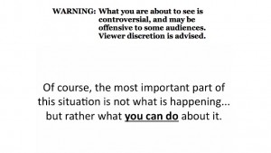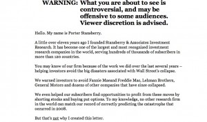
Direct marketing watchdog Denny Hatch had his knickers in a twist about the online ad shown here. And with good reason. It’s simply a long copy direct mail letter turned into a PowerPoint video and it runs 77 minutes (I am taking that part on faith since I lasted about 4 minutes) with no pause button and no call to action until the very end. The sell is for an investment newsletter which allegedly has 241,700 active subscribers, which I presume are the same as the 241,700 people currently viewing Otisregrets.

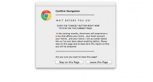
Hatch waited all the way to the end; I didn’t and clicked the close button, bringing up the frantic “WAIT!” alert usually reserved for adult content sites. I clicked the “stay on page” button … and was rewarded with the opportunity to read the same copy, but in its original mega-letter format. (And badly reproduced, too. Hope that Stansberry picks up a few subscribers so he can afford a new imaging drum for his scanner.) Even so there is no call to action until the very, very end of the letter where we find a single “subscribe” button.

Of course this is NOT evidence that long copy is a bad idea. Rather, it’s a great way to experience good direct marketing by its absence. When asked how long a man’s legs should be, Lincoln allegedly replied “long enough to reach the ground.” It’s the same with sales letters. They can be one page, or 32 pages (my personal record), or hundreds of pages like the Stansberry effort… just as long as the copy is permeated with calls to action so the reader can stop reading and give you the order as soon as they are convinced.
Hatch’s article had a great quote from old school copywriter Claude Hopkins, which talks about “print” but applies equally well to electronic media:
“People are hurried. The average person worth cultivating has too much to read. They skip three-fourths of the reading matter, which they pay to get. They are not going to read your business talk unless you make it worth their while and let the headline show it.
People will not be bored in print. They may listen politely at a dinner table to boasts and personalities, life history etc. But in print they choose their own companions, their own subjects. They want to be amused or benefited. They want economy, beauty, labor savings, good things to eat and wear.”
Getting back to the format of Stansberry’s online ad, Hatch closes (as will I) with this zinger from “Visual Display of Quantitative Information” author Edward Tufte: “Power corrupts. PowerPoint corrupts absolutely.”