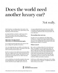
Lincoln, I like you better now. Oh, wait.

Lincoln New Yorker ad
Lincoln Ad. Click on the image to enlarge, then click again to read.

I am surely in the demo for the reimaged Lincoln, for the day after I saw the WSJ ad I ran across this in the New Yorker. It’s so dramatically superior to the “Hello. Again.” ad that the two could be compared as a copywriting clinic. Again, I’ve reproduced the actual ad since I can’t find the full text online and am too lazy to retype it. Let’s see what is better this time around.

1. There is a clear narrative. This is the story of Edsel Ford and how he had a dream, built great if eccentric cars, and now we are back presenting this new vehicle in his spirit. So much better than the “Hello. Again.” ad that darted back and forth between the past and the present, then swerved into the service commitment and ultimately made me carsick.

2. The proof points are big and dramatic. Instead of a sunroof, this new Lincoln has an entire “panoramic glass roof” that makes driving it like driving a convertible. And they have a hybrid model, getting an impressive 45 MPG, that costs not a penny more than the standard version.

One wonders how the copywriter for the other ad missed such clear differentiators and instead focused on the push button gearshift. Which makes an appearance here, by the way, but it’s tied to a benefit: “And what if we want to hold our spouse’s hand once in a while? Enter the push-button shift.” I do wish they’d chosen a more adventurous word such as “seat mate” or “companion” though… we Lincoln prospects are not totally moribund.

3. The voice of the copy is clear and consistent. There is a sure hand on the tiller this time, different from the preening narrator of “Hello. Again.” who kept distracting himself from self-important statements with news about the car. The story is told cleanly and well, up until a closing paragraph which is aspirational yet tight: “Call it luxury. Call it engineered humanity. [WTF?] We’re calling it the Lincoln Motor Company. A completely reinvented wheel, with you at the center.”

So why am I not now in my aging Packard or Escalade, headed for my Lincoln dealer (wherever that is)? Unfortunately, the “Hello. Again.” ad ran AFTER the Edsel ad per the marketing strategy, not before. If this Benjamin Button regression of copywriting smarts continues, pretty soon I will be test driving a Hupmobile. Or Maxwell, even.
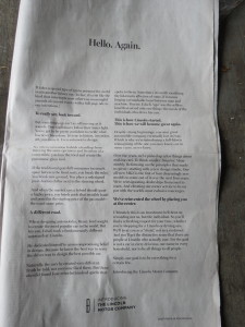
Hello, again, Lincoln. And now goodbye.

LincolnAd2
Click on the image to see larger size then click again to read

As a technologically savvy consumer who’s not excited by the current crop of luxury cars, I should be the perfect target for the reimaged Lincoln. Yet the full page ad in Saturday’s Wall Street Journal had me scratching my head. (I haven’t been able to find the full text anywhere online so I’ll shoot it at hopefully high enough resolution that you can read it for yourself.)

As a copywriter, I love long copy ads that succeed and hate long copy ads that make skeptics say “long copy doesn’t work”. This ad, unfortunately, is in the latter camp. Let’s examine why:

1. Lincoln assumes a coziness which is not likely to exist between ad and reader. Sadly, today’s consumer is not enamored with our silken prose and is more likely to turn the page than to read the copy. Witness the headline which, out of all the infinite possibilities, says “Hello. Again.” And a first paragraph that says, “It takes a special type of ego to presume the world needs another luxury car. (In fact, it’s a bit like the kind that interrupts your otherwise meaningful pursuit of current events with a full-page ode to our intentions.)” Lincoln, we could care less about your ego.

2. The ad has a tin ear. Here’s an aspirational statement in the second paragraph: “True trailblazers follow their inner light. You’ve got to be pretty confident to create what has never been done before. It’s true in history, invention, art, you name it. Even automotive design.” Pretty high-minded and soul-stirring.

But here’s their proof point in the very next paragraph: “If the traditional gearshift consumes too much space between the front seats, you break the rules. You break new ground. You place a redesigned push-button shifter next to the steering wheel.” Not only is that a terrible letdown from the aspirational high, it’s not even new. I had such a shifter in my 1963 Rambler.

3. Lincoln steps on his own coat tails in attempting to be all things to all consumers. The brand wants to be “what has never been done” as noted above. But they also want to build on their heritage, as the ad progresses. Past Lincolns are presented as “different… truth be told, not everyone liked them” and the “selfless” (sic) ego of Edsel Ford is brought forward as the kind of pure design fire that burned brightly. (When people think “Edsel” they think of the car, of course, with all its quirks, not the man.)

If you are brand new, then you’ve broken away from any history you have. Instead they’ve chosen to bring up the history, then belittle it or suggest that Lincoln has been misunderstood. I don’t think you can have it both ways. And there is also the television advertising to deal with, presenting the Lincoln as the “car of presidents” (as in presidential limo) which makes it seem like a mainstream choice and not an eccentric outlier. More discontinuity.

Finally, at the end of the ad, we’re told what lies in store for us: “elevating our owner service to be on par with the world’s most exclusive concierges… we’ll treat you as a ‘client,’ not as a customer… simply, our goal is to be everything for a certain few.” Here I know what is happening because I did some work for Lexus in the early 90s, when they were eating Infiniti’s lunch. The two new luxury brands were launched at the same time. Infiniti then, like Lincoln today, came forth with dreamy high-minded metaphors and poetic-sounding prose. Lexus simply said, we’re going to pamper you like you’ve never been pampered before.

So Lincoln is going to be both Infiniti and Lexus in the same body. We’re dreamers and unabashed egoists, but when push comes to serve we’ll open the door for you and give you a free carwash with your oil change. Actually, according to Yahoo! News, the promotional plans include a “date night” in which consumers get a free dinner for two when they take a test drive. Now that might get my attention. As long is it’s not Olive Garden or TGIF Friday.

Persuading people with social proof

Dr. Robert Cialdini is a psychology professor at Arizona State University who has conducted some interesting research studies with the help of his students. In the “hotel towel test”, he changed the language on signs in hotel rooms urging guests to reuse their towels. Compared to no sign, adding a standard message about “have concern for the environment” increased reuse 30%. But when the wording was revised to “three-quarters of the guests staying in this hotel reuse their towels” reuse increased to 44%. And when it was revised to “three-quarters of the guests staying in this room reuse their towels” reuse increased to nearly 50%.

In an interview with the American Psychological Association, Cialdini attributed these results to social proof: “If this is what people around you have decided is a good choice, it’s a great shortcut for you to determine what’s a good choice.” He cites a study by a Beijing restaurant in which a restaurant put on the menu, “these are our most popular items” and the items immediately became 17-20% more popular.

I thought about these results while working on a project in a new field for me, making requests for donations from college alumni. For the typical school well under half the alumni make gifts, so it’s fair to assume the ones who do give were happy with their experience or at least felt it was worthwhile. Thus the formula is to generate a mental picture of those halcyon college years for the reader, then tell them they can make the same thing possible for someone through their gift. You and your classmates were fortunate, therefore you should allow a new or current student to be fortunate.

Cialdini has another study in which the results backfired from what was desired, while upholding the principle of social proof. He distributed bits of petrified wood in the Petrified Forest Natural Park and tested signs admonishing visitors not to remove them. In situations where there was no sign at all, 2.92% of the pieces disappeared.

When a sign was added with a picture of several visitors taking wood and the caption “many past visitors have removed the petrified wood from the park, changing the natural state of the Petrified Forest”, theft actually increased to 7.92%. As copywriters we know this flabby third-party syntax is unlikely to persuade anybody, but what it does is introduce the concept of stealing wood to somebody who had not previously thought about it. And the social proof is that “many” visitors do this, so you should too.

A third sign showed a single visitor with a “no” symbol over his hand and the caption “please don’t remove the petrified wood from the park, in order to preserve the natural state of the Petrified Forest”. This reduced theft modestly, to 1.67% vs 2.92% for the control with no sign at all. It’s a direct request and clearly shows what not to do, but it’s not really social proof but a one-to-one message. What if the sign had said, “97 out of 100 visitors enjoy the park without disturbing its beauty. Thank you for preserving the natural state of the Petrified Forest”?

Cialdini summed up in an interview on NPR: “When we are uncertain about whether to be altruistic or pro-social or environmentally conscious, we look around us for the answer. We don’t look inside ourselves. We are all swept by the power of the crowd.”