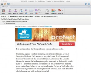
Specifics sell… this example shows why!

National Parks
Beginning of the National Park Foundation’s email

Unfortunately, it’s an example of what NOT to do: The National Park Foundation saw the terrible wildfire currently out of control in Yosemite as a great opportunity to raise money for its cause. It’s exactly the same tactic used by The Salvation Army, The American Red Cross and many other charities which often have their best efforts on the heels of a disaster which triggers’ readers empathy and desire to help.

Unfortunately, as the NPF email was on its way to the coder some bone head saw the proof and said, “wait a minute, what about all the other parks? If they’re not in California, maybe they don’t give a hoot about Yosemite!” And so the “ask” was expanded to mention acts of vandalism, including green paint being splashed on the Lincoln Memorial.

I didn’t even realize the Lincoln Memorial was a national park, and it seems to me responsibility for cleaning it off (or keeping vandalism from happening) should rest with the local police. They then go on to tell us that there were 2,000 acts of vandalism in national parks last year and that the parks are underfunded. There’s also a reference to the fact this is the parks’ 97th anniversary and that the Travel Channel will match your gift. And they close with the unacceptably vague promise that a gift will “provide critical resources that directly aid and enrich our national parks and the work of the National Park Service.”

What should they have done instead? Leave the kitchen sink in the kitchen! In this case, a vastly stronger email could have been created by focusing entirely on Yosemite, saying how this makes us realize how precious our parks are and how much they need our support, and bringing in the Travel Channel match as exciting news that makes your gift go twice as far. Tell us very specifically what our contribution is going to do. Then get out.

And that anniversary announcement? Save it for the 100th, for goodness sake. Assuming this Foundation actually is doing good work, I hope they’ll be around that long. Meanwhile, this one goes straight to the Badvertising Hall of Shame.

Back by popular demand at DMA2013

My panel discussion on K.I.I.S. (Keep it simple, stupid) marketing was asked to return to the Direct Marketing Association’s annual conference based on our being one of the top-rated panels at last year’s event. DMA2013 is happening in Chicago and we’ll be the last session before the wrap-up lunch presentation on Wednesday, October 16. I love Wednesday sessions because they happen after the trade show is over and the Echo awards are done, so anyone who’s still around has a serious reason for being there.

Once again, Dawn Wolfe of Autodesk and Philip Reynolds of Palio+Ignite will join me and show what happens when, instead of technical jargon or corporate posturing, your advertising connects with the reader or viewer or web browser based on a simple appeal to the things that are important to them. The rules of “back by popular demand” are that the framework of the topic is the same, but the examples and case histories used have to be completely new. Come sit in… it will be an interesting and hopefully entertaining hour.

What’s a new customer worth, Fidelity?

A death in the family caused us to contact Fidelity Investments, where the deceased’s assets were held. Fidelity told us we’d need to sign a form for redistribution of assets, and it would arrive in five business days. When about two weeks had elapsed, and no form, a family member called Fidelity and was told a/they had no way of tracking the form or even verifying it had been sent and b/mailing the form was unnecessary since it was available online. We then downloaded the form, completed it, and were done. 19 days after the original request (so 15 business days) the forms finally arrived in the mail. Two days after that, a second set of forms arrived in the mail.

There were three people involved on the recipient end. One of them had previous experience with Fidelity through a lump sum disbursement of a retirement account and commented “Fidelity… I should have known.” The second had no previous experience with Fidelity and is unlikely to establish a relationship on the basis of this experience. The third was me, who has had his business at Fidelity for many years and has always been delighted with the service and so was baffled by this Keystone Kops routine.

So, is there a double standard, where existing customers are treated better than potential new customers? In a perfect world, that’s the way it would be. But how much does it cost to gain a new customer? Wouldn’t it have been better to woo these two prospects rather than driving them away?

In a word, yes. Customers die, change their focus or get lured away by a more aggressive competitor. You ALWAYS need new business, and if you can acquire it at low cost that gives you more resources to use for pampering existing customers. Fidelity should get its departments talking to one another so fiascos like this aren’t the face of the company to prospective customers.

Not OK, Chrome

I am not sure how Google Chrome became the default browser on my Macbook Pro, but it’s gone now. Just way too many instances of “the Shockwave plug-in has crashed”, the fact that it won’t run the current version of Flash, and the frequent escapades of the “Chrome Renderer” and his evil twin, the “Chrome Worker” that slow my system to a crawl.

So I went through the peculiar (though obviously self-serving, to Apple) practice of changing the browser through Safari, Mac’s own browser which can’t be the default because of just too many incompatibility problems. Now I’m back to plain old Firefox.

How did I ever get into this pickle? I think I was lured by a casual invitation to try Chrome on the Google search page, and initially it seemed noticeably faster than Firefox (which has its own problems with plug-ins that are constantly getting out of date; but unlike Chrome, Firefox simply disables them rather than allowing them to crash the app). I also liked my fresh results with Bing, the browser which was oddly-enough (because it’s not Google) pre-loaded. Once a daily productivity app becomes a habit, it’s hard to change. But now they’re both gone. And I’m feeling a sigh of relief.