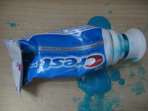
Seems like the old tube with the small opening and the screw top wasn’t good enough for them, so they went to this great big cap that is supposed to pop on, but it doesn’t. And they also changed the formula of the paste so it’s more liquidy and oozes out all over the drawer.
Anybody know why they did this? Hard to believe it’s less expensive than the traditional tube. I think it’s a case of a/changing two things at once, which as marketers we know is folly and b/somebody with too much time on their hands.
I’m too cheap to throw it out, but as soon as it’s done I’m going to switch brands to somebody who still uses the old fashioned tube.
Citing your item b above, the individual may now have more time on his/her hands!
I wholeheartedly agrre with the article above! All my friends complain about the same things. How did this idiotic design slipped by the testers? They are a mess. Please bring back the old texture, and the wide, top screw-on cap, or else we shall switch to another brand!