How to get your envelope (or email) opened

David Ogilvy said that the only function of the copy and art on the outside of an envelope is to get it opened. As a corollary, Herschell Gordon Lewis (I think) said that the majority of the creative energy on a project should be lavished on the outer envelope. Same goes for subject lines in email.

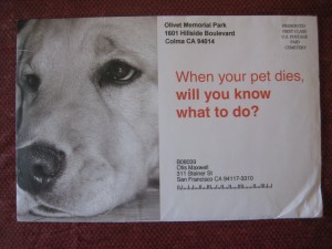
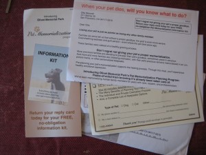
Is this the most effective possible outer envelope teaser?

All of which makes me wonder what was the process by which today’s example envelope got into the mailsteam. You can see it here: the plaintive muzzle of a loveable dog, with the teaser “When your pet dies, will you know what to do?”

It’s from the Olivet Memorial Park, presumably not a huge outfit to whom this project was so trivial they chose the first headline that came to mind. I imagine there was quite a debate. There might even have had a presentation from a copywriter who came up with this head, and told them why it was really good.

There are many motives to get people to open an envelope. Guilt, for example. “Your pet gave to you all her life. Now it’s your turn.” Or just love between a person and pet. “Now there’s a place to share forever the love you have.” But instead Olivet’s advisory board chose the practical way: “When your pet dies, will you know what to do?” There will be a body to dispose of, probably some health laws to follow, hmm. Yet I would bet if you did an A-B split against virtually any emotional headline, the emotion will win every time.

letter and other elements of Olivet package

And on actually opening the envelope, I find that there are indeed some emotional appeals. “Losing a pet is as painful as losing any other family member”… and an offer of a “Pet Memorialization Planning Program”. Putting one of these messages on the outer would certainly have boosted its effectiveness but, like a canny minor league pitcher, Olivet wanted to save its best stuff until last… after the crowds have departed.

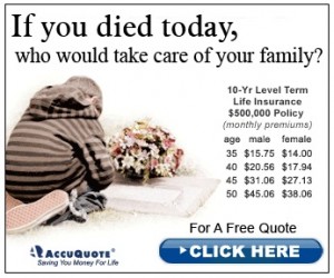
"If you died" web banner

As I was writing this, I happened to come across the example “if you died today, who would take care of your family?” web banner and wondered if this was the inspiration for Olivet. But look at the differences. It’s a very clear and specific concern vs “what would you do?” Plus, people trump animals every time.

Work hard on your outer envelope or subject line. Work on everything, but especially on that. If you don’t, you may end up in the pet cemetery.

3 tips for more effective copywriting in a recession

When economic times are bad and marketing budgets are tight, every promotion has to work harder than ever to pay back its investment with increased sales, leads or visibility. The good news for copywriters is that often we can improve return on the marketing investment with better response at no increase in costs, simply by wringing out every last benefit and bringing it home to the reader.

But how do you deliver a positive message when the news all around you (maybe even including the news you need to deliver in your copy) is bad? Here are three pointers.

Rule #1: Don’t go negative. Stick to a positive message in your copywriting.

At several points in my copywriting career I’ve felt like I uncovered a powerful “warning” or “caution” theme that outweighed anything positive I could say. And every single time this approach was tested, I’ve been blown out of the water by a bland and generic benefits-oriented message that handily defeated my negative scalpel twist.

The reason, I think, is that readers go through a filtering process before they get to your copy. Themes like “how to survive the coming depression” may be fine for best sellers, but people volunteered to read those books or watch those TV shows. You, on the other hand, are one flick of the finger away from the recycling bin or a click to the next web page. You have to earn a reader’s acceptance before they will permit you to market to them. And if you scare them on your initial approach, they’ll simply run away.

Tip #2: Be nurturing. Write copy your readers want to read.

Today’s consumers, even business people, are hurting and they want coddling however they can get it. If you can take them to a quiet and reassuring place even for a few minutes, chances are they’ll stick with you till you get to ask for the order.

One of the most successful promos I was associated with was a subscriber acquisition package for Great American Recipes during the early 1990s recession. It became the first non-sweepstakes control for this marketer by delivering a message of comfort and nostalgia:

Remember when good food meant the best times you ever had with your family and friends?

I’m talking about lazy summer evenings serving home-made ice cream on the screen porch. The fine feeling of knowing everything was cooked just right, and there was plenty to go around. The warmth of neighbors sharing recipes, in a cozy kitchen on a cold summer night…

We haven’t even gotten to the product yet, but this was already outpacing “you may already have won” even in tough times. And an extra benefit is that the product I’m selling is depicted as taking them back to happier days… so not only are readers more likely to order, they’re also more likely to keep the product (the initial pack in a recipe card continuity program) instead of sending it back when it arrives in the mail.

Tip #3: Be specific. Believable copywriting is effective copywriting.

Readers are extra-crabby and hyper-sensitive when they feel threatened. Even more than usual, they’re on the alert for flabby generalities and statements that are not supported by facts. The truth is your antidote, but you also need to be very clear in your writing so readers know you’re telling the truth.

Non-profit fundraising writers know about this challenge because for them, times in are always bad which is why they are raising money. Herschell Gordon Lewis shares a great example of bad fundraising copy, a letter that stars with a sentence something like “Around 2 million people in the western Sahara will go hungry this summer”. The word “around” is the deal breaker. If the writer didn’t care enough to find a more exact number, why should the reader care?

The other challenge is that huge negative numbers seem overwhelming. It’s terrible if famine threatens a region, but what can I as an individual do to help? On the other hand, if I understand that my $100 contribution saves 40 children with diarrhea, that’s that is something I can manage. Apply the same rigor to your benefit statements or descriptions no matter what the product or service, and you’ll be better off in bad times.

A promotion that follows all these rules is a lead generation letter for a major insurance company. It’s about long term care insurance and it starts with the “bad news” that Medicare is not going to cover your expenses in retirement like you thought it would. The lead sentence of this letter is what makes it work and it’s actually very close to something I heard from a salesman during a brainstorming session:

Every one of us would like to live well in our later years and leave some money for the next generation. Is that too much to ask?

Unfortunately, this modest dream could be shattered if you one day need assisted care in a nursing home… in fact you have a 40% chance of being in a nursing home after age 65. A nursing home stay can be expensive, averaging more than $180,000 nationwide. And it can be demeaning, robbing us of our choice and dignity.

Fortunately, Long Term Care Insurance is now available from ((client name)) that helps retain the very options that expensive long term care takes away…

This delivers one specific jolt of bad news (and carefully modulated outrage) but immediately provides the solution for it and proceeds to coddle and nurture the reader for the rest of the letter. It’s been the control for going on 10 years and I expect it will only do better in the current economy. Try the same formula in your own writing and see if you don’t succeed, good times or bad.

NOTE: I’m in the process of installing the contents of my DMA “Copywriting that Gets Results” course on this website. Watch for more articles and pointers coming soon.
How to build traffic for your trade show booth

Want to get more people into your trade show booth? Yes, you do, because a crowded booth creates buzz and attracts still more people, and a certain number of those will end up being qualified prospects.

People images making eye contact draw visitors into your booth.

You can do a lot to influence traffic with the design of the booth itself. Do: allow for a seamless flow of traffic from the show floor into your booth… so people can find themselves inside your booth without expecting it. This means minimizing the use of registration kiosks that throw up a barrier. Do: use people imagery in your booth signage, especially people who make eye contact with passers by.

Kiosks at the corners create a "desert island" effect and make your booth look empty.

Don’t: put kiosks in the far corners of a large booth. They create a desert island effect, making your booth look empty even when it isn’t.  And especially don’t: put up walls or barricades of any kind that people have to pass through to get into the booth. They simply won’t do it and your trade show will be an unsuccessful and lonely experience.

Double bad: a gatekeeper plus a fabric wall ensures this booth will stay empty.

You can also build traffic prior to the event by inviting customers, prospects whose contact information you have collected, and possibly registered attendees (depending on how much it costs you to use the list, it could be a good deal or not) to come to the booth and get something specific with solid perceived value: a new research report on trends in your industry, for example. Don’t invite them just to check out your new product line, that’s not a strong enough call to action. A drawing or bring-this-postcard-for-a-free-gift will also work, though as with other soft offers this means more response but less quality.

FSIs (newspaper inserts) and the Super Bowl

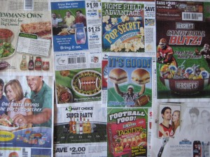
Newspaper coupons grasp at 2009 Super Bowl
Three years ago, I did a post on newspaper inserts and the Super Bowl… and how snack manufacturers contort themselves to create a “big game theme” without ever actually mentioning the Big Game, which is a copyrighted product with big licensing fees attached. Looking at this past Sunday’s crop of FSI’s, it’s reassuring to see that nothing has changed. The nation’s economy may have melted down and the web has transformed marketing for most products, but for salty snacks and their teammates it’s still “game on”.

Smirnoff offers us a “smart choice for your super party”.  Newman’s Own wants you to “go natural for the big game”. Tums will let us “enjoy the game heartburn free” while Pop-Secret popcorn promises a “home field advantage” and Hersheys wants us to “treat your home team” to a “candy bowl blitz”.  Marie’s salad dressings invite you to “tackle the taste” and Dean’s Cool & Creamy exhorts you to “bring the ultimate dip to the ultimate game.”  You can also “score one for the home team” with Ling Ling egg rolls, say “it’s good!” [umpire with upstretched hands holding up two hamburgers] for White Castle or enjoy “football food… ready for game time in minutes” from El Monterey Taquitos.

It’s clear that the marketers are doing an end run around the NFL by not mentioning the Super Bowl by name, and that the NFL has dropped the ball by not figuring out a way to bring them into its licensed marketing huddle. But more important, there’s a flagrant violation by most of these marketers because they forget that coming up with a catch-phrase is not the same as selling a product.

And so the winner, in overtime, is an ad from Butterball cold cuts with the theme “One taste brings the party together”.  Because after all, the reason these marketers are trying to tie in their products to the Super Bowl is that you’re going to serve them at a party—and here’s one marketer with a generic ad (originally created around the election, maybe?) that says how their product is going to make your event a success. Touchdown!

Copywriting that Gets Results!

The first time I taught my copywriting course for the DMA, I called it “Direct Response Copywriting”. After the initial semester I realized I should be practicing what I preach and I retitled it “Copywriting That Gets Results”—a description that, like all good direct response copywriting, contains a benefit for the reader.

RESULTS can be measured in orders, sales dollars, leads generated etc. But they can also be measured in success in landing a job or convincing an audience of your political views, among many other potential examples. And one of the best reasons to develop the skill of “copywriting that gets results” is that it helps you become more successful anytime you want to use words to convince someone.

Robert Collier put it this way in his 1930’s classic Letter Book: “Little Willy wants an extra slice of bread and jam; sister wants 15 cents for the movies; Dad is scheming how to get out of the house for lodge that night, and Mother is planning to have Dad sweep out the cellar–while around the corner the Preacher is planning a visit on the household to make it more church conscious and one and all, have their own pet ‘TESTED SELLING SENTENCES’ they plan to use on one another!”

This is the first of a series of posts in which I’ll reprise the DMA copywriting class which I’ve taught for several years in the bay area, most recently at UC Extension. Please check back often, or just subscribe to the RSS feed.

Winning the control

Winning a “control” is a holy grail for direct mail copywriters (this old-school term has not morphed to the web and email as far as I know). The control is the standard mailing that others are tested against; it’s the one that has consistently performed best over time. Win a few controls and you can start raising your hourly or project rate.

But here’s the problem. Apart from publishers who mail millions, clients can be a bit flakey about “awarding” the control. One client in financial services told me a package could not become the control unless it beat the old control by 20%. That’s a huge edge in a regulated industry. But he was limited by his tight operating budget: a 15% lift in response might produce profits, but changing over all the forms at the printer and tracking cost money and he had to draw the line somewhere.

This month I’ve “won” two controls win a way that shows how quirky this process is. The first was a #10 envelope package for a Long Term Care insurance company that beat the old control by 100%. But what I did was to take the existing control, a self mailer that was also written by me, and change the copy slightly and put it in an envelope for better stage management. I’d been advising my client we should do this for years so my win is nice, but not a creative breakthrough.

The second win was for a company selling education in how to be a financial success. I’d written a package and they tested it and the results didn’t reach their threshold. A year later they discovered 10,000 unmailed copies of my package at their printer and decided to test it again. It beat everything. Voila, new control.

What makes a good advertising slogan?

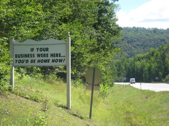
If your business was here you'd be home now

When I was a cub account guy long ago, I got a presentation from the radio advertising folks. They played a reel with a bunch of familiar jingles and then delivered the punch line: all of them had been off the air for at least 10 years. The good jingles had the original “stickiness” (a term which, today, means a website or other communications vehicle where you’re compelled to stick around and spend extra time)—you couldn’t get them out of your head.

Another evidence of a good slogan—that’s a jingle that doesn’t necessarily have a soundtrack—is seeing it get morphed into variations by someone who knows the audience will remember the original and recognize the relationship.

This photo of a roadside sign was taken on Route 30, a rural route that runs through the Adirondacks in upstate New York. The sign’s writer is using a variation of the advertising slogan “if you lived here, you’d be home now” which many suburbanites have seen while idling in traffic and passing a close-to-town subdivision. I’m pretty sure it is a piece of boosterism for the village of Speculator, a couple of miles north. Changing “home” to “business” makes it nonsensical, and putting the sign in this remote, tranquil and totally noncommercial location adds a rich helping of irony. I’ve just inducted it into my outdoor advertising hall of fame.

The middle manager

Early in my career I was direct marketing manager at a department store. The post office announced its first-ever presort discount (this tells you how long ago it was) but gave no instructions on how to prepare a mailing list to get the discount. An enterprising software company wrote an application to do the presort and they were willing to let me use it—for a finders fee of half the savings in postage.

I turned it down without a second thought, even though I could have still saved thousands of dollars. The prospect of looking like a sucker to my superiors far outweighed the financial gain. And of course the gain was to the company, while the looking foolish was on me personally.

I remembered this recently when a client wanted to do some email promotions. I did a bit of research and recommended several services that work with small lists. Then she came back to me with an objection that never would have occurred to me—what if somebody at the email service decides to steal their mailing list? Although highly unlikely, this was a big internal concern at the company and it stopped the email program in its tracks.

The concerns of middle managers are very different than those of higher up folks who have responsibility and maybe get a share of P&L. Managers are reviewed for being on time and on budget, with no unpleasant surprises. This is something to keep in mind in marketing, and also when dealing with them in person because often a direct marketing manager is your immediate client as a freelancer.

When writing a marketing letter to a middle manager, it’s a good idea to stress the absolute lack of negatives. Testimonials are priceless—your reader doesn’t want to be the first to take the plunge. Benefits like “make your job easier” and “stop users from complaining” are far more relevant than “help your company grow its revenue”.

And when you’re delivering your copy to the real-life middle manager, be on time!

Path of least resistance

I bought a vintage table saw last summer and almost immediately broke the vintage drive belts. Wonder of wonders, somebody had done the same thing and posted pictures of his repair online. However, my saw’s setup looked different than the photos. I spent a good 8 hours patiently jockeying the loose parts into alignment without success.  Then it dawned on me: it just can’t be this hard. I took a fresh look at my saw and realized one of the bearings had popped out of its housing. I cleaned the parts, popped it back in and was done in 20 minutes.

Another story with the same outcome: many years ago I was driving a VW bus on a very bad road in southern Mexico when a shock absorber came loose behind one of the wheels. I spent a couple hours trying to get it back on as a steadily growing audience of local indigenous men watched me. Finally one got impatient and pointed something out with sign language. The bolts that went into the top and the bottom mounts were different. And you could easily tell what was the bottom bolt because it had more road grit on it.

The lesson is, there’s usually a logical way to do things and people who are not bogged down by intellectual musings will find that way automatically by following the path of least resistance. Good designers of mechanical things know that and design accordingly (a notable exception being 1970s and 80s Detroit cars, where they’d often create special tools to make up for the fact their engine compartments were inaccessible) and ad writers should do the same.

If a reader has made the commitment to proceed through your letter or other body copy, they are fully intending to follow that path of least resistance. They know that A is followed by B, or supposed to be. Put a surprise in the road when they’re about to get to B—a special offer, or a new benefit—and it will get maximum attention. Change course without adding a benefit, and you’ll confuse and irritate and lose the reader. Keep this in mind when you’re framing out your next project.

Measure twice. Cut once.

I’ve been doing a lot of carpentry this summer, and I find myself pleased by the unforgiving nature of working with a saw. Once you make a cut you can’t take it back. Master carpenters who do the same thing over and over again develop an instinctive eye and a steady hand for sure, accurate cuts. But a tinkering hobbyist doesn’t get enough practice, so mistakes are going to happen. And it’s a milestone in the tyro’s journey when you decide you will toss away the maimed piece (perhaps an expensive piece of stock you’ve worked on for several hours) and start over rather than live with your mistake.

Copywriting used to be something like this, early in my career. I was too early for computers but too late to have access to a steno pool where my manuscript would be retyped. A copy deck was expected to look good as well as read well when submitted—no typos, strikeovers or white-out permitted. And there were moments, many of them, when you’d take the page out of your typewriter, read it over, and realized you should have used a different word or sentence order. And you’d have the choice of living with something that possibly could have been better—or typing the whole page over again.

There’s no doubt computers make for better copy. Not only can you delete your mistakes, you can try all kinds of what-ifs without penalty before hitting the “print” button. But I miss the finality…the recognition that once you type a word, there’s no going back without paying a price. In fact, that may have been what separated a good junior copywriter from a hack—the willingness to not only learn from your mistakes, but pay for them in extra time at the keyboard.