Chevrolet shoots self in crankcase, creates badvertising instant classic

You can’t make this stuff up. The VP, I mean Vice President of Marketing at GM, I mean General Motors, has asked all employees to stop calling Chevy by that casual name and refer to it by the formal “Chevrolet” henceforth. The request presumably extends to the brand’s new agency, Goodby Silverstein, but hopefully did not originate with them.

“We’d ask that whether you’re talking to a dealer, reviewing dealer advertising, or speaking with friends and family, that you communicate our brand as Chevrolet moving forward,” read a memo which was also signed by the Chevrolet Vice President for Sales and Service. “When you look at the most recognized brands throughout the world, such as Coke [they mean “Coca-Cola” of course] or Apple for instance, one of the things they all focus on is the consistency of their branding. Why is this consistency so important? The more consistent a brand becomes, the more prominent and recognizable it is with the consumer.”

Of course, you can also make a brand recognizable through generations of casual use until it becomes part of the national vocabulary as well as the title of several Facebook fan pages and the auto dealership of its chief NASCAR representative, Jeff Gordon Chevy. And presumably Don McLean will be asked to return to Café Lena here in Saratoga, where he originally penned “American Pie”, and revise its most memorable line to “drove my Chevrolet to the [whatever Chevrolet rhymes with] but the [whatever] was dry”.

The New York Times article which broke this story reports that there now is a “cuss jar” at Chevrolet headquarters and employees must deposit a coin every time they use the forbidden word. Once it’s full the proceeds will be used for a “team building activity”. Times reporter Richard S. Chang suggests that activity will probably not be a Mexican dinner at Chevy’s.

Thanks to Carol Maxwell to bringing this to my attention. And thank you America for making possible this badvertising epiphany. Your tax dollars at work.
Taking bad marketers to the woodshed

Did you ever get punished as a child for doing something naughty, because a parent or teacher didn’t believe you even though you were telling the truth? The problem here is a lack of authenticity—or, to borrow a favorite word from ace copywriter and gore movie maven Herschell Gordon Lewis— verisimilitude.

Consumers in general tend to be skeptical of marketers, which is why verisimilitude is very important. In addition to actually being true, a claim must APPEAR to be true or you break the spell and lose the sale. Today’s badvertising classic is a case in point.

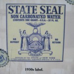
The original State Seal label
Original State Seal Label (from a plaque at the springs)

I live near the bubbling natural springs of Saratoga, NY. Folks have been coming here to “take the waters” for centuries and the greatest number of springs, as well as the classic bath houses, are located in a park which is owned by the state.

Early in the 1900s an entrepreneur had the idea to bottle the water and sell it nationally. To emphasize the official connection, it was called “State Seal” water and the antique-y state seal of New York was actually shown on the label. Millions were sold and FDR became a big promoter of the springs and the water.

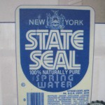
New State Seal Label
State Seal Spring Water label, c. 1980

Fast forward to the 1980s, and another entrepreneur had the idea to revive the brand. But he/she picked the wrong thing to revive. The new water is again called “State Seal” but the label design is bland and modern. Within a few years the revived brand was defunct.

The original State Seal water had verisimilitude. It looked like the kind of packaging a civic department might come up with if it had no clue about marketing but was simply trying to promote healthy water to its citizens. The revived water had none of this charm and authenticity. The revivalist probably thought the old design was out of date when in fact it was the essence of the brand.

Fetch me that paddle, ma. I think some marketer needs a whuppin’ here….

How to write a mission statement

This week I ran across the website of the Green Cleaners Council, whose “About Us” page states in part:

The Green Cleaners Council counts the many ways a professional dry cleaner can be ‘green’ by providing cleaners and consumers with defined environmental sustainability benchmarks to judge them by.

It is our mission to provide the necessary gravitas, which has been lacking regarding green marketing and greenwashing in the dry cleaning industry. We afford consumers a verifiable mechanism for judging how GREEN their cleaner is, while giving professional cleaners a vehicle to herald their genuine environmental accomplishments and strategies to help them achieve their green goals for the future.

In other words, this trade association provides consumers with tools to evaluate the environmental conscience of a dry cleaner, while providing the dry cleaner with marketing tools to show how green they are. This is what they do, but is it a “mission”? And are they helping their cause with grandiose words like “gravitas” and “herald”?

What went wrong here is that the Green Cleaners Council confused its mission with its marketing. A mission statement is not inherently a bad thing, but it should be primarily internally focused. Especially in a young and chaotic organization, it helps people keep their eye on the ball. It can remind them that their purpose is to serve customers or improve the world in some way, not just to make money.

A nice article on mission statements can be found on the FastCompany website, called “How to Write a Mission Statement that Isn’t Dumb.” The author, Nancy Lubin, points out that most corporate mission statements are like Hallmark greetings while a good one should encapsulate what the “Built to Last” folks call a Big Hairy Audacious Goal (BHAG for short).  Here’s a successful example, from Microsoft:

A computer on every desk and in every home, all running Microsoft software.

Here’s one that is more amorphous, and the company turned out to be less successful in keeping its eye on the prize:

Respect, integrity, communication, and excellence.

And here’s one that might well have been scribed by the marcom writer at the Green Cleaners Council in a former position:

It is our job to continually foster world-class infrastructures as well as to quickly create principle-centered sources to meet our customer’s needs.

A mission statement shouldn’t be written by the marketing department, but by the leaders of the organization who are responsible for living up to it. (Though I’d say it’s okay to have a professional writer on tap in case the execs get too full of themselves.)  And mission statements aren’t marketing and shouldn’t be featured in your marketing as a general rule.  It’s a lot easier to look silly than to effectively communicate or persuade, as the bad examples demonstrate.

By the way, the middle mission statement is from Enron Corporation. And the last one isn’t for a real company but was created by the “Dilbert Mission Statement Generator”. It isn’t available online anymore, unfortunately, maybe because too many real companies were using it to write their mission statements.

Defining and using the Unique Selling Proposition in your marketing

The Unique Selling Proposition is the attribute that makes your product or service different from any other, at least in the way you describe it. The USP can be a powerful weapon once you know your product and you know the audience’s needs or desires: now you have the opportunity to present the sole solution that gives them exactly what they want.

Every now and then you come across a product that truly is unique… durian, anybody? But often the USP is a matter of a clever marketer identifying a product attribute that’s unique and then blowing that up until it becomes an identity for the brand. Example: M&Ms melt in your mouth… not in your hands. The Mars company found during WWII that sailors in the South Pacific preferred them to Hershey Bars because they didn’t melt in the sun, and turned that into a brand identity.

Jerry Della Femina, who had a successful agency in Los Angeles when I was getting my start in the business, used to run a great long copy ad in the local Adweek about the “Capo D’Astra Bar”. Seems he was a cub copywriter hired to a backwater piano account and went to learn about the client’s product at their remote upstate NY factory.  The client kept saying “all pianos are pretty much the same” till Della Femina crawled under the piano and noticed a heavy band of metal across the bottom.

“Oh, that’s the capo d’astra bar, and I guess it is unique” the client said and it reminded him of the time that they’d had to knock out the wall at Carnegie Hall to install their pianos by crane, because the capo d’astra bar made them too heavy to go up the elevator. Carnegie Hall?? “Oh, didn’t I tell you, all the pianos at Carnegie Hall are our brand.” And thus was born the campaign for Steinway, the official piano of Carnegie Hall, with a resourceful copywriter digging deep to find a USP.

In a competitive market, especially for parity products (example: credit cards), finding a USP can be challenging. Sometimes it’s good enough to claim the high ground with a benefit statement so clearly stated that any competitor who says “wait a minute, we have that too” will look foolish. (You never heard Reese’s Pieces say “we don’t melt either.”) Also, remember that your competition is not restricted to competitors; it also includes doing nothing or doing without. A powerful USP will be good enough to overcome that inertia.

With this post we’re back to my series based on the “Copywriting that Gets Results” class I teach for the Direct Marketing Association. Visit the Copywriting 101 category to see them all.

Why you should send your copywriters and designers to trade shows

Colleague Carol Worthington Levy just wrote a great piece in the LENSER newsletter on the benefits of sending creative employees to conferences such as the DMA’s annual event. I’m a big fan of this and in fact I send my entire creative department, i.e. myself, to an average half-dozen trade shows per year.

But as Carol points out, most creatives don’t go to conferences because the management won’t let them. The suits are afraid of being caught short-handed while the lead designer or writer is out of the office, or maybe they’re just tight fisted. As a result, the few creative events the Direct Marketing Association has tried to put on have languished.

Here are four good reasons copywriters (and designers) should get to go to trade shows:

1. To see how the competition is advertising. In the petri dish of the exhibit hall you can quickly get a cross-section of images and messages your competitors are using to market… and better yet, you can see how the audience reacts by gauging the floor traffic.

2. To see your audience in the wild. I don’t know about you, but when I write I frequently have an imaginary picture of my prospect in my mind. It makes the copywriting task more focused. So what could be better than actually seeing real prospects to add detail to that visualization?

3. To see what hot buttons work for your audience. Hang back when a product demo is going… observe the phrases the demo person is using and how the recipient of the demo reacts. This is a great way to find out what is truly important about a complex product so you can use it effectively in your own selling.

4. To learn something new. I am generally pretty disappointed in the educational sessions at conferences (other than SXSW, and even that had some clinkers this year). But if you look at learning as a nice bonus instead of the focus, you’re OK. You’ll always learn SOMETHING new.

If you’re a laborer in the creative trenches, please pass the above list and Carol’s article along to your management. I’m doing a session at the DMA this October in San Francisco, and I’d rather not be alone in the room.

The Amish marketing miracle… sadly, debunked

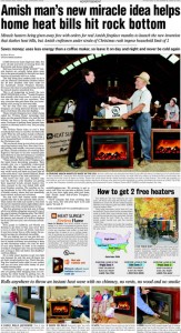
As a copywriter, I get goosebumps from promos like the “Amish Miracle Fireplace” full page ad which has been running of late. This is the Ronco/Popiel school of long form copy I pored over when I was learning my trade. (In fact, I once interviewed at the Ronco offices in North Hollywood. I recall they had the various examples of their direct marketing prowess… the Veg-o-Matic, Pocket Fisherman and more… lined up on a shelf like Teddy Roosevelt’s African hunting trophies). As a cub copywriter I felt these ads were more audacious than deceptive… they were so entertaining in their own right that no one should feel cheated if they didn’t get their money’s worth.

Ad for Amish Miracle Fireplace, from consumeraffairs.com

The Amish Miracle Fireplace copywriter would have old Sam Popiel sitting up in his grave and saluting. The miracle is the heater being promoted in the ad, which puts out a high level of radiant heat for such a tiny object and will be yours FREE as long as you buy a wooden box/mantle to house it, which is the part made by the Amish. A little sleuthing gets to how the marketer makes money: At $300 plus shipping, the price of the box is much more than the apparent value of the “free” heater. But still. So many marketing touchpoints here: thrift, American tradition, pride of ownership in something that makes your hope more cozy, who wouldn’t want one at the bargain price of free?

Unfortunately, the folks at consumeraffairs.com have burst our bubble. Their article is a miraculous bit of digging, and along the way they respond to such consumer queries as “I thought Amish people didn’t use electricity” and “I thought Amish people didn’t allow themselves to be photographed.” They also tell us why such endorsements as UL-approved and the Good Housekeeping Seal of Approval are essentially meaningless. And they point out that a device that produces the same level of electric heat (while sending your utility bill through the roof, by the way) can be bought at Target for $20.

The vice president of the company that makes the heater is interviewed in the article, and he is delightfully unrepentant. The “miracle”, he explains, is actually the imitation flames that are displayed on the front screen of the heater.  “These heaters are being called a miracle because they have what’s being called the ‘Fireless Flame’ patented technology that gives you the peaceful flicker of a real fire but without any flames, fumes, smells, ashes or mess. The patented ‘Fireless Flame’ looks so real it amazes everybody,” says David Baker, of Heat Surge in Canton, OH. I happened to have spent a weekend in Canton last fall and I wish I had had the presence of mind to check out this miracle for myself.

The carpenter’s jig

In my town lives a master carpenter named Chris. He donates his time to serve on the town historical preservation board, and he donated his time last fall to supervise a bunch of Saturday amateurs who volunteered to help rebuild a dilapidated but beloved local building. It was in this context that Chris provided a sweet example of a carpenter’s jig.

A jig is a made up structure which holds your work in place while you are performing a carpenter’s task such as sawing, drilling or glueing. A jig is handy if you are doing a number of repetitious operations (for example, drilling a row of holes at exactly the same position in a cabinet so you can hang a perfectly level shelf) but can also be used for a one-time operation if you don’t trust your ability to control an unpredictable process when wood meets a powerful force.

Making a jig is one delineator between a carpenter who cares about their work and a hobbyist tacking boards together. It’s the physical embodiment of laying the groundwork which a good marketer is going to do as well: define your problem, determine how you are going to approach it, then be clear in your mind about your plan of attack so you don’t get distracted and veer off course during the executional phase. Good copywriters do this without even thinking about it; less-good copywriters just hammer away.

But back to Chris’ jig. The job given to me and a couple of other guys was to hang siding along a 20 foot run. As he described the project Chris asked me, “do you want a jig?” That was music to my ears. Each row of siding needs to be perfectly level and it needs to overlap the previous row at exactly the same measure from the bottom. Trying to eyeball this with a long floppy board would create something ugly. So Chris made a jig. He took a 10” length of 2×4, ripped it down the middle to the 6” mark, then turned it 90 degrees and made a crosscut that met the first one to create a piece that looked like an L if you held it sideways. And then he made another jig exactly the same as the first one. If each guy takes a jig and fits in the shelf of the L under the previous row of siding, then rests the next piece on the top of the L, the work is in perfect position to nail into place.

Now it may occur to you there would be an easier way to do exactly the same thing. Just get two pieces of wood (you could even use scraps from the siding) then fasten them together offset at 6” to produce the two shelves you need to hold the work. But Chris did it the hard way because it gives him pleasure to make something that works well. Not a bad role model for copywriters.

On the value of “spec” creative (“spec” as in “specious”?)

Business is getting better, but I still make an extra effort to seek out potential projects I think would be fun or challenging. The creative director at one such client contacted me last week and said that frankly, their management was used to seeing potential creative resources do products on spec and I’d probably have to do the same if I wanted to get an assignment.

I sent a response in which I said, politely I think, that

There are two concerns I have on a philosophical basis about the whole idea of spec:

–for the writer, if you have other, paying clients waiting you are inevitably going to spend less time on the spec than a “real” assignment.

–for the client, there is the temptation to value the work on the basis of, it’s worth what you pay for it. They have no skin in the game, so they’ll evaluate the spec result less seriously than something they’ve paid good money for.

I didn’t hear back and not sure I will. This isn’t a stretch, by the way. It’s a category where I have done a lot of work for a competitor in the past and that work is easily accessible if they want to see “what I can do” in selling their product.

It’s my loss, but also theirs I think. If you demand spec work then you lose access to all the writers and designers who are too established or busy to be able to consider it.

And here’s something else. A good writer, especially a direct response writer, is going to go through a self-editing process (often unconscious). They will go through a series of drafts they never show the client because though they may sound sweet, they don’t have the oomph, benefit statements and sharpness required to sell effectively. This is something you don’t get from junior writers who may be great wordsmiths but not experienced salespeople. And if the client is used to choosing their talent pool from spec submissions, they may never know what they’re missing.

Along these lines, here’s a nice piece from a down-under designer on “Why Logo Design Does Not Cost $5”. Copywriting neither!

Best practices for graphics in emails

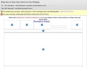
This Ace Hardware email has some great offers...

Right now thousands of people are re-installing Microsoft Outlook as they upgrade from XP to Windows 7. And the majority of these folks won’t touch the default settings which don’t load graphics within emails unless the user specifically asks to do so.

... but most recipients will see it in their preview pane like this.

Right now hundreds of marketers are designing emails that ignore this reality, by placing a big beautiful graphic at the top of the message that shows up as a blank spot superimposed with a red X instead of the desired image. Which means that most recipients will never see the graphic, or the message, because there is nothing visually compelling to pull them in. The “before and after” examples from Ace Hardware are proof positive. Inviting graphic and great offers, but most of the people who got this email will never see them. (I’m on a Mac so the red X’s show up as question marks for me, but the problem is the same.)

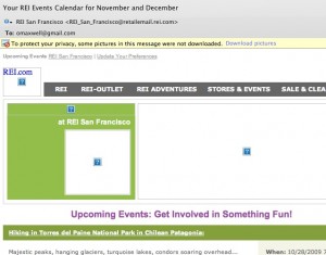
Better: REI newsletter has HTML text to tell the story before the graphics load.

So what can you do to fix it? Use HTML text creatively at the top of your email instead of relying on graphics to tell the story. The REI newsletter example is isn’t pretty, but there is a lot of REI identity here to pull people in, including the bar of clickable links.

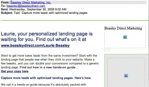
Best: very little of this message is lost, even without graphic.

Better yet is the email from Beasley Direct that has a good ol’ compelling headline to pull people in, and places this to the left of the page so it will have maximum visibility on small screens. This email also includes ALT text—the words “Beasley Direct Marketing” over the graphic—which appear when the graphic doesn’t load. That’s another good practice. Better yet would have been a benefit message or call to action in the ALT tag, such as “request your complimentary landing pages guide”.

Make sure you’re following these simple steps next time an email goes out. Don’t get intimidated by your art director… the design can still look great, you just need a backup scenario when the graphics don’t load. And everybody will be happier with the higher open rate and, hopefully, more clickthroughs.

Travelers In-Synch campaign joins Badvertising Hall of Shame.

Mike Sciosa’s decision to take out John Lackey in Inning 7 of tonight’s Angels-Yankees playoff game has to rank among the all time worst decisions. But close behind it is the new In-Synch tagline from sponsor Travelers Insurance. That’s right, not “in sync” but “in synch” even though if you do a Google search for “Travelers in synch” they’ll correct it to “did you mean Travelers in sync”?

I’ve done advertising for Travelers in the past and trust me, they are not adding piercings and tatts to the traditional insurance pitch. This is an ill-advised attempt to slap on something of interest to a younger audience that would logically have little interest in insurance.

The ads, including a cute one with a terrier that ran during the game (he frets for his lost bone which he should have insured with Travelers) are standard stuff but then the bizarre tag line appears. “Travelers. Insurance. In-Synch™.” That’s right, in addition to pandering to 25-34 they are kowtowing to the legal department which is not the way to get the attention of the young and the restless.

Travelers, welcome to the Badvertising Hall of Shame.