Dear Netflix: nut up or shut up!

Like many Netflix subscribers, I had a notice of a 60% subscription price increase slipped under my door last week in the form of an impersonal email that states the bare facts with zero attempt to placate me or to win me over if I am considering canceling after the increase. (The email concludes with “We realize you have many choices for home entertainment, and we thank you for your business. As always, if you have questions, please feel free to call us at 1-888-357-1516.” Hardly the best choice for a closing or conversion message.)

This increase is not for traditional Netflix subscribers who get a disk in the mail; it’s for the potentially far greater universe of prospects who came in via streaming. I signed up for streaming Netflix after my family got a Roku last holiday season. We quickly discovered that the “20,000 streaming movies” was actually not that big a number when looking for a specific title so we added the option of getting a disk when we can’t get instant satisfaction for $2 more a month. Nothing about our behavior, therefore, suggests we will be good candidates for conversion to a standard $7.99 a month disk in the mail plan (that’s the basis of the cost increase) and we are indeed cancelling our non-streaming subscription.

But meanwhile, Netflix is paring its streaming offerings presumably so it can get more disk orders. I know this because my teenager wanted to watch Zombieland for the umpteenth time last night and it’s gone! Not fair, Netflix! This is the company that always contacts me to ask about the video quality of the streaming show I watched or the delivery date of my DVD and a back door change in our agreement definitely doesn’t cut it. It feels like Netflix has made a corporate decision to move away from streaming and toward DVD delivery when everything we read about broadband consumption patterns should point them in the opposite direction.

Maybe, with negotiations going on behind the scenes with entertainment content providers, the streaming model isn’t making sense financially with unlimited viewings for one price. I would be willing to pay a small upcharge (NOT the full cost of renting a single DVD in the mall) for streaming access to new releases. I would also consider a “premium” level (let’s say $12.99 a month which is $5 more than the current streaming plan) for unlimited access for many more titles. But please, Netflix, don’t ask me to change my viewing habits to accommodate your new business model… even if it’s the old business model for many of your customers. I don’t think I’m alone in this. When I want to see it, I want it now… waiting for a disk in the mail seems forever.
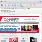
PC Connection’s makeover… not making it with me

Email from PC Connection Express

I’ve spent many a dollar over the years with PC Connection so when I got an email today offering great prices on an Adobe Creative Suite upgrade from “PC Connection Express” I was curious. Is this somebody hijacking the brand? If not, how can I take advantage of the savings… upgrades “starting at $289” for a product with a retail well over $1000?

Where's the offer? Where's the price?

Wanting to know more, I clicked through from the email and there is no ordering information at all, just a bunch of corporate info on Creative Suite. I did get a pop-up inviting me to chat but I declined, thinking that would be a roundabout way to get basic information that should be right here on the page.

Why should I have to choose? You do it for me.

Then, checking out the brandjacking possibility, I googled PC Connection and got this screen. Turns out they have rebranded themselves and now I have to choose which PC connection I go to. Why is this a good idea, making the customer do the work?

Sad thing is, I probably do want to buy this upgrade. I just purchased a new laptop from these guys within the past 90 days with no problem. Hope their fulfillment is in better shape than their marketing department.

Why you need an “escape hatch” in your user interface

If you have shopped at Ikea, you will notice that periodically you come across an escape hatch. You can stroll through the departments (which is what Ikea would like you to do because random browsing causes you to purchase additional merchandise) but if you get bored you can just duck through one of the little side doorways into a completely different department.

Good software user design includes an escape hatch as well. A good example is the TurboTax desktop product, which gives you an always-accessible choice of “Forms” or “EasyStep” so you can look at your current information in the way that makes most sense for you.

But I’m using TurboTax Online for the first time, and they don’t do that. The ONLY way to navigate is to follow the prompts on the screen, and if the prompts don’t work and you ask for help then Intuit twists itself into contortions trying to answer your question. (I’m talking about the in-program help, not the too-broad User Community sidebar.)

So, I want to import the return created with TurboTax Desktop 2009. I find a help screen with instructions which I’ll paste below (and cut out some info that is not pertinent):

Transfer Last Year’s Tax Info from Desktop to Online
Updated: 11/29/2010 Article ID: GEN12156
Below is the procedure for transferring (or uploading) a tax return created in 2009 TurboTax Desktop software to TurboTax Online 2010.
Follow these steps to transfer:
1. Sign in to TurboTax Online (or click the Create an Account or Try It First buttons).
2. Once you’re in TurboTax Online, click the Home tab and then select the first link in the lower half of the screen, titled Transfer last year’s TurboTax return from your computer.*
3. On the Transfer Last Year’s TurboTax Return screen, click Browse, and then select your 2009 tax data file. (Find last year’s tax file on Windows or Macintosh)
4. Click Transfer Return.
5. Once you see the message Transfer Complete, click Continue to start your 2010 return.

I assume you didn’t read all that, but I had to. I started from the top and followed the instructions to clear my 2010 return that I had started by accident. I looked for the link which they told me very clearly would be “Transfer last year’s return from your computer” but I saw no such link; instead I saw “we can help you transfer last year’s computer return from your computer”. Clicking that just resets the page I just reset, taking me nowhere.

Finally I notice the asterisk, and track down to the footnote at the bottom. It tells me:

* If you don’t see the Transfer last year’s TurboTax return link, it’s because you:
• Previously entered information in your 2010 TurboTax Online return; or
• Already transferred your 2009 data, either by uploading last year’s tax data file or by signing in with your 2009 TurboTax Online login.
Unless you signed in using your 2009 TurboTax Online login, you can click the Clear your 2010 return and start over link on the Home tab, and then resume at Step 2 above. Clearing your return removes all tax data from your return, so make sure you really want to do this.
However, if you signed in using your 2009 login, clearing your return automatically re-transfers your 2009 online data, making it impossible to transfer your desktop tax file. The only solution in this case is to create a new account in TurboTax Online 2010 so you can start with a clear return. [underlining mine.]

Again, I assume you didn’t read that so here is what is going on. IF you created a login last year, THEN you can’t transfer in a desktop return because TurboTax assumes you already have a return online. But I don’t because I created the return with their desktop product, then created a login for e-filing. It’s a Catch-22 which Intuit recognizes, hence their outrageous solution that I have to forget my old username and password and start anew.

This should never have seen the light of day. Whereas most companies urge you to set up an account and save your user name for a better experience, Intuit tells me the only option to get out of this problem is to forget I have a user name and start over with a brand new account. Boo, hiss. That’s what the lack of an escape hatch will do to you.

This Quality Inn is a poor “choice” for weary road warriors

I visited a client in Irvine, CA last week and stayed at the Quality Suites John Wayne Airport, an establishment I’ve used on several previous occasions. I like this place because it’s modestly priced yet has plenty of room to spread out when I’m working for several days. Evidently lots of road warriors feel this way, judging from the number of single guys in the breakfast room at 6 am.

When I checked out I half-heard someone else complaining about an illegitimate charge on their bill. I couldn’t get my own bill because the printer was broken and they promised to email it to me. When I received the email I saw my own illegitimate charge, a daily fee for a safe I didn’t know was in the room.

I emailed the general manager (who had sent me the invoice) asking for a correction. Nearly a week later I’ve heard nothing. After a few days I went on the website of the parent organization, Choice Hotels International, and filled out a tedious form asking for help. Though they say “we appreciate that you took the time to bring these matters to our attention” and promise a response within 72 hours, nothing from them either.

Isn’t this a great example of terrible customer service? There’s no excuse for the invoice trickery to begin with, but if it was unintentional the management should have corrected it and apologized immediately. And I’m now seeing that there is nobody behind the curtain at Choice International, a somewhat toothless affinity organization since all their hotels are independently owned.

A lost customer to this establishment and more than likely any other hotel in the chain… plus nasty whiny blog posts and tweets… seem like a poor trade off for somebody’s desire to stuff a couple of extra bucks in their pocket. Bad choice, Quality Suites John Wayne Airport and Choice International.

Maker Shed ate my children

My two boys are big fans of the O’Reilly “Make” concept. They’ve read the magazine, attended the Maker Faire, and would like a few blinking things in their stockings for Christmas. Unfortunately the lame makershed.com site makes this very difficult to pull off.

I’m presenting my experience not so much as a personal diatribe as a reminder that much of online shopping used to be this way. I invite you to cluck-cluck at these guys, then be thankful their practices are not more common.

I should be a pretty good prospect to Makershed since I subscribe to the magazine and have attended Maker Faires myself. So I get an email inviting me to enjoy the “deal of the day” which is an Arduino (that’s a blinking thing) with a $14 manual thrown in for free. Score! I click on the button and am taken to the website where I am told the manual is temporarily unavailable but I can download a PDF as part of the offer. WTF, that’s not so good, so I email help@makershed.com and tell them I want the offer but am in no hurry, want to wait till the book is back in stock.

You know what happens next: quick reply from customer service saying they have taken care of it. But not in the Makershed. It’s a full 5 days before they respond and say the offer is long past and the best they can do at this point is offer me a link to the pdf download.

So my boys will go Maker-less for Christmas apparently, but a couple weeks later a new email. Save 15% on anything with our special code on orders $125 plus. I click on the offer, get a message that says I have entered an invalid code. Click all over the email, same result. The hell with this, my boys need their blinking objects. So I do a search for Maker Shed on Google, find the site, put in my order, enter the special SAVE15 code… and am informed it expired a year ago.

I have no more time for shenanigans so I place the order and in a comments field point out that I tried to enter the 15% off code (I enclose a screen cap) and expect it to be taken off my total. 24 hours passes and I get a notice that my order has shipped. I click on the “my account” link to see if the 15% was taken off and am rebuffed because my password is not recognized… apparently Maker Shed allows customers to order without setting up an account but then gives you no way to check on order status.

You don’t want to hear more about my personal frustration with the above, which probably sounds like blab bla bla at this point, but I am not relating all this just to rant. At one time, a lot of e-commerce was like this… companies appeard quixotic and apparently uninterested in customer service because they didn’t actually have a clue about customer service, or else because they were overwhelmed at holiday time.

But today there’s not any excuse for this… especially since we are not anywhere close to the holidays. The learning and lessons:

  • Don’t go live before you have the elementals such as web links and savings codes locked down, which is where Maker Shed repeatedly fell down in my experience. It is particularly embarrassing because this is a “high tech” outfit but would be just as bad for a scrapbooking website.
  • Be accessible. Don’t take days and days to answer customer queries. These guys don’t even list a phone number!
  • If you do fail at the above two requirements, or even if you don’t, remember the customer is always right. Which is especially true if you have sloppy ecommerce practices and the customer is expected to pick up after you.

I expect that what has happened here is that the Make folks have simply contracted out the entire Maker Shed operation. They get a small commission and it’s somebody else’s problem to run the show. But that’s wrong. I used to think Make was cool. Now I think they are incompetent and rip-offs. That’s my left brain talking but my right brain is listening in.

Marketing to idiots

I had a client who was concerned that the information she was collecting on a registration page was going to be a potential problem because people are registering to win a prize and if they do win a prize then a/they might not want to receive it at work (which is the address we’re asking for, this being a B2B mailing) or b/they might have given a fictitious address as some people do because they don’t want to get advertising contacts yet they have to put something in the fields.

This same client had a problem at a previous company, which was the cause for her concern. She was giving away iPod shuffles (then selling for $59) to qualified prospects in return for their time to sit through a demo and apparently many people did not get their shuffles. I say “apparently” because it could also have happened that someone lied in order to get an additional shuffle…. dishonest, but hard to prove. Anyway, once bitten she wants to be sure this time.

My response (before caving, of course) was that there are always going to be a few idiots and outliers in your audience who are not going to play by the rules no matter what you tell them. And you should not do anything that is going to make your offer more complex to the vast majority, such as adding additional information on the reg page to deal with this issue by requesting an alternate shipping address in case they win. (Everybody who has ever designed an online survey or reg form knows that each additional field or question causes a certain number of people to drop out.) Suppose they fill in the form with their preferred address but, being idiots, they write it down wrong. What do you do then?

Along the same lines, I had a client back in my “suit” days who wanted to know if it was a good idea to pay a 1.5% commission based on the value of all sales paid by check in return for this supplier’s guarantee to make good any bad checks. This one was easy to figure out. Do bad checks cost more than 1.5% of revenue from all checks? No. Then this apparent insurance service is a money-losing sinkhole.  Plus, cheats are cheats. If a customer has it in their heart to trick you out of money, they’ll just find another way to do it.

Today’s moral is, the customer is not always right, not when they are idiots and outliers. Don’t screw up the rest of your promotion by making accommodations for a few wingnuts.

Gap shoots itself in the logo

I had been looking for a bad example of social media marketing to use in my DMA talk on Monday 10/11, when the good people at the Gap dropped one right in the lap of my denim jeans. Funny thing is, I don’t think they were aware they were involved in social media marketing which is part of the problem.

Gap old and new logos

Gap, as you may know, changed its logo last week. To my non-designer’s eye, the new logo looks like something I was offered free at a conference by an outsourcing design firm: I was asked to answer a few questions about my business, then come back in 20 minutes. Gap’s new logo is simply its name, set in the same font used for the table of contents in the New York Times magazine, with a little blue square at the side as homage to the old logo they’re getting rid of. On the face of it this does not seem like a particularly good change. Plus the old logo had a lot of recognition built up over 20 years; most marketers would consider that brand equity but Gap felt it was a problem. They’d had the same logo for 20 years, so it was time to get rid of it. Not evolve it, as many companies have done (think about how Betty Crocker, Uncle Ben and Aunt Jemima have morphed over the years in response to changing social mores). Just toss it out and start over.

The change drew over 1000 comments on Gap’s Facebook Wall, with the balance overwhelmingly on the negative side. (The Facebook page still displays the old logo as of this morning, by the way. Oops!) The critics tended to say either the new logo looked like an exercise from a beginning Photoshop class, or that they loved the old logo and didn’t want to see it go. And, not a few offered to redesign the logo themselves. That’s where it starts to get strange.

Gap's Facebook page still displays its old logo. Oops.

Gap President Marka Hansen wrote on her Huffington Post blog that “given the passionate outpouring from customers that followed, we’ve decided to engage in the dialogue, take their feedback on board and work together as we move ahead and evolve to the next phase of Gap. From this online dialogue, it’s clear that Gap still has a close connection to our customers, so tapping into this energy is right. We’ve posted a message on the Gap Facebook Page that says we plan to ask people to share their designs with us as well. We welcome the participation we’ve seen so far. We’ll explain specifics on how everyone can share designs in a few days.”

Aside from the condescending we-we language (“passionate outpouring”? more like “howls of outrage), what is really going on here? Is the lame new logo actually a placeholder and publicity stunt? Does Gap really want its customers to help design a new logo, and if so why did they not say that in the first place? And if they are indeed going to hold a design competition, what are the rules of the game and how will the winner be compensated? (Designers are already posting to warn their colleagues not to offer designs until copyright protection measures are made clear.)

Right now Gap’s getting a whole lot of free publicity. Problem is, most of it is negative especially for a company that would like to have a positive image for its design and customer interaction skills. It will be interesting to see how this unfolds.

UPDATE: on the evening of 10/11/10, Gap announced that it was going back to its old logo. Here’s their Facebook statement, thankfully free of we-weisms: “Ok. We’ve heard loud and clear that you don’t like the new logo. We’ve learned a lot from the feedback. We only want what’s best for the brand and our customers. So instead of crowd sourcing, we’re bringing back the Blue Box tonight.” And according to Ms. Hansen in their press release, “There may be a time to evolve our logo, but if and when that time comes, we’ll handle it in a different way.” Sounds like a plan.

Wall Street Journal won’t deliver on customer service

Residents of Saratoga Springs, NY have been noticeably more clueless over the last two months because of delivery problems with the Wall Street Journal.  Apparently there is some kind of turf war among carriers. So every morning I go online to https://services.wsj.com, sign in with my account number and login, and report the missed delivery.

A few minutes later I get an email that confirms my delivery problem and tells me I will be credited for the missed issue and the local office is working on the problem. It then goes on to advise me: “In the future, please go to services.wsj.com to report any problems with your delivery.  It’s easy and quick to use, and our delivery staff is notified directly from the site 24 hours a day, 7 days a week.”

See the problem? Since that’s exactly what I did, WSJ assuming I did not do it puts into question the rest of the message. And the takeaway is that I assume they are in fact doing nothing about my delivery problem, which in fact they are not.

Then, every few days they vary the mix and send an email that says “To make sure we provide the field office with everything they need to resolve this issue, please answer any of the questions below that apply to your situation.

Location questions:
— When did the problem begin?
— Where is the paper usually delivered?” Etc.

Once I rose to the bait and responded that nothing had changed about my delivery situation (the house has been here for 130 years) but it didn’t actually make any difference. Nor should it, since this is boilerplate that some helpful scribe inserted in the rotation (“if missed deliver complaints = >5, then print ‘n’ ”) so I wouldn’t see the same thing constantly. Instead of fixing the problem, they’ve focused on creating an extended library of customer service correspondence for people who get the same message over and over again.

The lesson here: If you have a contact strategy as elaborate as this one, then there’s something wrong at the core that needs to be addressed. Handle it, instead of asking some copywriter to paper over it. Oh, and don’t insert a marketing message when a customer is already pissed off, such as “Here’s an opportunity to give a great gift at a great price: The Wall Street Journal Print and Online for just $119!” Hey, I could give it to my dad… then he and I could both not receive the paper.

Toyota pays for my dead battery

A few months ago, I wrote about the hybrid battery that failed in my 2001 Prius at 71,000 miles, generating a $3700 repair bill because the battery was recently out of warranty. It’s time I explained the reason for my lack of follow-up posts.

Back in mid-February I got a call from the general manager at the dealership which had done the repair. He was calling not because of the rather robust online discussion of my experience, but because I had given the experience an unfavorable rating in a mail survey. (Yes, good to know at least someone at Toyota is paying attention to what their customers think.) After we discussed my issues he agreed that the matter had been handled inappropriately at his dealership and said he’d go to bat and try to get at least a partial reimbursement from Toyota. He also asked me to forward to him the letter I’d sent to American Toyota President James Lentz, summarizing my issue.

Two days later, on 2/18, this manager emailed me that:

Just got done speaking with my Toyota Factory Representative, she agreed with my assessment of the issue as well she agrees with your points you made to Mr. Lentz.

Based on that conversation it’s my guess you will probably receive a 100% reimbursement check in about 8 weeks at your Saratoga Springs address. Please understand I’m making no promises, but I feel it looks real good.

Based on that 8 weeks, I would have received the check in mid-April. When it didn’t arrive, I checked in with him and heard that:

Money is coming soon, should be no problem…..

Well, the money finally did arrive, on 5/25/10, and it was indeed a full reimbursement. I’m happy not to be out of pocket $3700, but I’m also happy that Toyota was willing to pay it which I don’t think they would have done if a huge number of Prius batteries was failing just out of warranty like mine did. (The cover letter made no reference to my history, by the way, just referring to it as a “goodwill check”.) So good news for me and good news for other Prius owners.

How to make your CEO a better blogger

Your CEO/boss/client wants to have a blog (or maybe just be on Twitter), and that’s a fine idea.  An informal but authoritative voice for the company is a great way to engage customers, especially if it’s on an otherwise dry corporate website. Unfortunately, your boss’ blog posts are REALLY DULL… or, worse, sound like best of breed innovative corporate b.s. What to do?

I asked this question of the panel in the fabulous “Marketing Goes Social” panel at today’s South by Southwest Interactive. And got some great answers. Here they are as quick as I could transcribe them. As you’ll see, most are clever gambits to get an egoistic executive to take an objective view of their work. DMS=David Meerman Scott. NB=USAF Capt. Nathan Broshear. MB=customer service specialist Melanie Baker.

1. Ask them to sit down and show you how they use the Internet… what sites they visit, whether they’re on Facebook and what their update stream looks like, who they follow on Twitter. This gives them the opportunity to realize the content of interest to them may be very different than what they’re putting out. [DMS]

2. Find ANOTHER blog or site that is very similar to your CEO’s and critique it together. Through this third-party bashing you can make valid points without making the boss defensive. [DMS]

3. Take two highlighters of two different colors and track a printout of your CEO’s blog. Put everything that’s self serving in one color, everything customer focused in the other color. Review it with the CEO. [DMS]

4. Ask them why they want to have a blog in the first place. The person writing should be the one who has the story… in the military that would be a sergeant in the field vs a general officer. In a company it might not be the CEO, especially if they’re writing for their ego gratification. [NB]

5. Show them some of the resources the Air Force has produced on how to intelligently engage with the public through social media. If it’s good enough for our armed forces, it should be good enough for your boss. [that’s mine, but I got a fist pump from NB when I mentioned it.]

6. Ask CEO to tell you what questions people ask about the company. Then suggest blog posts on that. [MB]