Advice for RIMM: make BlackBerry a prepaid phone

Last week brought yet another dose of terrible news from Research in Motion Limited, the company that makes BlackBerry, and I kicked myself for not going short on RIMM a few weeks back when the stock was more than twice as high as it is now. The handwriting is on the wall for BlackBerry just as for Betamax and HD-TV before them, and the shovels are busy in the boneyard of failed technologies.

BlackBerry, however, has something most other zombie technologies lack: an established user base that is, or was, enthusiastic about the platform. So here’s my plan to save the company: turn BlackBerry into a prepaid phone. This solves the problem of users abandoning BlackBerry for iPhone or Android because they don’t have to; they can continue using their BlackBerries as a backup. Many BB users already have multiple phones (remember Obama on the 2008 campaign trail?) so this concept will be an easy one for them to accept. And a package of text messaging can be sold at an attractive yet profitable price that will allow those thumb virtuosos to continue their real-time updates even while in the air. (I never was able to figure out why this is OK.)

The prepaid texting will be offered at a discount for in-network messages, encouraging current users to continue their text relationships with one another. And RIMM can keep its rock-solid network but, since far less bandwidth will be required with a reduced user footprint and no expectation of rich media, sell or rent off the capacity it doesn’t need.

I’ve never had a BlackBerry myself but have had plenty of prepaid phones. They are useful little gadgets with lots of applications. They’re great for kids who tend to leave them in their pockets when doing laundry, for example. And I am about to buy a TracPhone for a guest house where we’re required to have a phone for some weekend guests; it fits the contract and offers a number for them to give out, yet it’s miles cheaper than installing a landline or VoIP modem. Make the prepaid BlackBerry attractive with an initial offer and I would probably try one. Give me or my kids or guests a taste of that thumb power and we just might get hooked and go for an expanded package. There’s a reason they used to call it “CrackBerry” after all.
Best practices (and not) for recovering account passwords online

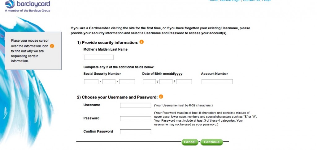
Barclaycard forgot password page
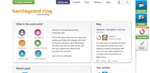
Barclaycard Ring MasterCard “forgot password” page

[THIS POST HAS BEEN UPDATED.] Yesterday I mentioned a problem I was having with the Barclaycard Ring MasterCard “forgot password” page. Today I’m taking the extra step of showing the page because this is something I don’t think has a lot of customer service advantage. They’re using the same page whether you are setting up a new online persona OR you have forgotten your password in which case you simply have to choose a new username.

What else could Barclaycard have done? Send an email at the user’s request, with a unique URL that expires after a few hours. That way the account is secure, but the user stays in control of it. This is the nearly universal practice, and it’s interesting to see an exception and mull the pros and cons.

Requiring a new username is particularly onerous for Barclaycard Ring because it’s supposed to be a social networking community. If I change my username, what happens to the badges and contacts I’ve built up under my old username? But I think it’s not a very good practice in general, and this big international bank must be somehow very stretched for programming resources.

While I’m at it, here’s another not-best practice: confirming the new (or old) password by sending out an email that contains exactly that password in unencoded text. Yikes! What if I’m reading my email in Starbucks or an unsecured wireless hotspot at the airport? Even if I’m in the comfort and sanctity of my home, I’m still going to have to delete that email now. The merchant or marketer probably thought they were doing me a favor by sending me a handy reminder. In contrast to Barclaycard, this is one we’ve all seen, probably several times. Don’t do it.

UPDATE July 3: got a call from Meagan in the Barclaycard digital marketing department and she had a little difficulty reproducing the above page on a test account; possibly I had done something like enter the wrong password too many times that caused the system to “clear out my account”. What I should have seen was a reset page with my security image and with her help I was able to get to that. More important, she and I discovered that if, instead of creating a new user name in the screen captured above, I entered my current one (after confirming who I was with the challenge info above) the system would accept it.

The GOOD news was that when I finally got into my account my screen name had not changed at all; must be different from the username the system recognizes. So all my badges, if I had them, would be intact.

Meagan says this is the password reset procedure used for all Barclaycard products but she does understand how it might be a good idea to present it differently (and tell people they can keep their current username if they like) for the Ring cardmembers. Will be interested to see what they come up with.

I’ve activated my Barclaycard Ring MasterCard!

The card is in my hands, and I’m excited to be using the first crowdsourced credit card. Well… actually I’m reacting to the message on the card carrier document I received that begins “Are you excited? Because we’re excited.” This represents one of my pet peeves about advertising copywriting. “Excited” is a result. I will get excited if you give me reasons to get excited. Unless you are selling certain products which are beyond the purview of this blog, getting excited is not a benefit by itself.

Barclay Ring Welcome Page

But let’s move past that. I’ve now registered the card on the Barclaycard.com website where I find the top level page shown here. The circles on the left are badges you can earn for such things as referrals, getting paperless statements and participating in the community. You also have a “ring” next to your profile that gets brighter with increased participation and there are different levels of participation as well. (Right now I’m Bronze, having just signed up.) I have a client who operates a similar sponsored community and this seems to follow the same best practices. The recognition options are too complicated for you to make a plan for progressing through the ranks, which is exactly the idea. You just get busy and over time your profile is festooned with badges and awards and presumably additional functionality will be revealed.

In my previous post on this card I described my perception of it: a rewards card with a low interest rate, in which the rewards program is determined in part by the community. I misunderstood. In a blog post called “Barclaycard Ring, where are the rewards?” product manager JaredY says there aren’t likely to be any rewards because at the low interest rate (prime + 4.75% which currently makes it 8%) and no annual fee, the bank can’t afford them.

The cardmembers are fine with that. So far the comments are almost universally positive. These early adopters (at present there are just about 1000 active cardholders, according to JaredY) love the idea of the card, love the low APR, love the option to donate some of the “Giveback™” to charities, and aren’t particularly concerned about the way that Giveback is calculated. One poster stated that he just liked being part of the community, and any reward at all was a bonus (sort of like belonging to your local grocery coop, maybe).

Today I’m going to put this plastic into action. Stay tuned…

UPDATE: There’s currently an issue on the barclaycardus.com website that is going to be a problem in building the community. If your password is not recognized and you click on “lost your password?” the only option given is to pick a new user name; you can’t get a “set a new password” email as with most sites. If I can’t keep my user name then it’s going to be a lot harder to establish my identity in the community and accumulate badges. (Another issue is that the password for the new username is not recognized either; hopefully this is just a temporary glitch.) Will update again if this is fixed.

Is that an advertising specialty in your pocket?

What’s the difference between a premium and an advertising specialty? A “premium” is something that has perceived value to the recipient and can be used as a sweetener when you’re asking people to give you contact information or take some other action. An “advertising specialty” is just that, an ad: a tchotchke with a name, logo and contact info imprinted on it that is useful enough or novel enough that the recipient will not immediately throw it away.

Offer a premium when you want to boost response for a marginal or unknown product so people who would otherwise ignore you will click, call, or return the reply form. These days the most common b-to-b premium is probably the “free report” delivered electronically. For physical delivery, the good old Amazon or iTunes gift card reigns supreme.

We’ve talked previously about the pros and cons of using giveaways to boost response. Those points are still valid and deserve a second read. The topic is on my mind because of the recent Advertising Specialty Institute trade show, nicely covered in today’s Wall Street Journal.

It’s heartening to know that in our jaded era, people will still go out of their way to get something for nothing. Even the White House is getting on the bandwagon: after promoting a “Stop Swag” program to keep federal agencies from spending tax dollars on giveaway junk, the Obama re-election campaign has done an about face and is hawking such items as the “I meow for Michelle” cat collar (yours for a $13 donation).

The most popular item at the ASI Show? USB thumb drives in every imaginable configuration. This is a tchotchke hunter’s dream: cheap enough to be a trade show giveaway, yet valued sufficiently that you can use it as a premium. If you do use USB drives, be sure to put some of your content on there, if only a few pdfs of your brochures. (Great task for a summer intern!) The recipient will see the files every time they use the drive and they just might open them out of curiosity.

Should you ever turn down business as a copywriter?

When I started freelancing, a couple decades ago, a wise old art director counseled me: never turn down work. Even if you’re super busy, stay up all night to get it done or offload it to a fellow creative and hopefully mark up their work. After all, you never know which new client might become your bread and butter or, conversely, if your current bread-and-butter client might go belly up tomorrow.

And I do try to stay hungry. But recently I’ve been turning down a bit of work. Part of this is a hunch we are headed for good times. Freelance creative are the canaries in the coal mine, first to get laid off in a recession but also first to know when companies think they better get cracking to stay competitive. And that’s what seems to be happening right now. Buy U.S. equities, dear reader. Buy Facebook like I did last week. (Though not at the IPO price obviously.)

And, another part of my reasoning is quality of life. I’m trying to get some traction on a fiction project, which uses the same brain cells as my copywriting. At the end of the day, when I’m trying to get the attention of David Ogilvy at that great water cooler in the sky, do I want to admit I didn’t get my novel finished because I decided to take on yet another few hundred $$ project? Not to mention my kid’s in the Little League playoffs and we are looking pretty good over here.

Both my turn down projects this week had to do with budget contractions. When times are good, prices start rising all over the place (the $3.47 deck pieces I wanted at Home Depot rose to $5.94 in the space of a month, for example), and it’s natural to get aggressively defensive.

One client wanted to redefine a project to pay less for work we’ve already agreed to. There’s a line item for A, and a line item for B, but the assumption is you’ll get both and I do research and prep with that in mind before I ever type a word. Now this client wants to only pay for the “A” portion which makes it a loser for me since the prep work is the same, so I’m outta here. Have to finish current projects but asking to be excused from future ones.

The second contested budget was much, much larger… an entire website. This is always a leap of faith because you don’t know how the pages will shake out when you estimate and hopefully pick a per-page number that averages out (same with catalogs by the way). With a new client, you also don’t know how finicky they will be and how complex the revisions. So I added something I thought was pretty generous, which was an offer to write 10 pages of the client’s choice at the per-page rate, charge nothing for my startup research time, then after that we could decide if it make sense for both of us.

Client instead wants a deal of some kind, which I can’t offer because my deal was my deal. This could have occupied me late into the night for much of the summer. Instead I’ll be baking baguettes, following the capers of my protagonist (a 19th century Quaker with a terrible problem) and maybe watching Logistics One finally get the best of Staffing in the Saratoga American Little League. Maybe I’m crazy, but maybe not.

What Chinese consumers want (and maybe Americans too)

Recently the Wall Street Journal ran a Saturday essay on selling to the new Chinese consumer. It’s adapted from What Chinese Want: Culture, Communism and China’s Modern Consumer by Tom Doctoroff, a book available on amazon.com. What I found interesting was that the three rules cited by Doctoroff could be applied to Americans as well. They don’t necessarily describe our main motivations, but I don’t think it would hurt if your marketing included the same assumptions.

Rule #1 is that a product that is consumed in public commands a premium over one used in private. Example: Chinese will pay a premium for international mobile phones, but prefer cheap domestic brands for their household appliances. Starbucks and Pizza Hut, among others, have well positioned themselves as brands consumed in a highly visible setting.

Rule #2 is that benefits should be external, not internal. To quote the author, “spas and resorts do better when they promise not only relaxation but also recharged batteries. Infant formulas must promote intelligence, not happiness. Kids aren’t taken to Pizza Hut so that they can enjoy pizza; they are rewarded with academic “triumph feasts.” Beauty products must help a woman “move forward.” Even beer must do something. In Western countries, letting the good times roll is enough; in China, pilsner must bring people together, reinforce trust and promote mutual financial gain.”

I love this one and think it should be added to any checklist of product benefits. It’s fine if the product makes you feel good, but doesn’t that make you look better too? If that electronic measuring device helps you do the job faster, doesn’t that make you appear more competent, confident and promotable to your boss? Let’s find ways to add external benefits whenever possible to our selling copy.

Rule #3 is that a product must help the user stand out while supporting their desire to fit in. This is why BMWs and Audis are preferred over Maseratis by those with the means to buy a luxury car. Obviously, Americans have fewer problems with flashy consumerism. And yet. According to Doctoroff, “the American dream—wealth that culminates in freedom—is intoxicating for the Chinese. But whereas Americans dream of “independence,” Chinese crave “control” of their own destiny and command over the vagaries of daily life.”

Doesn’t that sound familiar and appealing? Don’t we as copywriters, in addition to positives, make sure that our copy will include that absolute absence of negatives? Don’t we point out that you’ll be admired for your talent or good taste thanks to our product, and as a result other people will want to be like you? That’s quite different from being a lone wolf who insists on being one of a kind.

Think about selling to the Chinese, and you might find ways to sell more effectively to Americans as well.

What P&G and AT&T are doing on Facebook

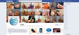
AT&T's Facebook page
AT&T is pretty happy with its 2 million adoring fans...

The Wall Street Journal article on GM pulling its Facebook advertising mentioned that General Motors is third in U.S. advertising spending, behind P&G and AT&T. This prompted me to go take a look at what the other two companies are doing with their Facebook presence.

P&G does not appear to have a corporate Facebook page. That is, if you search “P&G” or “PG” or “Proctor & Gamble” you’ll come up empty except for some odd special-purpose pages. Makes sense because P&G does not generally market itself as a brand but rather as a family of brands, each of which has its own brand manager. And indeed a random search turned up pages for Charmin which offers “SitOrSquat”, an app for finding clean public restrooms, and “Charmin Fan Perks” which are cents-off coupons available in limited quantities at preannounced times (generated repeated visits to the site).

There’s no brand page for Prilosec, another random choice, but there’s one for Pringles. Here you can find the “Tournament of Flavors”, a collection of fan-submitted videos, and “Make Us Laugh”, a joke contest which seems to be in Arabic. In short, P&G’s brand managers seem to have figured out how to use Facebook in a way that is appropriate to the medium and encourages user involvement.

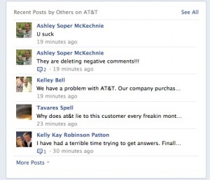
AT&T, U Suck
...but the feeling is not entirely mutual.

ATT, on the other hand, makes GM look like a social media maven. Their page is all over the fact they’ve gotten two million “likes” (Pringles has 19 million) with a big “two million thank yous” graphic at the top and a “two million thanks” link just below this. (The link actually leads to something interesting: on May 22 the ATT “house band” is going to start pumping out “thank you” songs written for people who sign up and submit personal information to be used in writing the lyrics. Sort of like the Old Spice Man.) Yet the rest of the page is full of gripes from customers about AT&T. They should do something to moderate these, or at least respond to them.

The moral of this story? With three so different approaches to Facebook, by America’s three top advertisers, this is still a very young medium. Or as Clint Eastwood might put it, we’re still waiting for the ball to come down after the opening kickoff.

General Motors doesn’t like Facebook… and the feeling’s mutual

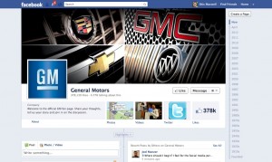
GM Facebook page
GM's got a fan page on Facebook!

So General Motors has pulled its Facebook advertising because it determined its ads had little effect on consumer behavior, according to the Wall Street Journal. Marketing VP Joel Ewanik says the company “is definitely reassessing our advertising on Facebook, although the content is effective and important.” And by “content” he means the pages GM isn’t paying for, as opposed to the sidebar ads.

The story goes on to say that GM had a $40 million Facebook budget, only $10 million of which actually went for ads. The rest “covers content created for the site, agencies that manage the content and daily maintenance of GM’s pages, people familiar with the figures said.”

I took a look at what we can assume is the flagship page for the company, http://www.facebook.com/generalmotors. You can see it pictured here, but you should go check it out for yourself. Then go check out a few other pages, like Chevrolet (NOT “Chevy”) , Camaro, Chevrolet Volt and Corvette. Notice anything interesting? Yeah, the layout and content design is all the same. The whole thing is probably auto-filled by a content management system. If this is worth $30 million I want that gig!

Now notice what GM is doing to promote itself: promote ITSELF. There’s news of what this brand or that brand is doing, Guy Fieri driving a Corvette at the Indy 500 (let’s hope it doesn’t get stolen like his last car) and some proud customers pulling up to a plant in their car on a road trip. Yes, there’s a blurb at the top, “Welcome to the official GM fan page [sic]. Share your thoughts, tell us your story and join in on the discussion.” But nobody’s actually doing that. How about inviting readers to interact with you by sending in photos of their cars, telling stories about their first car, and maybe giving them a chance to WIN something?

And, almost none of these pages has any sidebar advertising. I’m guessing that Facebook pulled all the ads in a fit of pique, to make the pages even less interesting than they are. But here’s an idea: now that you’re spending 75% of your budget to build a “web presence”, is it worth the other 25% to give people a call to action and maybe buy something?

Probably not, if everybody is like GM executives and other WSJ reader: in a poll accompanying the article, 93.4% said they “rarely or never” are affected by Facebook advertising. What more proof could you want that this whole Facebook thing is a flash in the pan?

Have you watched the Facebook roadshow video? You should.

[UPDATE: The Facebook roadshow video’s been taken down so the following is of archival interest mainly. Went looking to see if someone had saved it to YouTube, and no, but here’s an interesting 60 Minutes story from when they were at 60 million members.]

As a creative guy I’ve sat through a lot of agency capability presentations that made the air slowly leak out of the room before I ever got to speak. So there was a bit of schadenfreude associated with hearing that, after poor reviews in New York, Facebook had withdrawn their video from the IPO investor roadshow before today’s appearance in Boston.

But actually, it’s a pretty good video and you can watch it right here. (No freeze frame to click, sorry, and you have to sit through a long disclosure/disclaimer crawl before you ever see the people.) It’s the clearest statement yet of “who we are and what we’re trying to do” from a company that is usually very opaque about what it’s up to. And their explanations of the Facebook phenomenon make a lot of sense. Eg. At the beginning user profiles were static and the only thing users could easily change was their profile picture so they constantly changing them. Then they let users tag friends they saw in other photos and the whole social network thing took off. (That from Chris Cox, Vice President, Product in tandem with Mark Zuckerberg.)

The investors were apparently pissed off that after the video there wasn’t enough time for questions. So now there’s no video—and also no Zuckerberg. Did he skip Boston because he was disgusted with the reception to the video, which obviously they’d worked hard on? Time will tell, maybe, but meanwhile look at the video before they take it down. It’s about marketing, just like we are.

KISS: selling complex products with simple messages

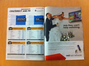
Rovi Bridezilla Ad
Rovi "Bridzilla" Ad in today's Ad Age. Thanks to client Bill Smith and his trusty iPhone.

I’m on a panel at this fall’s DMA called “K.I.S.S – Keys to Copy & Content that Generate Results”. My partners in crime are Dawn Wolfe from Autodesk and Philip Reynolds from pharma agency Palio. The idea is to talk about strategies for translating complex products or services into simple and universal human language that sells.

I’m thinking of using this Rovi promo, which appears in today’s Ad Age, as an example. Rovi does the ads that appear within onscreen television guides and other formats where the viewer is actively involved with a remote or other electronic device; viewers aren’t dozing or distracted so this is an attractive option for media buyers, our target audience. A bit complex so we boiled it down to this idea of the bridezilla who is so enamored of her remote that she can’t put it down even in the wedding chapel.

The antonym of this is the ads you’ll find in any issue of Wired or Fast Company for high-performance automobiles or audiovisual equipment. Those ads typically use visual metaphors of power and performance and expect the reader to be awed, not involved.

The session is happening on October 17, so plenty o’ time to noodle on this. If you have any thoughts or examples on this topic, please send them along!