It’s halftime in America

I just about wet myself the other night watching the spot during the Super Bowl. Very gutsy that Chrysler would spend God knows how much to run a 2 minute spot that could only run … during halftime in a single football game. After watching I had tears in my eyes and was about to run out and buy a Chrysler 300.

But reviewing it today a couple of nits. Clint Eastwood does not have the Detroit cred of Eminem, even though “I’ve seen a lot of tough eras, a lot of downturns in my life.” (I wondered if he actually was born in the Motor City and looked it up. No: San Francisco, CA.) And honestly as the spot began I was thinking it was a Clint Eastwood voice imitator (he was there but in shadows) and by the time he showed up I was almost irritated that it really was Clint. And of course the parallel to the Hal Riney “It’s morning in America” Reagan ad was a distraction for anyone who remembered.

The observation that “the fog of division, discord, and blame made it hard to see what lies ahead” was also a calculated risk on timing which I think misfired. Carl Rove says that’s a political attack which is for sure protesting too much. The producers were simply going for a chord of empathy, assuming we would be in the midst of hard times when they made the spot but the economy seems to be looking up so it doesn’t ring true for at least one viewer.

So, I still prefer Eminem’s spot last year. But I still think I will buy a Chrysler in the form of that little Fiat that morphs into a giant woman dressed in red and black in another Super Bowl spot.

Wrapping up CES 2012

The highlight of my final day at CES 2012 was a visit to Eureka Park, the area at the Venetian dedicated to new products and startup companies. Here are a few items of particular interest.

Cubelets. Designed for kids to learn programming, Cubelets are magnetic blocks that can be snapped together to produce complex reactions. For example, the brightness block determines the available amount of light and turns on the flashlight block, then the distance block tells the driving block to move the whole structure down the table. You can watch a really silly video since my photo didn’t work out well, and you can also preorder an (expensive) prototype kit to ship in March.

Postcard on the Run. An iPhone or Android app that lets you choose a photo, write a message (including your written signature) then mail it as a physical postcard to an address in your address book. I tried it out and the app was going to charge me $1.99 (including a scratch n sniff layer at 50 cents extra) which is not a bad price compared to buying and mailing a postcard from the post office.

Twykin.com. These guys are doing a mashup of bulletin boards, FAQs, Wikipedia type user written articles and using it to develop as a test case the world’s first crowdsourced customer service application. You’ll have to trust me (and I will have to trust them) on this one since their developer was in an accident just before CES but they promised to get back to me and I’ll do a full piece at some point in the near future.

Blippar. Instead of shooting a QR code with your smartphone that takes you to a website, the Blippar app allows you to interact directly with an augmented reality application. The examples shown by this UK company include a ketchup label that allowed you to turn the label into pages you can flip through, and a retail page in which you can order directly from the app.

SurfEasy.  This is a USB dongle that fits into a credit card-size carrier. On it are your browser preferences and passcodes with bank-level encryption so you can just plug into a public device and go right to work. There’s no storage on the device, but it comes with 2 GB of cloud storage. It’s a bit pricey at $60, but solves a problem for folks who use public computers in what looks like a complete and well thought-out execution.

That’s it for CES 2012. See you next year.

Bests of CES, 2012

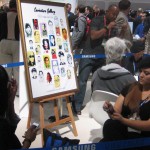
Artist drawing with Samsung Note

Best marketing: Samsung Note. This is the new device that’s small enough to use as a phone yet big enough to use as a tablet, soon to be announced for AT&T. (I want one!) To show off its capabilities, they had two artists doing portraits of showgoers using the special pen that comes with the device, and all their advertising features examples of these portraits.

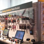
Kodak at CES 2012
Kodak "Sharing Solutions" at CES 2012

Best “dead man walking” imitation: Kodak. Even though they’re openly attempting to sell off their units to avoid bankruptcy, they were in their exhibit space maybe because they’d already paid for it. There was only a single wall of cameras, which they now call “sharing solutions”; more irony, they’ve now started packaging their inkjet cartridges in boxes that look like Tri-X film boxes.

LG 3D TV at CES 2012
Intro to the LG display area at CES 2012

Best commitment to 3D TV: LG. They ask you to put on the glasses before you enter their space, and leave them on because there’s just one 3D TV after another. I still predict a short lifetime for this fad and think it will wither once everybody who wants a 3D TV has one. The summer Olympics are being broadcast in 3D, I learned at the show, so that will be a tipping point one way or the other.

Biebermania at CES 2012
Biebermania!

Best waste of time: Justin Bieber. He was standing doing something in the middle of the Vody robotics booth, and a huge press of people were seeing nothing except the back of each other’s heads. The C/Net camera, a few rows back, did capture a wisp of his famous locks. Meanwhile, other showgoers were actually learning something about technology.

New York Deli at LVCC
New York Deli has great sandwiches

Best food without leaving the show: Uncle Joel & Darryl’s New York Deli, toward the back of the central hall. Real deli sandwiches with a pickle and excellent cole slaw and potato salad, for just a couple bucks more than you’d pay on the street.

Casio Bluetooth Watch demo
Casio watch tells you when your phone is ringing.

Best example of missing the boat: Casio. As the world switched to smartphones, they made a strategic decision to stick with watches. New this year, a Bluetooth watch that will alert you when a call is coming in. Hey, I have a phone for that.

Panasonic kicks eco-butt at CES 2012

Solar Racer
Panasonic's solar racer

If you are at CES, be sure to check out the “eco ideas” section of the Panasonic exhibit. Once again, they score with irresistible concepts and catchphrases for ideas that may or may not ever become practical but should be. A racecar that rockets across the Australian outback under its own solar power, and beats its nearest competitor by an hour. A planned community in Singapore built within a solar/wind farm on the site of an old Panasonic factory, so energy is immediately available for use without being stored or transmitted. An electric car that is recharged wirelessly, and warms its passengers with its onboard heat pump.

Panasonic 3D screen at CES
Panaonic's 3D screen, in which the image is projected on building blocks
Panasonic demo queen Joey Lao
The indefatigable Joey Lao

Be sure you get your demo from the indefatigable Joey Lao, who was featured a couple of years in my still-popular post on the heat pump washer/dryer. And don’t miss the showcase video, a tour de force in which the screen itself, not the camera, is in 3D.

Marketing Makeover at CES 2012

One of my favorite events at CES is Steven J. Leon’s Showstoppers. Tech companies large and small rent a 6-foot booth space for 4 hours so they can convince reporters and bloggers (this is a press event) how cool they are in hopes of getting coverage.

A real niche product
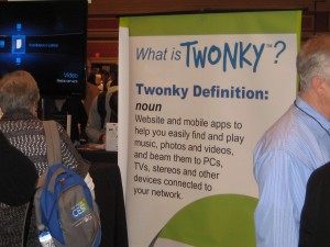
Some of these companies, like Twonky, have a real niche product.

Because I’m here to study how companies market themselves, I like to look at how good they are in their signage. With 100+ companies in a large ballroom, I’m not going to listen to everybody’s elevator pitch. It’s amazing how many just put up a sign with their name, giving no clue what they do. Others have slogans or graphics that are edgy or plays on words but, again, give no clue what the product or service is.

YurBuds
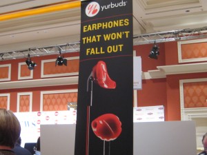
Creepy signage from YurBuds.

I’d like to do a marketing makeover of some of these guys, similar to the lightening rounds I used to do with Carol Worthington Levy at DMA events. Someone would bring up their catalog or mail pack or ad and we’ll have to fire off quick ideas to make it better. Some of our ideas were better than others, but it’s amazing how many obvious improvements are hiding in plain sight.

One company that could use a makeover is YurBuds, with its “earbuds that won’t fall out.” Please, don’t make them look like implants. Don’t make them red like blood. Don’t make the cords look like blood dripping from your ears. Change those things and your product will be less creepy and sell better.

Empower
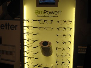
Glasses that look like glasses, from EmPower.

Another candidate is EmPower (note unhelpful jargony name), a company that makes eyeglasses with built in electronics in the earpiece that changes them from reading glasses to distance glasses at the touch of a finger. Invisible bifocal glasses that do this cost hundreds; these are $12 and available already at 1200 opticians. Nice story… but they miss the boat with a marketing display that features the fact they are glasses. Yes, we know that. It is the hidden electronics that makes them different. To demonstrate that, show them as anything BUT glasses.

Nicole Messier demos Kogeto panoramic camera
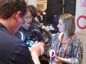
Nicole Messier demos Kogeto panoramic camera.

The only truly new product I saw was from Kogeto: a camera that attaches to your iPhone and will take a panoramic photo which you can then upload to Facebook or a similar app; the viewer uses a slider to move the image around. It was so cool that, true story, I did not even notice it was my pal Nicole Messier doing the demo. Their signage could use some work however.

Welcome to the year of crappy customer service

2011 was a year I’m happy to be done with. So, I expect, are Netflix, Bank of America and Verizon, who saw their ill-advised attempts to insert a direct tap into their customers’ wallets flame out in 2 months, 5 weeks and 2 days respectively.

Doesn’t anybody do customer research any more? Wouldn’t it be a better idea to find out how your customers are going to react before you implement a toxic new policy? B of A and Verizon wanted to charge customers for using a debit card and paying a bill online; since those policies subsequently were reversed they’re fiscally in the same place as before but with bad press and a lot of pissed-off customers. Netflix soldiered on with its plan to separate its DVD delivery and streaming content, but paid a terrible price in subscribers and market value. How is any of this a benefit to the shareholders?

I guess it’s good news that the cycle of mea culpa is getting shorter, as noted above. But meanwhile I’ve noticed a couple of new assaults on my wallet from smaller companies and wonder if it’s part of a larger trend to put short term revenues ahead of longer term customer loyalty and common sense.

I previously wrote about Boingo and their “good news” that I could now download an updated version of their wireless roaming app that allowed me to use just two devices in my account rather than have unlimited access. I cancelled, but then I recently found myself in the BWI airport needing wireless access and was tempted by an offer to get a $25 American Express gift card after 2 months of service. So I re-upped, after discovering out something interesting: of the three different devices I was carrying, each received a different offer when I went to boingo.com. My laptop (where I’d received the email) told me I could join for $9.95 a month and made no mention of the gift card. My tablet offered the gift card and $9.95 a month. My Android had the gift card for the rate of $7.95 a month so that’s how I joined. But I don’t need a wireless service on my cell phone since it has an unlimited data plan so I went through the process of registering my laptop and tablet and was told oops, I’ve reached my 2 device limit.

Turns out the very act of signing up had registered the cell as one of my two devices and now my only option is to cancel it, effective at the end of the billing period one month hence. So I’m down to one device during this period and then can register my second device. Just way too much clunkiness for customer satisfaction and what makes it all more irritating is that Boingo has this breezy website where a message “oops… something has gone wrong” that pops up way too often and only serves to increase my irritation with that man behind the curtain.

A more disturbing revenue tactic was applied by Bill Me Later after I tried to take advantage of an offer for $15 off when I paid for an eBay transaction through their service. I was told online that, for unspecified reasons, they were unable to process my payment so fine, I paid through Paypal. I then started to get daily voicemails from somebody who left a message saying “This is the fraud department at ramamafoqw calling about a recent transaction…” They didn’t exactly say ramamafoqw but they did mumble the company name. After several calls I realized they were saying “Bill Me Later.” I called the number and got a message “we’re sorry, no one is available.” Finally their representative reached me live and it turned out the purpose of this “fraud alert” was to set up an account, but not offer me the $15 credit since that one had expired.

So that’s downright deceptive… using the fraud alert concept, which has struck terror into the heart of every consumer at one time or another, to make the customer pay attention so you can sell them a service. (And how did they get my number? Well, turns out Bill Me Later is owned by Paypal…) What this has in common with Boingo, and also the three giant companies mentioned above, is that nobody applied the sniff test. As in, “this will hopefully make us some money but is it going to make our customers more loyal and satisfied, or less?” If that question is no longer relevant, then it’s going to be a long year.

P.S. Reading over this post, my experiences do sound a bit down in the weeds and yes I do have better things to do than chasing after $25 gift cards. But these are the hooks marketers use to get customers and prospects involved, and if they don’t provide a satisfactory customer experience or are perceived as deceptive then sales will suffer and more than likely we in the marketing department will get the blame.
Why copywriting is like selling (part 7)

It is hard to avoid sexual analogies with the “close” but I will try. This is the part where the sale wraps up and the salesperson gets the act of commitment—a satisfying reward for handling the previous steps in a methodical and unhurried manner. The copywriting counterpart should be just as satisfying because this is where you get your reader to respond to your call to action; if you have a good and smart client, the higher percentage of people who respond, the more you will get paid.

Because it is so important and satisfying, salespeople like to linger a bit on the close and add a bit of art to it. There is lots of ink on best/proven/classic closing techniques. A good salesperson will first make a trial close in which they soften up the prospect to get them to agree to a small point before proceeding to the actual sale. (Example: “Sounds like the hatchback is a better fit for your family’s needs, am I right?”) Then they might use the assumptive close in which they act as if the sale has already been consummated and query on a subsequent point (“Will you be using a credit card for this?”) or the alternative close which also makes an assumption and gives the reader a subsequent choice (“Now, do you want that in red or black?”)

Roy Chitwood, whom I’ve quoted throughout this series, offers The Guaranteed Close: “If we can (reprise something the prospect said was important) then can you think of any reason we shouldn’t (consummate the agreement)?” E.g. “If we can get those red slipcovers you liked, can you think of any reason we shouldn’t get the paperwork started?” The beauty part is that the salesperson gets the sale by making the prospect say “no”.

Good direct response copywriters will close the sale in a manner that’s quite different but leads to the same outcome. They will sprinkle their emails, web pages or letters with repeated brief calls to action because you never know when you’ve provided the right amount of sell for some readers to make a commitment. Then, for those who have stuck with you all the way to the end (this applies mainly to classic long-form direct mail letters), reward them with a wind-up in which you:

  • Spell out in detail all the benefits that are waiting for the prospect, accompanied by a description of the response options available (today it’s usually click the link or call).
  • Couple this with your guarantee that proves there is absolutely no reason NOT to say yes.
  • Include a limited time offer if you have one, or penalty for NOT responding. (Only 25 attendees can be accommodated to insure personal attention to each student! This guide is available in very limited quantities and when they’re gone, they’re gone!)

Then you’re done… as is this 7-part series, in which we have mused upon how good copywriting follows many of the same formulas as face to face selling. If you’ve joined us late, please go back and start from the beginning. Thanks for reading!

Excerpted from my new book, Copywriting that Gets RESULTS! Get your copy here.

How copywriting is like selling (part 6)

The general public has an image of “pushy salespeople” who cajole or badger them into buying something they don’t want or need. But good salespeople don’t actually do this. Instead, after they have presented the benefits of their product or service they will tease out any objections in the prospect’s mind and then respond to those before closing the sale.

Objections, also known as FUD (fears, uncertainties and doubts), are perceived reasons not to make a purchase that is otherwise attractive. By making an objection, the prospect is giving the salesperson a clue about something important to them. And by completely and correctly answering the objection, the salesperson can actually increase the prospect’s commitment level.

For example, if the prospect says it’s too expensive the salesperson can point out how it will actually save money, how not having it is costing them money, how the price is likely to be higher tomorrow.  If they say they want to shop around the salesperson will ask what they’re looking for from the competition and then prove how this product solves the problem in the best possible way.

So how does a copywriter answer objections, when you don’t have the reader in front of you to gauge their reaction to your written sales pitch? One answer is research—which can come from talking to a sales rep or product manager, reading up on the industry you’re selling to, or ideally from information in a good creative brief. You’re looking for big objections—the top one or two reasons buyers don’t buy—because that’s all you have time to respond to in your copy without getting off track.

A good example is the control direct mail I wrote for Geneva, a merger and acquisition consultant which wants to get business owners to attend a free seminar on how to evaluate their business. (The letter from this package is available on my website.) The #1 objection that business owners put forward was that they couldn’t admit to themselves (or to their employees) that they would consider selling the business. So we created a lift note that said just that with a pull quote on the outside: “I’m not about to sell my business… not after all the work I put into it!” And inside they read the story of a peer who felt the same way, but got a fabulous offer for more than he thought the business could possibly be worth. Objection answered.

Also, if you’re selling via direct response, certain objections come with the territory since customers can’t touch and feel the product. Will it work as advertised? What if it’s delivered and I don’t like it when I see it? And the answer is to paint very clear word pictures of how great it will be to use the product so the reader starts to visualize themselves doing just that, successfully, and becomes invested in your pitch. Couple this with a strong, clearly stated no-risk guarantee and you’re on your way.

Next time: we’ll conclude this series with thoughts on “The Guaranteed Close”.

Excerpted from my new book, Copywriting that Gets RESULTS! Get your copy here.

How copywriting is like selling (part 5)

According to sales trainer Roy Chitwood, every prospect makes the same 5 buying decisions and they always make them in the same order:

1. About you… are you a person I want to do business with?
2. About the company you work for or represent.
3. About your product or service.
4. About the price of the product or service you are selling.
5. About the time to buy.

Most copywriters spend all their time on step 3. But if you haven’t established credibility and trust, it doesn’t matter how appealing your product or service is because your audience doesn’t believe you are capable of providing it. And until you have created a need in the reader’s mind, it doesn’t matter how affordable it is or if you can buy one get one free for a limited time. (Which is why it’s rarely a good idea to use a price discount offer in prospecting for new leads.)

In my copywriting class we go through a role playing exercise where one student is a salesperson following Chitwood’s Track Selling method, and the other is the owner of a small insurance agency acting as the prospect. The prospect needs a new high speed copier but is concerned about cost and ease of use. However, they are also embarrassed that the current copier makes poor copies that do not represent the agency well. It’s the salesperson’s job to dig out these needs and concerns (which are described on a briefing sheet the salesperson does not see) and get an act of commitment.

This exercise happens shortly before lunch the first day, and I usually have two or three pairs of students go through it. Very few of these students have ever sold anything face to face before. The exercise gives them new respect for the concept of selling through your copy, as opposed to the straightforward presentation of technical features which is what most of them do in their marcom jobs.

Yet the salesperson’s job is easier in one way, because they have the prospect in front of them and can modify their pitch on the fly based on audience reaction. Next time: how you can too, sort of, in the way you handle objections and FUDs.

Excerpted from my new book, Copywriting that Gets RESULTS! Get your copy here.

Why copywriting is like selling (part 4)

If you’ve been following this series you are now at the point where you have a good idea of the buyer’s interests and concerns. It’s time to show how your product and service matches those interests and solves those problems because it always does, right?

A tyro copywriter will do this with features: throwing out a razzle-dazzle of technical information and forgetting to tie it back to the reasons people buy. (Remember, prospects may evaluate a product logically but their ultimate buying decision will always be emotional.) An experienced copywriter will always translate those features into benefits… how a technical characteristic answers one of the many cravings we talked about last time.

Even better is something called “FABS” which I was trained in when working for a home entertainment chain way back when. This is features, ADVANTAGES and benefits—describe why it does, explain why this is an advance or a superior solution compared to other products that claim to do the same thing, then drive home the benefit. It’s especially useful in selling high-tech products.

(In a live selling situation, a good salesperson will pause after presenting each FAB to gauge the prospect’s interest level, then adjust the presentation of the next FAB accordingly. You don’t have the benefit of the face-to-face contact as a copywriter, which is why it’s extra important to do your research or have a good creative brief.)

In my copywriting class (which is usually techie-heavy) I do an exercise where we pass a #2 yellow pencil around the room and each student has to present a feature, advantage and benefit of the pencil. This gets very interesting when it’s a large class and all the obvious FABS are claimed early.

For example:

FEATURE: the pencil is bright yellow.
ADVANTAGE: I can easily find it compared to other writing instruments.
BENEFIT: I enjoy peace of mind because I’m never without a way to express my thoughts.

FEATURE: #2 pencils are the standard used for computer graded tests.
ADVANTAGE: I know I have the ideal technology to complete the assignment.
BENEFIT: I won’t have to worry about getting marked down because my answers can’t be read by the computer.

And here’s one that came out late in the exercise in a large class:

FEATURE: #2 pencils can be sharpened to a very sharp point.
ADVANTAGE: That point sticks easily in the acoustic tiles when I throw it up at the ceiling.
BENEFIT: I have a way to amuse myself when the class gets boring.

Next time: the five buying decisions… and why buyers always make them in the same order.

Excerpted from my new book, Copywriting that Gets RESULTS! Get your copy here.