Allstate creates Mayhem with negative ad campaign

Copywriters love to write negative ads… they’re so much more fun than bland positive messages. But early in our careers we have it drummed into us that negative doesn’t sell. The reason is that the ad itself has no credibility. Rather than absorb an unrequested negative message, the reader simply turns the page.

I had to prove this for myself with a negative direct mail package to test against my control for Long Term Life Insurance at Met Life. Your chances of needing long term care are hundreds of times greater than the possibility of a home fire. Yet everybody carries fire insurance. Similarly, you have maybe a 1 in 10 chance of getting in an auto accident but the odds of needing long term care are 1 in 2. Getting worried yet?

The package bombed. Nobody wanted to read it. And I have stayed on the sunny side ever since…. with the exception of a few forays for my financial services client.  But now comes the Mayhem campaign for Allstate… which seems to be working, based on the way the campaign has expanded and the fact they are now running a “clips” spot for the holidays.

Mayhem points out all the bad things that can happen when you don’t have insurance or enough insurance…. with humorous depictions by the entertaining actor (who plays one of the dead family members on Rescue Me) Paul Dean Winters. My favorite is “Large Expresso” in which the bigwig executive, upset about losing millions in the market, spills a large expresso on himself and slams on the brakes… causing you to run into him from behind, your fault.

So we have two shibboleths broken at once, negative advertising and humorous advertising. Thank you Allstate (and thank you agency Leo Burnett).

UPDATE: Allstate’s PR folks contacted me to correct the spelling of the star’s name and to point out that Mayhem now has his own Facebook page. You can find it lower right on this Allstate site.


Maker Shed ate my children

My two boys are big fans of the O’Reilly “Make” concept. They’ve read the magazine, attended the Maker Faire, and would like a few blinking things in their stockings for Christmas. Unfortunately the lame makershed.com site makes this very difficult to pull off.

I’m presenting my experience not so much as a personal diatribe as a reminder that much of online shopping used to be this way. I invite you to cluck-cluck at these guys, then be thankful their practices are not more common.

I should be a pretty good prospect to Makershed since I subscribe to the magazine and have attended Maker Faires myself. So I get an email inviting me to enjoy the “deal of the day” which is an Arduino (that’s a blinking thing) with a $14 manual thrown in for free. Score! I click on the button and am taken to the website where I am told the manual is temporarily unavailable but I can download a PDF as part of the offer. WTF, that’s not so good, so I email help@makershed.com and tell them I want the offer but am in no hurry, want to wait till the book is back in stock.

You know what happens next: quick reply from customer service saying they have taken care of it. But not in the Makershed. It’s a full 5 days before they respond and say the offer is long past and the best they can do at this point is offer me a link to the pdf download.

So my boys will go Maker-less for Christmas apparently, but a couple weeks later a new email. Save 15% on anything with our special code on orders $125 plus. I click on the offer, get a message that says I have entered an invalid code. Click all over the email, same result. The hell with this, my boys need their blinking objects. So I do a search for Maker Shed on Google, find the site, put in my order, enter the special SAVE15 code… and am informed it expired a year ago.

I have no more time for shenanigans so I place the order and in a comments field point out that I tried to enter the 15% off code (I enclose a screen cap) and expect it to be taken off my total. 24 hours passes and I get a notice that my order has shipped. I click on the “my account” link to see if the 15% was taken off and am rebuffed because my password is not recognized… apparently Maker Shed allows customers to order without setting up an account but then gives you no way to check on order status.

You don’t want to hear more about my personal frustration with the above, which probably sounds like blab bla bla at this point, but I am not relating all this just to rant. At one time, a lot of e-commerce was like this… companies appeard quixotic and apparently uninterested in customer service because they didn’t actually have a clue about customer service, or else because they were overwhelmed at holiday time.

But today there’s not any excuse for this… especially since we are not anywhere close to the holidays. The learning and lessons:

  • Don’t go live before you have the elementals such as web links and savings codes locked down, which is where Maker Shed repeatedly fell down in my experience. It is particularly embarrassing because this is a “high tech” outfit but would be just as bad for a scrapbooking website.
  • Be accessible. Don’t take days and days to answer customer queries. These guys don’t even list a phone number!
  • If you do fail at the above two requirements, or even if you don’t, remember the customer is always right. Which is especially true if you have sloppy ecommerce practices and the customer is expected to pick up after you.

I expect that what has happened here is that the Make folks have simply contracted out the entire Maker Shed operation. They get a small commission and it’s somebody else’s problem to run the show. But that’s wrong. I used to think Make was cool. Now I think they are incompetent and rip-offs. That’s my left brain talking but my right brain is listening in.

Marketing to idiots

I had a client who was concerned that the information she was collecting on a registration page was going to be a potential problem because people are registering to win a prize and if they do win a prize then a/they might not want to receive it at work (which is the address we’re asking for, this being a B2B mailing) or b/they might have given a fictitious address as some people do because they don’t want to get advertising contacts yet they have to put something in the fields.

This same client had a problem at a previous company, which was the cause for her concern. She was giving away iPod shuffles (then selling for $59) to qualified prospects in return for their time to sit through a demo and apparently many people did not get their shuffles. I say “apparently” because it could also have happened that someone lied in order to get an additional shuffle…. dishonest, but hard to prove. Anyway, once bitten she wants to be sure this time.

My response (before caving, of course) was that there are always going to be a few idiots and outliers in your audience who are not going to play by the rules no matter what you tell them. And you should not do anything that is going to make your offer more complex to the vast majority, such as adding additional information on the reg page to deal with this issue by requesting an alternate shipping address in case they win. (Everybody who has ever designed an online survey or reg form knows that each additional field or question causes a certain number of people to drop out.) Suppose they fill in the form with their preferred address but, being idiots, they write it down wrong. What do you do then?

Along the same lines, I had a client back in my “suit” days who wanted to know if it was a good idea to pay a 1.5% commission based on the value of all sales paid by check in return for this supplier’s guarantee to make good any bad checks. This one was easy to figure out. Do bad checks cost more than 1.5% of revenue from all checks? No. Then this apparent insurance service is a money-losing sinkhole.  Plus, cheats are cheats. If a customer has it in their heart to trick you out of money, they’ll just find another way to do it.

Today’s moral is, the customer is not always right, not when they are idiots and outliers. Don’t screw up the rest of your promotion by making accommodations for a few wingnuts.

Some good advertising from Microsoft… Really?

The folks who brought us Windows Vista and Bob the Paper Clip are coming up with some good advertising all of a sudden.

In a spot promoting a photo retouching service, mom is frustrated because she can’t get all her family members to look charming at the same time for a photo, so she says “to the cloud” and accesses an online link where she can mix and match faces from different photos. This is the first execution of a “cloud computing” message I’ve ever seen that works… most marketers get obsessed over explaining the technology and stumble on their copy, as in my example from the DMA recently.

On, you thought I was going to talk about the “Really?” campaign for the new Windows Phone? Well, here’s my problem with that. I first saw the full version of this during the 2nd inning of the World Series last night (GO GIANTS) and thought it was damn funny: people so obsessed with their phones that they are banging into each other, ignoring strippers and in one case picking up the phone after it’s been dropped in a urinal, causing the guy at the next stall to say “Really?” Then (without really showing the phone, because it hasn’t been released) Microsoft closes with the tag line, “it’s time for a phone to save us from our phones.”

The new spot has well over a million hits on YouTube since it went up on October 10, and a viral campaign has been launched inviting viewers to share their own “head in phone” moments. Hipsters get it. But I think this is going to go completely over the heads of post-ironic consumers of mass media. They are going to look at the obsession over phones, see Microsoft as the sponsor, then conclude “I want a phone that is so cool I can’t put it down like the people in the commercial.”

Though come to think of it, that might sell a lot of phones. Really.

Marketing the moment: why “live” is the new “live”

Born in Dallas and a longtime San Franciscan, I have taken an unusual interest in this year’s baseball playoffs. As my teams climbed higher my viewing apparatus got correspondingly smaller. The first round was watched in a hotel suite with big screens, the early games of the league championships on a tube set in a hospital room, and by the time we got to the final game where Texas beat the Yankees I was using the live update feature on ESPN on my iPhone.

Glued to the tiny screen as I was, I barely noticed that there were advertisers who wanted me to click away to their websites. In these days when we TiVo everything I wanted nothing more than to be on the screen at the exact moment when the rangers got the final out. On the other hand, this is a great spot for brand advertising. Anybody who inserts themselves unobtrusively in the heat of the moment, as ESPN did with some of its own self promos, becomes part of the experience and is carried along with the ride.

Yet the final out in a baseball game is one of the rare times when you can know that the drama is about to happen. Most baseball excitement is unpredictable, a lull shattered by sound and fury. Many fans miss the moment because they are kibitzing or out for a beer, so they rely on replays or on announcers to tell them how excited they are. It’s rare to have an end-to-end nail biter like the Giants’ final home victory when I told myself, “I’m watching a game for the ages” before the commentators informed me of that.

And this is something we marketers can do something with…. remind consumers how excited they were at some pivotal point in the past and then offer some product with a real or imagined tie-in. I did this with a video continuity program for an old series called Highlander, asking people to remember where they had been when they saw the show for the first time. (Not having been there myself, I channeled the experience of watching the final episode of The Fugitive, as a wee lad at a youth hostel in Scotland.) Didn’t win a pennant but it got an Echo and, more important, sold a bunch of videos.

Sweet way to make a trade show impression

The annual Direct Marketing Association conference is a challenge for exhibitors. It’s a horizontal show, with many different categories of vendors represented from bankers to software to printers to agencies. And many of these have complex value propositions that are hard to convey with an elevator pitch.

Orange cupcakes = cloud computing, get it?
Orange icing = cloud computing, get it?

In this environment, the booth shown here stands out. Everything is orange, and they’re giving away cupcakes with bright orange icing. The cupcakes attract traffic, and when the sales force follows up after the show they can say “we’re the people who had the orange cupcakes, remember?” All good.

The marketing tie-in is a little more tenuous. The booth staffer explained that “we’re the only software-as-a-service solution at the show for migrating legacy systems” for order entry, customer records and other mail order chores. That’s a bit complex to convey in an elevator pitch so the company—named “swyft” and pronounced “swift” I will guess—decided to just go for being remembered. Some people might go to their website, but in any case there are these orange cupcakes.

A bit of research was done, consisting of looking at the collateral. The cupcake tie-in becomes clearer, though the copywriter unfortunately cannot resist a treacly flow of plays on words: “Sweet! Ripping and replacing legacy systems is about as fun as a root canal. It can be a slow, painful process and leaves a bad taste in your mouth. That’s why we built the Swyft Interaction Hub to sit ever so sweetly right on top of your existing customer systems. It’s like the icing on your customer infrastructure cupcake.”

I have the feeling the booth people either weren’t fully briefed on this platform or didn’t feel comfortable mouthing it. I pressed the booth rep on the tie-in between the cupcakes and the product and she said “we’re cloud computing” and we agreed the puff of orange icing was indeed like a puffy cloud. OK.

I’m giving them best of show for the DMA by default but you see how this could have been even better. Think through that metaphor of cloud computing and maybe there’s a better way to express it…. maybe cotton candy which was being given away at the next booth (not as a gimmick, just free candy). Or here’s an idea, how about tying into the name “swyft/swift”? Any metaphors come to mind for that one?

Gap shoots itself in the logo

I had been looking for a bad example of social media marketing to use in my DMA talk on Monday 10/11, when the good people at the Gap dropped one right in the lap of my denim jeans. Funny thing is, I don’t think they were aware they were involved in social media marketing which is part of the problem.

Gap old and new logos

Gap, as you may know, changed its logo last week. To my non-designer’s eye, the new logo looks like something I was offered free at a conference by an outsourcing design firm: I was asked to answer a few questions about my business, then come back in 20 minutes. Gap’s new logo is simply its name, set in the same font used for the table of contents in the New York Times magazine, with a little blue square at the side as homage to the old logo they’re getting rid of. On the face of it this does not seem like a particularly good change. Plus the old logo had a lot of recognition built up over 20 years; most marketers would consider that brand equity but Gap felt it was a problem. They’d had the same logo for 20 years, so it was time to get rid of it. Not evolve it, as many companies have done (think about how Betty Crocker, Uncle Ben and Aunt Jemima have morphed over the years in response to changing social mores). Just toss it out and start over.

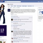
The change drew over 1000 comments on Gap’s Facebook Wall, with the balance overwhelmingly on the negative side. (The Facebook page still displays the old logo as of this morning, by the way. Oops!) The critics tended to say either the new logo looked like an exercise from a beginning Photoshop class, or that they loved the old logo and didn’t want to see it go. And, not a few offered to redesign the logo themselves. That’s where it starts to get strange.

Gap's Facebook page still displays its old logo. Oops.

Gap President Marka Hansen wrote on her Huffington Post blog that “given the passionate outpouring from customers that followed, we’ve decided to engage in the dialogue, take their feedback on board and work together as we move ahead and evolve to the next phase of Gap. From this online dialogue, it’s clear that Gap still has a close connection to our customers, so tapping into this energy is right. We’ve posted a message on the Gap Facebook Page that says we plan to ask people to share their designs with us as well. We welcome the participation we’ve seen so far. We’ll explain specifics on how everyone can share designs in a few days.”

Aside from the condescending we-we language (“passionate outpouring”? more like “howls of outrage), what is really going on here? Is the lame new logo actually a placeholder and publicity stunt? Does Gap really want its customers to help design a new logo, and if so why did they not say that in the first place? And if they are indeed going to hold a design competition, what are the rules of the game and how will the winner be compensated? (Designers are already posting to warn their colleagues not to offer designs until copyright protection measures are made clear.)

Right now Gap’s getting a whole lot of free publicity. Problem is, most of it is negative especially for a company that would like to have a positive image for its design and customer interaction skills. It will be interesting to see how this unfolds.

UPDATE: on the evening of 10/11/10, Gap announced that it was going back to its old logo. Here’s their Facebook statement, thankfully free of we-weisms: “Ok. We’ve heard loud and clear that you don’t like the new logo. We’ve learned a lot from the feedback. We only want what’s best for the brand and our customers. So instead of crowd sourcing, we’re bringing back the Blue Box tonight.” And according to Ms. Hansen in their press release, “There may be a time to evolve our logo, but if and when that time comes, we’ll handle it in a different way.” Sounds like a plan.

Why baby carrots are evil

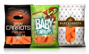
Maybe it’s too soon to call the campaign a runaway success, but the respected Middletown, OH Journal is reporting that at least some students at Cincinnati high schools are indeed purchasing baby carrots out of vending machines now that they have been repositioned as junk food.

Evil baby carrots in their vending machine jackets

The campaign was produced by Crispin Porter + Bogusky though I assume without the participation of Alex Bogusky, who pronounced he was sick of advertising and quit earlier this year.  It’s not a big media buy, $25M total, so in order to see their edgy commercials you’ll have to hit the right teen programming or just watch them on the web. The most popular seems to be a spot in which a woman fires baby carrots out of a Gatling gun at a guy who is trying to catch them in his mouth.

To me, baby carrots are kind of quease inducing to begin with. They are not actually “babies” at all but mature carrots with minor blemishes which have been tumbled and shaved until they are small and cute. (Thank goodness human babies are not made this way.) And apparently the process makes them last forever since they are typically sold without refrigeration in supermarkets and, I assume, in high school vending machines. Sometimes they get a white powdery coating with age, a kind of patina. But I guess that’s okay, right?

But what’s evil about this is the cynicism of the agency creatives, who seized upon this loophole in the creative brief: we don’t have to make kids eat them, just BUY them from the vending machine. And thus the pro bonos of the healthy school movement are satisfied even though most of the carrots are likely being used as projectiles, bookmarks, doorstops or god forbid this. (A demo of carrot warfare can be found in a fortunately timed V-8 commercial in which two kids are flicking baby carrots at each other across a table in the cafeteria but one of the kids is OK because he’s drinking a V-8… quite possibly containing some of the shavings that were a byproduct of those very baby carrots.)

Changing behavior through an ad campaign is hard, especially when it involves a pliable young audience with a shifting definition of cool. A campaign that did succeed was the “Truth” effort in Florida, aimed at reducing teen smoking by making it cool to attack adults who manipulate kids to smoke. See how many memes are encapsulated just in the description of that campaign? A villain… who may well be your own parent. A superhero… transformed from an ordinary teen. That’s your ad dollars at work.

By contrast, the Baby Carrot people took $25 million that could very well have been used to do something good and spent it on a smirk. Maybe Bogusky quit because he just didn’t want to work with these characters any more. Or maybe he just wanted to go off and be a farmer of great big, foot-long carrots.

The creative side of social media

It’s time to start beating the drum for my session at the Direct Marketing Association’s annual conference in San Francisco, which will happen at 3:15 3:00 pm on Monday, October 11th. The title is “How Twitter Killed Direct Marketing Copywriting (Just Kidding)” but it’s really a broader look at the creative side of social media and how apparently random and spontaneous social/viral marketers actually use some very ingenious traditional communications and brand strategies to get their point across. (And, this being the DMA, I’ll also talk about how traditional DM’ers can make the transition to being successful in social.)

The DMA has just added a session right after mine, at 4:25, called “The Social Media Faceoff”, in which a number of agency luminaries will exchange viewpoints (and, implies the DMA, possibly some virtual fisticuffs) on how marketers can monetize their social media efforts. Being from the home of the Travers Stakes, I will point out that this makes the perfect Exacta: join me for the apps, then move on down the hall for the main course.

Why context matters in your advertising

We’ve talked before about verisimilitude—the principle that, in addition to actually being true, an advertising message must appear to be true or the skeptical public won’t trust it. A parallel concept is context… in any given environment the audience expects to receive information in a certain way and you can either fit in with this convention, or startle and gain attention by doing the opposite.

Ads or banners that look like editorial content go down like butter. Direct mail packages that look like they are official notices get opened automatically. Of course, you need to stay in character or the audience may feel duped if your message turns out different than it appears.

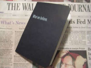
Frost's fake bank book inserted in the Wall Street Journal

For the “startle” approach, a good example was inserted with a recent Wall Street Journal (home delivered in Dallas, where I was traveling): unfold the paper and a bankbook falls out. Whoa, a bankbook! But it’s not really a bankbook because it has a headline on the front: What we believe.

Inside, we have ten spreads containing statements of belief, most of them no more than a sentence. Example: “We believe you get what you pay for.” It’s not until the very last page that the advertiser is revealed along with a CTA: We believe there is only so much you can learn from a book. Call (tollfree). WhatFrostBelieves.com Frost (logo)

Now, there’s nothing terrible about any of this… for a corporate website, or an annual report. But this isn’t marcom, it’s ADVERTISING and quite expensive advertising at that. I can see the boardroom wheels turning: Wall Street Journal readers are well heeled influencers. Let’s impress them with our sincerity and maybe they will become our customers.

Not likely. There is just too great a leap between a statement of purpose and high mindedness, and the actual activity of deciding to do business with a bank.  A few readers may pass the bankbook around their office as a curiosity but very few are going to do the thoughr process of “these guys seem decent enough, they’ve proved it by not trying to sell me too hard, therefore I will get a loan or open an account with them.”

The thing is, there is a way this promotion could have potentially been VERY successful: make it look like a real bank book. With nothing on the cover so you don’t give away that it’s marketing… or, wait a minute, let’s put the Frost logo on. That’s realistic and establishes brand up front.

Inside, some stage management—fake transactions.  The account holder has built up a huge balance, earned some nice interest, then withdrawn it all. (This is Texas, remember.) Tell a story with the numbers. The Wall Street Journal reader will like this. Then on the last page, a call to action: save a point on your business loan when you return this bankbook to Frost. That’s how you buy business by being out of context.