CES 2010: it has a pulse

Just finished my first day at the 2010 Consumer Electronics Show. The aisles are packed, at times so much so you can’t get through. But there are no exhibits in the huge Sands center this year, several of the areas in the back of the South Hall are blocked off, and one of the ballrooms usually used for the Hilton International pavilions is dark. In the main hall, OEM no-names share the prime spots with the likes of LG and Panasonic. My guess is that exhibitors panicked and stayed away while significantly more attendees are here than last year, signaling their intent to lift us out of our gloom.

According to show sponsor CEA, consumer electronics sales were off 7.8% in 2009 yet with higher volume led by bargain hunters. Sales for 2010 are projected to be up “slightly” from this terrible level. So it was interesting to see what attracted the most attention at the show.

Most popular trend that is going nowhere: 3D TV. Everybody is standing in lines to get into the theater rooms and see it but my prediction is, this is like the hot girl you’re never going to bring home to meet mom. Once the 3D glasses get stepped on or lost in the couch cushions, the party is over.  (One vendor, TCL, shows a Fresnel lens type 3D where the picture is slightly different as you sift your vision, and doesn’t require glasses, but it doesn’t really have the drama of the polarized glasses kind.)

Bad news for the 3D TV folks: virtually no traffic in the zone promoting mobile TV, a technology that is designed to provide high quality reception in a moving vehicle. If you don’t want your kids to watch live TV in the car, my prediction is you won’t want to watch 3D at home either. There’s a limit to how much fun you can have.
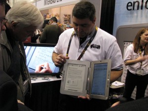
Entourage Edge e-reader
Entourage Edge gives you the best of both worlds. It’s an e-reader AND a tablet computer.

Attracting a lot of crowds: e-readers. Diverse interpretations and executions of what Kindle left out, many with added value content such as newspaper subscriptions, complete with graphics, delivered along with your e-books. There was prediction Apple would show its new tablet at the show, but I haven’t seen it. (SF pundits mention Moscone Center is mysteriously unbooked for several days in late January, suggesting an Apple stealth event coming then.)

I saw several specific technologies of interest. Will report on some of these tomorrow.

On my way to CES 2009

This is my first year as an “official” blogger at CES (why the quotes, dude?). I’m already a day late because many of the press events are held on Thursday so they can get coverage before the throngs arrive. Definitely sorry to miss Lady Gaga at the Monster booth. Wonder if I’ll run into her later tonight when I arrive, maybe at the Showstoppers Expo?

The first time I attended this show was before many of my readers were born, probably, back in the 80s. I was an account exec at an agency representing The Federated Group, a home entertainment chain that has since gone to its reward. Accommodations were incredibly hard to find pre-internet efficiency. I was put up at the Showboat, somewhere downtown and far from the action. It was all demos of Betamax and Quadraphonic. I did not have fun.

Today the CES incorporates many of the vendors who used to be at COMDEX and they’re primarily my focus in attending. As a marketer, I like to hang back in demos and watch my audience to see what questions they have and what bullet points make their eyes light up (or become less glazed over). I also like to look for new or interesting technology which often comes not from startups (it’s very expensive to exhibit here) but from backwaters divisions of major companies—Panasonic’s heat pump washer/dryer, covered last year, being a good example.

And, as a marketer I like to look at the way all these companies are marketing themselves. If you’re into home entertainment, how do you establish through your booth display that your product is “entertaining”? If it’s a new technology, how do you show in a microsecond what it does? Now that I’m on the press list I get to see lots of flackery, good and bad, in the press releases and invites sent out. Most intriguing so far is Gracenote’s display at the Showstoppers tonight, which promises only “surprises”. Hope I am. More later.

The perfect upsell

On New Years Eve, I stopped by BJ’s, the Costco equivalent in upstate NY. I’d received a coupon in the mail good for a 60 day trial membership, expiring 12/31. Since membership is normally $45 a year, this was my opportunity to check it out at no cost or risk if the savings weren’t that great or the products weren’t that useful (I imagine these are the two objections most prospective members would have).

The associate was happy to sign me up, but she wanted to mention another offer: get 14 months for the price of 12, AND a coupon good for $10 off any purchase, AND a full money-back guarantee for the life of my membership. But, I had to choose one offer or the other. If I signed up for the free trial then I couldn’t get the $10 later on. And since I’ve got an unconditional money back guarantee, doesn’t that count as a free trial anyway?

Didn’t have time to do any shopping, so I happily handed over my $45 when I’d planned to spend $0 and walked out with a fistful of coupons and not a trace of buyer’s remorse. If anyone knows a better-designed upsell than this one, I’d love to hear about it!

Copywriter piggybacks on Southwest “Bags Fly Free” promo

I hardly ever use this blog to promote my own services, so please indulge me. I want to make an analogy to Southwest Airlines, whose CEO David Kelly explained he gained market share in a dreadful economy by doing nothing. Other airlines started charging for checked bags, Southwest didn’t. “Bags Fly Free” was news.

The commercial side of Otisregrets can be found in the tabs at the top of the page. Though I’m a copywriter, I came out of a Master of Fine Arts program at UCLA Film School. I can’t help thinking in terms of stage management. How will the recipient interact with the elements of the direct mail package? What will the reader see “above the fold” on a web page that keeps them reading?

From the beginning, each of my copywriting deliverables has come with guidance on how to execute it graphically. Sometimes this means detailed design commentary within the copy deck; sometimes it’s working with an in-place designer; every now and then I do an old-school “copywriter’s rough”.

I don’t see other writers doing this as much these days, when we all are re-inventing ourselves to stay viable. Maybe it’s my own “Bags Fly Free” story. Check it out.

The carpenter’s jig

In my town lives a master carpenter named Chris. He donates his time to serve on the town historical preservation board, and he donated his time last fall to supervise a bunch of Saturday amateurs who volunteered to help rebuild a dilapidated but beloved local building. It was in this context that Chris provided a sweet example of a carpenter’s jig.

A jig is a made up structure which holds your work in place while you are performing a carpenter’s task such as sawing, drilling or glueing. A jig is handy if you are doing a number of repetitious operations (for example, drilling a row of holes at exactly the same position in a cabinet so you can hang a perfectly level shelf) but can also be used for a one-time operation if you don’t trust your ability to control an unpredictable process when wood meets a powerful force.

Making a jig is one delineator between a carpenter who cares about their work and a hobbyist tacking boards together. It’s the physical embodiment of laying the groundwork which a good marketer is going to do as well: define your problem, determine how you are going to approach it, then be clear in your mind about your plan of attack so you don’t get distracted and veer off course during the executional phase. Good copywriters do this without even thinking about it; less-good copywriters just hammer away.

But back to Chris’ jig. The job given to me and a couple of other guys was to hang siding along a 20 foot run. As he described the project Chris asked me, “do you want a jig?” That was music to my ears. Each row of siding needs to be perfectly level and it needs to overlap the previous row at exactly the same measure from the bottom. Trying to eyeball this with a long floppy board would create something ugly. So Chris made a jig. He took a 10” length of 2×4, ripped it down the middle to the 6” mark, then turned it 90 degrees and made a crosscut that met the first one to create a piece that looked like an L if you held it sideways. And then he made another jig exactly the same as the first one. If each guy takes a jig and fits in the shelf of the L under the previous row of siding, then rests the next piece on the top of the L, the work is in perfect position to nail into place.

Now it may occur to you there would be an easier way to do exactly the same thing. Just get two pieces of wood (you could even use scraps from the siding) then fasten them together offset at 6” to produce the two shelves you need to hold the work. But Chris did it the hard way because it gives him pleasure to make something that works well. Not a bad role model for copywriters.

On the value of “spec” creative (“spec” as in “specious”?)

Business is getting better, but I still make an extra effort to seek out potential projects I think would be fun or challenging. The creative director at one such client contacted me last week and said that frankly, their management was used to seeing potential creative resources do products on spec and I’d probably have to do the same if I wanted to get an assignment.

I sent a response in which I said, politely I think, that

There are two concerns I have on a philosophical basis about the whole idea of spec:

–for the writer, if you have other, paying clients waiting you are inevitably going to spend less time on the spec than a “real” assignment.

–for the client, there is the temptation to value the work on the basis of, it’s worth what you pay for it. They have no skin in the game, so they’ll evaluate the spec result less seriously than something they’ve paid good money for.

I didn’t hear back and not sure I will. This isn’t a stretch, by the way. It’s a category where I have done a lot of work for a competitor in the past and that work is easily accessible if they want to see “what I can do” in selling their product.

It’s my loss, but also theirs I think. If you demand spec work then you lose access to all the writers and designers who are too established or busy to be able to consider it.

And here’s something else. A good writer, especially a direct response writer, is going to go through a self-editing process (often unconscious). They will go through a series of drafts they never show the client because though they may sound sweet, they don’t have the oomph, benefit statements and sharpness required to sell effectively. This is something you don’t get from junior writers who may be great wordsmiths but not experienced salespeople. And if the client is used to choosing their talent pool from spec submissions, they may never know what they’re missing.

Along these lines, here’s a nice piece from a down-under designer on “Why Logo Design Does Not Cost $5”. Copywriting neither!

New Media meets Old at AdTech NY

Yesterday at AdTech a panel moderator asked the question, “now that anybody can find whatever they want through search, is creative still relevant?” And a panelist, I think from MTV (I can’t read my notes because my hands were shaking with outrage) replied that sure, for example when people go searching for a band we’ll show them another band they’ve never heard of. She MIGHT have been talking about contextual targeting a la Pandora or iTunes Genius but I don’t think so; I think she was talking about selling product.

Later on I was checking TweetDeck before a session and the guy next to me muttered, “Twitter, what a waste of time.” And it occurred to me how different this conference was than the last few I’ve attended and posted about.

The “old media” here isn’t print; it’s MTV, AOL, Comcast and the other mass produced content that the advertisers who attend will put their marketing messages alongside. I saw some clever solutions for monetizing just about every square inch of the Internet, but the core content providers seem stuck in a 20th century attitude of “we will build it, and they will come”.

Apropos which, equipment failure forced a switch from my beloved TiVo to a generic Direct TV DVR this week and I was amazed at the arrogance of the DTV user interface designers in assuming they could get away with the absolute minimum of features and intuitive usability. Good example: in TiVo there’s a “Season Pass” that lists all the recurring shows you plan to record including what is in the queue. On my new DTV box, I select the show and then it disappears. The “list” function only shows what is already recorded, no positive feedback to reassure me that yes indeed 30 Rock will be taped tonight.

The “new media” is of course the self-broadcasting that the audiences of all these old media companies have learned to do by TiVoing, Boxeeing, YouTubing and mashing it up with applications so you can see and share exactly what you want at any time. And getting back to that moderator’s question about whether creative is still relevant when people can find “whatever they want” by searching… where does he think that “whatever” is coming from?

Best practices for graphics in emails

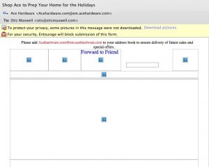
This Ace Hardware email has some great offers...

Right now thousands of people are re-installing Microsoft Outlook as they upgrade from XP to Windows 7. And the majority of these folks won’t touch the default settings which don’t load graphics within emails unless the user specifically asks to do so.

... but most recipients will see it in their preview pane like this.

Right now hundreds of marketers are designing emails that ignore this reality, by placing a big beautiful graphic at the top of the message that shows up as a blank spot superimposed with a red X instead of the desired image. Which means that most recipients will never see the graphic, or the message, because there is nothing visually compelling to pull them in. The “before and after” examples from Ace Hardware are proof positive. Inviting graphic and great offers, but most of the people who got this email will never see them. (I’m on a Mac so the red X’s show up as question marks for me, but the problem is the same.)

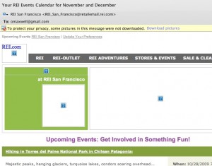
Better: REI newsletter has HTML text to tell the story before the graphics load.

So what can you do to fix it? Use HTML text creatively at the top of your email instead of relying on graphics to tell the story. The REI newsletter example is isn’t pretty, but there is a lot of REI identity here to pull people in, including the bar of clickable links.

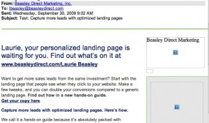
Best: very little of this message is lost, even without graphic.

Better yet is the email from Beasley Direct that has a good ol’ compelling headline to pull people in, and places this to the left of the page so it will have maximum visibility on small screens. This email also includes ALT text—the words “Beasley Direct Marketing” over the graphic—which appear when the graphic doesn’t load. That’s another good practice. Better yet would have been a benefit message or call to action in the ALT tag, such as “request your complimentary landing pages guide”.

Make sure you’re following these simple steps next time an email goes out. Don’t get intimidated by your art director… the design can still look great, you just need a backup scenario when the graphics don’t load. And everybody will be happier with the higher open rate and, hopefully, more clickthroughs.

Google, other marketers spend way out of recession

In an earlier post I talked about the argument for spending more to gain market share when others are cutting back, and cited Bed, Bath & Beyond and New York Life as success stories. Now comes news that Google, Juniper Networks, Cisco and Microsoft have launched major new campaigns into a still-roiling economy. “Everyone is trying to be the first mover,” commented Dean Crutchfield at one of the major tech agencies. “This is a market now where you’ll stand out or die.”

Coincidentally, Google’s Q3 revenue was up 7% year-to-year, in spite of tough economic times. Somebody is spending more on Adwords, that’s for sure. How about your company?

A three finger salute to bad product design

I have been getting cranky lately about products in my daily life that don’t work as well as they should. I’m cranky not just as a consumer, but as a marketer. Because if a product doesn’t work as it should, people are going to bring it back or not purchase again as surely as if you’d made false claims in your advertising. And since life isn’t fair, you may well end up with the blame.

So here are three ineptly designed mass produced products each of which richly deserves a middle finger salute—not just for their design flaws, but because those flaws are so obvious they would have been detected with the slightest hint of usability testing.

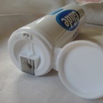
Glide in its unusable tube.

1. Glide dental floss tube. Glide is itself a success story of good design: Teflon coated dental floss, so it doesn’t get stuck and break off in your teeth. The idea worked so well that Oprah praised it on her show and stuck a package of Glide under every seat in her studio for the audience to take home.

Now we have an economy size in a tube, at about half the per-yard price and not much more bulk so it’s a no-brainer if you use Glide every day. But guess what: as soon as you start to pull out the floss, the top pulls off and the roll comes unraveled and it’s almost impossible to put back together. I guess they must have several billion of these tubes in stock because they’ve now come up with a Rube Goldberg fix: a disk of clear plastic over the top of the roll inside. The roll no longer comes out, but guess what: neither does the dental floss, making the whole delivery system inoperable. Middle finger salute.

How would YOU open this mustard bottle?

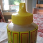
2. Nathan’s mustard plastic bottle. This is my favorite mustard, and it used to come in a sturdy bottle with a tip, anchored with a plastic strap to the rim of the top, that you could use to seal it. Now they’ve got a new design which is designed to self destruct on first use and render the seal inoperable, which I guess means you will want to buy another right away. Not.

Look at the picture and you’ll see it is not at all intuitive how to get the top off. Click on the picture to enlarge it. Oh, there it is, that flat area in front. But it’s hard to get your finger or thumb in and unless you lift it off carefully and perfectly that entire sealing lid is going to break off leaving you with an extra piece covered with wet mustard that is guaranteed to get thrown away. Also, Nathan’s has taken to not putting a label on the bottle and instead just prints on the shrink wrap. Maybe it is rebranded for sale in other countries or maybe they are just hiding from their ancestors. A second middle finger salute.

Wireless switch on my Gateway laptop.
Wireless switch on my poorly designed Gateway laptop.

3. My Gateway laptop. I could go on for hours about all the things that are wrong with this budget machine that could have been avoid simply by copying a well designed laptop instead of randomly assembling parts. But here’s the thing that is most infuriating and ridiculous: a slider on/off switch on the side near the front which controls the wireless. You’re virtually guaranteed to slide the switch at some point if the laptop is on your lap, or if you simply brush it with your hand. It’s easy to do this without noticing and then you wonder why you can’t get your mail or why that Skype call was dropped. Why in the world do they even need a wireless on/off switch in the first place instead of controlling it from the control panel? Middle finger salute.

That adds up to a three finger salute: Control+Alt+Delete. These companies should get these products out of here along with the designers that created them.