Does “made you look” strategy work for fundraisers?

Made You Look!
“Made you look” address sticker direct mail from DirecTV

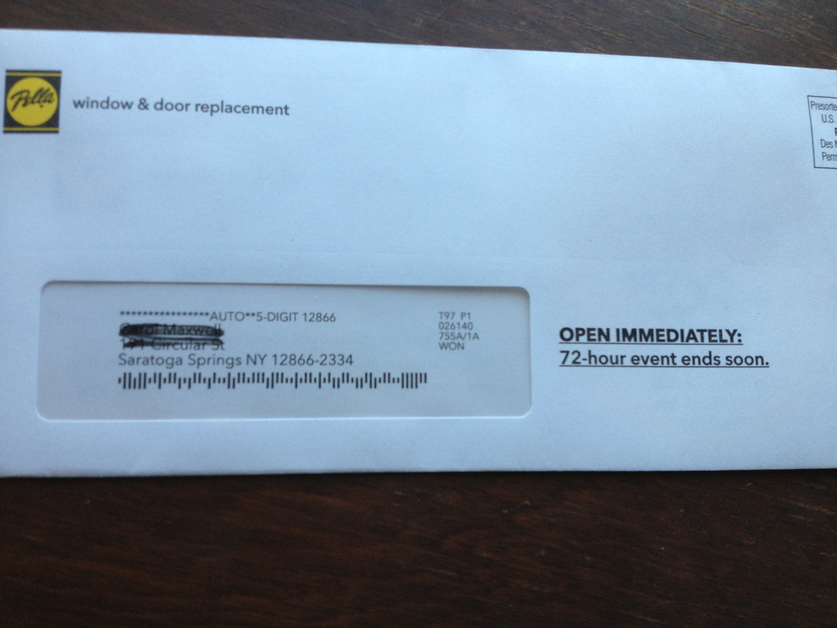
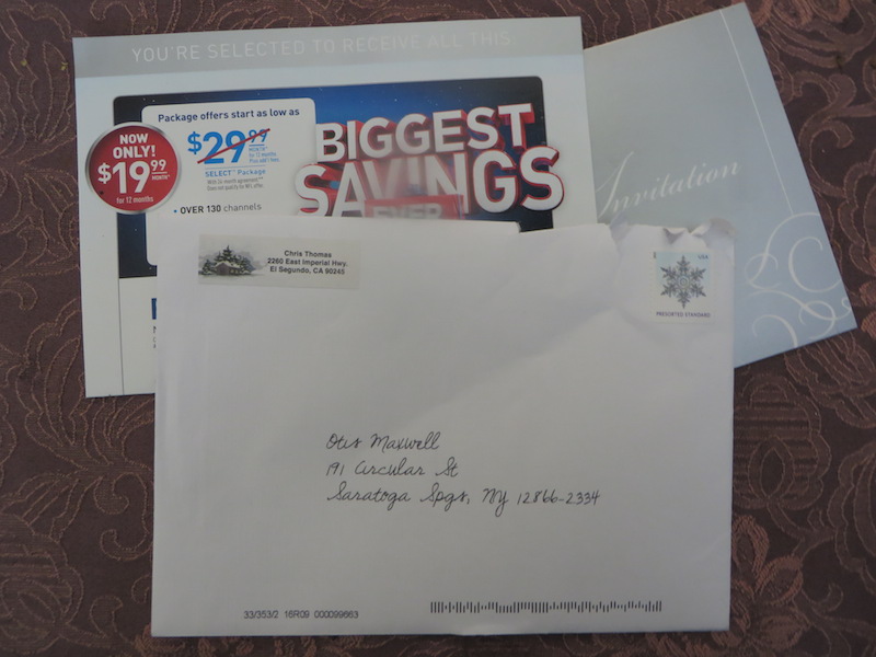
I got a Christmas card this week from Chris Thomas—or so I thought. I was intrigued by the seasonal address sticker and wondered who I knew in El Segundo, a community near LAX notorious for its predatory speed traps. I opened it up…and there was the familiar tent card invitation from DirecTV, which indeed has its corporate headquarters in that city.

The DirecTV invitation is successful judging by the frequency with which we all receive it; the question is whether this “made you look” twist on the outer envelope helps response. I’ll guess it does, because some people will open who otherwise wouldn’t, like me, and some of those may  be in a mood to churn their TV subscription. But is there a negative effect from people who are irritated by the trickery and become LESS likely to respond in the future?

The same question applies to a graduate student’s marketing experiment described in yesterday’s Wall Street Journal (it’s a long article, and this example is way down at the end). The researcher noticed that when a Salvation Army bell ringer was posted at one entrance of a mall store, shoppers would go out of their way to use the other entrance. He then posted solicitors at both entrances and had them directly request donations from some shoppers, and not from others.

Shoppers who were directly asked for donations were 60% more likely to give. That would seem to be a big win for the Salvation Army. But what about people who were irritated by the pressure and less likely to donate in the future (or maybe to visit that store)? Donors have memories and if you create a negative impression, does it hurt you in the long term?

I’d love to hear from readers who have some experience or thoughts on this. For me it goes back to my early experience with subscription and catalog direct mail when we definitely saw fatigue; mail somebody too often and they become less likely to respond, now or ever. I’m sure there is a negative effect from pushing too hard, and I’d like to know how organizations are factoring it into their fundraising.

What we can learn from college solicitation direct mail

My son is a high school junior who recently took the PSAT, so he’s receiving a ton of prospecting mail from colleges. The other night we went through a stack of these direct mail packs, and it was interesting to see his reactions.

There was a lot of good stuff. Overall, the colleges did a strong job of presenting what makes them unique, and if it’s not a good match for my high school student there’s no fault to either side. But he had a couple of interesting comments from which lessons can be learned.

A couple of colleges disqualified themselves for consideration with cut-rate production. Here’s a college he’s never heard of, and you send him a solicitation that looks like you’re operating on a shoestring, and out you go into the discard pile. Lesson: be aware of the competitive environment in which your solicitation is viewed. If you really can’t afford a professional photographer and designer, maybe a heart felt letter from the president, in laser addressed envelope,  is the way to go.

And, a good third of the schools wanted my student to continue the dialog by going to a special web page and logging in with his name and password. This is Gen-X, or even Baby Boomer, marketing: assuming people will feel special because you’ve gone to the trouble to set up a “personal web page”. My millennial found it laughable. Passwords and user names are for World of Warcraft and a discussion of them usually leads to how you have been hacked. He also drew amusement from how he was “gmaxwell” on some college sites but maybe “gmaxwell3” on others and wondered if that meant he was less desirable to the latter.

To me, the best of the bunch was a completely non personalized self mailer from Carleton College with body copy that started: “Nice work on the PSAT!” Do they have access to his score? No matter. Why not assume the best about him and give him a compliment he may or may not deserve?

Specifics sell… this example shows why!

National Parks
Beginning of the National Park Foundation’s email

Unfortunately, it’s an example of what NOT to do: The National Park Foundation saw the terrible wildfire currently out of control in Yosemite as a great opportunity to raise money for its cause. It’s exactly the same tactic used by The Salvation Army, The American Red Cross and many other charities which often have their best efforts on the heels of a disaster which triggers’ readers empathy and desire to help.

Unfortunately, as the NPF email was on its way to the coder some bone head saw the proof and said, “wait a minute, what about all the other parks? If they’re not in California, maybe they don’t give a hoot about Yosemite!” And so the “ask” was expanded to mention acts of vandalism, including green paint being splashed on the Lincoln Memorial.

I didn’t even realize the Lincoln Memorial was a national park, and it seems to me responsibility for cleaning it off (or keeping vandalism from happening) should rest with the local police. They then go on to tell us that there were 2,000 acts of vandalism in national parks last year and that the parks are underfunded. There’s also a reference to the fact this is the parks’ 97th anniversary and that the Travel Channel will match your gift. And they close with the unacceptably vague promise that a gift will “provide critical resources that directly aid and enrich our national parks and the work of the National Park Service.”

What should they have done instead? Leave the kitchen sink in the kitchen! In this case, a vastly stronger email could have been created by focusing entirely on Yosemite, saying how this makes us realize how precious our parks are and how much they need our support, and bringing in the Travel Channel match as exciting news that makes your gift go twice as far. Tell us very specifically what our contribution is going to do. Then get out.

And that anniversary announcement? Save it for the 100th, for goodness sake. Assuming this Foundation actually is doing good work, I hope they’ll be around that long. Meanwhile, this one goes straight to the Badvertising Hall of Shame.

Too much of a good thing from Values.com?

HenryFordValuesBillboard
Values.com billboard in Latham, NY

I pass this billboard frequently on a busy highway in upstate New York. It has multiple inspirational headlines stacked like cordwood: Driven/ Innovation/ Pass It On/ Values.com. To the left, a photo of Henry Ford (we know it’s him because there is a caption that says Henry Ford), driving (not being driven in) an early horseless carriage. The net effect is too much of a good thing, and I see it all the time, so I finally had to write about it.

Part of the problem is that the placement is a stone’s throw from Troy, NY, birthplace of the Arrow shirt, the cast iron stove, Uncle Sam and The Night Before Christmas among innovations. It sticks in our craw that they chose a non-local for their innovator. But the bigger issue is the multiple inspirational sayings when just one or two would do. It’s like too much candy on Halloween.

I headed over to Values.com to learn more about exactly what inspires them to inspire. It’s an interesting website. You can’t join them or give them money or get money from them; they’re doing this because “We believe that people are basically good and often benefit from a simple reminder.” Fair enough, and a good reason they deserve a little gentle nudging to make sure those reminders are effective.

There’s a section on the website called “Billboards” and on it you can create your own values billboard and look at it online, or look at billboards others have created. Each has one photo, one headline and one value and works a lot better than Values.com’s “Driven” effort. Give it a try. (But be sure your inspiration is not something naughty like “beer” or you’ll get a server error.)

By the way, what the website does not say is that Values.com is apparently funded by evangelical Christian Phillip Anschutz, who according to Wikipedia has also funded a think tank that criticizes evolution and a ballot initiative designed to overturn local and state laws that prohibit discrimination against individuals on the basis of sexual orientation. If I were Mr. Anschutz, I would identify myself and make my case on the website rather than leaving it to the curious visitor to go googling and draw their own conclusions.

Headline Horrors (outer envelope teasers that don’t)

Fresh Air camp appeal
What buses? Where are we going?

It’s been far too long since we’ve visited the Badvertising Hall of Shame… that corridor of horrors where unfortunate marketers teach us by example what NOT to do. Let’s begin with this outer envelope teaser from Fresh Air Fund.

This is a seasonal appeal I used to struggle with when doing work for Salvation Army… the “send an inner city kid to camp” fund. It seemed less urgent than putting food on the table or rescuing a child from the streets, and it was complicated because you’d have to create a word picture of why this was important before the reader got away. No missteps are permissible.

So look what Fresh Air Fund has chosen as its teaser: The buses are leaving soon… please hurry! What buses? Am I supposed to be on one? Why on earth does this not say instead, “The bus is about to leave for camp without me… please help!” (Singular better than plural because it’s more specific, and let’s mention the reason for the appeal for chrissake.) Also, while camps are universally recognized as a good thing buses are not. Seems like a terrible choice for the opening salvo in this appeal. Next.

Personal and Confidential OE
Do you believe this?

From… I don’t know who because I never opened it… I have a blind outer with nothing but PERSONAL AND CONFIDENTIAL printed above my name. Maybe I notice the “standard postage” indicia that spoils the illusion, but maybe I don’t; they’ve done a good job of designing something that looks like a real meter imprint.

But, look what’s above my name: PREPARED FOR: Okay, that’s too much and it’s also discordant with PERSONAL AND CONFIDENTIAL which suggests a very individualized letter, maybe a collection notice, whereas PREPARED FOR suggests a mechanized process like maybe a refund. Either would have been good on its own, together they cancel each other out. The blind outer has lost its intrigue so out it goes.

Pella 72 hour sale
When did the 72 hour sale begin anyway?

Finally we have this from Pella: OPEN IMMEDIATELY: 72-hour event ends soon. Well, is it 72 hours or isn’t it? If it is, it ends in 72 hours, not “soon”. The contradiction completely bursts the bubble of urgency and anticipation. Also, since this is clearly a piece of advertising mail, there needs to be more reader context, eg “Hurry! You’ve only got 72 hours to save” or “Open for your private invitation to our 72 hour preferred customer sale”.

That’s enough for today. Three examples in which the client or product manager is wondering why their mailing was not more successful, when in each case the fault lies with the copywriter who is probably making mischief on another campaign right now. I’ll have a couple more good ones in my next post.

Persuading people with social proof

Dr. Robert Cialdini is a psychology professor at Arizona State University who has conducted some interesting research studies with the help of his students. In the “hotel towel test”, he changed the language on signs in hotel rooms urging guests to reuse their towels. Compared to no sign, adding a standard message about “have concern for the environment” increased reuse 30%. But when the wording was revised to “three-quarters of the guests staying in this hotel reuse their towels” reuse increased to 44%. And when it was revised to “three-quarters of the guests staying in this room reuse their towels” reuse increased to nearly 50%.

In an interview with the American Psychological Association, Cialdini attributed these results to social proof: “If this is what people around you have decided is a good choice, it’s a great shortcut for you to determine what’s a good choice.” He cites a study by a Beijing restaurant in which a restaurant put on the menu, “these are our most popular items” and the items immediately became 17-20% more popular.

I thought about these results while working on a project in a new field for me, making requests for donations from college alumni. For the typical school well under half the alumni make gifts, so it’s fair to assume the ones who do give were happy with their experience or at least felt it was worthwhile. Thus the formula is to generate a mental picture of those halcyon college years for the reader, then tell them they can make the same thing possible for someone through their gift. You and your classmates were fortunate, therefore you should allow a new or current student to be fortunate.

Cialdini has another study in which the results backfired from what was desired, while upholding the principle of social proof. He distributed bits of petrified wood in the Petrified Forest Natural Park and tested signs admonishing visitors not to remove them. In situations where there was no sign at all, 2.92% of the pieces disappeared.

When a sign was added with a picture of several visitors taking wood and the caption “many past visitors have removed the petrified wood from the park, changing the natural state of the Petrified Forest”, theft actually increased to 7.92%. As copywriters we know this flabby third-party syntax is unlikely to persuade anybody, but what it does is introduce the concept of stealing wood to somebody who had not previously thought about it. And the social proof is that “many” visitors do this, so you should too.

A third sign showed a single visitor with a “no” symbol over his hand and the caption “please don’t remove the petrified wood from the park, in order to preserve the natural state of the Petrified Forest”. This reduced theft modestly, to 1.67% vs 2.92% for the control with no sign at all. It’s a direct request and clearly shows what not to do, but it’s not really social proof but a one-to-one message. What if the sign had said, “97 out of 100 visitors enjoy the park without disturbing its beauty. Thank you for preserving the natural state of the Petrified Forest”?

Cialdini summed up in an interview on NPR: “When we are uncertain about whether to be altruistic or pro-social or environmentally conscious, we look around us for the answer. We don’t look inside ourselves. We are all swept by the power of the crowd.”

World Wildlife Foundation bags it in new promo

I may have been a bit tough on World Wildlife Federation in my last diatribe. (Though it’s fascinating how many people search for “should we let the tiger go extinct?”) So instead of slamming their new direct mail deck, I’m going to assume there was a bit of slippage between the creative brief and the execution and suggest some ways they can tighten it up.

WWF outer envelope

On the front of the OE (the most important part of the entire package by far) we have the teaser, “Say no to plastic bags! See inside to learn how….” There’s a WWF logo as a corner card but it could just as easily have been WTF since it’s a complete disconnect with the teaser. On the back we have…. Plastic bags! Four of them, your gift when you “Show the World You’re Helping to Save the Environment” (note the Needless Use of Title Case, a telltale sign that nobody is minding the store).

I can see the copywriter and designer brainstorming this concept… sort of like the songwriting team in Smash, sticking index cards on a board then standing back and regarding them with furrowed brow… while the account director mutters in the background like a hapless Greek chorus.

Back of WWF envelope

Copywriter: “Here’s an idea. Lots of people would like to stop using plastic bags but they have no idea how. Let’s show them!” Designer: “I love it! Plus, we’re giving away our own plastic bag as a premium. Since we know they’re into plastic bags, let’s send them four instead of one.” Account director: “Doesn’t that send a mixed message? And what does that have to do with saving wildlife anyway. Oh, never mind…”

Inside, it comes together somewhat. There’s a buckslip that explains when you get your totes you’ll “carry them everywhere and help reduce the use of plastic bags.” And if you’re looking for the connection between wildlife and plastic bags, you’ll find it near the bottom of the first page of the letter, sort of: “The average American uses 350 plastic bags each year. And they don’t just end up in landfills… they end up in oceans, too. Every year more than 100,000 whales, seals, turtles and birds die as a result of plastic bags.”

Inside the WWF "plastic bags" promo

I turn the letter over, looking for details, and there are none. I know about the ghost sea of floating plastic in the Pacific off Hawaii, larger than Rhode Island. I imagine there are some ghastly Greenpeace-type tales to be told of birds getting their beaks caught in plastic bags, or animals choking on them. But the WWF copywriter does not bring it home with these details because they seem to have taken a vow about saying anything that may seem too harsh or negative. But wait a minute. Aren’t we raising funds for an environmental not-for-profit? Isn’t making people feel the pain what it’s all about?

I think the original assignment was “build a package around our free tote bags”. This is already a challenge because there is not an obvious and immediate connection between tote bags and wildlife. Somebody then decided to make it “educational” by helping people “learn” how to stop using disposable bags… that’s a rather condescending message to this audience which I expect is already environmentally savvy. And education in general (this package also has a “special insert” I am supposed to read called “10 Simple Things YOU Can Do to Help PROTECT the Earth”) is a deadly tactic for direct response. They aren’t going to stick around till the end of class, so you better ask them to reach for their wallet as soon as the tardy bell rings.

Really, the only way to make this package work is the simple logic of a/plastic bags kill animals b/here are some grisly ways c/you can stop the suffering by accepting our free gift. But the WWF’s creative team is into happy talk so they can’t do that. Time to bring in a new game warden.

Should we let pandas go extinct, or tigers? World Wildlife Federation wants to know.

Pandas, tigers, bears... oh, my.
Pandas, tigers and bears... oh, my.

In the Biblical Book of 1 Kings, Solomon must judge which of two women is the mother of a baby and, as a marketing experiment, he offers to split it in half. The bogus mom says “go for it” while of course the real mother says “she can have it, spare my child!”

This lesson was not lost on the new crop of marketers who seem to be in place at the World Wildlife Fund. They worry about which species you might like to support, so they give you a choice. Select a panda, polar bear or tiger, and to hell with the other two.

Of course, that’s not exactly what is happening. WWF wants you to “choose your favorite species” and they will send you a “symbolic adoption kit” consisting of an adorable stuffed panda/tiger/polar bear, matching tote bag, adoption certificate and “information brochure” when you make a commitment of $8 per month.

What is wrong with this campaign is a tone deaf absence of common sense. If you are a person committed to supporting threatened nature, “choose your favorite species” is fingernails on a chalkboard or a punch in the solar plexus. And as an adoptive parent I can tell you the concept of “symbolic adoption” is like that turd in the pie in The Help—gag-inducing repugnant. Adoption is like pregnancy. It is or it isn’t, no qualifiers allowed.

The devils that infest this package do more damage in the letter, whose first paragraph in its entirety is “You hear it every day:” Holy endangered pythons. Can you imagine a worse way to begin a letter than by acknowledging I am going to talk to you about something you already know? Then the final and fatal self-inflicted wound is delivered in the response device which, after all the lead-up in the letter and doubtless the campaign planning, reassures on the panel the recipient sees when opening the envelope that this is a “one-time gift”.

I actually have some inkling where this misbegotten concept originated. When my older son (not the “symbolic adopted” one) was about 4 years old, his big sister gave him an adoption certificate for an Asian tiger he was going to save through her gift. He was bummed because first, he wanted a stuffed tiger and second, he did not think he was up to caring for a real tiger.

You can see the wheels turning at WWF’s marketing department, before they came off. Great idea for grandparents! The kids are confused by the idea of “adoption” so let’s make it “symbolic”. And since polar bears, pandas and tigers are all just so cute, let’s give them a choice which they want to protect!

Sorry if I am on a bit of a high horse here, but we are not selling Bass-O-Matics®. This is a legitimate and well established not-for-profit with a very clearly defined mission. The sin, and let’s use that weighted word rather than just calling it a boneheaded mistake, was in forgetting a/who we are and b/who our audience is and c/where our mission and message intersects with their passion and desires.

If you’re a copywriter with recurring clients, you know this. An experienced WWF copywriter never would have come up with this concept because you have your client’s brand statement stapled on the wall of your studio if not tattooed on your brain pan. Pandas, tigers, polar bears, there’s room for everyone. Can we all get along?

The right way for marketers to say “thank you”

Two marketers contacted me to say “thank you” yesterday. The first was Starbucks, who wanted to thank me for being their customer with a free mini-dessert celebrating their 40th anniversary, if I made a purchase between 2 and 5 this afternoon. Then, the folks at Time-Life Books sent a thank you to me just for being awesome and for motivating and moving them with my “passion”. The subject line said simply, “thank you”. Nothing being sold here.

If a real person was thanking me in person, I’d find the Time-Life message much more sincere. But this is marketing. I found myself thinking, “dude, if you like me so much where’s the offer?” And the Starbuck’s message, cleverly built around getting trial for a new product at a slow time of day, was much more appealing.

Starbucks thanks you.

Time Life thanks you.

That’s the reality: the only way for a marketer to say thank you, and be appreciated for the gesture, is to include a gift or offer of some kind. Maybe charities are an exception. One of my favorite outer envelope lines was on a WorldVision mailing asking for a mini-sponsorship for a Third World child. The teaser: “Gift enclosed. But not for you.”

South by Southwest (SXSW) Interactive: Bikes and Ads

From SXSW Interactive, Day One

Alex Bogusky with the bike developed for Denver bike sharing

This is the conference where:

  • You have to wait in line 40 minutes to get the badge you preregistered for, thereby missing the introductory orientation session.
  • The volunteer who gives you the bag and conference program advises you not to take the program because you’ll probably lose it and they’ll charge $42 for a replacement; instead, you should come back at the end of the conference.
  • The management warns that you are not likely to get into many of the sessions you want so you should enjoy the sessions you do attend, which was called a zen approach.
  • Sessions may or may not have anything to do with the writeup in the program that brought you into the room. Which I guess is appropriate since you don’t know what you are going to end up attending.
  • Your iPhone doesn’t work for outgoing calls because there are too many people with iPhones. But wait, they have great wireless so you can use Skype.

As I write this I’m watching Alex Bogusky of Crispin Porter Bogusky, people responsible for Burger King, Mini and some other ads you probably really like. (Incidental advertising fun fact he shared about Burger King: in a day there are more impressions for the printing on the side of a cup of fries than two Super Bowls… so now instead of a BK logo [pointless, since people already know they are in a BK] the fry containers have a little story.]

His preso is titled “Plan B: Can an Ad Guy Bring Bike Sharing to America?” But in fact he warned it was not about that at all but rather a quick pitch for his agency followed by a serious talk about climate change. New info, channeling Al Gore: this summer, it rained for the first time in Antarctica.

But wait: now he does bring in bike sharing at the end. And a nicely designed pilot program his agency, Trek and Humana are doing where an advertiser can sponsor bike sharing and bike rack and cute logos on special Trek bikes for $1.2 million per year in a large city and get ad impressions for far less than a billboard or bus shelter.) The bikes are very cool, adjustable for people from 5 feet to 6 foot four with a nice aluminum basket for your stuff. I want one. Oh wait, that’s not the idea.