Boingo and the Netflix effect

I don’t have a lot of love for Netflix these days. But at least they are upfront about wanting to put their hand in my pocket. A much more insidious example of corporate greed showed up in my email this week with the subject line: Exciting Account Info, Boingo in the Sky, and a Celebration in Your Honor.

I signed up for Boingo wireless a couple of years ago when you had to pay through the nose for airport wireless access. I noticed that Boingo was often one of the carriers. I signed up for a month on a free trial, then when I tried to cancel at the end of the month they quickly lowered the $29.95 monthly fee to $9.95. I’ve been a subscriber ever since, though I’ve been wondering why since more and more airports offer free wireless now and, when they don’t, the Boingo network less frequently shows up as an option.

So, okay, I could use some exciting account news, and here’s what it is: Boingo wants me to download a new version of their app and, as soon as they do, my account will be tied to a specific wireless device. You get two devices so my laptop and Droid are ok, but if I want to add a tablet or occasionally connect on another computer, that’s another $5 a month per device.

That’s not exciting news, that’s a price increase, and I’ve hopefully avoided it for now by not downloading this Trojan horse of a new app (“It only takes a minute!”)  However, Boingo promises “lots of surprises between now and the end of the year” and I would not be surprised if one of those is the disabling of the current software.

Why you need an “escape hatch” in your user interface

If you have shopped at Ikea, you will notice that periodically you come across an escape hatch. You can stroll through the departments (which is what Ikea would like you to do because random browsing causes you to purchase additional merchandise) but if you get bored you can just duck through one of the little side doorways into a completely different department.

Good software user design includes an escape hatch as well. A good example is the TurboTax desktop product, which gives you an always-accessible choice of “Forms” or “EasyStep” so you can look at your current information in the way that makes most sense for you.

But I’m using TurboTax Online for the first time, and they don’t do that. The ONLY way to navigate is to follow the prompts on the screen, and if the prompts don’t work and you ask for help then Intuit twists itself into contortions trying to answer your question. (I’m talking about the in-program help, not the too-broad User Community sidebar.)

So, I want to import the return created with TurboTax Desktop 2009. I find a help screen with instructions which I’ll paste below (and cut out some info that is not pertinent):

Transfer Last Year’s Tax Info from Desktop to Online
Updated: 11/29/2010 Article ID: GEN12156
Below is the procedure for transferring (or uploading) a tax return created in 2009 TurboTax Desktop software to TurboTax Online 2010.
Follow these steps to transfer:
1. Sign in to TurboTax Online (or click the Create an Account or Try It First buttons).
2. Once you’re in TurboTax Online, click the Home tab and then select the first link in the lower half of the screen, titled Transfer last year’s TurboTax return from your computer.*
3. On the Transfer Last Year’s TurboTax Return screen, click Browse, and then select your 2009 tax data file. (Find last year’s tax file on Windows or Macintosh)
4. Click Transfer Return.
5. Once you see the message Transfer Complete, click Continue to start your 2010 return.

I assume you didn’t read all that, but I had to. I started from the top and followed the instructions to clear my 2010 return that I had started by accident. I looked for the link which they told me very clearly would be “Transfer last year’s return from your computer” but I saw no such link; instead I saw “we can help you transfer last year’s computer return from your computer”. Clicking that just resets the page I just reset, taking me nowhere.

Finally I notice the asterisk, and track down to the footnote at the bottom. It tells me:

* If you don’t see the Transfer last year’s TurboTax return link, it’s because you:
• Previously entered information in your 2010 TurboTax Online return; or
• Already transferred your 2009 data, either by uploading last year’s tax data file or by signing in with your 2009 TurboTax Online login.
Unless you signed in using your 2009 TurboTax Online login, you can click the Clear your 2010 return and start over link on the Home tab, and then resume at Step 2 above. Clearing your return removes all tax data from your return, so make sure you really want to do this.
However, if you signed in using your 2009 login, clearing your return automatically re-transfers your 2009 online data, making it impossible to transfer your desktop tax file. The only solution in this case is to create a new account in TurboTax Online 2010 so you can start with a clear return. [underlining mine.]

Again, I assume you didn’t read that so here is what is going on. IF you created a login last year, THEN you can’t transfer in a desktop return because TurboTax assumes you already have a return online. But I don’t because I created the return with their desktop product, then created a login for e-filing. It’s a Catch-22 which Intuit recognizes, hence their outrageous solution that I have to forget my old username and password and start anew.

This should never have seen the light of day. Whereas most companies urge you to set up an account and save your user name for a better experience, Intuit tells me the only option to get out of this problem is to forget I have a user name and start over with a brand new account. Boo, hiss. That’s what the lack of an escape hatch will do to you.

CES 2011: the chef has left the building

I did not have much luck finding a convection oven with multiple zones controlled from your iPad; in fact I had quite a bit of trouble locating the simple iGrill mentioned in my previous post on remote controlled household technologies. (If you happen to be at the show still, it’s in the Dr. Bott booth in the North Hall.)

Turns out there are just not a lot of technologies for controlling your home appliances remotely, not now and not in the immediate future. The closest I found to what I was looking for was a concept group from LG called the ThinQ; the ThinQ oven will tell you when its recipe is done and can be turned off or switched to warm from your handheld device. The ThinQ refrigerator knows what’s inside, so you can check in from the store if you forget whether you need milk or eggs. I also saw a Samsung refrigerator with a touchpad that accesses the internet and will check the weather or look up recipes; these are the key applications mentioned by a panel of working moms. But communication is one-way; you can’t input your own recipe for example. And all these devices are just ideas; they’ll never come to market in their current form.

If all you want to do is control electrical usage, we’re quite a bit further down the road as many manufacturers get ready for SmartGrid solutions that will adjust your power flow or delay electrical functions based on time-of-day metering. These devices talk to the utility’s smart meter via wireless or a powerline connection. Seems like it would be an easy enough thing to have the appliance accessible to the consumer, as well, via that same interface. And I hope some manufacturer or consortium of manufacturers will try that out soon. In the meantime, the IGrill looks pretty hip after all.

That’s it for CES; back to non-tech subjects in my next post.

Product wrapup from CES 2011

A product I didn’t expect to like, but impressed me, is the $449 neo-I from Optoma. it’s an iPod dock that has a sweet sound system and a picoprojector that projects a reasonable size image (say 3×5 feet) on a wall). They demo’ed it in a mocked up college dorm (beer bong not included) which looks like a great user case.

The product most likely to go nowhere: the Atrix suite from Motorola. In a year where everybody is selling a unified device in a do-it-all tablet, Motorola wants you to buy a component set that includes a phone that hooks into a dock that turns into a PC with a wireless keyboard that turns into a content input device for your HD TV. They call this a “PC in a phone” but it’s really an internet device with a few specialized apps; the demonstrated benefit was being able to show your vacation videos wherever you go. Nobody is going to want to buy and organize all these pieces of equipment. And to make it worse, their wireless partner is AT&T, master of dropped signals and a no-show at CES.

Under the radar technology that was getting the most attention: Hand gesture input for televisions. Like the Xbox Kinect, the Asus TV with PrimeSense has a microcam pointed at the viewer that reads your hand gestures so you can, for example, change channels by waving your arm up and down. A lot more elegant than yet another remote, even if it has a motion sensor like the Wii.

User interface design at CES 2011

Chopped arugula at ShowStoppers

There’s always a nice buffet at the ShowStoppers press event at CES. This year it included a beautiful arugula salad with orange slices. Trouble was, the long strands of arugula fell off the tiny plates they gave us. So by the end of the evening the kitchen was chopping the arugula into pieces that didn’t fall off the plates. User interface problem, solved.

It is not so easy for a consumer electronics company to change direction with its user interface, and I think that a lot of worthy products never get a foothold in the market because of poor or simply unfamiliar choices about the way the consumer interacts with them. This is allegedly the “Year of the Tablet” at CES, and indeed it is with hundreds of models on display. Tablets don’t have keyboards, so you have to design a way for consumers to manipulate the on-screen icons that is intuitive.

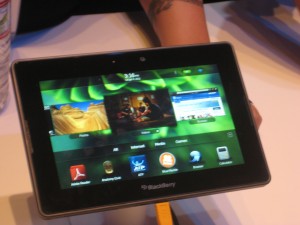
BlackBerry PlayBook
BlackBerry PlayBook

Most copied the iPad model with a grid of apps icons that you can select by touch. BlackBerry’s new PlayBook did something different and I liked it. There is a horizontal band of icons actual running applications [thanks to Peter Hansen, below, for this correction] across the middle and a dock of smaller favorite icons at the bottom. It’s a cleaner interface with much less on the screen. You can flick the band to left or right to expose more icons. When you want to activate an icon enlarge an application’s window you tap it and it fills the screen, but you can get back to a desktop by “rolling in” the edge from any of the four inner edges of the bezel. After a minute I was using it with ease. I wish RIM success with this device, although I’m a little nervous that they have not announced a battery life.

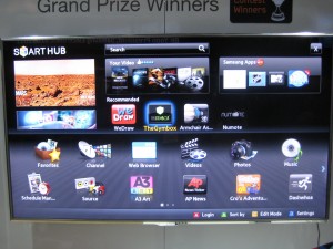
Apps menu on LG TV
Apps menu on Samsung TV

Less successful are the TV Apps I saw from Samsung and LG; I’m sure they are available from other brands as well. High-end “smart” TVs have a menu screen that looks like an overgrown iPad with big icons for sports programming, partner channels, and their own version of apps, mostly games and kid activities. The whole idea seems like a non-starter to me. How many people fiddle around with their TV menu instead of going right to the menu of the TiVo or set top box they’re familiar with? And tabbing among the icons with a handheld remote was awkward and reminded me how much more intuitive a touchscreen is.

A giant electronics company can absorb a mistake, but the same may not be true of  Anti Sleep Pilot, a device that mounts on your dashboard and monitors the driver’s performance and alerts you if it’s time to take a break. This is a very serious subject and a worthy thing to do but I wondered how they went about deciding how exactly to alert you and nobody at the booth could inform me.

The demo video shows a melancholy Dane who looks like he’s quite willing to cooperate but I wondered how it would be sold to Americans who are distracted to begin with. Here’s where the user interface makes a real difference. I’m told the warning sign, after you fail a certain number of tests, is a “chime”. Did they test that vs a buzzer or siren? I hope so. This is a product that truly will live or die by its interface. I watched it at ShowStoppers while munching my arugula.

GadgetTrak scribes best press release of CES 2011

GadgetTrak is a service that, if your smartphone or laptop is stolen, will snap a picture of the perp using the webcam and identify their location within a few yards, then forward the information so you can turn it over to law enforcement.

They could have told me about this with a standard press release that begins, say, “GadetTrak expands innovative protection service at CES 2011” but instead they sent this one which starts “Don’t Come to Vegas without Bringing Protection”. Smart and relevant double entendre. Then, they deliver the product pitch in a personal context a blogger can appreciate:  a reporter had his backpack stolen, and all the products he was going to review were lost forever… something that would not have happened if they were registered with GadgetTrak.

And finally, an offer: journalists can get a free month of GadgetTrack protection during the show, so they can try the product for themselves. This is followed at the end of the press release by contact information, web address for the presskit and so on…. all material that I know is going to be in there so no reason to lead with it.

Contrast this with a journeyman effort such as this which came from Westinghouse, but might have been sent by any of 500 TV brands here: “Westinghouse Debuts New LED And LCD HDTV Lineups At CES 2011: Super-Thin, Energy-Efficient Westinghouse Lineup Flagshipped By 60” LED And LCD Models.”

See the problem? With competition like this, GadgetTrak wins the “flack of the year” award with a first-round pin. And they demonstrate why you always need to sell your reader on the benefit of paying attention to your message… whether it’s a press release, a direct mail letter or a job application.

What’s cooking at CES 2011?

On the plane heading to CES in Las Vegas, I decided to think about innovations I’d LIKE to see prior to reading my sheaf of press releases to find out what I actually am GOING to see. This year I’m not looking for any dramatic product category breakthroughs. Instead I’m on the prowl for stuff that makes our life easier, especially when it comes to food and eating related tasks.

The iGrill Bluetooth thermometer mentioned yesterday is a good place to start. It’s pretty intuitive how it works without knowing much more than the name. You can be sitting in front of the game indoors and still monitor the temperature of your meat (or perhaps the internal temperature of the grilling chamber) and when it’s done, get up and waddle out into the sunlight to collect your perfectly smoked brisket.

At $99, the iGrill seems a bit pricey for a one-trick pony. It would be nice if, after reading the temperature, it can do something for you… like turn off the heat (if it’s a gas grill) or dump a fresh supply of wood or charcoal on the fire. And hey, how about a really smart convection oven that can show you temperature and airflow in your oven in a heat map diagram on your iPad and you can move your finger around to adjust things? Or, a device that releases an even supply of steam inside the oven to produce a perfect loaf of crusty bread? That doesn’t need to be electronic, probably, just a fancy teapot with tricky vents and valves. I’m digressing a bit…

Lots of devices are integrated systems these days…. think of your dishwasher, or clothes washer, and the multiple functions that happen at the touch of a button. These things are controlled electronically, so theoretically it does not seem to me complicated or expensive to add a software interface that lets you monitor and modify what’s going on. Then add the Bluetooth connection and software on the computing device, and you’re in business, right?

Every year there are a number of platform areas at CES…. a number of vendors following a common standard such as X-10 or Zigbee. The booths often seem kind of sad and underfunded and it’s hard to see them starting a revolution. Meanwhile some of the big vendors, often Panasonic, will develop a technology on their own and if it takes off then others adopt it. Such is the inefficient platform development system in conumser electronics.

I’d also like to see a solution that lets you retrofit a remote control, software based interface to legacy gadgets… like Slingbox, but for my bread machine. I have been fiddling with one of these devices and it shows promise. So, what if I want to set it from the road to turn on and have a hot fresh loaf waiting  when I come home? Slingbox’s secret is that it uses infrared technology,… a communications channel between the home entertainment system and a remote that is already there. The only interface to the bread machine is your finger. But, you’re saying, I could do all the programming and have some kind of delayed device to give power to the machine. That might work on some models but not mine; you have to unplug then plug it back in to input cycle instructions.

I am eager to see if some smarter soul has figured out some of these things for me…..

Blogger preview: CES 2011

Tomorrow I head west for this year’s Consumer Electronics Show in Las Vegas. The word is that LAS is packed, hard to get a taxi or a hotel room just like in the glory days. I’ll be attending press events on Thursday and Friday night, visiting a couple of clients, and trolling the floor for new and noteworthy things to write about.

In last year’s preview post (inexplicably titled “On my way to CES 2009”) I talked a little about my philosophy of working this show. I also predicted that 3D TV would be a non-starter… you read it here, and many other places, first. This year is supposedly “the year of the tablet” which also happened in 2003; I am more interested in things you can do with the tablet, such as iGrill, the world’s first bluetooth cooking thermometer you can monitor from your iPad.

My task on the plane is to scan some 300 press release emails and see if there is anything promising enough to follow up. Tip to flacks: like most people who will be writing about the show, I’ve been filtering my CES emails into a special folder. So if you don’t say “CES” in the subject line, you’re not visible to us.

Wearing my consumer hat, I am going to find what the ^% is happening with the content side of streaming video. Was excited to get an HD Roku for Christmas. Not so excited to discover that Netflix has just 20,000 streaming titles available, NOT including anything by the Coens, or Dumb and Dumber, or the Southland series from TNT. I’ve read that the studios seriously underestimated the appeal of streaming and delivered their content to Netflix at a bargain price, but if they’re going to just pull it back then we don’t have a seamless entertainment experience, do we?

Stay tuned…

Making the switch from iPhone to Android

After my frustration using my iPhone in San Francisco during the DMA earlier this month, I’ve decided to pull the plug. When my contract is up at the end of December I’ll move to Android, most likely the Droid X unless something better comes along. And will do this on the Verizon network, which I know as a former customer has far more towers in the two areas where I spend most of my time, San Francisco and Upstate New York.

My top 5 reasons for making the change:

1. Better coverage on Verizon. Yes, I could wait till the Verizon iPhone is released, but why? The other reasons are enough to switch.

2. Better GPS by all accounts. Even in good coverage areas, GPS in iPhone is near useless if you need to find something in a hurry. By the time the little dial has stopped spinning you are at/past your destination.

3. Ability to use the phone as a modem and tether my computer to the web. The iPhone offered this briefly, then took it away with a system update about a year ago. Having tasted freedom, I want it back.

4. Video camera. Like the idea of one fewer device to lug around when I need to shoot a quick video of something.

5. As a marketer, I’m looking forward to the experience of buying apps in a free market environment, both to experience the buying process and to see what’s available. Meanwhile, there are plenty of other Apple users in my family so I can stay up with what Brother Steve is doing.

And also:

6. Flash movies. This would be much higher on the list if I had confirmation it is working, but seems like it is. You need Android 2.1 or later which the Droid X has and you’re good to go.

7. I’m not sure I really like the idea of listening to music on my phone, as opposed to… an iPod! My two favorite headsets don’t have microphones, and I don’t feel like paying a lot to get a new headset that has both high quality audio and a decent mic. Seems like I am in a minority that feels talking on the phone and listening to music, even though both involve the ears, are two different activities.

Cool in tech: my favorite iPhone apps

I was asked what apps on my iPhone get used more often. Here’s a brief list, combined with a rant:

1.  ZipCar. How cool that I can reserve my car, unlock it, and find it in a lot by making its horn beep…. all from the iPhone.

2. Zillow. How much is that house actually worth? Ha! As long as I trust Zillow’s occasionally goofy algorithm, I can get the embarrassing answer while I’m standing right in front of it.

3. Pandora, as long as you appreciate its limitations. “Guy Clark Radio” turns up new thoughtful songwriters. “Robert Earl Keen Radio” is set to deliver songs about going to Mexico and getting drunk… not the right algorithm.

4. Yelp. Just plain essential if you ever go anywhere and get hungry.

5. NPR news.

6. Amazon. The other day I went to Walmart to buy a Smokey Joe mini charcoal grill, found they no longer carry it, ordered from Amazon while I was standing in the aisle. I also like that I can take a picture of something and they will try to find it for me (not always successfully).

7. Tiger Woods Golf. I know, I know. But I have learned a lot of golf by stroking my screen with the tip of my finger.

8. My bank’s mobile deposit feature. A problem that my bank is not in town. A solution that I can take a picture by aligning the check with the screen and deposit that way.

9. Email. This is actually the killer app for me. I don’t read much email in detail, but I do know when somebody is trying to get in touch so I don’t have to interrupt what I am doing and find a wireless connection for my laptop.

10. Caterday on YouTube. I said most used apps, not most used by me. For 8 year olds, a few Caterday episodes make a long car ride pass quickly. Then the battery runs out of juice, and that is even better.

And now the rant: why is it that location based apps (including several of the above) must find your location before they will load any of the program information such as your search box? It makes for a frustrating experience, often means that by the time you get to use the app you have passed whatever you were interesting in, and it just doesn’t seem necessary. WTF?