The sauce that made Mr. Durkee famous

I was introduced to Durkee’s Famous Sauce as a college freshman at the home of my roommate Reynold. His mother invited a homesick boy into their home for Thanksgiving and I discovered a ritual which included eating leftovers in sandwiches the day after with turkey, cranberry sauce, last night’s wilted salad, reheated dressing and gravy if you wanted it… all served on sturdy bread with a generous slathering of Durkee’s. That day their ritual became my own tradition.
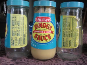
Durkee's jars through the decades. Click for a larger version to read the ingredient lists.

Durkee’s Famous Sauce is a niche product, literally, that somehow manages to hold onto a sliver of shelf space in many supermarkets year after year. It is a mayonnaise-mustard combination with extra richness that tastes like additional egg yolks… but the effect in a sandwich is more complex than that. It’s the sauce that holds its own when a lot of flavor notes are present. And though I know there are other uses, it is such a perfect partner with turkey (smoked as well as Thanksgiving leftovers) that I have never wanted to venture further.

There is lore suggesting Durkee’s is a traditional American recipe that was served, among other places, in the White House by Mary Todd Lincoln. But in fact the recipe has been through some changes over the years, as has the provenance of the expensive little jars. During my time the proprietorship has shifted from Burnes Foods of San Francisco (but manufactured in Canada), Tone Brothers of Ankeny IA, and currently ACH Food Companies of Memphis. The ingredient list shows that corn oil has been replaced by soy oil and water has moved ahead of vinegar as the second component with subtle changes in the preservatives further down the line.

By the time I am ready to open a new jar, the old one is either empty or pretty well past its prime so I have never been able to do a head to head taste test. But I do believe that the taste has remained consistent through all these permutations. Hats off to the food chemists… and Thanksgiving leftovers!
Maker Shed ate my children

My two boys are big fans of the O’Reilly “Make” concept. They’ve read the magazine, attended the Maker Faire, and would like a few blinking things in their stockings for Christmas. Unfortunately the lame makershed.com site makes this very difficult to pull off.

I’m presenting my experience not so much as a personal diatribe as a reminder that much of online shopping used to be this way. I invite you to cluck-cluck at these guys, then be thankful their practices are not more common.

I should be a pretty good prospect to Makershed since I subscribe to the magazine and have attended Maker Faires myself. So I get an email inviting me to enjoy the “deal of the day” which is an Arduino (that’s a blinking thing) with a $14 manual thrown in for free. Score! I click on the button and am taken to the website where I am told the manual is temporarily unavailable but I can download a PDF as part of the offer. WTF, that’s not so good, so I email help@makershed.com and tell them I want the offer but am in no hurry, want to wait till the book is back in stock.

You know what happens next: quick reply from customer service saying they have taken care of it. But not in the Makershed. It’s a full 5 days before they respond and say the offer is long past and the best they can do at this point is offer me a link to the pdf download.

So my boys will go Maker-less for Christmas apparently, but a couple weeks later a new email. Save 15% on anything with our special code on orders $125 plus. I click on the offer, get a message that says I have entered an invalid code. Click all over the email, same result. The hell with this, my boys need their blinking objects. So I do a search for Maker Shed on Google, find the site, put in my order, enter the special SAVE15 code… and am informed it expired a year ago.

I have no more time for shenanigans so I place the order and in a comments field point out that I tried to enter the 15% off code (I enclose a screen cap) and expect it to be taken off my total. 24 hours passes and I get a notice that my order has shipped. I click on the “my account” link to see if the 15% was taken off and am rebuffed because my password is not recognized… apparently Maker Shed allows customers to order without setting up an account but then gives you no way to check on order status.

You don’t want to hear more about my personal frustration with the above, which probably sounds like blab bla bla at this point, but I am not relating all this just to rant. At one time, a lot of e-commerce was like this… companies appeard quixotic and apparently uninterested in customer service because they didn’t actually have a clue about customer service, or else because they were overwhelmed at holiday time.

But today there’s not any excuse for this… especially since we are not anywhere close to the holidays. The learning and lessons:

  • Don’t go live before you have the elementals such as web links and savings codes locked down, which is where Maker Shed repeatedly fell down in my experience. It is particularly embarrassing because this is a “high tech” outfit but would be just as bad for a scrapbooking website.
  • Be accessible. Don’t take days and days to answer customer queries. These guys don’t even list a phone number!
  • If you do fail at the above two requirements, or even if you don’t, remember the customer is always right. Which is especially true if you have sloppy ecommerce practices and the customer is expected to pick up after you.

I expect that what has happened here is that the Make folks have simply contracted out the entire Maker Shed operation. They get a small commission and it’s somebody else’s problem to run the show. But that’s wrong. I used to think Make was cool. Now I think they are incompetent and rip-offs. That’s my left brain talking but my right brain is listening in.

Cooks Source: on the internet, everyone knows you’re a doofus

If you too are just now catching up with the Cooks Source train wreck, this LA Times blog entry is a good place to start. A small, low budget regional food publication printed a blogger’s post without permission (apparently this is the only event that is clearly documented and an uncontested fact) and when the writer protested, the editor or someone using the email of the editor of the publication wrote back and said everything on the web is public domain and the writer should be glad they were not sending her a bill for editing the piece.

I don’t have the complete chronology but apparently it was last Thursday, November 4, that all hell broke loose. Just before midnight on the 3rd, the blogger posted her account on her own very eclectic blog and by the next morning the story was everywhere including the LA Times. At some point it was discovered that Cooks Source had a Facebook page and that was when the pile-on began.

Some time during the day on November 4, the editor or someone with access to her account posted on FB, “Well, here I am with egg on my face! I did apologise to Monica via email, but aparently it wasnt enough for her. To all of you, thank you for your interest in Cooks Source and Again, to Monica, I am sorry — my bad! You did find a way to get your “pound of flesh…” we used to have 110 “friends,” we now have 1,870… wow!”

But of course, those “friends” were simply “liking” Cooks Source so they could post. The comments, assuming they are still there, are pretty funny for the most part but the whole experience certainly adds up to a public dunking or time in the stocks, which is appropriate considering that the original recipe was from a blog on medieval cooking.

After all that I got around to checking out the actual Cooks Source website, where there was an announcement that the magazine has taken down its website (sic), and shut down its Facebook page as of 6 pm on November 4. Unfortunately, the announcement continues,  the Facebook page is still there because it has been taken over by hackers. I wonder what the Cooks Source people thought they were doing and if they know it is actually pretty simple to take down your Facebook page if that is what you want to do. I hope nobody tells them because like I say, this is an entertaining read. Also, on the bottom of the non-website Cooks Source page there is an apology to the blogger which seems sincere.

This is a cautionary tale for how there really is no privacy on the web and no place to hide once you make a mistake. This particular editor (or some devious person portraying her) offended a particularly vocal segment of the population and apparently did not have the good sense to make a full and complete apology in time. Crowing about the situation on Facebook, if indeed she did this, was gasoline on the flames. If you’re wrong, or simply if you decide for your business survival to say you’re wrong, the only possible course of action is to apologize repeatedly, abjectly and without reservation to anyone who will listen. RIP Cooks Source.

Marketing the moment: why “live” is the new “live”

Born in Dallas and a longtime San Franciscan, I have taken an unusual interest in this year’s baseball playoffs. As my teams climbed higher my viewing apparatus got correspondingly smaller. The first round was watched in a hotel suite with big screens, the early games of the league championships on a tube set in a hospital room, and by the time we got to the final game where Texas beat the Yankees I was using the live update feature on ESPN on my iPhone.

Glued to the tiny screen as I was, I barely noticed that there were advertisers who wanted me to click away to their websites. In these days when we TiVo everything I wanted nothing more than to be on the screen at the exact moment when the rangers got the final out. On the other hand, this is a great spot for brand advertising. Anybody who inserts themselves unobtrusively in the heat of the moment, as ESPN did with some of its own self promos, becomes part of the experience and is carried along with the ride.

Yet the final out in a baseball game is one of the rare times when you can know that the drama is about to happen. Most baseball excitement is unpredictable, a lull shattered by sound and fury. Many fans miss the moment because they are kibitzing or out for a beer, so they rely on replays or on announcers to tell them how excited they are. It’s rare to have an end-to-end nail biter like the Giants’ final home victory when I told myself, “I’m watching a game for the ages” before the commentators informed me of that.

And this is something we marketers can do something with…. remind consumers how excited they were at some pivotal point in the past and then offer some product with a real or imagined tie-in. I did this with a video continuity program for an old series called Highlander, asking people to remember where they had been when they saw the show for the first time. (Not having been there myself, I channeled the experience of watching the final episode of The Fugitive, as a wee lad at a youth hostel in Scotland.) Didn’t win a pennant but it got an Echo and, more important, sold a bunch of videos.

Making the switch from iPhone to Android

After my frustration using my iPhone in San Francisco during the DMA earlier this month, I’ve decided to pull the plug. When my contract is up at the end of December I’ll move to Android, most likely the Droid X unless something better comes along. And will do this on the Verizon network, which I know as a former customer has far more towers in the two areas where I spend most of my time, San Francisco and Upstate New York.

My top 5 reasons for making the change:

1. Better coverage on Verizon. Yes, I could wait till the Verizon iPhone is released, but why? The other reasons are enough to switch.

2. Better GPS by all accounts. Even in good coverage areas, GPS in iPhone is near useless if you need to find something in a hurry. By the time the little dial has stopped spinning you are at/past your destination.

3. Ability to use the phone as a modem and tether my computer to the web. The iPhone offered this briefly, then took it away with a system update about a year ago. Having tasted freedom, I want it back.

4. Video camera. Like the idea of one fewer device to lug around when I need to shoot a quick video of something.

5. As a marketer, I’m looking forward to the experience of buying apps in a free market environment, both to experience the buying process and to see what’s available. Meanwhile, there are plenty of other Apple users in my family so I can stay up with what Brother Steve is doing.

And also:

6. Flash movies. This would be much higher on the list if I had confirmation it is working, but seems like it is. You need Android 2.1 or later which the Droid X has and you’re good to go.

7. I’m not sure I really like the idea of listening to music on my phone, as opposed to… an iPod! My two favorite headsets don’t have microphones, and I don’t feel like paying a lot to get a new headset that has both high quality audio and a decent mic. Seems like I am in a minority that feels talking on the phone and listening to music, even though both involve the ears, are two different activities.

The Chile Miners Diet

I for one could not get enough of the rescue of the Chilean miners yesterday. I spent much of the day watching “Miner TV” and I quickly switched to Telemundo so I could actually hear the statements of the rescued miners instead of Larry King talking over them. It was an inspiring example of teamwork on both ends of the tunnel and a testament to what determination and a little technology can accomplish.

The haters (including a few journalists) are now saying that it was no big deal, they weren’t actually in that much danger. Balderdash. For the first 17 days, when they had no idea whether they would be rescued, the miners subsisted on 48 hours worth of rations and when they were discovered the bloodwork showed their systems had started to feed on themselves from dehydration. The medics up top knew that to quickly bulk them up with candy bars or other sugar sources would send them into shock. So the miners got copious liquids… first water, then energy drinks, gradually giving way to protein and finally to empanadas that were specially shaped to fit in “la paloma”, the tube used for lowering supplies into the mine. By the time of the rescue, there was a little concern that some of the miners would fit into the rescue cylinder.

I predict that some entrepreneur will quickly come to market with “The Chile Miners Diet” consisting of this process… but in reverse. Start with a normal diet then strip away everything except protein and ultimately water. Hopefully it will stop at that point before the miners’ original state is reached. You read it first right here.

Why context matters in your advertising

We’ve talked before about verisimilitude—the principle that, in addition to actually being true, an advertising message must appear to be true or the skeptical public won’t trust it. A parallel concept is context… in any given environment the audience expects to receive information in a certain way and you can either fit in with this convention, or startle and gain attention by doing the opposite.

Ads or banners that look like editorial content go down like butter. Direct mail packages that look like they are official notices get opened automatically. Of course, you need to stay in character or the audience may feel duped if your message turns out different than it appears.

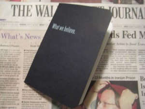
Frost's fake bank book inserted in the Wall Street Journal

For the “startle” approach, a good example was inserted with a recent Wall Street Journal (home delivered in Dallas, where I was traveling): unfold the paper and a bankbook falls out. Whoa, a bankbook! But it’s not really a bankbook because it has a headline on the front: What we believe.

Inside, we have ten spreads containing statements of belief, most of them no more than a sentence. Example: “We believe you get what you pay for.” It’s not until the very last page that the advertiser is revealed along with a CTA: We believe there is only so much you can learn from a book. Call (tollfree). WhatFrostBelieves.com Frost (logo)

Now, there’s nothing terrible about any of this… for a corporate website, or an annual report. But this isn’t marcom, it’s ADVERTISING and quite expensive advertising at that. I can see the boardroom wheels turning: Wall Street Journal readers are well heeled influencers. Let’s impress them with our sincerity and maybe they will become our customers.

Not likely. There is just too great a leap between a statement of purpose and high mindedness, and the actual activity of deciding to do business with a bank.  A few readers may pass the bankbook around their office as a curiosity but very few are going to do the thoughr process of “these guys seem decent enough, they’ve proved it by not trying to sell me too hard, therefore I will get a loan or open an account with them.”

The thing is, there is a way this promotion could have potentially been VERY successful: make it look like a real bank book. With nothing on the cover so you don’t give away that it’s marketing… or, wait a minute, let’s put the Frost logo on. That’s realistic and establishes brand up front.

Inside, some stage management—fake transactions.  The account holder has built up a huge balance, earned some nice interest, then withdrawn it all. (This is Texas, remember.) Tell a story with the numbers. The Wall Street Journal reader will like this. Then on the last page, a call to action: save a point on your business loan when you return this bankbook to Frost. That’s how you buy business by being out of context.

Anachronisms on “Mad Men”?

Is anybody else getting the feeling that the writers on the AMC advertising series “Mad Men” are messing with our heads as they get a little closer to the present day? Last Sunday, on episode #405 “The Chrysanthemum and the Sword”, we had:

Roger  referred to as being “out of the loop”, a phrase that could not have entered general conversation until knowledge of computer programming became widespread. Here’s a source that says its first published use (actually “in the loop”) was in 1970, though it’s acknowledged that it was used in the scientific community somewhat earlier.

Don taking his date to Benihana, a restaurant that was indeed opened in 1964 according to Wikipedia, with the first one in New York. However, it was very unsuccessful until the Beatles discovered it a year or two later so it seems unlikely it would have been as full as it was this night when Don ran into his rival for the Honda account.

And the week before, use of modern two-way mirrors for a focus group. Again, the internets tell us that focus groups were indeed a part of marketing as early as the 1960s but I have trouble accepting a modern setup vs sitting behind a curtain…. in fact I remember in my early advertising days (quite a bit later than 1964, by the way!) being admonished to be quiet because the participants could hear us.

Oh! And also recently, we find Peggy Olson hit on by the lesbian photo editor from Life she meets on the elevator. Peggy’s response: “I have a boyfriend!” For a conservative Catholic girl in 1964, wouldn’t a more appropriate response have been, “what are you doing?”

So not exactly untrue but skirting the edge of the truth, just enough to drive us, yes, Mad. And this is from somebody who took the trivia test on the AMC website and got 9 out of 10, by the way.

While I was at it, I forced myself to do a search for “Mad Men 9/11 falling man” because I have always recalled that unsettling photo as looking very much like the title sequence of Mad Men in which the ad man reclines as he plummets down the side of a skyscraper with a cocktail in hand. I had  remembered the 9/11 falling man as wearing shiny black shoes and a crisp white shirt, neither of which is the case nor is he reclining. As horrible as it is to go back there, this realization gave me some relief. I have no doubt that the image is seared into the memories of the Mad Men producers but I will now accept that it could be unconscious, instead of them making a particularly cynical analogy. I’m glad they are not messing with us in this instance.

Cool in tech: my favorite iPhone apps

I was asked what apps on my iPhone get used more often. Here’s a brief list, combined with a rant:

1.  ZipCar. How cool that I can reserve my car, unlock it, and find it in a lot by making its horn beep…. all from the iPhone.

2. Zillow. How much is that house actually worth? Ha! As long as I trust Zillow’s occasionally goofy algorithm, I can get the embarrassing answer while I’m standing right in front of it.

3. Pandora, as long as you appreciate its limitations. “Guy Clark Radio” turns up new thoughtful songwriters. “Robert Earl Keen Radio” is set to deliver songs about going to Mexico and getting drunk… not the right algorithm.

4. Yelp. Just plain essential if you ever go anywhere and get hungry.

5. NPR news.

6. Amazon. The other day I went to Walmart to buy a Smokey Joe mini charcoal grill, found they no longer carry it, ordered from Amazon while I was standing in the aisle. I also like that I can take a picture of something and they will try to find it for me (not always successfully).

7. Tiger Woods Golf. I know, I know. But I have learned a lot of golf by stroking my screen with the tip of my finger.

8. My bank’s mobile deposit feature. A problem that my bank is not in town. A solution that I can take a picture by aligning the check with the screen and deposit that way.

9. Email. This is actually the killer app for me. I don’t read much email in detail, but I do know when somebody is trying to get in touch so I don’t have to interrupt what I am doing and find a wireless connection for my laptop.

10. Caterday on YouTube. I said most used apps, not most used by me. For 8 year olds, a few Caterday episodes make a long car ride pass quickly. Then the battery runs out of juice, and that is even better.

And now the rant: why is it that location based apps (including several of the above) must find your location before they will load any of the program information such as your search box? It makes for a frustrating experience, often means that by the time you get to use the app you have passed whatever you were interesting in, and it just doesn’t seem necessary. WTF?

In media res with Groupons and social media

I have over the last year become a heavy user of Groupon, the viral couponing site that urges you to recruit your friends to share in the savings. Or, more correctly, a heavy buyer because I currently have more coupons in my bucket that I am able to use on my trips to the Bay Area. And that’s okay (for the merchant) because I’ve paid up front and they have my money whether or not I use the Groupon.

I will devote some time to talking about Groupon at my DMA preso on October 11, because this marketer is a great example of the “in media res” nature of social media. Traditionally there was one entry point for advertising. You hook them with your print ad, TV spot or direct marketing  and off you go.

But with social media, there are many possible entry points. Maybe you are on the email list. Maybe you get a Groupon offer forwarded by a friend. Or maybe you hear about it on a local TV news show, which is quite possible because of the “Groupawn” who has mounted a campaign to live successfully for a year with no money, just Groupons, and he wins $100,000 if he does.

Homer had some thoughts about plot construction when he wrote the Iliad and Odyssey some 3000 years ago. Instead of starting at the beginning of the Peloponnesian War, which many of his readers were bored sick about, he starts in the middle. Then the plot has occasional flashbacks but mostly you catch up as you go along.

For social media, what’s key is to have an anchor concept which is always present no matter when you arrive at the conversation. For Groupon, it’s the “live on Groupons” meme which was well articulated in a number of videos from contestants who promised to spend a year without money, using only Groupons (barter ok) to get their daily necessities.

You can “live on Groupons” because they’re so cool and the savings are so great, even if you don’t take it literally. That’s the message that gets across, no matter where you join the conversation.