The Amish marketing miracle… sadly, debunked

As a copywriter, I get goosebumps from promos like the “Amish Miracle Fireplace” full page ad which has been running of late. This is the Ronco/Popiel school of long form copy I pored over when I was learning my trade. (In fact, I once interviewed at the Ronco offices in North Hollywood. I recall they had the various examples of their direct marketing prowess… the Veg-o-Matic, Pocket Fisherman and more… lined up on a shelf like Teddy Roosevelt’s African hunting trophies). As a cub copywriter I felt these ads were more audacious than deceptive… they were so entertaining in their own right that no one should feel cheated if they didn’t get their money’s worth.
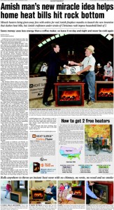
Ad for Amish Miracle Fireplace, from consumeraffairs.com

The Amish Miracle Fireplace copywriter would have old Sam Popiel sitting up in his grave and saluting. The miracle is the heater being promoted in the ad, which puts out a high level of radiant heat for such a tiny object and will be yours FREE as long as you buy a wooden box/mantle to house it, which is the part made by the Amish. A little sleuthing gets to how the marketer makes money: At $300 plus shipping, the price of the box is much more than the apparent value of the “free” heater. But still. So many marketing touchpoints here: thrift, American tradition, pride of ownership in something that makes your hope more cozy, who wouldn’t want one at the bargain price of free?

Unfortunately, the folks at consumeraffairs.com have burst our bubble. Their article is a miraculous bit of digging, and along the way they respond to such consumer queries as “I thought Amish people didn’t use electricity” and “I thought Amish people didn’t allow themselves to be photographed.” They also tell us why such endorsements as UL-approved and the Good Housekeeping Seal of Approval are essentially meaningless. And they point out that a device that produces the same level of electric heat (while sending your utility bill through the roof, by the way) can be bought at Target for $20.

The vice president of the company that makes the heater is interviewed in the article, and he is delightfully unrepentant. The “miracle”, he explains, is actually the imitation flames that are displayed on the front screen of the heater.  “These heaters are being called a miracle because they have what’s being called the ‘Fireless Flame’ patented technology that gives you the peaceful flicker of a real fire but without any flames, fumes, smells, ashes or mess. The patented ‘Fireless Flame’ looks so real it amazes everybody,” says David Baker, of Heat Surge in Canton, OH. I happened to have spent a weekend in Canton last fall and I wish I had had the presence of mind to check out this miracle for myself.

Is it time to reinvent your brand?

A friend and colleague made me fret this morning. He visited my blog and happened to read one of my posts about Toyota where I talked about “my recent issues” with a link to another article. He naturally assumed these “issues” were related to my own branding or marketing problems, since that’s what he reads me for, and was surprised to find an article about an automotive company.

I brought this on myself, more or less intentionally, by taking what is mostly a marketing blog and turning it occasionally into a bully pulpit for my rants on other “issues”. Though I have to say that the original Prius battery failure post has become the second-most read post ever on Otisregrets. And that my food posts draw a small but loyal readership who come for nothing but the food. So I guess I will be keeping it up.

The name of this blog is a bigger problem. “Otis Regrets” has been around a long time, since 2004 when it began as a venue where students in my copywriting class could exchange ideas outside of class. The thought of making it SEO-friendly was far from my mind… what was a search engine anyway? But I’ve since become painfully aware that “Otis Regrets” is buried by queries for “Miss Otis Regrets” and you’re not likely to stumble upon this blog by name unless you’re also looking for Otis Maxwell.

So here’s the lesson or moral for today. When you put up your website, transferring a meatspace or bricks-and-mortar personal or business brand to the web, you hopefully heeded the advice to provide useful content, not puffery. But it may not have occurred to you that your very brand needed a new look. The web was just one conduit by which people are going to look for you and identify you. Now we’ve got Facebook, LinkedIn, Twitter, maybe Yelp, and all the Namez, Plaxos, etc etc that are going to link to these larger communities and referral services.

Think, as an example, about how your Facebook identity might show up in the newsfeed of someone who is a friend of your own friend or fan, but so far has no idea who you are.  The brand needs to do some heavy lifting here. The new reader (who is a valuable referral because you’re connected through a friend) has to get an immediate positive idea of who you are and what you do. Traditional branding, even a traditional elevator pitch, takes too long.

The quality of your content… the news or activity that was quoted… has to do its part. But what about the brand itself? If it isn’t pulling its weight in terms of building instant appropriate comprehension, maybe it’s time for a change. I know I am thinking about this for my own brand, how about you?

On the value of “spec” creative (“spec” as in “specious”?)

Business is getting better, but I still make an extra effort to seek out potential projects I think would be fun or challenging. The creative director at one such client contacted me last week and said that frankly, their management was used to seeing potential creative resources do products on spec and I’d probably have to do the same if I wanted to get an assignment.

I sent a response in which I said, politely I think, that

There are two concerns I have on a philosophical basis about the whole idea of spec:

–for the writer, if you have other, paying clients waiting you are inevitably going to spend less time on the spec than a “real” assignment.

–for the client, there is the temptation to value the work on the basis of, it’s worth what you pay for it. They have no skin in the game, so they’ll evaluate the spec result less seriously than something they’ve paid good money for.

I didn’t hear back and not sure I will. This isn’t a stretch, by the way. It’s a category where I have done a lot of work for a competitor in the past and that work is easily accessible if they want to see “what I can do” in selling their product.

It’s my loss, but also theirs I think. If you demand spec work then you lose access to all the writers and designers who are too established or busy to be able to consider it.

And here’s something else. A good writer, especially a direct response writer, is going to go through a self-editing process (often unconscious). They will go through a series of drafts they never show the client because though they may sound sweet, they don’t have the oomph, benefit statements and sharpness required to sell effectively. This is something you don’t get from junior writers who may be great wordsmiths but not experienced salespeople. And if the client is used to choosing their talent pool from spec submissions, they may never know what they’re missing.

Along these lines, here’s a nice piece from a down-under designer on “Why Logo Design Does Not Cost $5”. Copywriting neither!

Travelers In-Synch campaign joins Badvertising Hall of Shame.

Mike Sciosa’s decision to take out John Lackey in Inning 7 of tonight’s Angels-Yankees playoff game has to rank among the all time worst decisions. But close behind it is the new In-Synch tagline from sponsor Travelers Insurance. That’s right, not “in sync” but “in synch” even though if you do a Google search for “Travelers in synch” they’ll correct it to “did you mean Travelers in sync”?

I’ve done advertising for Travelers in the past and trust me, they are not adding piercings and tatts to the traditional insurance pitch. This is an ill-advised attempt to slap on something of interest to a younger audience that would logically have little interest in insurance.

The ads, including a cute one with a terrier that ran during the game (he frets for his lost bone which he should have insured with Travelers) are standard stuff but then the bizarre tag line appears. “Travelers. Insurance. In-Synch™.” That’s right, in addition to pandering to 25-34 they are kowtowing to the legal department which is not the way to get the attention of the young and the restless.

Travelers, welcome to the Badvertising Hall of Shame.

Hidden money in your advertising (the direct marketing topic)

Last weekend I visited friend and fellow copywriter Dan Shaw and we were bemoaning the tight creative budgets in this economy. The issue is this: if a client can get an email or a web page written for $100 or $200, why in the world would they hire someone like us at several times that amount?

The answer is that you’re not just paying to get a project completed and checked off in your to-do list. You’re paying for results. And if a page costs 5 times as much to create yet generates 10 times as many leads, clicks, sales or whatever you’re looking for… then it nets out 50% less expensive. That’s hidden money in your advertising which is there for the taking as soon as you look beyond the basics of “how cheap can I get it”.

Writers and designers who do direct marketing well are compensated on results. If we interview with a prospective client we expect they will ask us to show us our “controls”—these are campaigns (the term usually refers to direct mail) that beat out competitive tests or previous controls so thoroughly they become the standard that is used again and again.

The more controls you have under your belt, the better you are likely to be compensated. Because your client is paying for results, they know that a writer who has the skills, instincts and experience to win repeatedly is likely to do better for them on the bottom line.

For example, Dan does some marketing to prospective college students who are choosing a school. He was telling me during our visit about a usability study he attended where he watched students as they interacted with web pages to see what elements appealed to them and were easiest to use. This translates into better results when he does his own pages for clients.  And his clients are quite happy to pay for that knowledge and insight.

With budgets tight, it’s very tempting for a marketing manager to just hire the cheapest provider and it’s tempting for a marketing director to review their direct reports on the basis of “how much money did you save me this quarter?” But it’s a cheap fix and in the end it may cost you more if your true goal is to get more customers, leads, donors, sales dollars etc. which of course it is.

Next time you bid out a project, take the extra step to hire somebody who’s good enough to charge more—and can prove it. If your management asks why you did not choose the cheapest possible solution, tell them you’re paying for results. And that’s how to find hidden money in your advertising.

Do twitter posts have a “voice”?

A good writer quickly learns the importance of developing a voice for his or her writing. Readers get more involved when they feel like a real person is writing to them. And over time you know what that voice is for a particular genre or publication and you fall into it like an actor playing a familiar part.

The author of otisregrets, for example, is somewhat professorial, a bit stuffy, yet tries hard to be approachable and takes extra care to explain what he means if it’s not immediately clear. While Otis M writing on Yelp is very different. That author is about 10 years younger and something of a wise guy. He uses catch phrases and occasional puns and enjoys going off on tangents in his reviews.

I know both these writers well and so do my readers. These voices haven’t always been there, as you can see from reading some early posts in either forum. I didn’t set out to be that person, but rather evolved into it over time.

All of which is my preamble to a theory on why I haven’t developed a habit of Tweeting frequently: I can’t find a way to develop a voice in 140 characters (which I try to keep to 120 for retweetability). By the time I say the bare minimum I have to say, I’m close to the limit.

After I realized this I started looking at other people’s tweets to see who had a voice I can recognize. @the_real_shaq has a voice, but he’s one of a kind. (Shaq’s eulogy for former NFL quarterback Steve McNair, who was shot to death yesterday: “Rip steve mcnair Roo roo q dog”) @broylesa has a voice, but she is nearly always writing about food in the Austin area… maybe very specific subject matter is a key.

Everyone else in my tweetstream is sticking to the facts, unless it’s personal. Here’s @heatheranne who works in advertising which is probably why we follow each other: “Trying to get glass out of my now-jammed garbarator. Oh my…” Now that is good writing, a vivid word picture plus a made up word and comment that makes you feel what she is feeling. I am going to go for adjectives and a personal aside next time I tweet and see what happens.

5 words that hurt (your marketing results)

Free! You! Now! We’ve all head about magic words that help your copy sell more effectively. But what about words that push readership and response in the opposite direction? Here is a starter list of five words (and word categories) to watch out for…. additional submissions appreciated.

1. “I”. Nobody cares about you, except your mother. Readers want to read about themselves. That’s why the presence of “I” in a classic marketing message is a clear indicator you are wandering into dangerous territory. (Social media is an exception, along with scenarios in which you expect to create a first-person story the reader will identify with.)

2. Even worse, “we”. Still in the first person, but now we’re talking about a corporate presence. “We” is a favorite word of posturing messages that are meant mainly to be read in the boardroom. Writing such messages is called “we weing all over yourself”. Try the We We Calculator to see if you are guilty of too much wee-ism in your copy.

3. “It”. Unless they’re already engrossed in your copy, when you use “it” the reader is going to have to refer back in the message to find out what the meaning of “it” is. They’re not likely to take the trouble.

4. Words that can be read more than one way. “Read” (present tense) and “read” (past tense) is one example. As is “lead” (make people follow) or “lead” (the metal). Anytime readers get confused because they have misunderstood your meaning, they’re likely to just stop reading.

5. Words that look similar enough to be misinterpreted by a hurrying reader. Example: “through/thorough/though”. If you depend on them to get your message across, you’re toast.

And, a bonus phrase:

6. “As I just mentioned”. Using this expression is what I call “as-backwards” copywriting because the reader probably doesn’t remember what you’ve just mentioned. You’re expecting them to reverse direction to find out when, more likely, they’ll just hit the delete button.

This is one of a series of excerpts from my DMA class, “Copywriting that Gets Results”.  Visit the Copywriting 101 category to see them all.

The role of predictability in advertising

Doorknob or handle: which would you choose?

The picture at left shows the inside of the men’s room door in the building where I used to rent a studio, in San Francisco. The knob is the way you get out of the room; the much more prominent grab bar is a useless appendage. During the 18 months I rented this space I used the bathroom certainly 100+ times… and at least 50 of those times I grabbed the bar because my sense memories “knew” that was the right thing to do.

People expect things to work a certain way. And this can have important implications when you’re marketing to them. Ads that play against expectations, especially in web video and TV, can surprise and delight and get through to a dulled viewer. But direct marketing pitches that veer in an unexpected direction—introducing a surprise element in the middle of a sales letter, for example—can turn off a reader and cause them to pitch your message in the recycling bin.

The difference with these scenarios: in the first, the prospect is on the outside, tacitly agreeing to let you try to entice them into your world. In the second, you’ve already created agreement and now you’re violating the contract. That’s why so many paragraphs in classic direct mail letters begin “that’s why”—to let the reader know you’ve established your point and are transitioning to another. And why many direct marketing pitches (including web pages and email, as well as print) will include what my clients at Rodale used to call “head nodders”—statements you know your audience will agree with, used to establish that you are on the same page and your message is reasonable and relevant.

It’s OK to be unpredictable… just as long as you know when to use and not use this strategy. If you’re doing intrusive advertising—which would include most examples of direct marketing—then it’s best to stay within expectations and avoid surprising your prospect except with the wonderful news of your offer and its benefits.

This is one of a series of excerpts from my DMA class, “Copywriting that Gets Results”.  Visit the Copywriting 101 category to see them all.

How to use a creative brief

A creative brief is a contract between the account team or project “owner” and the creative team. It quickly defines a marketing project so the creatives know what it is all about, what it’s trying to accomplish, and what are the budget and other parameters—no coming up with a web video when the brief calls for a small space ad.

I’ve worked with creative briefs from several dozen marketers and agencies over the years. Although there are variations, most follow the same outline—a series of questions which are answered by the account folks, approved by the client, then handed off to creatives:

  1. What is this project about in a sentence?
  2. What are we trying to accomplish?
  3. Who is the audience?
  4. What do they think about our product or service now?
  5. What do we want to think? Is there a specific action we want them to take?
  6. How are we going to accomplish this?
  7. Is there a specific offer?
  8. What are likely objections and how can we handle them?
  9. Are there any delimiting budget or production considerations?
  10. What sacred cows, legal mandatories etc. should we be aware of?
  11. What is the schedule?

As a copywriter and creative director, I like working with a creative brief very much. It reduces the element of surprise, tells me my clients will act professionally (and not pile on deliverables or insist “that’s not what I asked for”), and helps me organize my own thinking. In fact, if a creative brief isn’t provide I’ll write one for myself as a way to jumpstart my diminishing brain cells. (But I don’t tell anyone… this is a private and personal exercise. And I never write a creative brief on behalf of a client—something I’ve been asked to do—because that defeats the whole purpose of the document.)

In my copywriting class, I ask the class how many of them have worked with a creative brief and the “yes” group is always under 50%. Then we do an exercise in which we divide into teams and each group follows a prewritten brief to come up with a concept for a space ad. (The class is primarily about writing email and direct mail, but the space ad gives us something to show.) This is a very popular activity. Afterward most of the students say they will demand, or write (if  they’re managers), a creative brief for their next project.

Not everybody I work with personally gives me a brief. Almost without exception the clients who provide a brief are more organized, better funded, and less likely to self-destruct in the middle of a project. Yet it doesn’t cost anything to write a brief, just time and thinking you should invest anyway toward a successful result.

If you’re not now using a creative brief, give it a try on your next project. You will be pleased.

The “CEO Letter”

A client and I got into a wrangle recently when he asked me to write a “CEO letter” to other top execs who would be joining him at an event, and the result was not what he expected.  Here’s what I responded by way of explanation:

There’s been a fair amount of discussion and research on this topic in the DM community, as you might expect, and I’ve myself written a number of “C level” or “CEO” letters over the years. I think there is universal agreement the most important characteristic is BREVITY.  An efficient CEO is not going to get down in the weeds of an issue because of an unsolicited letter. What you need to do is instantly establish relevance, describe an action which is quick and easy to take—eg NOT “I am going to take time to research this company because they have provided me with some interesting stats and education” but rather “I am going to ask my marketing director to include this company on his short list to check out”and then get out.

As for tonality, the most important element is showing the reader you respect his or her time as a fellow CEO and makes clear the offer of a personal demo. The tonality consists in being brief, terse and to the point much as if you would be talking to him or her in person.

Do you write letters to high level executives in your own marketing? What works best—brief and to the point, or laced with personal elements? (That’s what my client was expecting, I think.) Inquiring minds (mine, anyway) want to know!