Does your direct marketing need a Letter Doctor?

I started my direct marketing career in the 1980s, a quaint bygone era when there was no internet. One of my favorite resources was a perfect bound magazine called Direct Marketing and one of my favorite contributors to said magazine was Luther Brock, “The Letter Doctor”.

Brock would take a sort of self-help approach to copy critique. He would pick a common marketing problem, present a few paragraphs from a letter (possibly not a real one) that was not solving the problem so well, then make suggestions for improvement. It was a diagnostic approach: you know things are supposed to be a certain way, but they’re not; what’s wrong, and why? Of course he was promoting his own services as a freelance copywriter, but there was lots of good information to a fledging.

I expect Luther Brock is no longer among us. A 1958 graduate of a Denton, TX high school is listed on the internets as the owner of a business called The Letter Doctor, so this is probably Luther’s son. Another person, I assume unrelated, owns the domain lettterdoctor.com and markets from that website. The original Letter Doctor probably never saw any reason to claim the domain name; what was an internet domain anyway and who cared? (In the very early days of the World Wide Web, we looked up numerical domain identifiers, not names.)

I found myself invoking the spirit of the Letter Doctor today when a client asked me to take a look at some not-successful lead generation direct mail. There were some bullet points of features and benefits: did they really know those were the most powerful message to their audience? There was an informational offer: was it really the best appeal to the target reader, and was it stated appropriately? In short, this robust and experienced company needed a checkup, same as any of us.

Do you have a letter doctor–someone who’s willing to poke and probe and make recommendations based on how your marketing differs from expectations? If not, it might be worthwhile to seek one out.

What are you on, Diet Coke?

Diet Coke Kiosk
Diet Coke’s fiendishly ironic (or not) kiosk at Fisherman’s Wharf; click the picture for a closer look.

The riskiest kind of advertising is that in which you are so much inside the head of your audience that you can actually poke gentle fun at them and they will be appreciative rather than insulted. My favorite successful example is an etrade billboard that towered above San Francisco in the height of the dot-com craziness: “Sure, it’s scary. But so is falling in love.” Sly reinforcement of the trepidation the internet bubble investor was feeling, and implication you should do business with etrade because they understand. Of course, this love affair didn’t end very well, but that’s not the copywriter’s fault.

A less good example is the badvertising kiosk I photographed at the Hyde Street turnaround, one of the most touristy areas of San Francisco. “You moved to San Francisco with a crowd-funded website. A dad-funded hatchback. And a no-funded bank account. You’re on. Diet Coke.” Please tell me how the target of this ad could be anything but insulted.

To parse it, you’re a loser who can’t afford to buy a car and you have no money in your bank account, and you’ve moved to San Francisco like thousands of other idealistic young people who are about to get a harsh lesson in reality. The “crowd-funded website” is what does the greatest damage here, though. I don’t think the copywriter (who I have the feeling is some old cackling dude in New York, with arthritis-gnarled fingers, who last visited San Francisco when Carol Doda was performing on Broadway) has any idea what a “crowd funded website” is—that’s actually quite a complex thing to pull off, hardly in the wheelhouse of somebody who can’t balance a checkbook. No, they’re just trying to paint a picture using some phraseology they grabbed out of Wired magazine and the general idea is that’s what young people move to SF for these days, instead of serving coffee at Vesuvio.

Actually, it isn’t, necessarily. There’s quite a battle among young people these days for the city’s soul as evidenced by protestors vomiting on the massive buses with the black tinted windows that whip the techies back and forth. Being an internet billionaire is not on a par, karma-wise, with being discovered playing your guitar in Golden Gate Park. The stock photo (behind the Diet Coke logo) of the “Painted Ladies”, another touristic attraction with little meaning for the young scrounger unless he sleeps under the bushes in Alamo Square, and the very location of this kiosk where few actual San Franciscans would see it all suggest the campaign was conceived by a couple of nicotine-stained hacks peering out the dirty windows of an office in Midtown Manhattan.

I haven’t yet mentioned the tag line, with its subtle-as-a-brick double entendre. Note in the photo that the period in “You’re on. Diet Coke.” is in a smaller font than the rest of the type (compare it to the punctuation in the body copy) to give us an extra wink. Oh. I get it. “You’re on” is one of those anthemic phrases like “let’s ride” but they just couldn’t resist suggesting the youngster is hopped up on caffeine and artificial sweeteners.

Which makes me wonder…. Could this actually be intended as irony? Is it in fact designed for the tourists, inviting them to mock the Friscans they know are mocking them? If so, genius. But I don’t believe that is what is happening here. Diet Coke team, if you’re reading, please tell me it is or isn’t so.

Playing the “oops” card in email marketing

Have you noticed how many emails you get these days with a subject line like “OOPS, we goofed” or “please accept our apologies”? Then you read and it’s a company that you may or may not recognize, telling you that they previously sent out a message in error saying that your discount was void when it really wasn’t, or they sent out a very private offer by mistake to the entire list and now they’re going to have to honor it?

Made you look, didn’t they? It’s the virtual equivalent of the good old “our buyer goofed” sale. We made a mistake, and you can reap the benefits, you greedy bastard you.

Well [IF YOU ARE MY CLIENT, PLEASE STOP READING RIGHT NOW], I found myself with a natural marketing opportunity this week when my internet service provider actually did face an “oops” moment in real life. It seems that SpamCop went all Putin and decided to block all kinds of completely legitimate non-spamming email servers. The ISPs have to plead to be unblocked and even after they are, it takes some time for the pending emails to resolve  and be delivered.

After thinking I was having a wonderfully peaceful week, I discovered today why I was not getting replies to my various project-based emails: they hadn’t been delivered. Several frantic hours were spent following up to re-send from gmail, in each case asking the recipient to confirm receipt.

Several of these were emails I wouldn’t normally expect to be answered: a casual conversation with a prospect, for example. But when I re-sent they dutifully said yes, I got it which means they read my email. Wait a minute! So this gave me the excuse to email a few folks [YOU CLIENTS AND PROSPECTS AREN’T READING THIS, ARE YOU?] I have been trying to light a fire under and saying hey, I’ve been trying to reach you, maybe the emails just haven’t been delivered, I’m still interested in working with you!

Try it yourself, if you dare. Disclaimer: professional driver on closed course. Possible side effects may include drowsiness and over-optimism.

What we can learn from college solicitation direct mail

My son is a high school junior who recently took the PSAT, so he’s receiving a ton of prospecting mail from colleges. The other night we went through a stack of these direct mail packs, and it was interesting to see his reactions.

There was a lot of good stuff. Overall, the colleges did a strong job of presenting what makes them unique, and if it’s not a good match for my high school student there’s no fault to either side. But he had a couple of interesting comments from which lessons can be learned.

A couple of colleges disqualified themselves for consideration with cut-rate production. Here’s a college he’s never heard of, and you send him a solicitation that looks like you’re operating on a shoestring, and out you go into the discard pile. Lesson: be aware of the competitive environment in which your solicitation is viewed. If you really can’t afford a professional photographer and designer, maybe a heart felt letter from the president, in laser addressed envelope,  is the way to go.

And, a good third of the schools wanted my student to continue the dialog by going to a special web page and logging in with his name and password. This is Gen-X, or even Baby Boomer, marketing: assuming people will feel special because you’ve gone to the trouble to set up a “personal web page”. My millennial found it laughable. Passwords and user names are for World of Warcraft and a discussion of them usually leads to how you have been hacked. He also drew amusement from how he was “gmaxwell” on some college sites but maybe “gmaxwell3” on others and wondered if that meant he was less desirable to the latter.

To me, the best of the bunch was a completely non personalized self mailer from Carleton College with body copy that started: “Nice work on the PSAT!” Do they have access to his score? No matter. Why not assume the best about him and give him a compliment he may or may not deserve?

Chrysler, Dylan show how not to use celebrities in your advertising

Much has been made of the expensive nonsense that was the Chrysler ad in last week’s Super Bowl. What does “more American than America” mean? And is it disingenuous to proclaim “you can’t import American pride” when Chrysler is in fact owned by a German company? What was most troubling to me, however, was the way that Bob Dylan’s most public product endorsement (surprisingly, there been others) turned him from an icon into a pitchman.

The use of Eminem and Clint Eastwood in the two previous Super Bowl spots was brilliant. Eminem didn’t appear till toward the end and he looked like an anonymous and well-dressed young hipster, no visible tattoos, prompting many viewers to say “who’s that?” (The theme of the spot in that dark year, by the way, was “Imported from Detroit,” a direct contradiction to this year’s.) There’s no hiding Clint Eastwood’s voice, but the man himself was in shadows until the very end for the “halftime in America” spot, another piece of brilliant writing and staging.

By contrast, Dylan is in almost every frame of the 2014 spot so it comes to seem like a “you’ve seen him on…” retrospective. It doesn’t deflect the blatantly obvious to have the ironic cut of him flipping through his own albums in a record store. And at the end he does in fact turn to us and come right out and say it: “we will build your car.” And if you act fast, you’ll get a bonus set of floor mats!

Celebrities stand for something beyond their (often tawdry) actual selves. If you pay to put them in your advertising and fail to leverage that aura, you’re shooting yourself in the crankcase. The only exception might be the Ed McMahon/Bob Dole category of commercials used to pitch to an elderly audience, which is believed to have great respect for figures of authority. Come to think of it, Dylan’s actually old enough to join those ranks.

Here are the actual words to the Chrysler Dylan 2:00. Thanks to Mike Wayland, Michigan Live automobile blogger, for providing them so I don’t have to watch the spot over and over again to write them down.

Is there anything more American than America?
‘Cause you can’t import original.
You can’t fake true cool.
You can’t duplicate legacy.
Because what Detroit created was a first
and became an inspiration to the… rest of the world.
Yeah…Detroit made cars. And cars made America
Making the best, making the finest, takes conviction.
And you can’t import, the heart and soul,
of every man and woman working on the line.
You can search the world over for the finer things,
but you won’t find a match for the American road
and the creatures that live on it.
Because we believe in the zoom,
and the roar, and the thrust.
And when it’s made here, it’s made with the one thing
you can’t import from anywhere else. American…Pride.
So let Germany brew your beer,
Let Switzerland make your watch,
Let Asia assemble your phone.
We…will build…your car.

And, here are the Eminem and Eastwood spots in case you to watch and compare.

Direct marketers think we’re pretty gullible, it seems

The best scams and con games involve an element of human greed: that wealthy banker in Nigeria who made you his heir because of an incident you don’t remember, and may actually involve someone else; the check that reaches you by accident yet has your name on it and is perfectly legal tender. In the more adept scams, the next step usually is to tap into your bank account. In direct mail, it would typically be a subscription or sale of some kind.

Water Park Voucher
Timeshare “fake check” offer

In our more cynical age these tactics may not work as well, and I don’t see them as often. But they show up every now and then, like embers of a dying fire that flicker back to life. This “fake check” example charmed me with its absurdity: Indoor Water Park Voucher Enclosed/Verification of Delivery Information Required/FINAL NOTICE. Wow, that’s a lot of security to deliver what looks like a discount to an amusement park. But I did open it and it turns out it’s a timeshare offer, which happens to include admission to the water park. And if this isn’t enough, there’s a kicker: “our records indicate that by responding within 48 hours you will also receive a $100 Restaurant dining card”. I am almost tempted to take advantage of this offer to see what kind of person responds. Almost.

It’s easy to poke fun at the individual who would be lured into buying a money-sink timeshare purchase by the offer of a free ride on a water slide. But what about the distinguished prospect for Forbes, a respected business magazine? Would they really be motivated by that violator lower right on the envelope that says DO NOT BEND?

Forbes Do Not Bend
Forbes “DO NOT BEND” offer

The target for this tactic was, traditionally, somebody who isn’t used to getting a lot of respect. The reason the package says “do not bend” is that a photo is inside (or sometimes a computer punch card, or a certificate of some kind). Wow, I’m so important that Steve Forbes, president of Forbes, is sending me a photo. But the funny thing is there isn’t any photo, or anything else which would be harmed in any way if you folded this mailer in half and stuffed it in your pocket.

Forbes is using a mass-production format and so you can bet they’ve done plenty of testing, and from that they’ve found out that hinting at an enclosed photo, then not providing the photo, is a great way to save some money without reducing response. In other words, it works, or they wouldn’t be doing it.

It’s humbling that such mailers are effective, and especially humbling that my household was deemed a ripe enough target to receive them. Maybe I should pack my bags for that 3 Days and 2 Nights including Water Park Passes for 4 guests, after all.

How to write a good lift note or publisher’s letter

International Living mail pack
Here’s the complete International Living mail pack. Click the photo to enlarge to a readable size.

The lift note, or publisher’s letter, is an additional element in a direct mail package which is designed to elevate (lift) the response rate and profitability sufficiently to repay its printing and production costs. It might highlight the offer, answer one specific objection, spotlight a key benefit, or emphasize the penalty for not responding.

The pub letter is a variation which is literally a communication from the publisher. The conceit is that he (in the old days, always a male) grabbed the mailer proofs as they were on their way to the printer and was inspired to add a personal message. He might talk about his pride in the product, make a guarantee, or offer the classic “frankly, I’m puzzled” perspective in which he wonders why more people don’t respond to such a great opportunity and urges the reader not to lose out.

We don’t see too many lift notes in today’s lean direct mail packs, but I received a fine example recently from International Living. These folks are one of the last old-school newsletter publishers and they send a classic 8-page letter about the low costs and lifestyle benefits to be found retiring abroad.

The pub note, which is personalized and the first thing you see upon opening the package, begins: “I’m concerned that you have not had a chance to review the enclosed letter”. The publisher (now it’s a she) drops in a paragraph describing the product then continues, “in the past, you may have received an invitation from us. However, I’m quite sure you have not received one recently…” and then goes on to sell not the newsletter, but the investment of 10 minutes of my time to read the rest of the package components.

What’s nice about this is that the copywriter took the knowledge that the name was rented from a list of people who have not been prospected previously, and turned this into a very personal message and benefit. (Reminds me of the classic Emily Soell letter for Vanity Fair which begins “if the list on which I found your name is any indication…”)

Does it work? I sure hope so. In essence, by elevating and personalizing the lift note, International Living has turned it into the driver of the package. The preprinted long form letter, which today’s distracted readers are less likely to pay attention to, becomes a supporting brochure. It’s a great way to refresh an appeal to an older audience which today is far more cynical and less trusting than the previous generation. I’m definitely going to try this tactic for myself, next time I have the budget to write a package with lots of components. How about you?

Why your writing could use an AutoCrit

I am working on a book, and before sending it out I wanted to eliminate as much sloppy language as I could. I’ve been experimenting with a tool called AutoCrit which I recommend to anyone who writes long form copy–and best of all you can try it for free.

The sample free report (which is limited to 500 words, but you can chop up your copy and make three submissions per day) will identify overused words and tell you how many to eliminate, and also identify cliches and redundancies. I was particularly happy at how often it flagged “it”, a trouble word that slows down readers because they have to take the time to figure out what “it” refers to if it’s not obvious.

The paid versions, which start at $47 for a year’s subscription (you can currently get 10% off with the promotion code fb2013), also identify repeated words and homonyms. Sometimes we repeat words intentionally, but sometimes it’s accidental, and the result is that the narrative loses texture and the reader might actually notice the repetition when the flow of your narrative should always be seamless with all grammatical tricks behind the scenes.

Homonyms are words that sound like other words–eg “in” which sounds like “inn”–and they’re mostly innocuous. But this feature will also catch words which can have more than one meaning, and those are deadly–“lie” being an example; the skimming reader might not know whether it refers to something in a prone position or someone who’s not telling the truth. (Something it doesn’t catch, but you should be vigilant against, is words that look similar to other words so they can be mistaken by the reader–“through” and “though” being an example pair.)

Seeing your text in the context of the report also helps you look at it with fresh eyes, and catch typos or awkwardness you might otherwise miss because you’re too close to it. I took perhaps 10% of the suggestions AutoCrit had for me, but that 10% has definitely improved my manuscript. Check it out.

Is this the John Caples of 2014?

Neetzan Zimmerman
Neetzan Zimmerman

Almost a century ago, John Caples wrote one of the most famous direct response ads of all time: “They laughed when I sat down at the piano. But when I started to play…” Caples combined a homespun way with words and a scientific approach to analyzing the interests of his audience, as documented in his classic Tested Advertising MethodS.

If John Caples were to re-animate, be zombified, or simply time-shift to the present day, what would he be writing now? Maybe something like the work of Neetzan Zimmerman, who was recently profiled in the Wall Street Journal. Zimmerman doesn’t write space ads, long-form direct mail or emails. He’s an editor at the website Gawker, where he’s charged finding story threads that are so irresistible, people not only read them but pass them along, in huge viral numbers, to their friends.

Zimmerman was responsible for “Mom Fined $140 Every Day Until She Circumcises Her Child” and “Black Man Arrested Dozens of Times for ‘Trespassing’ While At Work” among countless other gems. His posts generate an astonishing 30 million page views a month, more than all other Gawker contributors combined. When they linger on his posts, web visitors see the ads that accompany them; that’s the Gawker revenue model.

According to WSJ, Zimmerman’s ability to draw traffic allows Gawker to subsidize other deeper and longer pieces. He’s the equivalent of a retail loss-leader, but with words. Like Caples, he combines a scientific curiosity with the ability to connect with his audience on the topics they care about—“cute, outrageous, heartwarming, hilarious, anger-inducing” being some typical threads.

Zimmerman starts each day by analyzing the metrics (Twitter and Facebook mentions) for popular stories, then deciding which ones to pass along. “Within 15 seconds, I know whether an item is going to work,” he told WSJ. “It’s a biological algorithm… I’ve put myself into the system—I’ve sort of become the system—so that when I see something I’m instantly thinking of how well it it’s going to do.” He adds that he can no longer tell the difference between stories he finds interesting and stories that will be popular. “If it’s not worth posting then I’m not interested.”

Lee Euler, a savvy newsletter publisher who was my client at one time, describes this as “the common touch”. It’s not enough to write well, to know your subject and audience, to deliver up benefit statements that get readers reaching for their wallets. To be a truly great and consistently control-busting copywriter you need to be able to connect with people on a visceral level, where they trust you and want nothing more than to hang on your every word. It’s a rare gift, and this guy seems to have it.

Behavioral Economics at DMA2013

Dan Ariely is a professor of psychology and behavioral economics at Duke University, and also a consultant to the Wilde Agency. Yesterday he delivered an entertaining and eye-opening keynote called “Who Put the Monkey in the Driver’s Seat?” in which he documented irrational and yet predictable human behavior for the benefit of the direct marketers at DMA2013.

First example: statistics for organ donor signups in European nations. Organ donation doesn’t hit all the altruism hot buttons because it happens after you’re dead, and the recipient will never know who provided the life-saving transplant. So it’s not surprising that donations are close to zero in some countries, such as Germany. Yet in demographically similar nations, such as Austria, donations are close to 100%. The difference? In the high-donor nations people have to opt out at their DMV if they don’t want to donate and people will do almost anything to avoid doing something.

ArielyInsurance
This buckslip produced a 588% lift.
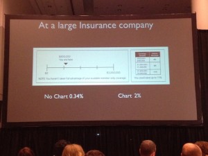
Moving on to direct marketing: a large insurance company wanted to improve response for its affinity accidental death offer. So a chart was added on a buckslip, showing people that although they are eligible for $3 million in coverage at present they are only at $800K. It’s obvious at a glance that the reader is missing out. Given a reference point, response increased from 0.34% to 2%.

Another example is a response form for The Economist. Given the choice of an online-only subscription for $59, print-only for $125, or online plus print for $125, 84% opted for the last option. Who wouldn’t—it’s like getting online for free! But in fact it’s a significant upsell for anyone who was considering an online-only subscription. And when the print-only option was removed the numbers reversed: 68% went for online-only, vs only 32% for the online plus print combo.

ArielyBigData
Ariely poked fun at the direct marketer’s infatuation with Big Data.
As a creative practitioner, I eat this up. It’s one thing to sell your prospects through a positive reception of your carefully presented benefits, but much better if you can cement the sale by making them feel like they’ve gotten a great deal or they aren’t missing out. As to that organ donor stat, most of us have found that negative option offers (in which you have to opt out to keep something from happening) lead to poor pay-up, conversions and renewals. But if the consumer is dead, I guess that isn’t a problem. Fascinating stuff.