Twitter Bios: the 160 character sales pitch

Here is a great project for your copywriting class or inhouse brainstorming session: give everybody five minutes to write the best possible Twitter bio, which has to be 160 characters or less, including spaces.

Your Twitter bio is what shows up in another user’s inbox when you follow them and they make a split second decision about whether to follow you in return. The New York Times had a nice sidebar piece in which they join Slate and the Washington Post in anointing Hillary Clinton’s bio a superb example of the craft:

Wife, mom, lawyer, women & kids advocate, FLOAR, FLOTUS, US Senator, SecState, author, dog owner, hair icon, pantsuit aficionado, glass ceiling cracker, TBD …

It states her qualifications, though not in a pompous way. It veers off into some relevant light touches (Hilary’s lack of hair savvy and her predilection for pantsuits are well known non-presidential attributes) which are amusing without being frivolous.

A bio like that promises that the tweets also will be interesting, and that you may meet other cool folk by following her. It’s much more effective than a straightforward statement of qualifications, or an unabashedly promotional bio like the one Lady Gaga is currently running: BUY MY NEW SINGLE ‘APPLAUSE’ AND PRE-ORDER MY ALBUM ‘ARTPOP’ HERE NOW!

Before writing this post I checked my own neglected bio for @otisregrets and found it pretty terrible:

Results-focused ad copywriter; blogger about writing, marketing, customer service, technology and more.

I gave myself the five minutes and came up with:
I write direct response ads, web pages, emails, direct mail & whatnot. Gold Echo & Caples Silver Cup winner. Guilty pleasure: streaming bluegrass videos at work.

Some work qualifications hopefully written in a  casual way… but I don’t like the personal aside because it might imply to some that I bill for time when I’m actually not working. (I don’t.) So I tweaked it to:

I write results-oriented ads, web pages, emails, direct mail & whatnot. Gold Echo & Caples Silver Cup winner. Read my blog for marketing tips & off-topic rants.

The blog’s a good call to action since that is indeed where I want the reader to go next, and the throwaway about “off topic rants” will hopefully garner curiosity. I’m sure I can do better but I only had 5 minutes. Let me know how you do on your bio.
Money in your mailbox

“Money in your mailbox” was the mantra of many a get-rich-quick offer in a simpler and sunnier era, promising greedy and gullible people they could run a successful mail order business from home. Simplicity has fallen on hard times, as has the United States Postal Service, and interesting direct mail examples are increasingly rare. But I hit a hot streak recently and will share them with you.

LLSouter
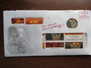
Outer envelope of Leukemia & Lymphoma Society mailer

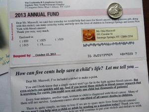
First up is a package that literally has money in it, “How can 5¢ save a child’s life?” from the Leukemia & Lymphoma Association. This is a worthy but small organization and they went to the big agency that makes the address labels and a junior copywriter was assigned to the job. I know the copywriter is junior because they never answer the question!

The letter starts, “I’ve included a nickel to make a point. You and I both know that a single nickel won’t go far in the fight against blood cancers. But even nickels can quickly add up. And if you invest these nickels in blood cancer research that is searching for clues, you could save not only one child but thousands of patients.” Then the nickel is referenced in passing on the ask sheet: “your generous gift, along with this nickel…”

LLSInside
Letter intro from LLS package

The copywriter wasn’t comfortable with the (probably mandated) concept so they disparage it. No, a nickel really can’t do much. I’m just enclosing it to make a point. But what if they’d told us about one thing that actually does cost a nickel in research and used that as a stepping stone? And said I want you to send as many nickels as you can spare… and keep this one or pass this along and tell another person about the need. Take the time to make the reader think and visualize, instead of going through the motions.

DiscoverOuter
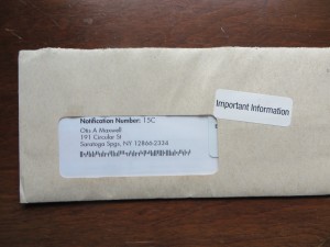
Mystery outer envelope from Discover

Next up is one of those cleverly art directed packages that you want to open out of curiosity. What’s new is the peel off sticker next to the window that says “important information”. It looks like somebody working at their desk literally printed that off from a sheet of Avery labels and stuck it on the package. The placement of the sticker calls attention to a plastic card inside, its corner just visible through the envelope window. So I have to open it and discover… it’s a “proof of special invitation status” from Discover. They want me to take out a personal loan; if I was in the market for a loan they certainly would have gotten my attention.

HRC
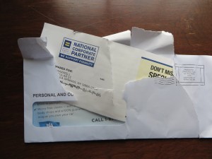
HRC package after opening by 11 year old

There’s a story behind the next package, another anonymous package which has been torn into pieces. My 11 year old asked why I was recycling this without opening it and I pointed out the clues: “personal and confidential” but with a standard mail indicia indicates it’s a piece of junk mail. But he insisted on opening it (by ripping it apart). And lo and behold, it’s an affinity offer to supporters of Human Rights Council, a LGBT political action group. It’s not that long ago that all mail referencing the recipient’s LGBT status was delivered anonymously to protect their privacy but I am going to guess that any HRC member today would be proud to announce their affiliation. This is one anonymous mailing that should NOT have been anonymous; Nationwide Insurance could have multiplied their response by putting something simple like “A special announcement to HRC supporters” on the OE. But I’m guessing this is a standard format that is used by Nationwide for all kinds of affinity groups so that possibility never even crossed their mind.

PostageDue
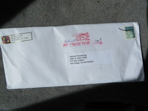
Why is there 20 cents postage due on this letter?

Finally, a word about the sheer incompetence of the USPS which has to be a factor in the decline of direct mail. Back in the day when I was direct mail manager for a department store, we had to hire a “postal consultant” because it was impossible to communicate with the post office directly about the most efficient and cost effective ways to make sure our mail got through. Time and time again, the USPS has shot itself in the foot with oblique self-serving practices when it could have thrived if it treated itself like the business it claims to be.

This envelope is an example. It was rejected and returned “postage due” 3 weeks after mailing. It’s not overweight, so I took it to my local post office and asked for an explanation. They said it’s probably because of the cardboard square inside, the UPC from a product box, which I was returning for a rebate. It made the envelope “non machinable” and when it got stuck in the automated feeder it was kicked out, where it sat in a pile for a few weeks till somebody processed it. Turns out there is a 20 cent surcharge for “mail containing a rigid object”. Bet you didn’t know that. Metal’s obviously rigid, but what about a piece of cardboard? I guess if the automated equipment rejects it, it’s rigid. The machines have taken over; too bad they’re not more discerning.

Specifics sell… this example shows why!

National Parks
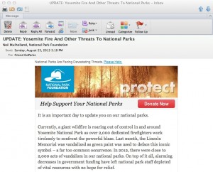
Beginning of the National Park Foundation’s email

Unfortunately, it’s an example of what NOT to do: The National Park Foundation saw the terrible wildfire currently out of control in Yosemite as a great opportunity to raise money for its cause. It’s exactly the same tactic used by The Salvation Army, The American Red Cross and many other charities which often have their best efforts on the heels of a disaster which triggers’ readers empathy and desire to help.

Unfortunately, as the NPF email was on its way to the coder some bone head saw the proof and said, “wait a minute, what about all the other parks? If they’re not in California, maybe they don’t give a hoot about Yosemite!” And so the “ask” was expanded to mention acts of vandalism, including green paint being splashed on the Lincoln Memorial.

I didn’t even realize the Lincoln Memorial was a national park, and it seems to me responsibility for cleaning it off (or keeping vandalism from happening) should rest with the local police. They then go on to tell us that there were 2,000 acts of vandalism in national parks last year and that the parks are underfunded. There’s also a reference to the fact this is the parks’ 97th anniversary and that the Travel Channel will match your gift. And they close with the unacceptably vague promise that a gift will “provide critical resources that directly aid and enrich our national parks and the work of the National Park Service.”

What should they have done instead? Leave the kitchen sink in the kitchen! In this case, a vastly stronger email could have been created by focusing entirely on Yosemite, saying how this makes us realize how precious our parks are and how much they need our support, and bringing in the Travel Channel match as exciting news that makes your gift go twice as far. Tell us very specifically what our contribution is going to do. Then get out.

And that anniversary announcement? Save it for the 100th, for goodness sake. Assuming this Foundation actually is doing good work, I hope they’ll be around that long. Meanwhile, this one goes straight to the Badvertising Hall of Shame.

Serotta Bicycles and the “quality of time”

BenSerotta
Ben Serotta explains the “quality of time”

Last month I got a tour of Serotta Bicycles, a world-renowned high-end facility located in my little town of Saratoga Springs, New York. These bikes cost from $4800 to over $28,000—and that’s just the frame. But the painstaking details make it seem worthwhile—from a machining process that can take a stock titanium tube and give it 3 different diameters and three different thicknesses, so it has light weight along with the perfect balance of strength and flex at every point along its length. The total process from beginning to end takes about 40 hours to produce a finished frame; the shop turns out an average of 3 per day.

All the other visitors were current owners who’d come to see the mother lode, and there were esoteric questions about discontinued models and “why don’t you use steel anymore?” (Google that one with Serotta in the search box.) Finally I had to ask the question, why does it take 40 hours instead of 39 or 41? How do you know when it’s done?

Founder and President Ben Serotta said it’s about the “quality of time”. He wouldn’t amplify on that and when I asked a local bike evangelist and Serotta enthusiast to explain it to me, he was silent. So there’s a bit of mysticism afoot here and I will make a couple of educated guesses.

SerottaAlighing
Frames are aligned after every assembly stage, making this the most important machine in the shop

First, quality of time means diminishing returns. As nearly perfect as these bikes are, the finish will never be completely immaculate. (Even though in the final polishing step they use 2500 grit sandpaper, which feels as smooth as a baby’s bottom.) There’s got to be a point when an hour produces so much less benefit than the hour preceding it that you’re spending your own money or raising the price for no good reason, so you stop. Second, bicyclists spend a lot of time in the saddle. If incredibly subtle details can make for a more productive or efficient or competitive ride and so improve their quality of time, they’re worth doing.

Both these hypotheses have application in copywriting. As a creative practitioner, I charge several times what a junior copywriter would charge and there are people who charge several times more than me. Here the time you are paying for is experience—the knowledge and instinct based on past work that a particular message and way of presenting that message will work better than all others. It’s probably not necessary to hire a senior copywriter to write a coupon for your dry cleaning establishment; someone who can follow basic common sense marketing rules (and mayn can’t) will be fine. But if you’re planning to mail millions of people or launch an elaborate website, then the cost of the creative becomes a relatively minor one and it pays to pay more for the best.

SerottaFinish
Final step: polishing with 2500 grit sandpaper

The other way to look at “quality of time” is in the experience of the user—the prospect or retail customer who is the recipient of your message. The more time you spend understanding that person’s preferences and motivations—whether through research or hunches—the better their experience is going to be when they receive your message and the more likely they will respond positively.

I may never be able to afford a Serotta bike but it’s something to aspire to—especially because the way to making the money to buy one lies in maximizing my own quality of time.

How to be a good tech writer

The other day a marketing colleague asked me to write him an email which he’d pass along to his CEO, about why I should be hired to write technical copy. Feel free to use these selling points in your own self-marketing, assuming of course they apply.

The first thing I believe about tech writing is that you need to understand the product—-not necessarily on a programmatic level, but the problem it solves, and why it does this better than other options. I’m not a scientist but I love to learn how things work.

Secondly, I believe that technology buyers are people with the same personal motivations as those buying consumer products. They want to be secure, avoid conflict and achieve recognition and in an indirect way technical products help them do this. They get promoted because they’ve contributed to the bottom line. They get to go home on time instead of staying to placate angry users.

Finally, I always ask to interview the sales team so I can understand the objections that are typically raised and the hot buttons that get prospects excited about the product. I go to CES most every year (and attended Comdex before that) and spend most of my time hanging back near kiosks to watch sales engineers do technical presentations.

I believe these steps are missing in a lot of the copy I read for technical companies which reads like a laundry list of specs. I spent most of my career working in the Bay Area, and my work was typically lead generating direct response that was tested against other messages and I usually won.

To my fellow copywriters, I’ll add that I won consistently not so much because I was a dramatically better writer, but because I was diligent in my preparation. As Yogi Berra may have said, half of success is showing up.

Attention copywriters: nobody likes a downer….

Just finished watching “Young Adult” with Charlize Theron. The good news: great performance, solid directing. The bad news: it was free on Amazon Prime, barely 12 months after release. And therein hangs a story….

This movie is a downer. A ghost writer of “young adult” fiction gets a birth announcement for the baby of her old boyfriend. On a whim she decides to return to her small hometown and win back the old beau and in the process gets tangled up with a former classmate who was or was not gay but in any case was maimed by jocks who thought he was gay and now is as physically crippled as she is mentally. Are you laughing yet?

I wanted to see this movie when it first came out based on some trailers showing Theron trying to hide her dog checking into a motel and other deadpan moves. So did 8 or 9 other people but it didn’t work. The plot is incredibly depressing and you do not leave the film with an uplifted morale. So nobody wanted to see it except a very few who told their friends to stay away.

Moral for us copywriters is, nobody’s going to read something that makes them feel bad. Okay to turn on the spigots of negativity, but be sure to transition to that golden shower of redemption before you’re done… AND you need to let them know at the outset that said redemption is in sight. Make sense?

Headline hijinks revisited with Bose, Wall Street Journal and Coke Zero

Bozz
Bose speaker ad
We’re back as promised to that corridor of horrors where tyro copywriters go to die. But this time we’ll focus on the context in which your headline/outer teaser is read and include a couple of positive examples.

First, some badvertising from Bose on the back of a Sunday newspaper insert… about as broad a demographic as you can find. “If you think watching TV is exciting, wait until you really hear it.” There are two things wrong here. First, the copywriter assumes universal agreement that “watching TV is exciting”. If it’s not a head-nodder then the reader is lost. But do we all agree that “watching TV is exciting”? Not likely. Second, there’s an intellectual contortion required to stay with the writer’s train of thought. When you switch from one action mode to another (watching… to listening) that’s some heavy lifting for the reader to do in their mind’s eye. Not likely they will stay around for the body copy, and neither shall we.

wsjwelcomeback
Wall Street Journal “welcome back”
Now look at this envelope from the Wall Street Journal: “Welcome Back”. Apparently I renewed after a lapse but don’t remember doing so; naturally, I’m going to open the envelope to see what I agreed to. And when I get inside it turns out this is their standard “professional courtesy discount” offer; they WANT to say welcome back and maybe I will feel a little guilty about getting an offer that maybe I’m not entitled to so you can guess I’ll jump on that. The two simple words “Welcome Back” do a brilliant job of framing the conversation and getting me involved.

CokeZeroDontRead
Coke Zero “don’t read” banner
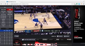
Same thing with this Coke Zero banner that ran during the NCAA championship game: “Don’t read this banner. There’s basketball on.” Well, of course I’m going to read it because I can’t not do so. But in this chest-bumping environment I will give you huge points for the apparent cool factor. Yet it actually ties perfectly into their tag line, “enjoy everything”.

The copywriters on the WSJ and Coke Zero projects thought about the environment in which the prospect is viewing the ad, and meet them on their own turf. The Bose copywriter asked readers to switch from what they’re doing to what the writer wants them to think about. Which is better and more effective?

Headline Horrors (outer envelope teasers that don’t)

Fresh Air camp appeal
What buses? Where are we going?

It’s been far too long since we’ve visited the Badvertising Hall of Shame… that corridor of horrors where unfortunate marketers teach us by example what NOT to do. Let’s begin with this outer envelope teaser from Fresh Air Fund.

This is a seasonal appeal I used to struggle with when doing work for Salvation Army… the “send an inner city kid to camp” fund. It seemed less urgent than putting food on the table or rescuing a child from the streets, and it was complicated because you’d have to create a word picture of why this was important before the reader got away. No missteps are permissible.

So look what Fresh Air Fund has chosen as its teaser: The buses are leaving soon… please hurry! What buses? Am I supposed to be on one? Why on earth does this not say instead, “The bus is about to leave for camp without me… please help!” (Singular better than plural because it’s more specific, and let’s mention the reason for the appeal for chrissake.) Also, while camps are universally recognized as a good thing buses are not. Seems like a terrible choice for the opening salvo in this appeal. Next.

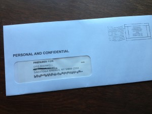
Personal and Confidential OE
Do you believe this?

From… I don’t know who because I never opened it… I have a blind outer with nothing but PERSONAL AND CONFIDENTIAL printed above my name. Maybe I notice the “standard postage” indicia that spoils the illusion, but maybe I don’t; they’ve done a good job of designing something that looks like a real meter imprint.

But, look what’s above my name: PREPARED FOR: Okay, that’s too much and it’s also discordant with PERSONAL AND CONFIDENTIAL which suggests a very individualized letter, maybe a collection notice, whereas PREPARED FOR suggests a mechanized process like maybe a refund. Either would have been good on its own, together they cancel each other out. The blind outer has lost its intrigue so out it goes.

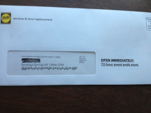
Pella 72 hour sale
When did the 72 hour sale begin anyway?

Finally we have this from Pella: OPEN IMMEDIATELY: 72-hour event ends soon. Well, is it 72 hours or isn’t it? If it is, it ends in 72 hours, not “soon”. The contradiction completely bursts the bubble of urgency and anticipation. Also, since this is clearly a piece of advertising mail, there needs to be more reader context, eg “Hurry! You’ve only got 72 hours to save” or “Open for your private invitation to our 72 hour preferred customer sale”.

That’s enough for today. Three examples in which the client or product manager is wondering why their mailing was not more successful, when in each case the fault lies with the copywriter who is probably making mischief on another campaign right now. I’ll have a couple more good ones in my next post.

The new American is arriving

I love the new commercial announcing the US Airways/American Air merger. It’s stirring, and poignant, and on-message. Who would have thought that a corporate merger could make your heart swell with pride? They did it with an emotional tug at the appeal of new beginnings… an empty airport becomes filled with promise and we remember that flying used to be romantic and exciting. Here’s the script, as narrated by John Hamm:

It’s time to make a change.
It’s time to become better versions of ourselves.
To be greater than you expected.
And more than you had hoped for.
So starting now, we begin a new chapter.
One written in passion, and skill, ambition, and sweat.
One where two companies take the best of themselves to create something better.
And when all is said and done, we will not only have become a bigger airline
But also something so much greater.
So let’s introduce ourselves to the world…
Not again, but for the very first time.
The new American is arriving.

What’s even better is that the spot was completed on February 12 (per the slate at the beginning), the day before the merger was announced, so it would seem to have been produced in record time. How did they do it? Perhaps it was in the can in anticipation of the event (which had been publicly discussed for several weeks), but I like to think they (McCann Worldwide) quickly threw it together using footage from the recent “Change is in the Air” campaign which debuted last month.

That campaign, by the way, fails for me in the same way this new spot succeeds. All the people stopping what they’re doing to look into the skies seems manipulative and unlikely, and also brings unfortunate echoes of 9/11, especially the peek at the tail of the plane disappearing over the top of the building. The evolution from that campaign to this one is to be applauded. I also like the fact I’ll finally be able to use my AAdvantage miles, since US Airways but not American flies to my local airport. Well done.

Do Initial Caps Improve Response?

I was half-dozing through a Google Adwords tutorial the other day when something woke me up: the instructor’s advice that you can improve results by putting all the words in your ad, but especially your keywords, In Initial Caps Like This.

David Ogilvy must be spinning in his grave as if on a rotisserie. He railed against ALL CAPS in Ogilvy on Advertising because they deconstruct a word and turn it into a bunch of separate letters which the reader must look at one by one in order to make sense of it. Readers don’t do this. If there is any impediment to readability, they move on.

I have always assumed that Capitalizing The First Letter Of Each Word presents a similar problem, and I thought Ogilvy wrote about it, although I can’t find the source right now. But it’s the same issue of comprehension. Inappropriate use of initial caps means the reader sees individual words, not phrases, so it’s that much more trouble to seamlessly absorb the message. What’s more, overuse of initial caps gives your advertising a kind of stilted, affected, 19th century look. It’s certainly not what you want if you are selling a product or service which is closely attuned to the needs of 21st century consumers or businesses.

For these reasons I’ve always advised my clients against unnecessary initial caps, and often changed their copy if I get my hands on it. That’s why the Google “tip” is so demoralizing. Have people stopped reading copy completely, so they no longer have the mental acuity to focus on more than a single word or at most a keyword phrase?

Please, tell me it ain’t so. If you have testing experience with standard capitalization (what Microsoft Word calls “Sentence case”) vs initial caps, I’d love to hear the results. If initial caps are indeed the wave of the future, I’ll accept that. But I Won’t Like It.