New Crest tube is designed by idiots

Crest Tube
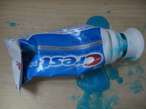
Crest tube can’t hold the toothpaste… brilliant
Do you have a mess like this in your toothbrush drawer? You will, if you’re a loyal customer of Proctor & Gamble and their flagship Crest brand.

Seems like the old tube with the small opening and the screw top wasn’t good enough for them, so they went to this great big cap that is supposed to pop on, but it doesn’t. And they also changed the formula of the paste so it’s more liquidy and oozes out all over the drawer.

Anybody know why they did this? Hard to believe it’s less expensive than the traditional tube. I think it’s a case of a/changing two things at once, which as marketers we know is folly and b/somebody with too much time on their hands.

I’m too cheap to throw it out, but as soon as it’s done I’m going to switch brands to somebody who still uses the old fashioned tube.

What we can learn from college solicitation direct mail

My son is a high school junior who recently took the PSAT, so he’s receiving a ton of prospecting mail from colleges. The other night we went through a stack of these direct mail packs, and it was interesting to see his reactions.

There was a lot of good stuff. Overall, the colleges did a strong job of presenting what makes them unique, and if it’s not a good match for my high school student there’s no fault to either side. But he had a couple of interesting comments from which lessons can be learned.

A couple of colleges disqualified themselves for consideration with cut-rate production. Here’s a college he’s never heard of, and you send him a solicitation that looks like you’re operating on a shoestring, and out you go into the discard pile. Lesson: be aware of the competitive environment in which your solicitation is viewed. If you really can’t afford a professional photographer and designer, maybe a heart felt letter from the president, in laser addressed envelope,  is the way to go.

And, a good third of the schools wanted my student to continue the dialog by going to a special web page and logging in with his name and password. This is Gen-X, or even Baby Boomer, marketing: assuming people will feel special because you’ve gone to the trouble to set up a “personal web page”. My millennial found it laughable. Passwords and user names are for World of Warcraft and a discussion of them usually leads to how you have been hacked. He also drew amusement from how he was “gmaxwell” on some college sites but maybe “gmaxwell3” on others and wondered if that meant he was less desirable to the latter.

To me, the best of the bunch was a completely non personalized self mailer from Carleton College with body copy that started: “Nice work on the PSAT!” Do they have access to his score? No matter. Why not assume the best about him and give him a compliment he may or may not deserve?

Chrysler, Dylan show how not to use celebrities in your advertising

Much has been made of the expensive nonsense that was the Chrysler ad in last week’s Super Bowl. What does “more American than America” mean? And is it disingenuous to proclaim “you can’t import American pride” when Chrysler is in fact owned by a German company? What was most troubling to me, however, was the way that Bob Dylan’s most public product endorsement (surprisingly, there been others) turned him from an icon into a pitchman.

The use of Eminem and Clint Eastwood in the two previous Super Bowl spots was brilliant. Eminem didn’t appear till toward the end and he looked like an anonymous and well-dressed young hipster, no visible tattoos, prompting many viewers to say “who’s that?” (The theme of the spot in that dark year, by the way, was “Imported from Detroit,” a direct contradiction to this year’s.) There’s no hiding Clint Eastwood’s voice, but the man himself was in shadows until the very end for the “halftime in America” spot, another piece of brilliant writing and staging.

By contrast, Dylan is in almost every frame of the 2014 spot so it comes to seem like a “you’ve seen him on…” retrospective. It doesn’t deflect the blatantly obvious to have the ironic cut of him flipping through his own albums in a record store. And at the end he does in fact turn to us and come right out and say it: “we will build your car.” And if you act fast, you’ll get a bonus set of floor mats!

Celebrities stand for something beyond their (often tawdry) actual selves. If you pay to put them in your advertising and fail to leverage that aura, you’re shooting yourself in the crankcase. The only exception might be the Ed McMahon/Bob Dole category of commercials used to pitch to an elderly audience, which is believed to have great respect for figures of authority. Come to think of it, Dylan’s actually old enough to join those ranks.

Here are the actual words to the Chrysler Dylan 2:00. Thanks to Mike Wayland, Michigan Live automobile blogger, for providing them so I don’t have to watch the spot over and over again to write them down.

Is there anything more American than America?
‘Cause you can’t import original.
You can’t fake true cool.
You can’t duplicate legacy.
Because what Detroit created was a first
and became an inspiration to the… rest of the world.
Yeah…Detroit made cars. And cars made America
Making the best, making the finest, takes conviction.
And you can’t import, the heart and soul,
of every man and woman working on the line.
You can search the world over for the finer things,
but you won’t find a match for the American road
and the creatures that live on it.
Because we believe in the zoom,
and the roar, and the thrust.
And when it’s made here, it’s made with the one thing
you can’t import from anywhere else. American…Pride.
So let Germany brew your beer,
Let Switzerland make your watch,
Let Asia assemble your phone.
We…will build…your car.

And, here are the Eminem and Eastwood spots in case you to watch and compare.
Budget Rent A Car mines data, comes with new $15 gas gimmick

Last week I was in Southern California, meeting with a client about how to use customer and transaction data to market more effectively. Coincidentally, when I picked up my rental car from Budget, they made me an offer which did just that.

I generally rent a car when I’m staying overnight. Rarely do I make any significant dent in the gas tank. Thus I always fill up on the way to the airport rather than just returning it and paying a refueling charge which is prohibitively expensive, or accepting the offer to prepay for a full tank I’m not going to use.

Neither Budget nor I wants me to fill up on the way to the airport. I don’t like refueling because I’m usually cutting it close time-wise, plus I often finding myself paying extra because the previous customer didn’t fill it up all the way. Budget doesn’t like it because they aren’t making any money on me. So they came up with a new offer: pay $15 for gas, no additional refueling charge as long as I drive under 75 miles.

If I drive 75 miles, at the worst they’ll break even. I was in a midsize car, and gas in this area was around $4.50 a gallon. But most customers probably don’t come close. (I didn’t.) So they’ve found a new revenue channel and I’m perfectly happy to pay it. $15 is close enough to the $7 or $8 I’d pay on my own that I am willing to buy freedom from the inconvenience.

Designing an offer like this for your own business, or your client’s, isn’t rocket science. You need to understand the pattern of usage, which will probably vary by area. This was at Orange County Airport, where people are either renting a car for a trip to Disneyland (well over 75 miles by the end of the trip) or right in the Irvine area (my scenario). And they may have tested different pricing to find that sweet spot where the customer is happy to pay for freedom from the inconvenience of the fill-up.

I am an agnostic car renter in that I’ll buy whatever is cheapest in the results that pop up on Kayak, so long as they’re not out of the airport. But Budget has given me a reason to pay extra attention to them next time. Nice work.

FSI coupons score for the home team before 2014 Super Bowl

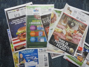
Super Bowl FSIs
Football-themed FSIs a week before the big bsme
Okay, football fans, what’s special about this past Sunday? If you said Pro Bowl, you just got sacked for a loss. Correct answer: it’s the weekend before the Super Bowl, and therefore the Sunday when the FSI coupons do a Richard Sherman trying to connect themselves to the Super Bowl without actually mentioning the name of the event, since they haven’t paid the hefty licensing fee.

Here comes Kraft with “your bold lineup for game day dipping”. Foster Farms wants us to “save big on tasty favorites for game day”. With a casserole made with Carnation evaporated milk, “game day just got tastier”. Attacking a problem we didn’t know we had, Hefty plasticized paper plates advise us to “soak proof your game day”. And, in case you’re planning to eat a few too many nachos, Pepcid offers to “kick off the big game with even bigger savings”. Cheez-It advises you to “kick off the big game with these fan favorites”. And Land O’Frost offers “easy game day entertaining with our premium line-up”. Anybody notice a trend here?

But the story on the sidelines is that there are far fewer of these themed coupons than in years past. And, where many of them did photo shoots of hyperactive fans enjoying their products in a home setting, now most simply stick some stock art of a green football field behind their usual overdressed product graphics. What’s the strategy, coach? Where’s your jumbo package or that gimmick play?

It just may be that marketers have found these themed ads aren’t worth the effort in terms of incremental sales. The overwhelming majority of coupon clippers are female, and so the underlying message is that the little woman is going to put out a bountiful spread for the men in her house and their loutish guests. But more and more consumers may be blowing the whistle on this blatant pandering. It may be that it’s better to promote your tried-and-true product positioning after all.

In my house, I know, the males are going to be expected to put together their own Super Bowl spread and clean up after themselves. Maybe I should get some of those soak-proof plates.

Direct marketers think we’re pretty gullible, it seems

The best scams and con games involve an element of human greed: that wealthy banker in Nigeria who made you his heir because of an incident you don’t remember, and may actually involve someone else; the check that reaches you by accident yet has your name on it and is perfectly legal tender. In the more adept scams, the next step usually is to tap into your bank account. In direct mail, it would typically be a subscription or sale of some kind.

Water Park Voucher
Timeshare “fake check” offer

In our more cynical age these tactics may not work as well, and I don’t see them as often. But they show up every now and then, like embers of a dying fire that flicker back to life. This “fake check” example charmed me with its absurdity: Indoor Water Park Voucher Enclosed/Verification of Delivery Information Required/FINAL NOTICE. Wow, that’s a lot of security to deliver what looks like a discount to an amusement park. But I did open it and it turns out it’s a timeshare offer, which happens to include admission to the water park. And if this isn’t enough, there’s a kicker: “our records indicate that by responding within 48 hours you will also receive a $100 Restaurant dining card”. I am almost tempted to take advantage of this offer to see what kind of person responds. Almost.

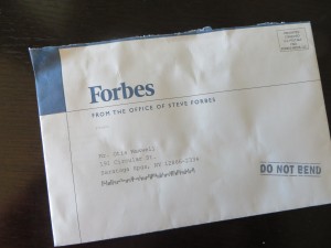
It’s easy to poke fun at the individual who would be lured into buying a money-sink timeshare purchase by the offer of a free ride on a water slide. But what about the distinguished prospect for Forbes, a respected business magazine? Would they really be motivated by that violator lower right on the envelope that says DO NOT BEND?

Forbes Do Not Bend
Forbes “DO NOT BEND” offer

The target for this tactic was, traditionally, somebody who isn’t used to getting a lot of respect. The reason the package says “do not bend” is that a photo is inside (or sometimes a computer punch card, or a certificate of some kind). Wow, I’m so important that Steve Forbes, president of Forbes, is sending me a photo. But the funny thing is there isn’t any photo, or anything else which would be harmed in any way if you folded this mailer in half and stuffed it in your pocket.

Forbes is using a mass-production format and so you can bet they’ve done plenty of testing, and from that they’ve found out that hinting at an enclosed photo, then not providing the photo, is a great way to save some money without reducing response. In other words, it works, or they wouldn’t be doing it.

It’s humbling that such mailers are effective, and especially humbling that my household was deemed a ripe enough target to receive them. Maybe I should pack my bags for that 3 Days and 2 Nights including Water Park Passes for 4 guests, after all.

How to write a good lift note or publisher’s letter

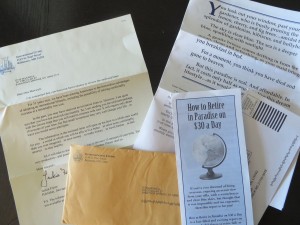
International Living mail pack
Here’s the complete International Living mail pack. Click the photo to enlarge to a readable size.

The lift note, or publisher’s letter, is an additional element in a direct mail package which is designed to elevate (lift) the response rate and profitability sufficiently to repay its printing and production costs. It might highlight the offer, answer one specific objection, spotlight a key benefit, or emphasize the penalty for not responding.

The pub letter is a variation which is literally a communication from the publisher. The conceit is that he (in the old days, always a male) grabbed the mailer proofs as they were on their way to the printer and was inspired to add a personal message. He might talk about his pride in the product, make a guarantee, or offer the classic “frankly, I’m puzzled” perspective in which he wonders why more people don’t respond to such a great opportunity and urges the reader not to lose out.

We don’t see too many lift notes in today’s lean direct mail packs, but I received a fine example recently from International Living. These folks are one of the last old-school newsletter publishers and they send a classic 8-page letter about the low costs and lifestyle benefits to be found retiring abroad.

The pub note, which is personalized and the first thing you see upon opening the package, begins: “I’m concerned that you have not had a chance to review the enclosed letter”. The publisher (now it’s a she) drops in a paragraph describing the product then continues, “in the past, you may have received an invitation from us. However, I’m quite sure you have not received one recently…” and then goes on to sell not the newsletter, but the investment of 10 minutes of my time to read the rest of the package components.

What’s nice about this is that the copywriter took the knowledge that the name was rented from a list of people who have not been prospected previously, and turned this into a very personal message and benefit. (Reminds me of the classic Emily Soell letter for Vanity Fair which begins “if the list on which I found your name is any indication…”)

Does it work? I sure hope so. In essence, by elevating and personalizing the lift note, International Living has turned it into the driver of the package. The preprinted long form letter, which today’s distracted readers are less likely to pay attention to, becomes a supporting brochure. It’s a great way to refresh an appeal to an older audience which today is far more cynical and less trusting than the previous generation. I’m definitely going to try this tactic for myself, next time I have the budget to write a package with lots of components. How about you?

Why your writing could use an AutoCrit

I am working on a book, and before sending it out I wanted to eliminate as much sloppy language as I could. I’ve been experimenting with a tool called AutoCrit which I recommend to anyone who writes long form copy–and best of all you can try it for free.

The sample free report (which is limited to 500 words, but you can chop up your copy and make three submissions per day) will identify overused words and tell you how many to eliminate, and also identify cliches and redundancies. I was particularly happy at how often it flagged “it”, a trouble word that slows down readers because they have to take the time to figure out what “it” refers to if it’s not obvious.

The paid versions, which start at $47 for a year’s subscription (you can currently get 10% off with the promotion code fb2013), also identify repeated words and homonyms. Sometimes we repeat words intentionally, but sometimes it’s accidental, and the result is that the narrative loses texture and the reader might actually notice the repetition when the flow of your narrative should always be seamless with all grammatical tricks behind the scenes.

Homonyms are words that sound like other words–eg “in” which sounds like “inn”–and they’re mostly innocuous. But this feature will also catch words which can have more than one meaning, and those are deadly–“lie” being an example; the skimming reader might not know whether it refers to something in a prone position or someone who’s not telling the truth. (Something it doesn’t catch, but you should be vigilant against, is words that look similar to other words so they can be mistaken by the reader–“through” and “though” being an example pair.)

Seeing your text in the context of the report also helps you look at it with fresh eyes, and catch typos or awkwardness you might otherwise miss because you’re too close to it. I took perhaps 10% of the suggestions AutoCrit had for me, but that 10% has definitely improved my manuscript. Check it out.

Online retail’s Obamacare moment

UPS experienced a surge of last minute Christmas orders and there weren’t enough planes to carry the packages, so many presents weren’t delivered till after the holiday. In some ways this is a good thing: consumer confidence suggests a strengthening economy and prosperous times ahead. But many of those orders had been placed with the promise of pre-Christmas delivery, so there remained the question of how retailers would make good their contract with their customers.

I had two affected orders, one from Brookstone and the other from Amazon. When I discovered the packages had not been delivered till December 26, I contacted both companies and let them know I was upset and disappointed and would like a response.

Brookstone was pretty straightforward. I contacted them using their online form, including the order number, and received this response: “This automated message is to let you know that we have received your inquiry and will respond to it as quickly as possible. We will be glad to assist you in any way we can.” Four days later, I’ve heard nothing further. This was my first online order from Brookstone, and it’s good to know how they handle customer problems. For me and Brookstone, it’s one and done.

Amazon’s order was supposed to arrive two days before Christmas, not one, according to my Prime membership terms. I navigated the byzantine online help system to find a form I could actually fill in. I didn’t need to tell them how long I had been a Prime member or how much I spend because they certainly know this; I did let them know it was far from the service I expected and paid for.

Amazon’s response was a $10 credit (against my $50 order) and a one-month extension of my Prime membership, worth $6 and change. Doesn’t seem like a very significant accommodation to a valued customer. Perhaps they feel they already have secured my loyalty and don’t have to bend over backwards; maybe newer Prime members got a more significant adjustment and bigger apology?

As with the healthcare.gov fiasco, many of the shoppers who were let down by incidents like these were likely first time online buyers; their mistrust in the internet has been confirmed and it may be years before they try online ordering again. For Obamacare, that meant that the most desirable prospects—young people who didn’t have health insurance because they didn’t think they needed it—were scared off. With this year’s late retail deliveries, the first time buyers would have been late adopters who are more expensive to acquire, more expensive to maintain.

While we’re on the subject of the trust between a customer and a retailer, I had a remarkable experience with Sears that is only nominally mail order. I wanted to purchase an item online for in store pickup and, because it was out of stock at my local Sears, I ordered it at another store 25 miles away. I finally went up there last Friday, order confirmation in hand, and was told they didn’t have my order because they’d sold the goods to somebody else after the order was placed, and the item was now out of stock so they’d have to refund my money. Pretty straightforward, but completely wrong. I’ll continue to work on this order and will report back on what I learn.

It’s almost 2014, and mail order retailers still haven’t figured out gift order options

If you give a gift, you want to be acknowledged, right? At the very least the recipient should know the package came from you and has a bit of thought behind it. Yet some of the largest mail order retailers are doing a very poor job of dealing with this issue at holiday 2013, long after they should have figured it out.

I’m not that experienced at web giving—I order a lot online, but it’s either for my personal consumption or to be packaged and presented in person. The idea of trusting a mass merchant to honor my earnest attempts to find and deliver the right gift has always made me queasy. And with good reason, it turns out.

I wanted to send somebody two pairs of flannel boxer shorts found on L.L. Bean… a somewhat whimsical yet practical gift. To gift these I would have to spend another $6 per pair of shorts (which on their own cost $16 per pair) and deliver them in two separate gift boxes. I don’t expect to have a live human running around and picking my order in 2013, but I do think it’s reasonable to expect the retailer to anticipate items that might be grouped, like this order, and offer combined packaging. Failing that, give me a substantial discount on gift boxing when I order multiple items sent to the same recipient.

That order abandoned, I went to Eddie Bauer where I found a well-priced duffel bag for the same recipient. Into my shopping bag, appropriate information entered, all the way to checkout, and I realize I’ve never been asked if this is a gift even though it’s to a second ship-to address. I try the chat function and it’s unavailable so I ask for instructions for handling a gift to be sent by email. Several hours later, the only email I’ve received is a notification that I better hurry and complete the order because my item might sell out. I never did find out how to specify a gift message or buy gift wrapping at Eddie Bauer, assuming these services exist.

Amazon, as usual, sets the bar on this. Gift options always available unless it’s clearly specified they are not (as on large items, like snowblowers), and the charges for gift wrap are reasonable. Folks complain about how Amazon is stifling competition but if Bean and Bauer refuse to perform at the same level I don’t think the complaint is justified.

The final element of the gift giving process is, of course, the delivery. Amazon will include a personalized gift greeting, as will my old friend Liberty Orchards which still offers the option of a handwritten gift card at no extra charge. Packages which have the giver’s name printed on the mailing label, and that’s it, are an embarrassment and betrayal of the well-meaning giver’s good intentions. Maybe next year I’ll self-order a bunch of gifts and see what kind of greeting I get. I don’t expect to be overly impressed.