Guest Post: Five Tips for Young Writers

This post was contributed by LOVEREADING.CO.UK

Pursuing writing as a successful means of making ends meet is not an easy task, but it can be among the most rewarding of careers once you have overcome the initial hurdles. The following five tips should help you develop your skills and make you a better writer:

1.     Read widely

To become a good writer, you need to become an avid and vociferous reader; if you aren’t already! Seek out and read as wide a range of books and articles as you can. Don’t restrict yourself merely to reading the books that you instinctively like. Expose yourself to as many authors and different writing genres as possible. Some books you will love, others you will hate, but you will learn from all of them – and it will all help you develop your own unique style.

2.     Live your life

The most successful writers use their words as a mirror of their experiences in everyday life, and in this sense all writing is autobiographical. Leading a full life gives you inspiration and fires the imagination, as well as giving you first- hand experience of the deep and varied richness of human emotions. Take on a variety of jobs, travel the world, try new activities, have your heart broken – and if possible, keep a journal of your thoughts, ambitions and experiences along the way.

3.     Write regularly

It is a cliché that ‘practice makes perfect’, but with writing this is very close to the truth. To develop your skills as writer you need to write regularly. This is an especially important habit to cultivate, because ‘writer’s block’ is a demon that affects even the best writers. Writing regularly – about everything and nothing, even if it is only a few hundred words a day, will train you to hone your style and give you the confidence to plough through the hard times when they arrive.

4.     Don’t Pigeonhole yourself

As your style develops you will find a favourite genre in which you excel. This may be through accident or by design. For instance, much of my work is marketing literature, and I have become very good at it through years of practice. However, don’t pigeonhole yourself by being afraid to stray out of your comfort zone. The hallmark of a good wordsmith is their ability to be able to write convincingly on any subject, from romantic fiction to academic reports!

5.     Don’t Give Up

There is a lot of competition in the world of writing and success will not necessarily come overnight. Writing is as much a vocation and a way of life as it is a ‘job’ or a ‘career’. Follow your passion, keep believing in yourself; and never, ever give up

For young writers the biggest challenge is often to know where to start; what to write about, where to seek publication, how to stand out from the competition. The answer is to take your writing career one step at a time; to take the long term view and aim for your words to reflect an interesting an enjoyable life. Most importantly, remember that nothing you write is ever a waste of time, and that the process of reaching to your goal is as important – and can be as much fun – as the end result itself!
Survey worst practices from American Express

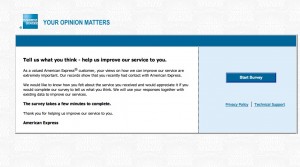
Landing page of the Amex survey
Landing page of my American Express survey

I got a survey invitation the other day from American Express that exhibited a number of worst practices. I’ll share highlights so we can hopefully learn from it.

1. The survey arrived too late. The email started, “Our records indicate you logged on to americanexpress.com on September 19, 2012, and we would like feedback about your on-line experience.” Problem: the email didn’t reach me till September 24. How am I supposed to remember something I did online 5 days ago?

2. The survey offered no incentive. It’s a sad but true fact that you have to give people a reward to participate in these days, simply because everybody else is doing it. It doesn’t have to be much … how about just a chance to win a $100 American Express Gift Card?

3. The survey is poorly written. The landing page starts, “As a valued American Express® customer, your views on how we can improve our service are extremely important. “ My views aren’t the customer, I am. That’s a dangling prepositional phrase and it’s distracting.

4. The survey doesn’t promise that it will be a quick and easy experience. The landing page simply states, in bold type, “The survey takes a few minutes to complete.” In context, that feels like a very long time.

5. The survey demands an explanation on each question of why I answered the way I did, written in free text. Eg, “What could have been done to make you more likely to recommend American Express to a friend or colleague?” (More bad or awkward writing.) Nothing really… I was just paying my bill! And it won’t let me leave the field blank. I have to type something, even if it’s nonsense, otherwise the page reloads.

6. The survey asks questions it already knows the answer to, in this case why I was on the website and what I did there. (It could have ben spun into a “do you recall what actions you performed while on the website” question which would have had more apparent validity since it appears to be testing the intensity of my recollection.)

7. The survey asks a question I can’t answer: “Please rate your satisfaction with the ease of navigating the American Express website, americanexpress.com.” Yo! The site I go to is called “Open Savings”. It does resolve (I just checked) to americanexpress.com but a consumer I shouldn’t be expected to know that. Why mention the URL at all?

8. The survey communication wasn’t sufficiently personalized. After I abandoned the survey for all the irritations described above I got an email “reminder” which was the same as the first email with this additional superscript: If you have already completed the survey, thank you and please accept our apology for the additional e-mail. But when I returned to the survey I was deposited where I left off.

What’s happening here is that they are automatically sending a follow up email to EVERYBODY who received the first email, and not removing or acknowledging the completions or people who started and then abandoned it. How irritating is that?

The “independent research company” that provides this survey is researchhq.com. Autofills on the search panel suggest they’ve also done surveys for Wells Fargo and Allstate. Good luck with that.

For all you long-copy haters out there…

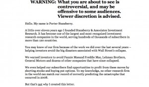
Screen grab from Stansberry's 77 minute online ad
Screen grab from Stansberry’s 77 minute online ad

Direct marketing watchdog Denny Hatch had his knickers in a twist about the online ad shown here. And with good reason. It’s simply a long copy direct mail letter turned into a PowerPoint video and it runs 77 minutes (I am taking that part on faith since I lasted about 4 minutes) with no pause button and no call to action until the very end. The sell is for an investment newsletter which allegedly has 241,700 active subscribers, which I presume are the same as the 241,700 people currently viewing Otisregrets.

Stansberry's "don't leave" interrupter screen
Stansberry’s “don’t leave” interrupter screen

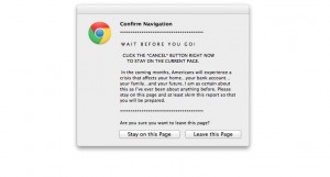
Hatch waited all the way to the end; I didn’t and clicked the close button, bringing up the frantic “WAIT!” alert usually reserved for adult content sites. I clicked the “stay on page” button … and was rewarded with the opportunity to read the same copy, but in its original mega-letter format. (And badly reproduced, too. Hope that Stansberry picks up a few subscribers so he can afford a new imaging drum for his scanner.) Even so there is no call to action until the very, very end of the letter where we find a single “subscribe” button.

Stansberry's letter
Stansberry’s letter

Of course this is NOT evidence that long copy is a bad idea. Rather, it’s a great way to experience good direct marketing by its absence. When asked how long a man’s legs should be, Lincoln allegedly replied “long enough to reach the ground.” It’s the same with sales letters. They can be one page, or 32 pages (my personal record), or hundreds of pages like the Stansberry effort… just as long as the copy is permeated with calls to action so the reader can stop reading and give you the order as soon as they are convinced.

Hatch’s article had a great quote from old school copywriter Claude Hopkins, which talks about “print” but applies equally well to electronic media:

“People are hurried. The average person worth cultivating has too much to read. They skip three-fourths of the reading matter, which they pay to get. They are not going to read your business talk unless you make it worth their while and let the headline show it.

People will not be bored in print. They may listen politely at a dinner table to boasts and personalities, life history etc. But in print they choose their own companions, their own subjects. They want to be amused or benefited. They want economy, beauty, labor savings, good things to eat and wear.”

Getting back to the format of Stansberry’s online ad, Hatch closes (as will I) with this zinger from “Visual Display of Quantitative Information” author Edward Tufte: “Power corrupts. PowerPoint corrupts absolutely.”


People were easier to amuse in the old days…

I was back in San Francisco this week and paid a visit to the Musee Mechanique. This is a warehouse full of old arcade games that are restored and maintained by a private owner in return for your plunking in many quarters for a chance to experience a thrill from yesteryear that probably cost a penny back in the day.

There are early video games, tests of strength, and machines that tell your fortune along with your weight. But the really charming exhibits are boxed dioramas which come to life to show a man trying to calm a crying baby (whose jaw is repaired with what looks like silly putty), the horrors of an opium den, or the flatulence that results from eating too many beans on the prairie in the example below.

O for the good old days, in which consumers could be amused by simple thrills like this and marketers could get them to read long copy ads like John Caples’ “They laughed when I sat down to play the piano” or the Charles Atlas ads. Today they demand amped-up computer graphics, and they wouldn’t have the patience to watch to watch the full two minutes of “The Inquest”, a large exhibit in which buffalo shuffle their heads while investigating the body of an Indian warrior who has frozen to death in the snow. Today’s consumers also lack the generous acceptance of our wiles that made advertising a welcome, entertaining part of daily life.

Our job is a lot harder, which makes it more interesting I guess. Happy Labor Day.

How not to do damage control in your public relations

An article in yesterday’s San Francisco Chronicle offered textbook examples of what to do, and NOT to do, if your company gets involved in damage control. I’ve never seen a contrast so clear-cut.

Here’s the backstory: an animal welfare group named Compassion over Killing shot a video of cattle allegedly being brutally mistreated at Central Valley Meat, a slaughterhouse in California. The video was turned over the USDA who immediately sent inspectors out. Finding conditions just as bad as depicted on the video, they shut the operation down.

In-N-Out Burgers was, it turns out, a customer of Central Valley Meat, and quickly severed the relationship. Quoting from the article: “Mark Taylor, chief operating officer, said Tuesday the company acted immediately upon becoming aware of it. ‘In-N-Out Burger would never condone the inhumane treatment of animals and all of our suppliers must agree to abide by our strict standards for the humane treatment of cattle,’ Taylor said to The Associated Press in a written statement.”

Reaction was instant and decisive… absolutely no question as to where In-N-Out stands on this. They defused a nasty situation as soon as they were associated with it. That’s the good example of damage control.

But here’s the bad: instead of making themselves available to the press, the owners of the plant (who are identified by name in the article) declined to comment, explaining they had not seen the video. They then hired a PR firm, which issued the following statement: “Central Valley Meat takes these issues very seriously and is now developing a plan of action to present to (the Food Safety Inspection Service) to remedy any potential violations of USDA guidelines,” the statement said. “Based on our own investigation and 30 years of producing safe, high-quality US beef, we are confident these concerns pose no food safety issues.”

Maybe that’s true, but it’s hard to believe in the context of the USDA’s shutting them down. They first ran from the issue, then stuck their heads in the sand. And shame on the unnamed PR agency, which was apparently hired in the middle of a crisis and responded by issuing a hard-to-believe press release. You couldn’t find a worse example of crisis management.

Fumbles in fulfillment: Applebee’s Lunch Decoy

Applebee Lunch Decoy fulfillment pack

So I am now the proud owner of an Applebee’s Lunch Decoy, which I ordered pursuant to the previous post. Notice anything wrong? Yup, they sent a gal decoy instead of the guy promised on Amazon. No way my boss is going to be tricked into thinking that’s me. So much for sneaking out for that Lunch Deal.

But there’s actually something more serious about this fumble, which is the lack of follow-through from the ad campaign. Is there anything to promote it on the outside of the package? No, not even the Applebee’s name. And the little mock-instruction sheet is great, but how about including a $5 off coupon since this recipient is obviously a heavy user?

So many campaigns start with a great idea and it’s forgotten that an actual element needs to be fulfilled. It’s a total afterthought and it ends up like this. And guess what creative geniuses: when you enter this campaign for an award you’re going to need to include a sample of the fulfillment pack, and that will be a bit of an embarrassment, won’t it?

Speaking of non-followthrough, a chap named Craig Murray emailed me and asked if I’d consider running a guest post for an infographic if he created one to my specifications. I could tell it was a mass solicitation but the idea interested me so I replied. Do you think Craig has followed up? Nope. And how does that inaction help him make sales? Don’t you think, if he contacts me again, I’d be less likely to consider his offer rather than more?

Dot your i’s and mind your p’s and q’s. That’s my small lesson for today.

Applebee’s out-ironics The Onion with its new campaigns

Have you seen this? According to a media commentator, Applebee’s has a new campaign in which they are urging hipsters to dine at their restaurants “ironically” which makes sense since they are never going to get them there through conventional advertising. Take a look:

Funny thing is, Applebee’s actually is running a social media campaign that is far more bizarre as this, called “Girls’ Night Out. Life is better shared.” A Betty White character harangues ladies for spending too much time online, then tells them the solution is to get down to Applebee’s for some facetime. Take a look:

There’s also a tumblr page that anchors the campaign and has links to Pinterest and Twitter pages (no Facebook, maybe because it’s a regional campaign). All the elements of a well thought out and expensive social media campaign.

Speaking of social media, Applebee’s is also marketing a life size inflatable dummy you can leave at your desk while you sneak out for lunch. This one is on Facebook, where you can take the Desk Lunch Diagnosis Quiz (I am the “Break Room Hero… people are tired of cleaning up the microwave after you”).

Does this stuff work? The “goddess” video above has over 50,000 hits but how many of those are potential customers? There are only 400 plus followers on the Twitter page and the selection of inflatable dolls on Amazon was originally 7 but is now down to just 2. The bottom line is that Applebee’s is still Applebee’s (check the hashtag #applebee and you’ll get a far more realistic snapshot of Middle America’s view of the chain) and there’s only so much you can do to get hipsters to change their behavior… unless they do it ironically, perhaps.

More from Barclaycard Ring

I’ve now got a lot more insight into this card as the result of an online exchange with Product Manager Jared Young and a phone conversation with community manager Jen Hitchens. I didn’t get a clear answer as to how I happened to be solicited for the card—there were a number of test programs in place etc—but did glean some other insights of interest to marketers.

The Barclaycard Ring MasterCard grew out of an alpha experiment called Innovation Lab, as documented on the timeline of their Facebook page. Paul Wilmore, Managing Director-Consumer Markets, Barclaycard US, wanted to launch a new product that a/combats the low trust level of the banking industry b/leverages the popularity of social media and c/includes a financial literacy/education component. It evolved into Barclaycard Ring, which was launched in March 2012.

As I mentioned previously, I was looking for a new rewards card (Citi’s Thank You had changed its program and shafted me by expiring my nearly 400,000 points) and got a solicitation via email. But Jen says it’s not intended to be a rewards card. People are attracted by the low interest rate (currently 8% APR) and the transparency and they really enjoy talking about financial literacy topics on the community website.

In a post called “Community Share of Giveback™” (access for cardmembers only), Jared calculates that the average cardholder will earn $9 in giveback over a 6 month period. Assuming that cardmember averages $1000 a month in charges, that’s a much lower percentage than the 1% minimum that’s typical with rewards cards. So there have to be other benefits, and evidently there are.

Jen reports that the conversations have been almost universally positive on the forums so far—she’s got controls to handle negative or abusive posters but she’s never had to use them. The cardmembers are very happy to discuss arcane features of CILs (that’s credit line increase), nominate charities the community should support, and (especially) lend their recommendations about other card features they’d like to see. They also like to see the financial statements although I personally find them rather opaque.

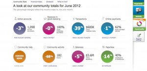
Barclaycard Ring Community Stats June 2012
Active cardmembers were up 3% in June 2012.

One concern I have is that all these folks are early adopters… there were only 1090 active cardmembers as of the June reporting period… and the community may change as more people join. But it’s a very interesting experiment with its heart in the right place. If you’re involved in social media, you should get this card just to keep up with what they’re doing. (That’s my referral code, of course…. it will generate Giveback™ to the community if you are accepted.)

The Writer’s Diet

Pompous, stilted and jargon-esque prose may be popular in corporate marcom departments and annual reports, but it turns readers off and causes copywriters to lose their jobs because we’re putting people to sleep. That’s why we need to stay ever-vigilant against that dark inner voice that keeps whispering, if we aren’t saying anything or don’t know what we are talking about, we better sound smart.

Along with the beloved we-we calculator that tells us if our copy is too me-centric, we have a useful new tool in the Writer’s Diet from Kiwi pedagogist Helen Sword. Cut-and-paste an entry from 100 to 1000 words and her program will score you from “Fit and Trim” to “Heart Attack Waiting to Happen” for readability based on your choice of various parts of speech.

A snippet of my direct marketing copy was labeled “fit and trim” with a recommendation to tone up some abstract nouns. (I was writing about an abstract concept.) My intro to a fiction piece was labeled “needs toning” based on a “flabby” score for my verbs in which a passive observer is commenting on what he sees around him. Busted. This sucker seems to work pretty well.

I had originally encountered Dr. Sword through her article “Zombie Nouns” in the opinion pages of the New York Times. These are “nominated” words in which a verb or adverb is transformed into a noun: participation, perception, observation, nominalization. A few of these are fine, but when they are overused they suck the life out of the text as in this example from a social sciences book:

The partial participation of newcomers is by no means “disconnected” from the practice of interest. Furthermore, it is also a dynamic concept. In this sense, peripherality, when it is enabled, suggests an opening, a way of gaining access to sources for understanding through growing involvement. The ambiguity inherent in peripheral participation must then be connected to issues of legitimacy, of the social organization of and control over resources, if it is to gain its full analytical potential.

For those of us who work with technology companies, this is new yet oddly familiar—companies in this space (another word to hate BTW) tend to turn verbs into nouns (verbalization?) that have the ring of authenticity without really meaning anything; cf. “impact” (how will this initiative impact our bottom line?).

In both cases, the construction of active, well-structured sentences using simple yet evocative words will awaken our readers and, hopefully, keep the zombies at bay.

Advice for RIMM: make BlackBerry a prepaid phone

Last week brought yet another dose of terrible news from Research in Motion Limited, the company that makes BlackBerry, and I kicked myself for not going short on RIMM a few weeks back when the stock was more than twice as high as it is now. The handwriting is on the wall for BlackBerry just as for Betamax and HD-TV before them, and the shovels are busy in the boneyard of failed technologies.

BlackBerry, however, has something most other zombie technologies lack: an established user base that is, or was, enthusiastic about the platform. So here’s my plan to save the company: turn BlackBerry into a prepaid phone. This solves the problem of users abandoning BlackBerry for iPhone or Android because they don’t have to; they can continue using their BlackBerries as a backup. Many BB users already have multiple phones (remember Obama on the 2008 campaign trail?) so this concept will be an easy one for them to accept. And a package of text messaging can be sold at an attractive yet profitable price that will allow those thumb virtuosos to continue their real-time updates even while in the air. (I never was able to figure out why this is OK.)

The prepaid texting will be offered at a discount for in-network messages, encouraging current users to continue their text relationships with one another. And RIMM can keep its rock-solid network but, since far less bandwidth will be required with a reduced user footprint and no expectation of rich media, sell or rent off the capacity it doesn’t need.

I’ve never had a BlackBerry myself but have had plenty of prepaid phones. They are useful little gadgets with lots of applications. They’re great for kids who tend to leave them in their pockets when doing laundry, for example. And I am about to buy a TracPhone for a guest house where we’re required to have a phone for some weekend guests; it fits the contract and offers a number for them to give out, yet it’s miles cheaper than installing a landline or VoIP modem. Make the prepaid BlackBerry attractive with an initial offer and I would probably try one. Give me or my kids or guests a taste of that thumb power and we just might get hooked and go for an expanded package. There’s a reason they used to call it “CrackBerry” after all.