The Call to Action

In most of our marketing we are trying to get people to do something. This used to be the purview of “direct response” advertising but on the web every page is full of clickable links, and today even the most image-y print ad or TV spot will include a URL or 800 number to find out more.

We want to pay attention to how we craft these calls to action (CTAs for short) because they affect our paychecks as copywriters. If we can prove that our efforts produced more calls or dollars or customers, we will get more work and bigger fees. Here are a few tips:

Combine the call to action with a benefit statement. Are classes limited to 20 students to ensure personal attention? Then say that in the call to action, followed by a request to respond now to avoid being left out. Is the product going to taste great, improve health or make them money? Then add urgency to the CTA: To enjoy the health-giving benefits of royal jelly bon-bons just as soon as we can ship them, call our hotline right now.

Tell the reader early and often what you want them to do. If it’s a direct mail letter you want to cut to the chase no later than the third or fourth paragraph. You’ve created desire or concern through your windup, now tell the reader specifically how they can scratch the itch. If it’s a long letter, repeat the call to action at least once per page. CTAs in web pages and emails are more compact since they are clickable links, so they can be used more frequently, as often as once every couple of paragraphs.

The reason for the multiple CTAs is simply that you never know exactly when your reader will be ready to take action, and you don’t want to take a chance on losing them because they get distracted and wander off the page.

Make the call to action consistent throughout your communication. Don’t invite them to request more information in one CTA, then tell them you want an order right now further down the page. If you have a freebie or a giveaway contest for them, mention it in each CTA or they will wonder, “hey, where is that prize I was going to win?” The reason is that readers are donkeys. They will follow willingly as long as you give them no reason not to, but if you throw in a distracting or confusing element they will dig in their heels and do everything except what you want.

Deliver a complete CTA at the end of a sales letter, or the sidebar of an email invite. This includes everything the reader needs to know about the offer—and all possible response options including mail, phone, email, web link, fax and maybe something else. If you are asking for money or a serious commitment of their time, this CTA should also include a guarantee of some sort for reassurance.

Excerpted from my new book, Copywriting that Gets RESULTS! Get your copy here.
How to open a sales letter or email

The first paragraph is the most important element of any selling message. If you don’t hook your reader here they will abandon you. (Which is why it’s not a good idea to keep key selling points in reserve, thinking you will reveal them if you go along.) Just like the subject line or outer envelope teaser, these words are worth the investment of a disproportionate amount of your time.

It’s never wrong to open with a strong statement of your offer (I want to let you know about an unusual sale on first quality goods that don’t normally get discounted, but are now 50% off for a limited time) or an explanation why you are writing (because I believe you are among the top 5% of salespeople, I want to share an opportunity that most people would not even understand). But that’s not good enough.

You ALSO need to provide verbal chum for the slow-moving fish who initially are not attracted by your offer, or do not think it applies to them, but can be lured into the net with the right conversational gambit. Let’s talk about a few ways to do this.

Problem/solution open: works with many technology products because technology consumers nearly always have some problem to solve. If you’re looking to maximize the potential of the XYZ platform, then you’ll want to read a new collection of case histories from industry leaders who have done just that.

Picture yourself here: paint an evocative word image of the benefits to be gained as a result of the offer in the letter, tied to the reader personally. My control letter for Online Trading Academy, which educates people to trade stocks and other investments online, does this: “Imagine, for a moment, what investing would be like if you knew you could not fail. Never again would you sell a winning position too soon—or hold onto a loser for longer than you should…”

Flattery: you are writing the recipient precisely because they are a perceptive member of your target audience, and they can justify your confidence in them by acting appropriately. Nice if you can pull it off. The variations on Emily Soell’s classic intro for Vanity Fair belong in this category: “Dear Friend, If the list on which I found your name is any indication, this is not the first – nor will it be the last – subscription letter you receive… [goes on to explain it is a very special list of perceptive readers].”

News: this is the default opening in fundraising and politics, where there is generally an urgent need that your reader is enlisted in helping to relieve. May also work for business to business or personal-interest consumer marketing IF you are confident from your audience research that the reader will be as excited about the news as you are.

Emotion: My control letter for Met Life’s long term care insurance prospecting starts with a paragraph I jotted down in a meeting with the sales team: “Every one of us would like to live well in our later years and leave some money for the next generation. Is that too much to ask?” It fits the combination of fear for the future and indignation at the status quo that the reader is feeling. As with the news approach, this only works if you have a true mind meld with your reader.

Entertainment/escape: Many of the most successful publications promotions start with a “free sample” of the content. People will subscribe to be inspired or entertained or to be lifted out of their quotidian existence, so why not start right now? The Great American Recipes letter does this: “Remember when good food meant the best times you ever had with family and friends? I’m talking about lazy summer evenings serving home-made ice cream on the screen porch….”

An opener that does several of these things simultaneously is the introduction of my four page letter for Geneva, a M&A consultant whose business model was to invite business owners to a two-day paid (not free) workshop on how to value their business:

We’re in the midst of the hottest Mergers & Acquisition market in 100 years and you, as the owner of a middle-market business, have the most desirable property of them all… That’s why, like many of the people who attend our Business Valuation Seminar, you may have already received an offer—and for more than you ever dreamed your business could be worth. And even if you haven’t yet been approached about selling, you probably will be soon.

News, flattery, a bit of picture-yourself-here sets the reader up nicely for the presentation of my client’s seminar as the solution to the problem.

One final tip, after you’ve completed your best effort at an opening paragraph, take it out. That’s what I said. Editors often advise writers to cut the first paragraph of their work because it’s an unnecessary wind-up before the real pitch and the same may be true of your letter. If your copy falls flat with the first paragraph removed, then you know you have a winner for an opening.

This article mentions several examples which can be found in my new book, Copywriting that Gets RESULTS! Get your copy here.

What happens when your viral video doesn’t go viral?

You put your heart and soul and best marketing smarts into a YouTube video campaign expecting it will go viral and quickly spread across the globe. And… not all that much happens. That’s disheartening but a useful object lesson.

In my little town of Saratoga Springs, NY, the Chamber of Commerce decided to make a promotional video in which thousands of local citizens are captured by a roving camera as they lip sync to a medley of songs from the pop group Train. (Local connection: Train’s drummer hails from Saratoga.) The C of C was up front about the fact that they wanted to emulate the success of a similar video from the city of Grand Rapids, MI which has gotten over 10 million hits.


The Saratoga video is now live, and in the first week, it’s gotten about 36,000 hits. That’s about what you might expect if each of the people in the video sent the link to a few of their friends. By comparison, surveillance videos of a couple of drunks knocking over a statue of a horse (Saratoga is a horse racing town) have gotten over 100,000 hits. Of course, things could change but as local blog All Over Albany points out, most of the traffic to the horse video happened in the first few days after the video went live.

A comparison of the Saratoga and Grand Rapids videos yields some ideas of what works in viral and what may not so work so well.

First of all, the Saratoga piece is obviously a promotional effort. It opens with the producer’s logo, and the first few seconds are archival footage of a thoroughbred race. Many of the participants throughout are waving signs or wearing logos to promote their own organizations. That’s fine for civic pride, but maybe less so for attracting interest from those who don’t already know you. Second, the Train music is just not that good or that catchy; critics have complained that many participants don’t appear to be lip syncing but the songs aren’t really sync-able.

By comparison, the Grand Rapids video has a “wow” factor both in the choice of scenes (including pillow fighters, zombies, an outrageously hamming mayor and a quick pan to what looks like the entire police and fire departments driving down the street waving in unison) and the “how did they do that?” production which looks like a single take. (It isn’t; you can get details in “The Making of the Grand Rapids Lip Dub” which itself has over 112,000 hits.)

It also has great music which ties into a heart-tugging storyline. The video was made to dispel the image of Grand Rapids as just another dying smokestack city, and the music fits in perfectly: a 10 minute concert version of Don McLean’s elegiac “Bye Bye Miss American Pie.” Which, ironically, was penned as McLean was sitting in a bar right here in Saratoga.

I’m a member of the Saratoga Springs Chamber of Commerce myself and would like this video to become successful. My first suggestion is to remove the producer credit and stock footage and to start with Sam the Bugler strutting toward us. Second, now that everybody’s had their moment in the sun try some creative editing of some “best of” clips like local celebrity Garland Nelson in the park, really selling it. Third, sponsor a competition for local citizens (or anyone who wants to try their hand on YouTube) to remix or even parody the original… some very interesting things can happen when you do that.

Drunk on social media?

Researchers at University of Wisconsin-Madison reviewed publicly-available Facebook profiles of 224 students for references to being drunk or problems related to drinking. All profiled students were then invited to take a 10-question quiz. Researchers found that 6 of 10 who mentioned excessive drinking symptoms on Facebook (as opposed to just saying “I had a glass of wine”) showed other signs of problems with alcohol, such as the fact nearly 1 in 5 risky drinkers admitted an alcohol-related accident in the past year.

That’s good if it helps head off risky behavior before somebody gets hurt, but bad from a privacy standpoint. Or is it? All these students had freely posted and their profiles could be accessed by anyone who took the time to look for them. This study was not conducted by the university itself but by independent researchers. But what’s to keep the Dean of Students from doing the same digging?

Or, for that matter, what’s to keep marketers from using the same sources to do similar research? Establish a cohort by the way participants have identified themselves, set up rules for doing a query, push the button, do your analysis. The difference from other research being that the participants are anything but anonymous.

Original report from Reuters is here.

“Top Tweets” do_not_like

At this moment I’m sitting in #DMA2011 listening to Biz Stone and trying to follow the stream on his tool… wait, that sounds odd. What I’m doing is watching the tweetstream on my preferred reader (Hootsuite) which though it does not say so is only bringing me the Top Tweets as defined by Twitter’s recently instituted algorithm. And then I have my twitter.com open manually reset to “all” with the #dma2011 hashtag and I’m getting so many more tweets and it is so much more interesting.

The irony of Twitter filtering our results, so only the cool guys show up, is that it’s exactly the opposite of the behavior that caused Twitter to catch fire at SXSW 2008 (or was it 2009?)… people in a session tweeting that there was a better session next door and everybody gets up and leaves because everybody is tweeting and following the same hashtag. If only the Top Tweets were permitted those folks would probably still be sitting in that room at the Austin Convention Center.

Just sayin. You can find a less instantaneous, more well-thought commentary on Top Tweets here.

Should you offer a money-back guarantee?

A money-back guarantee is essential to any web or direct marketing offer. It takes care of an enormous concern on the part of the buyer: I can’t see this product before I order… so, what if I get it and I don’t like it?

That’s the simple and unequivocal answer to a question you may be asked by your clients: “Do I need a guarantee?” Yes, of course you do. The next question is how generous is your guarantee, and how scrupulous will you be in honoring it?

One of my early bosses was a master of deception… I don’t think he would mind me referring to him as such because it was a point of pride to him that he could persuade people to buy products at much more than their true value. He tried to show me how to insert wiggle room in the guarantee so it would never need to be honored. But even as a naïve young marketer I knew this was not a good idea.

The people who intend to take advantage of you will find a way to do so. They’ll claim the product was damaged or simply never arrived. They’ll protest their credit card bill.  Defending yourself against them is futile and by trying to do so with a miserly or weasel-worded guarantee you’ll cause yourself far more damage among the majority of honest customers who will now be less confident about ordering from you.

At one point in my career, I wrote a lot of promos for investment newsletters. The standard guarantee was “a prompt prorata refund of your subscription cost for all unmailed issues”. What hokum.  The cost of the physical issues was negligible and the real product was intellectual property; if the reader no longer values that product why force them to pay for it?

We were able to change the standard wording to something like, “100% refund of your entire subscription price even if you cancel on the very last issue” and guess what? Refunds did not go through the roof because most subscribers do not make a mental note that okay, I can game the publisher a year from now and get my money back. Rather they make a decision about whether or not the product is for them based on their first experiences with it. A generous guarantee simply removes the roadblocks in this decision process.

My favorite guarantee is still Lands Ends’ “Guaranteed. Period.” It’s gutsy that the uncompromising language has been maintained since Lands End was acquired by Sears, but when you think about it this guarantee simply puts in writing what most retailers would offer their customers. If you don’t like it and you take the trouble to bring it back to the store, we are going to give your money back regardless of whether we think it’s justified because we don’t want an angry customer roaming the corridors.

So, copywriters, always include a guarantee—and tell the art director to put it on a fancy safety-paper background to make it look valuable. Maybe your client will protest that “we don’t actually have a return policy” to which your answer is “you should, and you do now.”

Excerpted from my new book, Copywriting that Gets RESULTS! Get your copy here.

Copywriting 101: Saratoga Chips

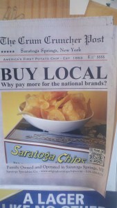
A local company is marketing a boutique potato chip in Saratoga Springs, NY, where that salty snack was invented in 1853. The chips are made with high quality potatoes and taste delicious. They are charmingly packaged in a replica of the “takeaway” box from the 1870s. The company is well regarded and family owned. And as a bonus, they are one of the largest clients of Saratoga Bridges, a not-for-profit that finds meaningful work for mentally disabled adults.

Okay, copywriters. Think you can create some kind of a marketing campaign from that?

Oh, there’s one thing I haven’t mentioned. For whatever reason, Saratoga Chips has chosen to sell at a per-ounce price about the same as Lays. I’m not in love with that decision because price competition is the mark of a commoditized product and this is anything but. In fact, there’s a huge potential audience of tourists who come for the track, the spa and the waters who would love to take something back to friends and family in Jersey or Florida.

Saratoga Chips Advertising

Unfortunately, the marketing department of Saratoga Chips is not you nor I. Avoiding history, warmth and local color, their copywriter came up with the Walmart-style headline: “Buy local… why pay more for the national brands?” Doing the copywriter one better, the art director mistrusted the visual appeal of the product and the antique box and subjugated them to a fake newspaper page (“Crum Cruncher” refers to George Crum, the inventor of the chip, but of course the reader doesn’t know this) superimposed on a fake wood background as if, I guess, the fake newspaper has been plopped down on a fake table.

Purely on the basis of missed opportunity, Saratoga Chips is hereby fast-tracked into the Badvertising Hall of Shame.

Goodbye, Groupon?

You, a freelance creative, buy a plane ticket to go and see a client. You rebill the ticket at cost and your client pays you back. So, if you need to state a number when you’re applying for a credit line or some such, should you include the value of that ticket in your revenues?

Of course not. That pass through expense has nothing to do with your business; it’s just money that appears on your balance sheet on its way from one place to another. Or to quote the wonderful though wonky Grumpy Old Accountants website, “SEC Staff Accounting Bulletin 101 on Revenue Recognition, Question 10 specifically, is congruent with EITF 99-19.  The SEC stated that firms should report revenues on a net basis if they did not take title to the products, did not have the risk and rewards of ownership, and acted as an agent or broker.”

Groupon did not get the memo. They have been booking the full value of their coupon sales as revenue, not accounting for the fact that a large percentage of what they are collecting is going to go into the pockets of retailers and they are just a conduit. As a result, yesterday Groupon had to restate its revenues and reduce them by 50%, while incidentally announcing their recently hired CEO is on her way back to Google.

So much for that IPO. And perhaps much of that money that Groupon collected on the premise that its copywriters are worth $6 billion will have to be returned, since it was based on the misstated revenues. As I mentioned in that earlier post, retailers like the results that they get with Groupon but resent the charges which are higher than with other social couponing sites. It would be a lot of fun to be a LivingSocial or BlackBoardEats rep calling on your prospects next week, would it not?

I hope Groupon does not go down in flames because I think the quality of its creative expression (along with excellent, rock-solid marketing) has been the decider. You may have noticed that the Groupon “Voice” now extends no further than the opening sentence or two of most offers; after that it is straightforward, though good, marketing copy. But this is offset by the wonderful temporary insanity of the “Groupon Says” feature at the bottom of the offer page.

Google copywriters: if you guys get laid off, give otisregrets a call and let’s talk about some mutual opportunities.

Copywriter slugfest at DMA2011… coming soon!

DMA2011, the annual conference of the Direct Marketing Association, starts in Boston the first weekend in October… that’s soon! I am on a panel with colleagues Nancy Wahl, Alan Rosenspan and Carol Worthington Levy at 3 pm Monday afternoon, October 4. The topic is “Mundane, Inane and Boring Creative” and evidently we are going to try and outdo one another by seeing who can put the audience to sleep fastest with campaigns that never should have seen the light of day or, if they did, succeeded in spite of themselves.

I just got a preview of my fellow panelists’ slide decks and there is some pretty outrageous stuff there. At the end of the hour the audience will be invited to vote on who was the most mundane, inane or boring and the winner will be doused in the chill waters of Boston Harbor just outside the convention center. It’s an experience not to be missed!

If you haven’t yet registered for the DMA, you can still do so here. Try entering “friends and family” code AN614 which will hopefully give you a discount on your conference price. See you there.

Is Reed Hastings a Quickster?

Since I’m still a Netflix customer (at least until 9/24 when the new pricing kicks in per my billing date) I was a recipient of the soon-to-become-infamous email from Reed Hastings in my in-box this morning, which opens “I messed up. I owe you an explanation.”

I would have liked “apology” which would indicate a price rollback but “explanation” carries no such connotation and indeed regarding the pricing, Hastings informs us “we’re done with that!” The explanation is of the rationale behind splitting the streaming and DVD-delivery services; the mess-up was in not explaining it properly to consumers, which he now does in the email and more extensively in his own blog.

The streaming video service is now Netflix and the DVDs are about to become “Quikster”, a new orphan brand, suggesting that the “familiar red envelope” is about to become the equivalent of “AOL dial-up”, an analogy Hastings uses in his message though not exactly in that way.

I am fascinated by this turn of events. It’s like that story of the backpacker who cuts off his own arm to escape and save his life. It’s like watching Wil. E. Coyote standing his ground as the roadrunner approaches at full speed. And I am especially fascinated by evidence the decision was not made with full benefit of research and reflection by one of the world’s most recognizable brands. Do a web search for “quickster” and “quikster” (results will be roughly the same) and right now the top two hits are for an Amway-related scandal involving a like-sounding product, and a rather risqué definition on urbandictionary.com. Look up quikster.com on the internet registries and you’ll find the registration changed just a couple of weeks ago and as of this morning quikster.net and quikster.org were still available for purchase, suggesting haste and confusion in the name-changing.

I plan to stay tuned…. Though perhaps not as a Quikster customer.

UPDATE: just a few hours later, those web search results have changed quite a bit… I hope you will take my word as to what they looked like about 7 am Eastern this morning. Also with more reflection, I want to point out a huge failing of Quikster as a brand identity: it does nothing to say what this product or service actually does, other than the fact that it’s fast. I’m guessing that QuickFlix and QuikFlix were taken?