People are not all alike… here’s proof!

I spend a lot of time on the SF Chowhound board, where (just to pick a random example) “Best Bun Cha in the Bay Area” recently accumulated 37 quick posts. So when I wanted to know how the food is at the iconic Highland Park Cafeteria, recently reopened in Dallas, I naturally clicked over to the Texas CH board.

And how many posts did I find there? None. In fact, the most recent post on Highland Park Cafeteria was my own back in January, lamenting its closing, with no more recent messages to correct me. A wider search of the web found only stories about the restored portraits of the Presidents in the waiting line, and a couple of quick comments on personal blogs. This is a temple of Southern home cooking that has served some 36,000 diners since it reopened a month ago (based on published stats of 1200 meals a day) and not a single one has been moved to share their experiences in any depth.

In the Bay Area, online chatter about a restaurant event like this would have melted the copper in the DSL lines. Texas, as we see, is different. I happen to think the Bay Area has the right idea (which is why I’m here and not there, where I was born). But the purpose of this article is to note how really different groups of people can be, with this minor data point to prove it. Something to think about next time you fall into the copywriter’s trap of writing to yourself, AKA thinking everybody has the same priorities that you do.

“I want your free stuff. Please call me now.”

Would you like to put yourself in the shoes of a prospect receiving lots of marketing messages and deciding which ones to respond to? Try this: place an ad in the “free” stuff of craigslist.org.

I recently gave away a big kids’ playhouse and two perfectly good laser toner cartridges. Got over 40 responses in the playhouse (in about an hour), several each for the other item. So how did I decide who was the lucky recipient?

Some of the respondents disqualified themselves immediately with obviously automated responses that sounded like they might have been generated from some mailbot within the Russian mafia. “I want you item for my purposes. Please call my cell now 415-555-1212.” I don’t think so.

But there were lots of legitimate respondents who didn’t rise above the pack. I got a dozen or more “My kids/grandkids would love your playhouse!” so how to choose? Another issue was that I needed to know that getting rid of the item was going to be quick and easy for me. Some people said they had a van or a truck (mandatory and stated in the ad) to pick up the big playhouse; those who didn’t were automatically kicked to the curb.

The winners were a/a single mom who wanted the playhouse for her daughter who was just coming out of the hospital, and had a friend (a fireman!) who would come over right away with his truck; and b/another single mom who wanted the laser cartridge because her printer was streaking and making her kids’ homework look bad.

See the chosen motivations at work here? First they echoed the business proposition, then showed how they could uniquely meet my need to place my item in a good home. As writers, we need to be just as good at presenting our own products and services.

How we learn

I decided I need to learn some basics of electronic circuitry, a subject on which I was pretty ignorant. My path gave me some useful insights into how educators do, or do not, make learning interesting and successful.

Snap Circuits Lie Detector
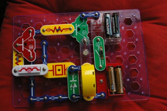
Initially, my curiosity was piqued by Elenco’s Snap Circuits Junior, a kit that allows kids to build simple projects by snapping together components onto a plastic board. It’s fun and my kids and I were successful in such achievements as a prototype lie detector. If your hands are clammy and you touch the connectors, it makes a loud noise and lights go off—fun! But we had no idea how it actually worked. We were connecting a series of black boxes to make a new black box.

Next stop was amazon.com, where reviewers heartily recommended Getting Started in Electronics by Forrest E. Mims III. It’s worth getting just to see the production value—every page is painstakingly hand-lettered (which makes for some interesting results when you tell Amazon to “search inside this book”) instead of typeset. But whereas the Snap Circuits have you doing projects without explanation, this book is much more telling than showing.

I put the Mims book aside when I moved on to “300 in 1 Electronics Lab”, also by Elenco, which was exactly what I was looking for. You get a console to work on with real wires, resistors, capacitors etc to assemble into projects on a breadboard. The manual directs you into projects that are just hard enough to be frustrating but ultimately doable and at the end of each, tells you what you’ve learned.

Why was 300 in 1 the best? First, the role of user feedback. You’d do something, test it, and if successful there was a verbal or audio response. That’s different from rote learning for its own sake, which has never worked for me. (I’m terrible at studying languages in the abstract, for example, but less terrible when I’m in a country and have to make myself understood.)

And second, there was a sense of accomplishment that motivated me to learn more. My initial projects were unsuccessful till I discovered I was misreading the marking on the resistors and hooking up parts that kept the current from flowing. Once I figured out that problem I was on my way. Capacitors, diodes, bring ‘em on… I’ll certainly be more likely to persevere next time I get a challenge.

This is stuff to keep in mind if you write user documentation of any kind. But it’s also applicable if you want to “teach” people to read the copy you write for any purpose. Good example: Hershell Gordon Lewis’ advice that you should always make the first sentence of a letter short, because people then assume the letter won’t be tough reading even if it is.

There’s learning at work here—the reader is throwing up the initial words against such screens as “is it worth my time to read this piece of junk mail that obviously wants to sell me something?” And it comes back with good marks for intelligibility and ease of reading. That’s user feedback… possibly augmented, if we’re really good writers, by a sense of accomplishment for having read something interesting or useful.

“It’s [still] not creative unless it sells.”


I’ve always followed David Ogilvy’s dictum, which means I never show work around if I know was not successful in the marketplace. But what if the market was wrong? Or, to put it less arrogantly, what if the lists got messed up somehow and my mailer or email went to the wrong folks? Shouldn’t you be allowed a free pass once every few decades on work YOU really like and think is good?

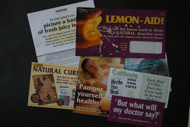
I was going to present the piece shown here as an example. It’s always been one of my personal favorites, though I hadn’t looked at it in a number of years. The client and I were very surprised at the time that it was not a big winner. But when I pulled it out today, I could immediately see what was wrong.

The outer envelope (upper right in the photo) is what kills this package. We’re selling a book of relaxing natural cures to women and I wanted to use a lemon to illustrate how our mind has powers to help us. (Really concentrate, think about a lemon and its taste, and your mouth starts to pucker up.) But where’s the reader benefit in this? I was also betrayed by my choice of visuals from a great designer… this stop-motion bursting lemon image is frenetic when it should be calming, and the background should be green not purple for a restful, natural cure. And yep, that reversed out type is pretty hard to read.

Inside is lots of good stuff which the recipient of this package never got to see. There are two headlines I like: “Pamper Yourself Healthy” and “Natural Cures that Feel as Good as They Work”. Either one of these might have given me a fighting chance if I’d used it on the outer.

Once again the marketplace—and David Ogilvy—are right.

The “Buffer” problem

Our San Francisco Chronicle TV critic, Tim Goodman, recently urged us to watch a new show on FX called “The Riches”. It’s about a family of “Travelers” (think Gypsies, without the ethnic implications) and how they outsmart and rip off mainstream Americans who are called “Buffers” in the show.

I like the acting, but I signed off about halfway into the current show, when Doug Rich BSs his way through an introductory speech to his new staff at the firm where he’s pretending to be a lawyer, then the family fails to BS its way into a private school. The problem is that we viewers don’t know whose side we are supposed to take. We don’t identify with the Riches who are not a particularly attractive or likeable lot, and we are smarter than the real estate office that Doug Rich BSs with his nonsense speech that is supposed to be a tour de force.

Aristotle figured this out a while back, by the way. Dramatic appeal in tragedies comes from the “tragic flaw” in an otherwise heroic protagonist, while the protagonist in a comedy, our representative in what can be a very chaotic tableaux, is an essentially good person of modest abilities who is striving for something better. (Thanks to the nice De Paul University syllabus notes I found to refresh myself on this topic. )

Ineffective advertising is often bad because of this very failing. Who are we in this scenario? What problem of ours is being solved? The audience is not given anything credible or of sufficient weight to identify with. A straw man problem is presented and then solved, but we don’t care because we never got involved in the first place.

Sorry, Mom. The art director did it!

I gave my mother the highly-touted new edition of the Joy of Cooking for her birthday, and bought a second copy for us to have at home. I like to leave the book open for reference when I’m cooking, and soon I noticed I was doing a lot of squinting and carrying the book into brighter light. Could it be that the type had gotten smaller?

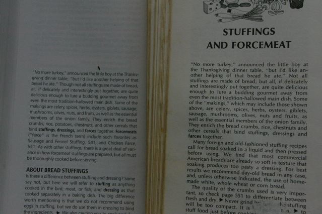
A comparison of two identical passages shows that’s exactly what happened—20% smaller in fact. (Count the characters in the first line of the new edition, at left in the picture, and compare to the 1975 edition, at right.) I can understand why they didn’t want to make the book too unwieldy with all the new additions. But I’m too preoccupied to memorize the recipe before I cook it, and too finicky to be satisfied when I misread and put a tablespoon of salt in when the recipe calls for a teaspoon. Sorry, but the type’s too small.

This is why I advise my students and clients to double-check the work of their designers. If it looks too pretty, it probably is—something’s been sacrificed for the sake of great design. If there’s a coupon, try filling it in to be sure there’s room to write—or better yet, have your art director do it.

What does it taste like?

Cam Huong Bahn Mi
I’m finishing up a project that had me writing web product copy for over 150 different cuts and preparations of beef, pork and lamb. I need to describe each one in a way that makes the reader understands how it’s unique. A lot of this has to do with taste. Or does it?

So much great food writing is about the experience surrounding the eating—the origin of the ingredients, the way they’re prepared, the environment in which they’re consumed. Tasting itself is when all these elements come together—it’s the payoff for being in this place, at this time, eating this food. And if it’s good, that first bite and the flavor released becomes a time capsule or shorthand for remembering the entire experience.

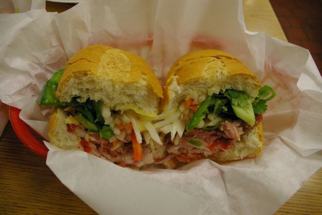
Prepared dishes are easier to describe because the flavors play off against each other. The other day for lunch, for example, I had the Pork Bacon Sandwich at Cam Huong in Oakland’s Chinatown. The crunchy baguette lends crispness while showering my lap with crumbs. Mayonnaise adds sweetness and lubrication. Cucumber sliced and pickled daikon and carrot shreds provide coolness, crunch and slight acidity. Jalapeno means more crunchiness plus the anticipation of a delayed reaction mouth tingle from the aromatic chili oils. And all this is a backdrop for two meats. The “bacon” is one of those Asian special-pork concoctions that has very little taste but the slippery mouth feel that we love from fat. And the other pork, shredded, is cooked with salt and red spices and ends up with a gamy intensity which we recognize as the essence of meat. The day laborer who’s grabbed the seat opposite me asks how is it, and I say “great”.

By comparison, how does a New York steak taste? I find myself writing about musculature and where the beef comes from on the animal in part to make the reader an expert so they’ll feel comfortable presenting this expensive meat to their guests. And when it’s time to deliver an institutional message it comes through sounding like this:

“Eating dry-aged beef is as sensual and satisfying as drinking well-aged wine. The flavors have deepened and mellowed. The taste is concentrated, an effect brought about by moisture loss and by changes in the meat itself. Natural enzymes in the meat break down the fibers, enhancing the taste with a delicious nutty flavor and tender texture.”

So, science and nature come together to make magic which translates to user satisfaction. Appealing? I hope so. One of the greatest challenges, I found, is that there are actually only two words that describe this experience—“taste” and “flavor”. Can you tell me some others? Another word, “tenderness” which is universally used as a compliment for really good steak, is more closely related to the amount of fat than anything else. While “texture” is a promise, that when you bite into this stuff it WILL be tender, or perhaps crunchy, or maybe it will coat your tongue with the eggy creaminess of a rich sabayon.

Food writing may be hard, but it is easy and fun to read because it is so experiential and suffused with the joy of life. My personal favorite example, and in fact a book that was mentioned by many of the chefs I interviewed, is Heat by Bill Buford (that’s an Amazon.com ordering link). Buford, whose day job is an editor for The New Yorker, decides to see what life is like as a line cook at a Mario Batali restaurant. Before we know it, he’s made a lifelong commitment to a summer job carving meat in a Tuscan village. Go get it, and read it. But be sure you go hungry.
On the Internet, everyone knows I’m a dog…

One of the worst days of my life is now a matter of public record, as Jeopardy has now posted its complete archives including who played what game, what questions they answered, and what they went home with. In my case, all pretty pathetic. I don’t even recall that dome tent as the 3rd prize winner and suspect I gave it to charity. Click the title link of this article for the full gory details.

But here’s what REALLY happened folks: I kept buzzing in TOO SOON. I knew the answers, almost all of them, and was eager to prove it. You believe me, right? Hello?

Batteries not included.. neither is the lid for the battery case.

I just got through a holiday season filled with toys that required batteries, and something finally dawned on me. All of them now have battery covers that are attached with a tiny screw, rather than the slide-on-and-click-to-lock type that I remember.

I first assumed this was some kind of money saving move, and that somehow it cost less to use a screw than to mold a special plastic case that shuts tightly… higher quality plastic, tighter tolerances presumably being needed for the latter. But maybe not.

A bit of poking around the web suggests the screw-on battery cases are in fact for child safety and to keep kids from getting at the batteries so they can stick them in their mouths. Perhaps there’s new legislation requiring the manufacturers to use them. Anybody know?

I want to bring up a couple of points about this, which are completely random and unrelated:

* I can’t find anybody who is upset about what is really a pretty major change in toy design, no Amazon reviews or web postings by folks who are upset about the extra difficulty of dealing with the screws or the need to run out and buy a tiny screwdriver. (And by the way, in most cases these screws are really IN THERE and require a lot of torque to remove.) Suggesting as a nation we are a lot more handy than one might suspect. Wonder if there are any more hidden competencies lurking out there?

* It costs about a 1/10th of a mill (which is 1/10th of a cent) to add a little locking washer so the screw doesn’t fall out and get lost, and yet maybe 1 toy in 5 has it. So picture this. You’re trying to load the batteries while your child with trembling hands awaits. Of course the battery screw falls out and of course it disappears (possibly into the mouth of a smaller child). And now you have a lid with no way to secure it other than our old friend, Mr. Tape.

Progress?

Trade Show Tactics

We’re coming up on January, which has become my big trade show month since the demise of Comdex. I’ll go to the Consumer Electronics Show first, followed by a quick stop at Macworld, and then the Fancy Food Show at the end of the month. What am I looking for, other than schwag and free food?

First, I want to see how companies I work with—or their competitors—get the attention of the audience through elevator pitches or booth design. And second, I want to watch other show-goers who may well be my audience at some point to see what questions they ask and what “hot buttons” cause their faces to light up. It’s also nice to put a face with abstract stats so I can have a mental image of my reader, next time I write to Dear IT Manager or whatever.

In my copywriting class we talk a little about trade show booth design for smaller companies—something that increasingly seems to be the responsibility of the marketing folks who are my students. It’s not easy to create a visual “home” out of nothing that can be erected and disassembled quickly. One thing I’ve noticed is that faces help—big photos of people who look like your users, making eye contact with the show traffic. Not enough companies do this so it’s very easy to make yourself stand out.

Also, too little attention is paid to booth traffic patterns. If you stand behind a high counter, you’re creating the metaphor of a store checkout—people will not approach unless they’re already committed to doing business, which eliminates most potential booth visitors. If you put up registration kiosks at the outside corners, or entry points framed by signs, you’ve created a boundary that may keep people out.

As a show floor troller, I tend to be wary of a big and empty booth—I assume that they don’t have much to offer and that if I go in I’m guaranteed to be hit with a sales pitch. But I find a booth with higher traffic irresistible, because I want to see what the buzz is all about. You can do this with good visual design and a seamless traffic pattern. Oh, and free samples of artisanal cheese will help.