Fulfillment lessons from the Container Store

Container Store fulfillment materials
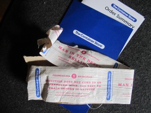
Packing tape and portfolio from my Container Store shipment

My wife loves the Container Store. She has a closet full of Elfa components and various other elements that roll around or sit under shelves. Recently she bought four big stacking wire baskets to hold mittens, hats and other snow gear, one for each family member. The box arrived (several days before the promised date, by the way) and it was as big as a steamer trunk. I’d assumed that shipping, an unhappy necessity for those who don’t live near a store, was similar to what they charge at Ikea—an arm and a leg. Not so; this was shipped at a flat rate of $19.95.

Before I knew this I had opened the package and became somewhat intrigued by a couple of its features. First, there was a special heavy-duty fiber tape used to seal the box which had CS’s “7 Foundation Principles” printed on it in an endless loop. These can be found on the website along with lots of comments and inspiring videos. CS is consistently voted one of the best places to work in America and its employees are fervent in their mission. To me the dialog seems a bit cultish but that’s just my perspective and I do not begrudge the employees or their customers their enthusiasm.

Second, the bill of lading was packaged in a little blue portfolio including a thank you from the President. It was at this point I decided shipping must be REALLY expensive so I peeked inside and there were no prices on the receipt. Then I went online and discovered how reasonable their shipping actually is.

Bottom line, this is a great fulfillment effort that extends the Container Store brand right into the home as the package arrives. The cost of the special tape and the card-stock portfolio are not insignificant but my guess is they haven’t been tested against a generic approach. Container Store felt this is the way to communicate with their customers, and that’s the end of it.

The whole experience puts to shame mass produced efforts like Lands End, from whence your coveted fashions arrive in a plastic sack and a return label is printed on your shipping document as if they assume you’re already having second thoughts. Amazon with its non-recyclable receipts, in which the UPC code for the package is printed on peel-off paper and then switched to the outside of the package leaving a blank spot on the receipt, isn’t much better. Not as bad as Applebee’s decision to just throw it in a box, but not great.

Fulfillment is the last mile in your relationship with your customer. There may be sound economic reasons that you can’t be as effusive as the Container Store. But consider their example, and learn from it.

Fumbles in fulfillment: Applebee’s Lunch Decoy

Applebee Lunch Decoy fulfillment pack

So I am now the proud owner of an Applebee’s Lunch Decoy, which I ordered pursuant to the previous post. Notice anything wrong? Yup, they sent a gal decoy instead of the guy promised on Amazon. No way my boss is going to be tricked into thinking that’s me. So much for sneaking out for that Lunch Deal.

But there’s actually something more serious about this fumble, which is the lack of follow-through from the ad campaign. Is there anything to promote it on the outside of the package? No, not even the Applebee’s name. And the little mock-instruction sheet is great, but how about including a $5 off coupon since this recipient is obviously a heavy user?

So many campaigns start with a great idea and it’s forgotten that an actual element needs to be fulfilled. It’s a total afterthought and it ends up like this. And guess what creative geniuses: when you enter this campaign for an award you’re going to need to include a sample of the fulfillment pack, and that will be a bit of an embarrassment, won’t it?

Speaking of non-followthrough, a chap named Craig Murray emailed me and asked if I’d consider running a guest post for an infographic if he created one to my specifications. I could tell it was a mass solicitation but the idea interested me so I replied. Do you think Craig has followed up? Nope. And how does that inaction help him make sales? Don’t you think, if he contacts me again, I’d be less likely to consider his offer rather than more?

Dot your i’s and mind your p’s and q’s. That’s my small lesson for today.

Applebee’s out-ironics The Onion with its new campaigns

Have you seen this? According to a media commentator, Applebee’s has a new campaign in which they are urging hipsters to dine at their restaurants “ironically” which makes sense since they are never going to get them there through conventional advertising. Take a look:

Funny thing is, Applebee’s actually is running a social media campaign that is far more bizarre as this, called “Girls’ Night Out. Life is better shared.” A Betty White character harangues ladies for spending too much time online, then tells them the solution is to get down to Applebee’s for some facetime. Take a look:

There’s also a tumblr page that anchors the campaign and has links to Pinterest and Twitter pages (no Facebook, maybe because it’s a regional campaign). All the elements of a well thought out and expensive social media campaign.

Speaking of social media, Applebee’s is also marketing a life size inflatable dummy you can leave at your desk while you sneak out for lunch. This one is on Facebook, where you can take the Desk Lunch Diagnosis Quiz (I am the “Break Room Hero… people are tired of cleaning up the microwave after you”).

Does this stuff work? The “goddess” video above has over 50,000 hits but how many of those are potential customers? There are only 400 plus followers on the Twitter page and the selection of inflatable dolls on Amazon was originally 7 but is now down to just 2. The bottom line is that Applebee’s is still Applebee’s (check the hashtag #applebee and you’ll get a far more realistic snapshot of Middle America’s view of the chain) and there’s only so much you can do to get hipsters to change their behavior… unless they do it ironically, perhaps.