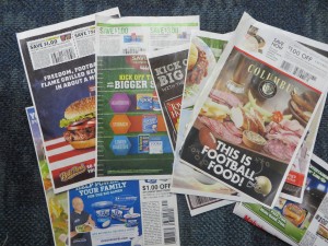
FSI coupons score for the home team before 2014 Super Bowl

Super Bowl FSIs
Football-themed FSIs a week before the big bsme
Okay, football fans, what’s special about this past Sunday? If you said Pro Bowl, you just got sacked for a loss. Correct answer: it’s the weekend before the Super Bowl, and therefore the Sunday when the FSI coupons do a Richard Sherman trying to connect themselves to the Super Bowl without actually mentioning the name of the event, since they haven’t paid the hefty licensing fee.

Here comes Kraft with “your bold lineup for game day dipping”. Foster Farms wants us to “save big on tasty favorites for game day”. With a casserole made with Carnation evaporated milk, “game day just got tastier”. Attacking a problem we didn’t know we had, Hefty plasticized paper plates advise us to “soak proof your game day”. And, in case you’re planning to eat a few too many nachos, Pepcid offers to “kick off the big game with even bigger savings”. Cheez-It advises you to “kick off the big game with these fan favorites”. And Land O’Frost offers “easy game day entertaining with our premium line-up”. Anybody notice a trend here?

But the story on the sidelines is that there are far fewer of these themed coupons than in years past. And, where many of them did photo shoots of hyperactive fans enjoying their products in a home setting, now most simply stick some stock art of a green football field behind their usual overdressed product graphics. What’s the strategy, coach? Where’s your jumbo package or that gimmick play?

It just may be that marketers have found these themed ads aren’t worth the effort in terms of incremental sales. The overwhelming majority of coupon clippers are female, and so the underlying message is that the little woman is going to put out a bountiful spread for the men in her house and their loutish guests. But more and more consumers may be blowing the whistle on this blatant pandering. It may be that it’s better to promote your tried-and-true product positioning after all.

In my house, I know, the males are going to be expected to put together their own Super Bowl spread and clean up after themselves. Maybe I should get some of those soak-proof plates.
Direct marketers think we’re pretty gullible, it seems

The best scams and con games involve an element of human greed: that wealthy banker in Nigeria who made you his heir because of an incident you don’t remember, and may actually involve someone else; the check that reaches you by accident yet has your name on it and is perfectly legal tender. In the more adept scams, the next step usually is to tap into your bank account. In direct mail, it would typically be a subscription or sale of some kind.

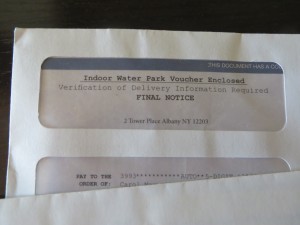
Water Park Voucher
Timeshare “fake check” offer

In our more cynical age these tactics may not work as well, and I don’t see them as often. But they show up every now and then, like embers of a dying fire that flicker back to life. This “fake check” example charmed me with its absurdity: Indoor Water Park Voucher Enclosed/Verification of Delivery Information Required/FINAL NOTICE. Wow, that’s a lot of security to deliver what looks like a discount to an amusement park. But I did open it and it turns out it’s a timeshare offer, which happens to include admission to the water park. And if this isn’t enough, there’s a kicker: “our records indicate that by responding within 48 hours you will also receive a $100 Restaurant dining card”. I am almost tempted to take advantage of this offer to see what kind of person responds. Almost.

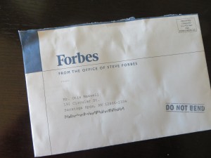
It’s easy to poke fun at the individual who would be lured into buying a money-sink timeshare purchase by the offer of a free ride on a water slide. But what about the distinguished prospect for Forbes, a respected business magazine? Would they really be motivated by that violator lower right on the envelope that says DO NOT BEND?

Forbes Do Not Bend
Forbes “DO NOT BEND” offer

The target for this tactic was, traditionally, somebody who isn’t used to getting a lot of respect. The reason the package says “do not bend” is that a photo is inside (or sometimes a computer punch card, or a certificate of some kind). Wow, I’m so important that Steve Forbes, president of Forbes, is sending me a photo. But the funny thing is there isn’t any photo, or anything else which would be harmed in any way if you folded this mailer in half and stuffed it in your pocket.

Forbes is using a mass-production format and so you can bet they’ve done plenty of testing, and from that they’ve found out that hinting at an enclosed photo, then not providing the photo, is a great way to save some money without reducing response. In other words, it works, or they wouldn’t be doing it.

It’s humbling that such mailers are effective, and especially humbling that my household was deemed a ripe enough target to receive them. Maybe I should pack my bags for that 3 Days and 2 Nights including Water Park Passes for 4 guests, after all.

How to write a good lift note or publisher’s letter

International Living mail pack
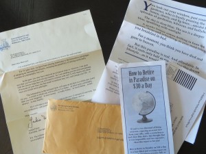
Here’s the complete International Living mail pack. Click the photo to enlarge to a readable size.

The lift note, or publisher’s letter, is an additional element in a direct mail package which is designed to elevate (lift) the response rate and profitability sufficiently to repay its printing and production costs. It might highlight the offer, answer one specific objection, spotlight a key benefit, or emphasize the penalty for not responding.

The pub letter is a variation which is literally a communication from the publisher. The conceit is that he (in the old days, always a male) grabbed the mailer proofs as they were on their way to the printer and was inspired to add a personal message. He might talk about his pride in the product, make a guarantee, or offer the classic “frankly, I’m puzzled” perspective in which he wonders why more people don’t respond to such a great opportunity and urges the reader not to lose out.

We don’t see too many lift notes in today’s lean direct mail packs, but I received a fine example recently from International Living. These folks are one of the last old-school newsletter publishers and they send a classic 8-page letter about the low costs and lifestyle benefits to be found retiring abroad.

The pub note, which is personalized and the first thing you see upon opening the package, begins: “I’m concerned that you have not had a chance to review the enclosed letter”. The publisher (now it’s a she) drops in a paragraph describing the product then continues, “in the past, you may have received an invitation from us. However, I’m quite sure you have not received one recently…” and then goes on to sell not the newsletter, but the investment of 10 minutes of my time to read the rest of the package components.

What’s nice about this is that the copywriter took the knowledge that the name was rented from a list of people who have not been prospected previously, and turned this into a very personal message and benefit. (Reminds me of the classic Emily Soell letter for Vanity Fair which begins “if the list on which I found your name is any indication…”)

Does it work? I sure hope so. In essence, by elevating and personalizing the lift note, International Living has turned it into the driver of the package. The preprinted long form letter, which today’s distracted readers are less likely to pay attention to, becomes a supporting brochure. It’s a great way to refresh an appeal to an older audience which today is far more cynical and less trusting than the previous generation. I’m definitely going to try this tactic for myself, next time I have the budget to write a package with lots of components. How about you?

Why your writing could use an AutoCrit

I am working on a book, and before sending it out I wanted to eliminate as much sloppy language as I could. I’ve been experimenting with a tool called AutoCrit which I recommend to anyone who writes long form copy–and best of all you can try it for free.

The sample free report (which is limited to 500 words, but you can chop up your copy and make three submissions per day) will identify overused words and tell you how many to eliminate, and also identify cliches and redundancies. I was particularly happy at how often it flagged “it”, a trouble word that slows down readers because they have to take the time to figure out what “it” refers to if it’s not obvious.

The paid versions, which start at $47 for a year’s subscription (you can currently get 10% off with the promotion code fb2013), also identify repeated words and homonyms. Sometimes we repeat words intentionally, but sometimes it’s accidental, and the result is that the narrative loses texture and the reader might actually notice the repetition when the flow of your narrative should always be seamless with all grammatical tricks behind the scenes.

Homonyms are words that sound like other words–eg “in” which sounds like “inn”–and they’re mostly innocuous. But this feature will also catch words which can have more than one meaning, and those are deadly–“lie” being an example; the skimming reader might not know whether it refers to something in a prone position or someone who’s not telling the truth. (Something it doesn’t catch, but you should be vigilant against, is words that look similar to other words so they can be mistaken by the reader–“through” and “though” being an example pair.)

Seeing your text in the context of the report also helps you look at it with fresh eyes, and catch typos or awkwardness you might otherwise miss because you’re too close to it. I took perhaps 10% of the suggestions AutoCrit had for me, but that 10% has definitely improved my manuscript. Check it out.

Is this the John Caples of 2014?

Neetzan Zimmerman
Neetzan Zimmerman

Almost a century ago, John Caples wrote one of the most famous direct response ads of all time: “They laughed when I sat down at the piano. But when I started to play…” Caples combined a homespun way with words and a scientific approach to analyzing the interests of his audience, as documented in his classic Tested Advertising MethodS.

If John Caples were to re-animate, be zombified, or simply time-shift to the present day, what would he be writing now? Maybe something like the work of Neetzan Zimmerman, who was recently profiled in the Wall Street Journal. Zimmerman doesn’t write space ads, long-form direct mail or emails. He’s an editor at the website Gawker, where he’s charged finding story threads that are so irresistible, people not only read them but pass them along, in huge viral numbers, to their friends.

Zimmerman was responsible for “Mom Fined $140 Every Day Until She Circumcises Her Child” and “Black Man Arrested Dozens of Times for ‘Trespassing’ While At Work” among countless other gems. His posts generate an astonishing 30 million page views a month, more than all other Gawker contributors combined. When they linger on his posts, web visitors see the ads that accompany them; that’s the Gawker revenue model.

According to WSJ, Zimmerman’s ability to draw traffic allows Gawker to subsidize other deeper and longer pieces. He’s the equivalent of a retail loss-leader, but with words. Like Caples, he combines a scientific curiosity with the ability to connect with his audience on the topics they care about—“cute, outrageous, heartwarming, hilarious, anger-inducing” being some typical threads.

Zimmerman starts each day by analyzing the metrics (Twitter and Facebook mentions) for popular stories, then deciding which ones to pass along. “Within 15 seconds, I know whether an item is going to work,” he told WSJ. “It’s a biological algorithm… I’ve put myself into the system—I’ve sort of become the system—so that when I see something I’m instantly thinking of how well it it’s going to do.” He adds that he can no longer tell the difference between stories he finds interesting and stories that will be popular. “If it’s not worth posting then I’m not interested.”

Lee Euler, a savvy newsletter publisher who was my client at one time, describes this as “the common touch”. It’s not enough to write well, to know your subject and audience, to deliver up benefit statements that get readers reaching for their wallets. To be a truly great and consistently control-busting copywriter you need to be able to connect with people on a visceral level, where they trust you and want nothing more than to hang on your every word. It’s a rare gift, and this guy seems to have it.

How to get more page views for your copywriting blog

Would you like to increase the traffic on your marketing blog or copywriting web site through organic search results? Here is an accidental success story that may help.

I have another blog, Burnt My Fingers, which is specifically about food and cooking. It’s a fun, niche project and I have never worked too hard to pump up the metrics. But in the last 3 months my page views have increased by well over 100%. How come?

I wrote a post called “Why I’m not buying a Sansaire sous vide device” which was an offshoot of some earlier articles on this specialty cooking method. Well, turns out there is a lot of interest in this gadget and the buzz is only increasing as the holidays roll around. Do a web search for “Sansaire” as many shoppers might and there’s my post, close to the top of your search results. It looks like a negative review (it actually isn’t) so is just the sort of thing a shopper might want to read as part of their research.

The good news is that search links to this specific post account for only about 25% of my new page views. The rest are from the activity of users once they get to the site: they browse around to linked articles, then my recipes, which is exactly what you hope they would do if the article they came for is relevant to your core content vs. link bait.

The key to this accidental success story was finding a topic a certain audience wants to read about, vs something I wanted to write about. Think about the interests of your audience—then think about how you might mine that with catchy content that draws them to your site.

Behavioral Economics at DMA2013

Dan Ariely is a professor of psychology and behavioral economics at Duke University, and also a consultant to the Wilde Agency. Yesterday he delivered an entertaining and eye-opening keynote called “Who Put the Monkey in the Driver’s Seat?” in which he documented irrational and yet predictable human behavior for the benefit of the direct marketers at DMA2013.

First example: statistics for organ donor signups in European nations. Organ donation doesn’t hit all the altruism hot buttons because it happens after you’re dead, and the recipient will never know who provided the life-saving transplant. So it’s not surprising that donations are close to zero in some countries, such as Germany. Yet in demographically similar nations, such as Austria, donations are close to 100%. The difference? In the high-donor nations people have to opt out at their DMV if they don’t want to donate and people will do almost anything to avoid doing something.

ArielyInsurance
This buckslip produced a 588% lift.
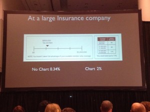
Moving on to direct marketing: a large insurance company wanted to improve response for its affinity accidental death offer. So a chart was added on a buckslip, showing people that although they are eligible for $3 million in coverage at present they are only at $800K. It’s obvious at a glance that the reader is missing out. Given a reference point, response increased from 0.34% to 2%.

Another example is a response form for The Economist. Given the choice of an online-only subscription for $59, print-only for $125, or online plus print for $125, 84% opted for the last option. Who wouldn’t—it’s like getting online for free! But in fact it’s a significant upsell for anyone who was considering an online-only subscription. And when the print-only option was removed the numbers reversed: 68% went for online-only, vs only 32% for the online plus print combo.

ArielyBigData
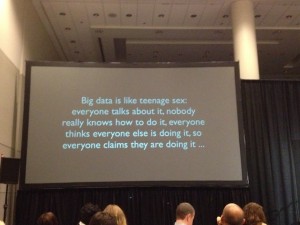
Ariely poked fun at the direct marketer’s infatuation with Big Data.
As a creative practitioner, I eat this up. It’s one thing to sell your prospects through a positive reception of your carefully presented benefits, but much better if you can cement the sale by making them feel like they’ve gotten a great deal or they aren’t missing out. As to that organ donor stat, most of us have found that negative option offers (in which you have to opt out to keep something from happening) lead to poor pay-up, conversions and renewals. But if the consumer is dead, I guess that isn’t a problem. Fascinating stuff.

Onsite at #DMA2013

I just arrived in Chicago for the Direct Marketing Association’s annual conference and have already seen a couple of great sessions and met some folks that made the whole trip worthwhile. (Also happened to walk down Michigan Avenue as the marathon was being run and got to see both the men and women winners.) If you’re here please email me via the contact form or tweet to @otisregrets and hopefully we’ll find a time to meet up.

I’m leading a panel at 10 am Wednesday with Dawn Wolfe of Autodesk and Philip Reynolds of Palio+Ignite. The topic is “KISS: Keys to Copy and Content that Generate Results” and we’ll talk about how to apply powerful and simple communications techniques to selling complex products. Attend and you will see and learn:
* A refi direct mail offer that was so successful, it drew a cease-and-desist order
* An insider’s view of ED (erectile dysfunction) advertising
* how to sell software through “gamification”
* and much more!

This is the last breakout session of the conference and the exhibit hall will have shut the day previous, so there’s absolutely no reason not to join us. See you one Wednesday October 16.

Twitter Bios: the 160 character sales pitch

Here is a great project for your copywriting class or inhouse brainstorming session: give everybody five minutes to write the best possible Twitter bio, which has to be 160 characters or less, including spaces.

Your Twitter bio is what shows up in another user’s inbox when you follow them and they make a split second decision about whether to follow you in return. The New York Times had a nice sidebar piece in which they join Slate and the Washington Post in anointing Hillary Clinton’s bio a superb example of the craft:

Wife, mom, lawyer, women & kids advocate, FLOAR, FLOTUS, US Senator, SecState, author, dog owner, hair icon, pantsuit aficionado, glass ceiling cracker, TBD …

It states her qualifications, though not in a pompous way. It veers off into some relevant light touches (Hilary’s lack of hair savvy and her predilection for pantsuits are well known non-presidential attributes) which are amusing without being frivolous.

A bio like that promises that the tweets also will be interesting, and that you may meet other cool folk by following her. It’s much more effective than a straightforward statement of qualifications, or an unabashedly promotional bio like the one Lady Gaga is currently running: BUY MY NEW SINGLE ‘APPLAUSE’ AND PRE-ORDER MY ALBUM ‘ARTPOP’ HERE NOW!

Before writing this post I checked my own neglected bio for @otisregrets and found it pretty terrible:

Results-focused ad copywriter; blogger about writing, marketing, customer service, technology and more.

I gave myself the five minutes and came up with:
I write direct response ads, web pages, emails, direct mail & whatnot. Gold Echo & Caples Silver Cup winner. Guilty pleasure: streaming bluegrass videos at work.

Some work qualifications hopefully written in a  casual way… but I don’t like the personal aside because it might imply to some that I bill for time when I’m actually not working. (I don’t.) So I tweaked it to:

I write results-oriented ads, web pages, emails, direct mail & whatnot. Gold Echo & Caples Silver Cup winner. Read my blog for marketing tips & off-topic rants.

The blog’s a good call to action since that is indeed where I want the reader to go next, and the throwaway about “off topic rants” will hopefully garner curiosity. I’m sure I can do better but I only had 5 minutes. Let me know how you do on your bio.

Specifics sell… this example shows why!

National Parks
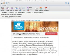
Beginning of the National Park Foundation’s email

Unfortunately, it’s an example of what NOT to do: The National Park Foundation saw the terrible wildfire currently out of control in Yosemite as a great opportunity to raise money for its cause. It’s exactly the same tactic used by The Salvation Army, The American Red Cross and many other charities which often have their best efforts on the heels of a disaster which triggers’ readers empathy and desire to help.

Unfortunately, as the NPF email was on its way to the coder some bone head saw the proof and said, “wait a minute, what about all the other parks? If they’re not in California, maybe they don’t give a hoot about Yosemite!” And so the “ask” was expanded to mention acts of vandalism, including green paint being splashed on the Lincoln Memorial.

I didn’t even realize the Lincoln Memorial was a national park, and it seems to me responsibility for cleaning it off (or keeping vandalism from happening) should rest with the local police. They then go on to tell us that there were 2,000 acts of vandalism in national parks last year and that the parks are underfunded. There’s also a reference to the fact this is the parks’ 97th anniversary and that the Travel Channel will match your gift. And they close with the unacceptably vague promise that a gift will “provide critical resources that directly aid and enrich our national parks and the work of the National Park Service.”

What should they have done instead? Leave the kitchen sink in the kitchen! In this case, a vastly stronger email could have been created by focusing entirely on Yosemite, saying how this makes us realize how precious our parks are and how much they need our support, and bringing in the Travel Channel match as exciting news that makes your gift go twice as far. Tell us very specifically what our contribution is going to do. Then get out.

And that anniversary announcement? Save it for the 100th, for goodness sake. Assuming this Foundation actually is doing good work, I hope they’ll be around that long. Meanwhile, this one goes straight to the Badvertising Hall of Shame.