Serotta Bicycles and the “quality of time”

BenSerotta
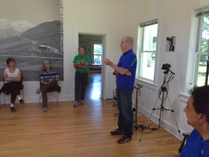
Ben Serotta explains the “quality of time”

Last month I got a tour of Serotta Bicycles, a world-renowned high-end facility located in my little town of Saratoga Springs, New York. These bikes cost from $4800 to over $28,000—and that’s just the frame. But the painstaking details make it seem worthwhile—from a machining process that can take a stock titanium tube and give it 3 different diameters and three different thicknesses, so it has light weight along with the perfect balance of strength and flex at every point along its length. The total process from beginning to end takes about 40 hours to produce a finished frame; the shop turns out an average of 3 per day.

All the other visitors were current owners who’d come to see the mother lode, and there were esoteric questions about discontinued models and “why don’t you use steel anymore?” (Google that one with Serotta in the search box.) Finally I had to ask the question, why does it take 40 hours instead of 39 or 41? How do you know when it’s done?

Founder and President Ben Serotta said it’s about the “quality of time”. He wouldn’t amplify on that and when I asked a local bike evangelist and Serotta enthusiast to explain it to me, he was silent. So there’s a bit of mysticism afoot here and I will make a couple of educated guesses.
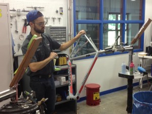
SerottaAlighing
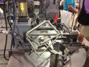
Frames are aligned after every assembly stage, making this the most important machine in the shop

First, quality of time means diminishing returns. As nearly perfect as these bikes are, the finish will never be completely immaculate. (Even though in the final polishing step they use 2500 grit sandpaper, which feels as smooth as a baby’s bottom.) There’s got to be a point when an hour produces so much less benefit than the hour preceding it that you’re spending your own money or raising the price for no good reason, so you stop. Second, bicyclists spend a lot of time in the saddle. If incredibly subtle details can make for a more productive or efficient or competitive ride and so improve their quality of time, they’re worth doing.

Both these hypotheses have application in copywriting. As a creative practitioner, I charge several times what a junior copywriter would charge and there are people who charge several times more than me. Here the time you are paying for is experience—the knowledge and instinct based on past work that a particular message and way of presenting that message will work better than all others. It’s probably not necessary to hire a senior copywriter to write a coupon for your dry cleaning establishment; someone who can follow basic common sense marketing rules (and mayn can’t) will be fine. But if you’re planning to mail millions of people or launch an elaborate website, then the cost of the creative becomes a relatively minor one and it pays to pay more for the best.
SerottaFinish
Final step: polishing with 2500 grit sandpaper

The other way to look at “quality of time” is in the experience of the user—the prospect or retail customer who is the recipient of your message. The more time you spend understanding that person’s preferences and motivations—whether through research or hunches—the better their experience is going to be when they receive your message and the more likely they will respond positively.

I may never be able to afford a Serotta bike but it’s something to aspire to—especially because the way to making the money to buy one lies in maximizing my own quality of time.
How to be a good tech writer

The other day a marketing colleague asked me to write him an email which he’d pass along to his CEO, about why I should be hired to write technical copy. Feel free to use these selling points in your own self-marketing, assuming of course they apply.

The first thing I believe about tech writing is that you need to understand the product—-not necessarily on a programmatic level, but the problem it solves, and why it does this better than other options. I’m not a scientist but I love to learn how things work.

Secondly, I believe that technology buyers are people with the same personal motivations as those buying consumer products. They want to be secure, avoid conflict and achieve recognition and in an indirect way technical products help them do this. They get promoted because they’ve contributed to the bottom line. They get to go home on time instead of staying to placate angry users.

Finally, I always ask to interview the sales team so I can understand the objections that are typically raised and the hot buttons that get prospects excited about the product. I go to CES most every year (and attended Comdex before that) and spend most of my time hanging back near kiosks to watch sales engineers do technical presentations.

I believe these steps are missing in a lot of the copy I read for technical companies which reads like a laundry list of specs. I spent most of my career working in the Bay Area, and my work was typically lead generating direct response that was tested against other messages and I usually won.

To my fellow copywriters, I’ll add that I won consistently not so much because I was a dramatically better writer, but because I was diligent in my preparation. As Yogi Berra may have said, half of success is showing up.

Too much of a good thing from Values.com?

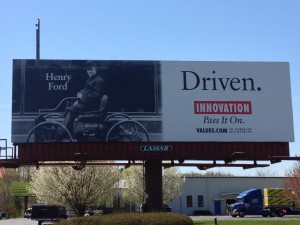
HenryFordValuesBillboard
Values.com billboard in Latham, NY

I pass this billboard frequently on a busy highway in upstate New York. It has multiple inspirational headlines stacked like cordwood: Driven/ Innovation/ Pass It On/ Values.com. To the left, a photo of Henry Ford (we know it’s him because there is a caption that says Henry Ford), driving (not being driven in) an early horseless carriage. The net effect is too much of a good thing, and I see it all the time, so I finally had to write about it.

Part of the problem is that the placement is a stone’s throw from Troy, NY, birthplace of the Arrow shirt, the cast iron stove, Uncle Sam and The Night Before Christmas among innovations. It sticks in our craw that they chose a non-local for their innovator. But the bigger issue is the multiple inspirational sayings when just one or two would do. It’s like too much candy on Halloween.

I headed over to Values.com to learn more about exactly what inspires them to inspire. It’s an interesting website. You can’t join them or give them money or get money from them; they’re doing this because “We believe that people are basically good and often benefit from a simple reminder.” Fair enough, and a good reason they deserve a little gentle nudging to make sure those reminders are effective.

There’s a section on the website called “Billboards” and on it you can create your own values billboard and look at it online, or look at billboards others have created. Each has one photo, one headline and one value and works a lot better than Values.com’s “Driven” effort. Give it a try. (But be sure your inspiration is not something naughty like “beer” or you’ll get a server error.)

By the way, what the website does not say is that Values.com is apparently funded by evangelical Christian Phillip Anschutz, who according to Wikipedia has also funded a think tank that criticizes evolution and a ballot initiative designed to overturn local and state laws that prohibit discrimination against individuals on the basis of sexual orientation. If I were Mr. Anschutz, I would identify myself and make my case on the website rather than leaving it to the curious visitor to go googling and draw their own conclusions.

Headline hijinks revisited with Bose, Wall Street Journal and Coke Zero

Bozz
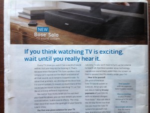
Bose speaker ad
We’re back as promised to that corridor of horrors where tyro copywriters go to die. But this time we’ll focus on the context in which your headline/outer teaser is read and include a couple of positive examples.

First, some badvertising from Bose on the back of a Sunday newspaper insert… about as broad a demographic as you can find. “If you think watching TV is exciting, wait until you really hear it.” There are two things wrong here. First, the copywriter assumes universal agreement that “watching TV is exciting”. If it’s not a head-nodder then the reader is lost. But do we all agree that “watching TV is exciting”? Not likely. Second, there’s an intellectual contortion required to stay with the writer’s train of thought. When you switch from one action mode to another (watching… to listening) that’s some heavy lifting for the reader to do in their mind’s eye. Not likely they will stay around for the body copy, and neither shall we.

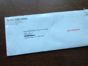
wsjwelcomeback
Wall Street Journal “welcome back”
Now look at this envelope from the Wall Street Journal: “Welcome Back”. Apparently I renewed after a lapse but don’t remember doing so; naturally, I’m going to open the envelope to see what I agreed to. And when I get inside it turns out this is their standard “professional courtesy discount” offer; they WANT to say welcome back and maybe I will feel a little guilty about getting an offer that maybe I’m not entitled to so you can guess I’ll jump on that. The two simple words “Welcome Back” do a brilliant job of framing the conversation and getting me involved.

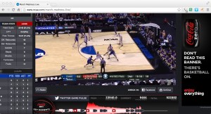
CokeZeroDontRead
Coke Zero “don’t read” banner
Same thing with this Coke Zero banner that ran during the NCAA championship game: “Don’t read this banner. There’s basketball on.” Well, of course I’m going to read it because I can’t not do so. But in this chest-bumping environment I will give you huge points for the apparent cool factor. Yet it actually ties perfectly into their tag line, “enjoy everything”.

The copywriters on the WSJ and Coke Zero projects thought about the environment in which the prospect is viewing the ad, and meet them on their own turf. The Bose copywriter asked readers to switch from what they’re doing to what the writer wants them to think about. Which is better and more effective?

Headline Horrors (outer envelope teasers that don’t)

Fresh Air camp appeal
What buses? Where are we going?

It’s been far too long since we’ve visited the Badvertising Hall of Shame… that corridor of horrors where unfortunate marketers teach us by example what NOT to do. Let’s begin with this outer envelope teaser from Fresh Air Fund.

This is a seasonal appeal I used to struggle with when doing work for Salvation Army… the “send an inner city kid to camp” fund. It seemed less urgent than putting food on the table or rescuing a child from the streets, and it was complicated because you’d have to create a word picture of why this was important before the reader got away. No missteps are permissible.

So look what Fresh Air Fund has chosen as its teaser: The buses are leaving soon… please hurry! What buses? Am I supposed to be on one? Why on earth does this not say instead, “The bus is about to leave for camp without me… please help!” (Singular better than plural because it’s more specific, and let’s mention the reason for the appeal for chrissake.) Also, while camps are universally recognized as a good thing buses are not. Seems like a terrible choice for the opening salvo in this appeal. Next.

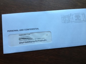
Personal and Confidential OE
Do you believe this?

From… I don’t know who because I never opened it… I have a blind outer with nothing but PERSONAL AND CONFIDENTIAL printed above my name. Maybe I notice the “standard postage” indicia that spoils the illusion, but maybe I don’t; they’ve done a good job of designing something that looks like a real meter imprint.

But, look what’s above my name: PREPARED FOR: Okay, that’s too much and it’s also discordant with PERSONAL AND CONFIDENTIAL which suggests a very individualized letter, maybe a collection notice, whereas PREPARED FOR suggests a mechanized process like maybe a refund. Either would have been good on its own, together they cancel each other out. The blind outer has lost its intrigue so out it goes.

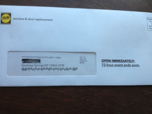
Pella 72 hour sale
When did the 72 hour sale begin anyway?

Finally we have this from Pella: OPEN IMMEDIATELY: 72-hour event ends soon. Well, is it 72 hours or isn’t it? If it is, it ends in 72 hours, not “soon”. The contradiction completely bursts the bubble of urgency and anticipation. Also, since this is clearly a piece of advertising mail, there needs to be more reader context, eg “Hurry! You’ve only got 72 hours to save” or “Open for your private invitation to our 72 hour preferred customer sale”.

That’s enough for today. Three examples in which the client or product manager is wondering why their mailing was not more successful, when in each case the fault lies with the copywriter who is probably making mischief on another campaign right now. I’ll have a couple more good ones in my next post.

The new American is arriving

I love the new commercial announcing the US Airways/American Air merger. It’s stirring, and poignant, and on-message. Who would have thought that a corporate merger could make your heart swell with pride? They did it with an emotional tug at the appeal of new beginnings… an empty airport becomes filled with promise and we remember that flying used to be romantic and exciting. Here’s the script, as narrated by John Hamm:

It’s time to make a change.
It’s time to become better versions of ourselves.
To be greater than you expected.
And more than you had hoped for.
So starting now, we begin a new chapter.
One written in passion, and skill, ambition, and sweat.
One where two companies take the best of themselves to create something better.
And when all is said and done, we will not only have become a bigger airline
But also something so much greater.
So let’s introduce ourselves to the world…
Not again, but for the very first time.
The new American is arriving.

What’s even better is that the spot was completed on February 12 (per the slate at the beginning), the day before the merger was announced, so it would seem to have been produced in record time. How did they do it? Perhaps it was in the can in anticipation of the event (which had been publicly discussed for several weeks), but I like to think they (McCann Worldwide) quickly threw it together using footage from the recent “Change is in the Air” campaign which debuted last month.

That campaign, by the way, fails for me in the same way this new spot succeeds. All the people stopping what they’re doing to look into the skies seems manipulative and unlikely, and also brings unfortunate echoes of 9/11, especially the peek at the tail of the plane disappearing over the top of the building. The evolution from that campaign to this one is to be applauded. I also like the fact I’ll finally be able to use my AAdvantage miles, since US Airways but not American flies to my local airport. Well done.

Legal advice for freelance copywriters

I had, then lost, a new client this month. The breaking point was a work for hire agreement that specified I could not work for any company “in the same business” as this client for two years after working for them. My problem was that the document did not specify what business the client was in! So I added a phrase to do this, and they rejected the edit because they wanted to reserve the right to go into other, new businesses in the future. We thus went our separate ways.

This is not the first time I’ve lost work by declining to sign a legal document I felt was unreasonable. Once a small agency (whose client base was banking, not the CIA) wanted me to sign a commitment never to show any work I had done for them or even say I had done it. Since a freelancer needs to prove experience to get work, this didn’t seem a good idea. It’s not the same thing as signing an NDA (non-disclosure agreement) which I’ve done many times and simply holds the contractor responsible for keeping confidential any trade secrets revealed during the project.

What do you do to protect your legal rights while still getting new business? Do you show everything you are asked to sign to a lawyer? Do you have a lawyer draft your own estimates and contracts? I don’t. For one thing, the cost of the lawyer would cause me to raise my rates to a level the market wouldn’t bear. For another, if there ever were a legal complaint the cost of defending it would most likely put you out of business anyway, so the best defense is to act ethically in all your dealings and hope it never happens. This is the “reasonable person” (nee “reasonable man”) concept in which you honor any commitment, in writing or not, in a way that meets the expectations of your profession and the business community.

When I’m asked to propose an agreement to a client (as I’ve done a number of times in retainer relationships) I write a letter, in plain English, and put a place for both of us to sign at the end. I describe what it is I’m delivering, how it will be judged as satisfactory and complete, what are the payment and delivery terms, and how either party can get out of the contract. I deliberately keep it simple. Again, if they want to outwit me with a legal shenanigan they can do that easily enough but I’m hoping a satisfactory working relationship is more important.

Do you have professional liability insurance that would defend you if a client claimed a business failure was your fault? I don’t… see above, if you ever get a claim it’s probably going to put you out of business insurance or not. If you do purchase this insurance be sure the business you are in is clearly defined. You probably want it to be “advertising consultant” not simply “freelance writer” and you want to get a clear commitment from the insurer as to what is covered.

One type of insurance I do have is a “studio” rider on my homeowner’s policy (I work in a separate building on the same lot where our house is located) that covers the cost of business equipment, some business interruption costs, and personal liability as it relates to people who come on the property. Once a delivery man was surprised by my German Shepherd (long since deceased, by the way) and jumped off the second floor balcony; the insurance paid for his medical bills and time lost from work.

That’s what I do to protect myself legally. I’m sure it could be better, but I feel like it handles the worst scenarios. I’m gratified that most of my contracts, even for some fairly large clients, are still made with a handshake rather than a legal document. How about you?

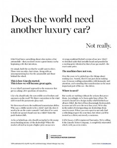
Lincoln, I like you better now. Oh, wait.

Lincoln New Yorker ad
Lincoln Ad. Click on the image to enlarge, then click again to read.

I am surely in the demo for the reimaged Lincoln, for the day after I saw the WSJ ad I ran across this in the New Yorker. It’s so dramatically superior to the “Hello. Again.” ad that the two could be compared as a copywriting clinic. Again, I’ve reproduced the actual ad since I can’t find the full text online and am too lazy to retype it. Let’s see what is better this time around.

1. There is a clear narrative. This is the story of Edsel Ford and how he had a dream, built great if eccentric cars, and now we are back presenting this new vehicle in his spirit. So much better than the “Hello. Again.” ad that darted back and forth between the past and the present, then swerved into the service commitment and ultimately made me carsick.

2. The proof points are big and dramatic. Instead of a sunroof, this new Lincoln has an entire “panoramic glass roof” that makes driving it like driving a convertible. And they have a hybrid model, getting an impressive 45 MPG, that costs not a penny more than the standard version.

One wonders how the copywriter for the other ad missed such clear differentiators and instead focused on the push button gearshift. Which makes an appearance here, by the way, but it’s tied to a benefit: “And what if we want to hold our spouse’s hand once in a while? Enter the push-button shift.” I do wish they’d chosen a more adventurous word such as “seat mate” or “companion” though… we Lincoln prospects are not totally moribund.

3. The voice of the copy is clear and consistent. There is a sure hand on the tiller this time, different from the preening narrator of “Hello. Again.” who kept distracting himself from self-important statements with news about the car. The story is told cleanly and well, up until a closing paragraph which is aspirational yet tight: “Call it luxury. Call it engineered humanity. [WTF?] We’re calling it the Lincoln Motor Company. A completely reinvented wheel, with you at the center.”

So why am I not now in my aging Packard or Escalade, headed for my Lincoln dealer (wherever that is)? Unfortunately, the “Hello. Again.” ad ran AFTER the Edsel ad per the marketing strategy, not before. If this Benjamin Button regression of copywriting smarts continues, pretty soon I will be test driving a Hupmobile. Or Maxwell, even.

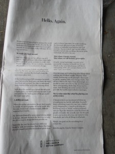
Hello, again, Lincoln. And now goodbye.

LincolnAd2
Click on the image to see larger size then click again to read

As a technologically savvy consumer who’s not excited by the current crop of luxury cars, I should be the perfect target for the reimaged Lincoln. Yet the full page ad in Saturday’s Wall Street Journal had me scratching my head. (I haven’t been able to find the full text anywhere online so I’ll shoot it at hopefully high enough resolution that you can read it for yourself.)

As a copywriter, I love long copy ads that succeed and hate long copy ads that make skeptics say “long copy doesn’t work”. This ad, unfortunately, is in the latter camp. Let’s examine why:

1. Lincoln assumes a coziness which is not likely to exist between ad and reader. Sadly, today’s consumer is not enamored with our silken prose and is more likely to turn the page than to read the copy. Witness the headline which, out of all the infinite possibilities, says “Hello. Again.” And a first paragraph that says, “It takes a special type of ego to presume the world needs another luxury car. (In fact, it’s a bit like the kind that interrupts your otherwise meaningful pursuit of current events with a full-page ode to our intentions.)” Lincoln, we could care less about your ego.

2. The ad has a tin ear. Here’s an aspirational statement in the second paragraph: “True trailblazers follow their inner light. You’ve got to be pretty confident to create what has never been done before. It’s true in history, invention, art, you name it. Even automotive design.” Pretty high-minded and soul-stirring.

But here’s their proof point in the very next paragraph: “If the traditional gearshift consumes too much space between the front seats, you break the rules. You break new ground. You place a redesigned push-button shifter next to the steering wheel.” Not only is that a terrible letdown from the aspirational high, it’s not even new. I had such a shifter in my 1963 Rambler.

3. Lincoln steps on his own coat tails in attempting to be all things to all consumers. The brand wants to be “what has never been done” as noted above. But they also want to build on their heritage, as the ad progresses. Past Lincolns are presented as “different… truth be told, not everyone liked them” and the “selfless” (sic) ego of Edsel Ford is brought forward as the kind of pure design fire that burned brightly. (When people think “Edsel” they think of the car, of course, with all its quirks, not the man.)

If you are brand new, then you’ve broken away from any history you have. Instead they’ve chosen to bring up the history, then belittle it or suggest that Lincoln has been misunderstood. I don’t think you can have it both ways. And there is also the television advertising to deal with, presenting the Lincoln as the “car of presidents” (as in presidential limo) which makes it seem like a mainstream choice and not an eccentric outlier. More discontinuity.

Finally, at the end of the ad, we’re told what lies in store for us: “elevating our owner service to be on par with the world’s most exclusive concierges… we’ll treat you as a ‘client,’ not as a customer… simply, our goal is to be everything for a certain few.” Here I know what is happening because I did some work for Lexus in the early 90s, when they were eating Infiniti’s lunch. The two new luxury brands were launched at the same time. Infiniti then, like Lincoln today, came forth with dreamy high-minded metaphors and poetic-sounding prose. Lexus simply said, we’re going to pamper you like you’ve never been pampered before.

So Lincoln is going to be both Infiniti and Lexus in the same body. We’re dreamers and unabashed egoists, but when push comes to serve we’ll open the door for you and give you a free carwash with your oil change. Actually, according to Yahoo! News, the promotional plans include a “date night” in which consumers get a free dinner for two when they take a test drive. Now that might get my attention. As long is it’s not Olive Garden or TGIF Friday.

Persuading people with social proof

Dr. Robert Cialdini is a psychology professor at Arizona State University who has conducted some interesting research studies with the help of his students. In the “hotel towel test”, he changed the language on signs in hotel rooms urging guests to reuse their towels. Compared to no sign, adding a standard message about “have concern for the environment” increased reuse 30%. But when the wording was revised to “three-quarters of the guests staying in this hotel reuse their towels” reuse increased to 44%. And when it was revised to “three-quarters of the guests staying in this room reuse their towels” reuse increased to nearly 50%.

In an interview with the American Psychological Association, Cialdini attributed these results to social proof: “If this is what people around you have decided is a good choice, it’s a great shortcut for you to determine what’s a good choice.” He cites a study by a Beijing restaurant in which a restaurant put on the menu, “these are our most popular items” and the items immediately became 17-20% more popular.

I thought about these results while working on a project in a new field for me, making requests for donations from college alumni. For the typical school well under half the alumni make gifts, so it’s fair to assume the ones who do give were happy with their experience or at least felt it was worthwhile. Thus the formula is to generate a mental picture of those halcyon college years for the reader, then tell them they can make the same thing possible for someone through their gift. You and your classmates were fortunate, therefore you should allow a new or current student to be fortunate.

Cialdini has another study in which the results backfired from what was desired, while upholding the principle of social proof. He distributed bits of petrified wood in the Petrified Forest Natural Park and tested signs admonishing visitors not to remove them. In situations where there was no sign at all, 2.92% of the pieces disappeared.

When a sign was added with a picture of several visitors taking wood and the caption “many past visitors have removed the petrified wood from the park, changing the natural state of the Petrified Forest”, theft actually increased to 7.92%. As copywriters we know this flabby third-party syntax is unlikely to persuade anybody, but what it does is introduce the concept of stealing wood to somebody who had not previously thought about it. And the social proof is that “many” visitors do this, so you should too.

A third sign showed a single visitor with a “no” symbol over his hand and the caption “please don’t remove the petrified wood from the park, in order to preserve the natural state of the Petrified Forest”. This reduced theft modestly, to 1.67% vs 2.92% for the control with no sign at all. It’s a direct request and clearly shows what not to do, but it’s not really social proof but a one-to-one message. What if the sign had said, “97 out of 100 visitors enjoy the park without disturbing its beauty. Thank you for preserving the natural state of the Petrified Forest”?

Cialdini summed up in an interview on NPR: “When we are uncertain about whether to be altruistic or pro-social or environmentally conscious, we look around us for the answer. We don’t look inside ourselves. We are all swept by the power of the crowd.”