The Retailization of Heath Care at DMA2013

This was the best session I attended at the Direct Marketing Association’s just-concluded annual conference, featuring a CMO from a large insurer and a finance exec with huge experience in retail at Google, with excellent moderation from another healthcare exec. A few takeaways:

Tremendous change in the healthcare industry is underway, and it’s not just because of Obamacare. Used to be insurers could underwrite and consumers had no choice because they got insurance through employers. Now insurers have to accept everybody and consumers can shop around. Over the next 10 years a trillion dollars will shift in the industry as consumers shop around.

Google perspective: Google is where people come when they have concerns about their health. Worried about a diagnosis or a pain, they google it. They have a serious reason for being there and are making a critical decision about their health. 50% of queries now related to healthcare reform. Many queries from mobile devices and about Medicare… so it’s absolutely not true that “people 65+ don’t use the Internet”.

How healthcare is marketed: focus moving to retail. Consumers want self service. Price transparency is not necessarily a bad thing; retailers have known this for 10 years. (Retailers lead the way because their margins are razor thin so they have to be agile.) Insurers are worried about protecting their brand with standard Gold, Silver, Bronze levels. But customers not just interested in lower price, they will pay more for value if you demonstrate it. This is how Nike, Coach, Tiffany maintain a premium price.

The customer experience: companies need to add a Chief Customer Officer who reports directly to the C suite. Insurers are used to saying no to their customers; we’re in a new era where they need to learn to say yes. Don’t let your org chart show: if the customer goes through a phone tree and they have to answer the same health or personal questions they just answered to a new person, that’s your org chart showing. Customer has to be at the center of your business model, just as they are in retail.

Where should you spend your next dollar as a healthcare marketer? Traditional model was very straightforward: send people a mailer or an agent, they sign up. Now they may get input from a number of places. Most marketers don’t cover the fact that you’re watching an ad then go to Google and search; they don’t have a search strategy combined with their TV buy. Mobile devices a big black hole because there is no equivalent to a cookie to find out how they researched their decision on their phone or tablet, then moved to their computer or the other way round. Gamification may become part of the marketing process: reward people for learning about the health.

What’s the impact of the startup problems at healthcare.gov and the state exchanges? People assume that the Internet “just works” so this has been a profoundly negative experience. We know from retail that when people experience this kind of “choke point” they don’t return. But ACA is a marathon, not a sprint. The question is how well the government will respond from here.
What’s a new customer worth, Fidelity?

A death in the family caused us to contact Fidelity Investments, where the deceased’s assets were held. Fidelity told us we’d need to sign a form for redistribution of assets, and it would arrive in five business days. When about two weeks had elapsed, and no form, a family member called Fidelity and was told a/they had no way of tracking the form or even verifying it had been sent and b/mailing the form was unnecessary since it was available online. We then downloaded the form, completed it, and were done. 19 days after the original request (so 15 business days) the forms finally arrived in the mail. Two days after that, a second set of forms arrived in the mail.

There were three people involved on the recipient end. One of them had previous experience with Fidelity through a lump sum disbursement of a retirement account and commented “Fidelity… I should have known.” The second had no previous experience with Fidelity and is unlikely to establish a relationship on the basis of this experience. The third was me, who has had his business at Fidelity for many years and has always been delighted with the service and so was baffled by this Keystone Kops routine.

So, is there a double standard, where existing customers are treated better than potential new customers? In a perfect world, that’s the way it would be. But how much does it cost to gain a new customer? Wouldn’t it have been better to woo these two prospects rather than driving them away?

In a word, yes. Customers die, change their focus or get lured away by a more aggressive competitor. You ALWAYS need new business, and if you can acquire it at low cost that gives you more resources to use for pampering existing customers. Fidelity should get its departments talking to one another so fiascos like this aren’t the face of the company to prospective customers.

No thank you to Citi “Thank You Points”

I used a Citi “Thank You” card as my main purchasing vehicle for maybe 10 years. Its attraction was that it credited travel points for miles on any airline (at the time, unheard of) and I amassed some 300,000 points and paid the $75 annual fee each of those ten years. Then, about a year ago, I happened to have a question about my account and the telephone rep told me that virtually all my points were expiring in 90 days. I could purchase travel for a future date but if I didn’t buy something before the deadline they were gone.

So, my wife and kid went to visit friends in Germany in high season at a ridiculous price and we used more points on a family vacation. There were still tens of thousands of points left over so I transferred them to a new, no-fee Thank You card and cancelled the paid card. A few months later that card’s points are about to expire so I have been scheming to get some value out of them. It’s an expensive time to book travel so I’m looking to buy gift cards for places where I spend money. Meanwhile, from Citi’s perspective, I’ve transitioned from a presumably profitable customer paying a high annual fee to a fee-free and soon to be ex-customer.

While I’ve been spending way too much time negotiating with the Thank You folks, I have wondered whether there are any useful marketing lessons to be gleaned. Certainly the strangest policy is to let points expire without notifying the customer. It’s not like you get an AAdvantage statement where you can see that you need to book travel before a certain date to keep your old points; the whole procedure is invisible unless you log onto their website. Why in the world don’t they send me notices that warn, “your points are about to expire, here are some great offers from our partners”?

And about that website. You can check your points from your Citi card login which takes you to a rather promotional and unhelpful website, but there is a shadow thankyou.com website that you will never see unless you establish a separate log-in with a username and password that have different rules from your Citi card login. Yet this secret handshake is required for certain privileges, such as redeeming for Amazon purchases which they offered me recently (that’s how I found out about the separate website). And I don’t consider myself a web troglodyte. What happens with people who barely know how to log on, or still do their business by phone?

Thus, when I got an invitation to take a survey and say how happy I was with Thank You Points, you can bet I swooped down on it like a hawk on a chicken. A few days later I got an email from a certain [redacted], inviting me to call her and explain why I would not recommend Thank You to a friend. Apparently she had tried repeatedly to reach me by phone, which is peculiar because my cell is listed in my Citi contact information and there is no record of calls from unidentified callers. I called her back and left a message, also emailed her, and she did not return my call or respond to the email. But I was more than ready to share my opinion, so I am doing it here. [UPDATE: she finally did call me. See the comment for an update, plus why it took so long.]

What can marketers learn from all this? First, the points expiration seems ridiculous, but any expiration must be treated as an opportunity to contact your customer. Not doing that is just crazy. It’s lost revenue and lost good will.

Second, byzantine websites that require the user to decode your intentions are not okay. (If you want to book travel, the main reason I got the card, that link is buried in the bottom menu of the page of “rewards” below bubbly cross-promotions.) If you aren’t willing to meet your customer’s needs with clean and logical navigation, they will go find somebody who will.

Third, don’t play games by telling me you’ve tried to contact me when you haven’t and then not responding to my calls and emails. That’s middle school stuff.

To be fair, I haven’t reported some nice transactions with Citi folks on the phone trying to solve these problems but neither have I described every problem I’ve had with this program; there’s lots more. Also, full disclosure, I bought Citi stock when it was in the toilet and have made enough to pay for the points I lost. But not for the aggravation.

Priceline cancellation process… smart, or sneakily stupid?

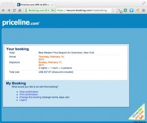
Priceline Change reservation Page
Can you find the cancellation link on this page?

[This post is preserved for historical reasons only. See UPDATE below.]

I booked a hotel through Priceline’s Booking.com subsidiary where you don’t have to pay up front but do have to give them a credit card with advance notice required if you cancel. Then I did need to cancel and found it surprisingly difficult.

The email confirmation made no mention of a cancellation procedure. I went back to the confirmation page on Priceline and there was nothing there about cancellation either. I poked around with searches for “cancel” on the Priceline website without success. I emailed the hotel at the address in my confirmation email and got no response. Finally, I called the hotel and they had no record of the reservation. They said since it was made through booking.com I’d have to go back through them.

So I did go on the booking.com website and entered the reservation number and PIN I’d been given and it took me to the page shown here. Notice there’s no cancellation option, just the choice to “change” my booking. I chose that and was then able to cancel without further difficulty.

I’m wondering if Priceline has run the numbers on the effects of this process, which is definitely more sneaky than what I’ve encountered on hotel sites and also on other aggregators like Expedia. On the one hand, there are probably people who, faced with the difficulty to cancel, just say screw it, I’ll stay there after all. But how often does that happen? Don’t you generally have a good specific reason when you cancel a reservation?

And the net effect on me is that, similar to CarRentals.com with its deceptive pricing policy, I’m much less likely to use booking.com in the future. How is that a good thing for them?

UPDATE as of June 2015. I used booking.com for a recent stay, and had to cancel. Happy to say that the cancellation procedure is completely transparent. There’s now a prominent link on your confirmation email that says “manage your booking” and when you click to that page there’s a prominent (red) “Cancel” button. Very pleased with this change in policy, which I assume was made by Priceline not out of the goodness of their heart but because it makes sound business sense to be up front with your customers.

Is Amazon messing with its Prime program?

I was an early adopter of Amazon Prime, the membership program where you get unlimited 2-day shipping at no extra charge for an annual fee of $79. The program has over the years been enhanced with a limited selection of free instant videos and free Kindle books, but the shipping is what I really like. It’s a great feeling to be able to see something, want it, and know I’ll have it in 48 hours without paying express shipping. It’s definitely led to some impulse buys which were probably better for Amazon than for me. And it’s conditioned my family (immediate family members also get the free shipping, though not the other features) to look at Amazon as their primary shopping modality.

So with all those mutual benefits, I haven’t felt more than a tinge of guilt about buying the occasional five dollar item knowing Amazon is probably paying more to ship it than I’m paying for it. But now that seems to be changing. Some low priced items (I’ve noticed this in their grocery and baby departments) are now “add on” items where you get free shipping only if you combine them with another purchase. And others have been raised to outrageous price points: a box of kosher salt, which costs $3.29 at the supermarket, is now $10 at Amazon. I’m not sure who would buy it at this price so wonder what purpose it serves to even offer it.

The net result is that I’m now questioning my relationship with Prime. I don’t have an alternative in mind… nobody else offers such a loyalty program combined with a huge selection to make it meaningful… but that means my roving eye should be all the more troubling for Jeff Bezos and crew. It’s hard to break such an ingrained shopping habit, but I’m thinking it may be worth the trouble. And I’ve definitely got my eyes open for a price increase or other future limitations, so I won’t be automatically renewing as I have in the past.

If a lot of other Prime customers feel as I do, Amazon may want to do some rethinking.

Fulfillment lessons from the Container Store

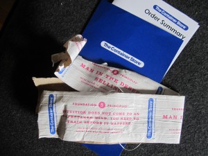
Container Store fulfillment materials
Packing tape and portfolio from my Container Store shipment

My wife loves the Container Store. She has a closet full of Elfa components and various other elements that roll around or sit under shelves. Recently she bought four big stacking wire baskets to hold mittens, hats and other snow gear, one for each family member. The box arrived (several days before the promised date, by the way) and it was as big as a steamer trunk. I’d assumed that shipping, an unhappy necessity for those who don’t live near a store, was similar to what they charge at Ikea—an arm and a leg. Not so; this was shipped at a flat rate of $19.95.

Before I knew this I had opened the package and became somewhat intrigued by a couple of its features. First, there was a special heavy-duty fiber tape used to seal the box which had CS’s “7 Foundation Principles” printed on it in an endless loop. These can be found on the website along with lots of comments and inspiring videos. CS is consistently voted one of the best places to work in America and its employees are fervent in their mission. To me the dialog seems a bit cultish but that’s just my perspective and I do not begrudge the employees or their customers their enthusiasm.

Second, the bill of lading was packaged in a little blue portfolio including a thank you from the President. It was at this point I decided shipping must be REALLY expensive so I peeked inside and there were no prices on the receipt. Then I went online and discovered how reasonable their shipping actually is.

Bottom line, this is a great fulfillment effort that extends the Container Store brand right into the home as the package arrives. The cost of the special tape and the card-stock portfolio are not insignificant but my guess is they haven’t been tested against a generic approach. Container Store felt this is the way to communicate with their customers, and that’s the end of it.

The whole experience puts to shame mass produced efforts like Lands End, from whence your coveted fashions arrive in a plastic sack and a return label is printed on your shipping document as if they assume you’re already having second thoughts. Amazon with its non-recyclable receipts, in which the UPC code for the package is printed on peel-off paper and then switched to the outside of the package leaving a blank spot on the receipt, isn’t much better. Not as bad as Applebee’s decision to just throw it in a box, but not great.

Fulfillment is the last mile in your relationship with your customer. There may be sound economic reasons that you can’t be as effusive as the Container Store. But consider their example, and learn from it.

Survey worst practices from American Express

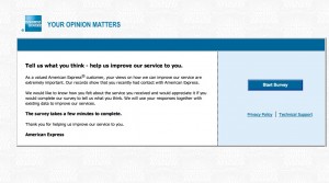
Landing page of the Amex survey
Landing page of my American Express survey

I got a survey invitation the other day from American Express that exhibited a number of worst practices. I’ll share highlights so we can hopefully learn from it.

1. The survey arrived too late. The email started, “Our records indicate you logged on to americanexpress.com on September 19, 2012, and we would like feedback about your on-line experience.” Problem: the email didn’t reach me till September 24. How am I supposed to remember something I did online 5 days ago?

2. The survey offered no incentive. It’s a sad but true fact that you have to give people a reward to participate in these days, simply because everybody else is doing it. It doesn’t have to be much … how about just a chance to win a $100 American Express Gift Card?

3. The survey is poorly written. The landing page starts, “As a valued American Express® customer, your views on how we can improve our service are extremely important. “ My views aren’t the customer, I am. That’s a dangling prepositional phrase and it’s distracting.

4. The survey doesn’t promise that it will be a quick and easy experience. The landing page simply states, in bold type, “The survey takes a few minutes to complete.” In context, that feels like a very long time.

5. The survey demands an explanation on each question of why I answered the way I did, written in free text. Eg, “What could have been done to make you more likely to recommend American Express to a friend or colleague?” (More bad or awkward writing.) Nothing really… I was just paying my bill! And it won’t let me leave the field blank. I have to type something, even if it’s nonsense, otherwise the page reloads.

6. The survey asks questions it already knows the answer to, in this case why I was on the website and what I did there. (It could have ben spun into a “do you recall what actions you performed while on the website” question which would have had more apparent validity since it appears to be testing the intensity of my recollection.)

7. The survey asks a question I can’t answer: “Please rate your satisfaction with the ease of navigating the American Express website, americanexpress.com.” Yo! The site I go to is called “Open Savings”. It does resolve (I just checked) to americanexpress.com but a consumer I shouldn’t be expected to know that. Why mention the URL at all?

8. The survey communication wasn’t sufficiently personalized. After I abandoned the survey for all the irritations described above I got an email “reminder” which was the same as the first email with this additional superscript: If you have already completed the survey, thank you and please accept our apology for the additional e-mail. But when I returned to the survey I was deposited where I left off.

What’s happening here is that they are automatically sending a follow up email to EVERYBODY who received the first email, and not removing or acknowledging the completions or people who started and then abandoned it. How irritating is that?

The “independent research company” that provides this survey is researchhq.com. Autofills on the search panel suggest they’ve also done surveys for Wells Fargo and Allstate. Good luck with that.

Fumbles in fulfillment: Applebee’s Lunch Decoy

Applebee Lunch Decoy fulfillment pack

So I am now the proud owner of an Applebee’s Lunch Decoy, which I ordered pursuant to the previous post. Notice anything wrong? Yup, they sent a gal decoy instead of the guy promised on Amazon. No way my boss is going to be tricked into thinking that’s me. So much for sneaking out for that Lunch Deal.

But there’s actually something more serious about this fumble, which is the lack of follow-through from the ad campaign. Is there anything to promote it on the outside of the package? No, not even the Applebee’s name. And the little mock-instruction sheet is great, but how about including a $5 off coupon since this recipient is obviously a heavy user?

So many campaigns start with a great idea and it’s forgotten that an actual element needs to be fulfilled. It’s a total afterthought and it ends up like this. And guess what creative geniuses: when you enter this campaign for an award you’re going to need to include a sample of the fulfillment pack, and that will be a bit of an embarrassment, won’t it?

Speaking of non-followthrough, a chap named Craig Murray emailed me and asked if I’d consider running a guest post for an infographic if he created one to my specifications. I could tell it was a mass solicitation but the idea interested me so I replied. Do you think Craig has followed up? Nope. And how does that inaction help him make sales? Don’t you think, if he contacts me again, I’d be less likely to consider his offer rather than more?

Dot your i’s and mind your p’s and q’s. That’s my small lesson for today.

More from Barclaycard Ring

I’ve now got a lot more insight into this card as the result of an online exchange with Product Manager Jared Young and a phone conversation with community manager Jen Hitchens. I didn’t get a clear answer as to how I happened to be solicited for the card—there were a number of test programs in place etc—but did glean some other insights of interest to marketers.

The Barclaycard Ring MasterCard grew out of an alpha experiment called Innovation Lab, as documented on the timeline of their Facebook page. Paul Wilmore, Managing Director-Consumer Markets, Barclaycard US, wanted to launch a new product that a/combats the low trust level of the banking industry b/leverages the popularity of social media and c/includes a financial literacy/education component. It evolved into Barclaycard Ring, which was launched in March 2012.

As I mentioned previously, I was looking for a new rewards card (Citi’s Thank You had changed its program and shafted me by expiring my nearly 400,000 points) and got a solicitation via email. But Jen says it’s not intended to be a rewards card. People are attracted by the low interest rate (currently 8% APR) and the transparency and they really enjoy talking about financial literacy topics on the community website.

In a post called “Community Share of Giveback™” (access for cardmembers only), Jared calculates that the average cardholder will earn $9 in giveback over a 6 month period. Assuming that cardmember averages $1000 a month in charges, that’s a much lower percentage than the 1% minimum that’s typical with rewards cards. So there have to be other benefits, and evidently there are.

Jen reports that the conversations have been almost universally positive on the forums so far—she’s got controls to handle negative or abusive posters but she’s never had to use them. The cardmembers are very happy to discuss arcane features of CILs (that’s credit line increase), nominate charities the community should support, and (especially) lend their recommendations about other card features they’d like to see. They also like to see the financial statements although I personally find them rather opaque.

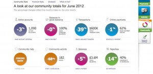
Barclaycard Ring Community Stats June 2012
Active cardmembers were up 3% in June 2012.

One concern I have is that all these folks are early adopters… there were only 1090 active cardmembers as of the June reporting period… and the community may change as more people join. But it’s a very interesting experiment with its heart in the right place. If you’re involved in social media, you should get this card just to keep up with what they’re doing. (That’s my referral code, of course…. it will generate Giveback™ to the community if you are accepted.)

Best practices (and not) for recovering account passwords online

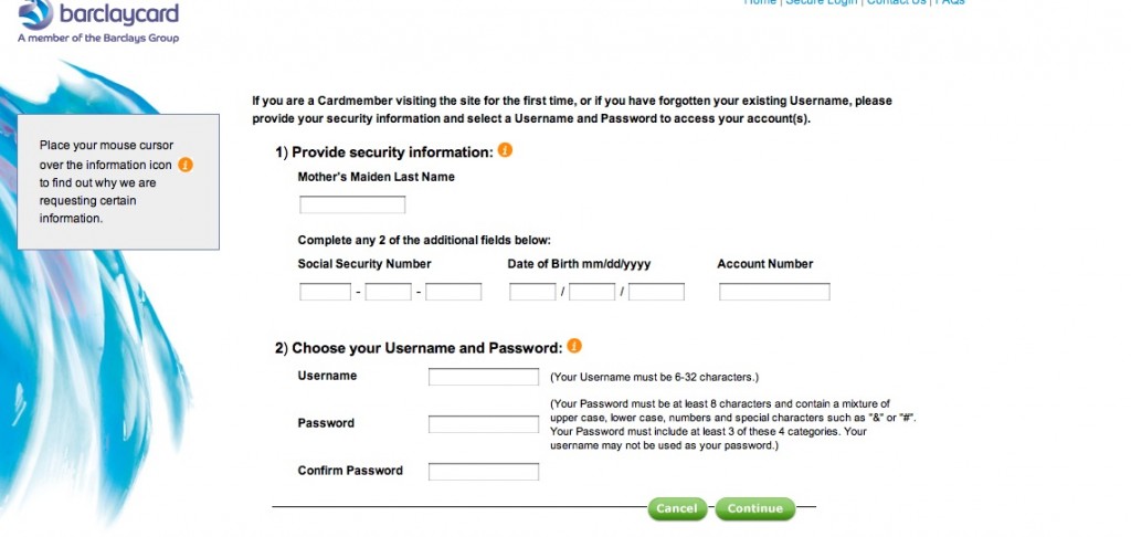
Barclaycard forgot password page
Barclaycard Ring MasterCard “forgot password” page

[THIS POST HAS BEEN UPDATED.] Yesterday I mentioned a problem I was having with the Barclaycard Ring MasterCard “forgot password” page. Today I’m taking the extra step of showing the page because this is something I don’t think has a lot of customer service advantage. They’re using the same page whether you are setting up a new online persona OR you have forgotten your password in which case you simply have to choose a new username.

What else could Barclaycard have done? Send an email at the user’s request, with a unique URL that expires after a few hours. That way the account is secure, but the user stays in control of it. This is the nearly universal practice, and it’s interesting to see an exception and mull the pros and cons.

Requiring a new username is particularly onerous for Barclaycard Ring because it’s supposed to be a social networking community. If I change my username, what happens to the badges and contacts I’ve built up under my old username? But I think it’s not a very good practice in general, and this big international bank must be somehow very stretched for programming resources.

While I’m at it, here’s another not-best practice: confirming the new (or old) password by sending out an email that contains exactly that password in unencoded text. Yikes! What if I’m reading my email in Starbucks or an unsecured wireless hotspot at the airport? Even if I’m in the comfort and sanctity of my home, I’m still going to have to delete that email now. The merchant or marketer probably thought they were doing me a favor by sending me a handy reminder. In contrast to Barclaycard, this is one we’ve all seen, probably several times. Don’t do it.

UPDATE July 3: got a call from Meagan in the Barclaycard digital marketing department and she had a little difficulty reproducing the above page on a test account; possibly I had done something like enter the wrong password too many times that caused the system to “clear out my account”. What I should have seen was a reset page with my security image and with her help I was able to get to that. More important, she and I discovered that if, instead of creating a new user name in the screen captured above, I entered my current one (after confirming who I was with the challenge info above) the system would accept it.

The GOOD news was that when I finally got into my account my screen name had not changed at all; must be different from the username the system recognizes. So all my badges, if I had them, would be intact.

Meagan says this is the password reset procedure used for all Barclaycard products but she does understand how it might be a good idea to present it differently (and tell people they can keep their current username if they like) for the Ring cardmembers. Will be interested to see what they come up with.