Should you care about email marketing?

Somehow email marketing has become the red headed stepchild of promotion channels. It’s not as pervasive as Facebook, immediate as Twitter or insidious as native advertising. And it’s all too easy to take email for granted and put it on autopilot with a management tool like Eloqua or Pardot. So email gets short shrift in planning meetings and the email marketing manager is often someone who’s expected to handle production rather than make a creative and strategic impact. Am I right?

But email marketing is also the face of your company to people on your email list as well as email inquirers. And if you don’t pay attention to the channel you risk looking like you are clueless or don’t care. I’ve recently moved, which has caused a number of new interactions. Here’s an email from Thermador customer service when I asked about a part for my 25-year old range:

Good Afternoon Mr. Maxwell,

Thank you for taking the time to contact us. We here at Thermador are always more than happy to assist you with your appliance inquiries and we appreciate you allowing us to do so.

Please accept our sincere apology for the delayed response as we are currently experiencing a high volume of email correspondence.

In regards to your inquiry, unfortunately there aren’t any parts available for your unit…

See what I mean? Here’s a potential new customer reaching out to you… sell me an upgraded product! And, while you’re at it, engage with me instead of saying you’ve been too busy to answer my query.

Here’s another. The USPS partners with a company called My Move which makes a number of offers during the process of changing your address. There’s an interstitial page with check boxes for retailers you want offers from, and after you leave there is a second page with more offers. I get it, the second page is for marketers who didn’t pay enough to be on the first page, but there are some really good offers here. $50 off $500 at Amazon! 10% off my next Home Depot purchase! I want this stuff.

But when I try to submit the page, it doesn’t work. I just get the spinning ball in my browser (Safari for Mac… I suspect a compatibility issue). I find a support link for My Move and I write to them and describe the above problem in detail and ask how I can get these offers since the submit button didn’t work. The response:

Hi,

MY MOVE sends your information to the advertisers you selected during your transaction. Fulfillment of specific offers is done by those advertisers and can take anywhere from 48 hours to several weeks depending on the content. For example, a catalog you selected may not arrive for a few weeks, but a coupon that is emailed may arrive in just 2 days. If you need a more specific time frame please contact the advertiser directly. Good luck with your move, and I hope this has helped.

See what I mean? No, it hasn’t helped, since you answered a completely different question than the one I asked. Hopefully Amazon and Home Depot are on a performance contract with My Move, because they are getting exactly zero hits from anyone who is using Safari for Mac. And they can’t be happy about this indifference to a prime target because My Move can’t be bothered to clean up its email automation or pay a human a few dollars to actually read the emails.

UPDATE: Here’s an even better example. I needed a recommendation for a pool & spa service (in my hostile climate, we have to have a “closing” and drain the pipes for winter) and went to Angie’s list. I noticed that one of the reviews had an “F” which was clearly intended from the content to be an “A”. Unlike Yelp, there’s no way to flag a review or give feedback on it so I wrote an email to support using their online form. Here’s the reply; note that has nothing to do with my concern and also contains a number of grammatical errors:

Thank you for contacting Angie’s List. 
We do apologize that you were not able to use the one of the recommended services in your area. For the reviews, we rely on our members feedback. We advised them to be as accurate as they can and non biased as for the work performed by the companies enlisted with us.
Let us know if you have any other questions, or visit the 24/7 Angie’s List support site for additional help. Don’t forget, if you have any home maintenance or improvement projects coming up, you can save time and money by shopping at  AngiesList.
Thanks again. Have a great day!

See what I mean? You too, dear reader. Have a great day.
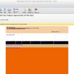
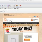
Home Depot, where’s your ALT tags?

Home Depot without graphics
(Click the thumbnails to see the emails in readable size.)
Home Depot graphic loaded
Aha! load the graphics, and see the special.

Home Depot sends me an enticing daily email: one special item, on sale for one day only! But I have no idea what they’re offering because my email reader (Outlook for Mac 2011) does not load graphics without permission and Home Depot does not use ALT tags.

ALT tags are text that appear in the space reserved for graphics, when for some reason the graphics don’t load. In many email readers graphics are turned off by default, and the user has to make the decision to turn them on. It was only very recently that Gmail started loading graphics by default. And many security conscious companies still refuse to allow network users to open graphics.

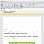
Hootsuite no graphics
Who is this email from?
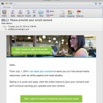
Hootsuite no graphics
Oh, look, it’s my friends from Hootsuite!

Forgetting to put in an ALT tag (or being clueless) can lead to some peculiar effects. Like the message that I got from Hootsuite that said I needed to give them permission to keep contacting me, but I didn’t know who they were because their name was in the graphic. And the cookbook publisher which invited me to a launch event, but the date and venue were in the graphic. If I don’t recognize the sender and nothing appeals to me in the text I can see, how likely am I to investigate further? (Emails like Home Depot’s, with no text at all, are the worst offenders.)

Belcour no graphixs
I‘m invited to an event, but where and when?
Belcour with graphics on
Looks like a nice party! Sorry I missed it.

In each of these cases it would have been a trivial task to code an ALT tag which conveys the day’s special, the sender’s identity and the venue. Even if the no-graphics group is 5% or 10% of your audience, why give those folks a reason to ignore your email?

Best practices for graphics in emails

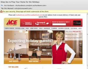
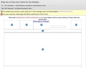
This Ace Hardware email has some great offers...

Right now thousands of people are re-installing Microsoft Outlook as they upgrade from XP to Windows 7. And the majority of these folks won’t touch the default settings which don’t load graphics within emails unless the user specifically asks to do so.

... but most recipients will see it in their preview pane like this.

Right now hundreds of marketers are designing emails that ignore this reality, by placing a big beautiful graphic at the top of the message that shows up as a blank spot superimposed with a red X instead of the desired image. Which means that most recipients will never see the graphic, or the message, because there is nothing visually compelling to pull them in. The “before and after” examples from Ace Hardware are proof positive. Inviting graphic and great offers, but most of the people who got this email will never see them. (I’m on a Mac so the red X’s show up as question marks for me, but the problem is the same.)

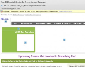
Better: REI newsletter has HTML text to tell the story before the graphics load.

So what can you do to fix it? Use HTML text creatively at the top of your email instead of relying on graphics to tell the story. The REI newsletter example is isn’t pretty, but there is a lot of REI identity here to pull people in, including the bar of clickable links.

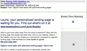
Best: very little of this message is lost, even without graphic.

Better yet is the email from Beasley Direct that has a good ol’ compelling headline to pull people in, and places this to the left of the page so it will have maximum visibility on small screens. This email also includes ALT text—the words “Beasley Direct Marketing” over the graphic—which appear when the graphic doesn’t load. That’s another good practice. Better yet would have been a benefit message or call to action in the ALT tag, such as “request your complimentary landing pages guide”.

Make sure you’re following these simple steps next time an email goes out. Don’t get intimidated by your art director… the design can still look great, you just need a backup scenario when the graphics don’t load. And everybody will be happier with the higher open rate and, hopefully, more clickthroughs.

Electronic Etiquette

A good friend and colleague died this past winter. I quickly learned about a tribute website, and posted a message which expressed my feelings in the passion of the moment. Having achieved some satisfactory personal closure I never got around to contacting his widow, who is also a good friend and colleague.

That faux pas clearly deserves a bitch-slap from Miss Manners and I needed to atone for it. Thus, when the widow wrote a broadcast email with the news that she was moving to a small town where she would be mainly taking care of her aging parents, I responded with some personal news about my family and expressed a wish to keep in touch. I never heard back.

Some possibilities are: a/the lady’s mad at me, as well she should be. But what if b/in her new life she rarely checks email; or, c/my message got caught in her spam filter. How can I know and what do I do about it, if anything? Such are the new challenges of communication in the electronic age, as we attempt to communicate through media that are still being defined.

In my copywriting classes, I always do an informal survey of email habits. Some findings:

1. Email has gotten much more formal over the past decade as it’s become a primary mode of correspondence. Misspellings, for example, are no longer OK. (Save them for IM.)

2. The majority of female senders say they start their message with a salutation (Dear so-and-so) even though it’s superfluous. Most male senders don’t use a salutation.

3. Most people “sign” their emails with their personal name, even though it’s unnecessary because you can be identified both by the “from” line and from the boilerplate signature if you use one. A best practice seems to be to sign off with your first name just above the standard signature, as a way to personalize the email.

4. There’s a trend toward composing email in HTML even though there’s no need for it because no graphics are involved. I like words to stand on their own, so this one really makes me grind my teeth.