On the floor at Fancy Food Show 2011

The Fancy Food Show was jam-packed at San Francisco’s Moscone Center…. good news for business but making it difficult to navigate during a truncated visit this week. Here are some highlights:
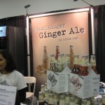
Trending up: fancy soda

Trending up: cured meats, especially Serrano and Parma hams. I remember when it was a rare treat to get a slice of one of these beasts; this year they are everywhere. Though oddly enough, the salt content of most seems significantly reduced from classic preparations. There was also a jerky stand advertising 50% less sodium than traditional jerky. Also, lots of high-end sodas.

Trending down: nuts. Once a massive snack category, the vendors showing fancy smoked and salted nuts are today few and far between, Too much fat for today’s snacker? Baja Bob’s, a low calorie cocktail maker, can pour you a margarita for 60 calories vs 240 calories for a regular margarita. The benefit of which, they explain, is that your date will have more than one.

Down and out: gluten free everything, All of last year’s signs were gone. Also, vendors trumpeting the ‘USDA Organic” certification were rare even though a pavilion was set aside for them. May be that, as some of the folks at Terra Madre Day speculated, the designation is cumbersome and simultaneously lets in questionable products while not defining a level of quality that is actually useful.
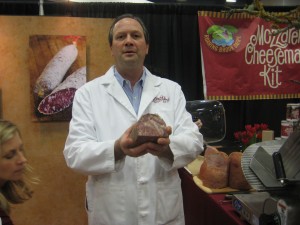
Paul Bertolli and his wonderful head cheese

Product of the year: Testa di Porco (head cheese) from Fra’mani. Paul Bertolli has been threatening to bring this product to market for several years and last Sunday it happened. Ethereal. It’s not little bits of this and that like traditional head cheese but nice big chunks of celery-cured ham held together with a clove-y gelee. People were standing in line for this one.

Trend to watch: consolidation. NYC-based Rick’s Picks, to take one example, is now shipping 10 standard products rather than 14 in the past. In a tough economy retailers can’t be asked to stock that many SKU’s. Rick says there’s a demand for “spears” but that yen is now satisfied with a classic dill sour (really crunchy and good) and the green bean and asparagus spears have been put out to pasture.

Most popular giveaway: showgoers who traveled across the country, and could have all the food they wanted, stood in a long line to get a tea press with the Tea Republic logo. Starbucks take note.
Trends of note from Fancy Food Show 2010

This show didn’t have the excitement of June in NYC, which may be due to the fact that the west coast was harder hit by the recession than the Northeast. (Though many of the same vendors exhibit at all the shows in SF, Chicago and NYC, merchants tend to go to the show closest to them.) There were some empty booths, but good floor traffic. Three trends I noted:

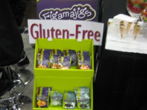
Gluten-free candy... who would have thought?

1. Gluten-free everything. People with celiac disease can’t eat gluten, but for most of the rest of us it’s the wheat protein enhanced during kneading that makes rustic bread chewy and delicious. But marketers seemed to have sensed a trend that “free” of anything equates healthy goodness, so there are many booths advertising “gluten-free” products that would never contain gluten in the first place.

2. Pizza. Lots and lots of frozen gourmet pizzas are on hand, designed to be sold at $6 or more for an individual-size pie. Also a lot of flatbreads that are advertising themselves as pizza foundations.

3. Old-timey packaging. There are an increasing number of packagers trying to make their product look like it has been around for 150 years, with accompanying benefits of heritage and nostalgia and old time values, even if it just came to market. Correspondingly, there’s less of the light and bright “lightbox” look (I call it that because the products are designed to look great when lit from below on a shelf) that has been popular in recent years.

I did a taste comparison of high end vodka pasta sauces, which were easy to find on the floor. I’d had the real thing, more or less, at Rao’s in Las Vegas last week, and the ones I tasted (included jarred Rao’s as well as Mario Batali) suffered in comparison less from being preserved than from being dumbed-down in flavor and salt. Marketers, no doubt with lots of consumer research backing them up, have decided that the product’s personality should come from the face on the label, rather than the actual taste.

This show is not blogger-friendly, by the way. I registered as a media “trade affiliate” which I won’t do again. Maybe guessing I am not a serious buyer, some boothers tend to pull back the sample tray as I approach. Or maybe they’re just worried I am going to suitcase them.

Trade Show Tactics

We’re coming up on January, which has become my big trade show month since the demise of Comdex. I’ll go to the Consumer Electronics Show first, followed by a quick stop at Macworld, and then the Fancy Food Show at the end of the month. What am I looking for, other than schwag and free food?

First, I want to see how companies I work with—or their competitors—get the attention of the audience through elevator pitches or booth design. And second, I want to watch other show-goers who may well be my audience at some point to see what questions they ask and what “hot buttons” cause their faces to light up. It’s also nice to put a face with abstract stats so I can have a mental image of my reader, next time I write to Dear IT Manager or whatever.

In my copywriting class we talk a little about trade show booth design for smaller companies—something that increasingly seems to be the responsibility of the marketing folks who are my students. It’s not easy to create a visual “home” out of nothing that can be erected and disassembled quickly. One thing I’ve noticed is that faces help—big photos of people who look like your users, making eye contact with the show traffic. Not enough companies do this so it’s very easy to make yourself stand out.

Also, too little attention is paid to booth traffic patterns. If you stand behind a high counter, you’re creating the metaphor of a store checkout—people will not approach unless they’re already committed to doing business, which eliminates most potential booth visitors. If you put up registration kiosks at the outside corners, or entry points framed by signs, you’ve created a boundary that may keep people out.

As a show floor troller, I tend to be wary of a big and empty booth—I assume that they don’t have much to offer and that if I go in I’m guaranteed to be hit with a sales pitch. But I find a booth with higher traffic irresistible, because I want to see what the buzz is all about. You can do this with good visual design and a seamless traffic pattern. Oh, and free samples of artisanal cheese will help.