Direct mail has a unique benefit, compared to other direct marketing media: the opportunity for stage management. You can control the user experience by the way you design the components and deliver your message. You can decide what your user will see first when they open the envelope (which is why you should always give your mail house a folding dummy, stapled together with the components in the correct order) and then lead them through a compelling story.
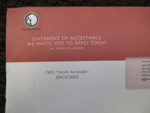
This Mutual of Omaha burial insurance package has a great example of stage management. The OE teaser says, quotes included, FREE “Family Keepsake” ENCLOSED. I despise unnecessary quotes, which often make their way into peppy corporate manuals (e.g. “huddle” with your team) but here they have a place because they call attention to the rather intriguing phrase. I’ve got to know what this “family keepsake” might be so I rip open the envelope.
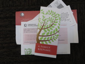
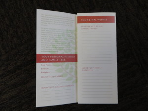
Turns out the keepsake is a pretty two-fold on card stock which is for recording your family tree. Without commentary, on the flap Mutual Omaha provides some lines to write in the contact information for people who should be notified in the event of your demise. See what they did there? They got me thinking about my family and how they would be affected by my death, and I realized I don’t want them paying for my funeral out of pocket so I better buy this insurance.
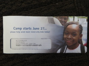
In contrast, a missed opportunity for stage management comes from our old friends the Fresh Air Fund. I have to give credit, first of all, for a much better teaser than in past years. When I hold the package there’s an odd heft to it. Something extra is in there. I open the package and… it’s a note pad, with the logo of the Fresh Air Fund on it and nothing more.
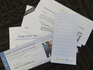
What else could they have done? Invite you to write down a message to the kid you’re sending to camp, maybe. (The first page would be pre-filled, then when you tear it off you’ve got a usable notepad.) Or ask you to write down your own favorite camp memories, which brings alive the value of summer camp in the same way the “family keepsake” brings alive the reality of funeral expenses. Plus they should have their contact info on there, since the note pad will stay around long after the other components have gone.
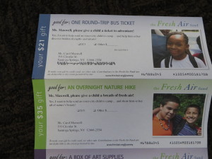
In addition, the reply device is a series of “tickets”. That’s the right idea: your gift directly contributes to a child’s camp experience and this is the embodiment of that benefit. But let’s make them look like tickets, instead of calling them tickets and then making them standard response devices. For example, instead of
Good for: One Round-Trip Bus Ticket
Mr. Maxwell, please give a child a ticket to adventure!
Yes, I want to help send an inner-city kid to camp….
And help him or her discover hidden strengths and talents
It might say
Round-Trip Bus Ticket to Camp
Provided through the generosity of: Otis Maxwell
Please use my contribution to help send an inner city to camp.
[ ] $21 pays for one bus ticket.
[ ] I want to help more kids and I am enclosing my contribution of [ ]
Or, given a little more budget (which might be provided by eliminating the note pad) I might print very authentic-looking tickets without an ask, then put them inside a carrier sleeve of some kind. It would then be very credible and an involving experience to have the donor indicate on the sleeve how much they are giving and how they want the gift to be used. Stage management.

