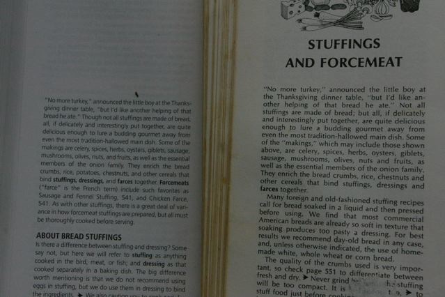
 I gave my mother the highly-touted new edition of the Joy of Cooking for her birthday, and bought a second copy for us to have at home. I like to leave the book open for reference when I’m cooking, and soon I noticed I was doing a lot of squinting and carrying the book into brighter light. Could it be that the type had gotten smaller?
A comparison of two identical passages shows that’s exactly what happened—20% smaller in fact. (Count the characters in the first line of the new edition, at left in the picture, and compare to the 1975 edition, at right.) I can understand why they didn’t want to make the book too unwieldy with all the new additions. But I’m too preoccupied to memorize the recipe before I cook it, and too finicky to be satisfied when I misread and put a tablespoon of salt in when the recipe calls for a teaspoon. Sorry, but the type’s too small.
This is why I advise my students and clients to double-check the work of their designers. If it looks too pretty, it probably is—something’s been sacrificed for the sake of great design. If there’s a coupon, try filling it in to be sure there’s room to write—or better yet, have your art director do it.