Pork Board asks consumers to pig out with new slogan

If the National Pork Board has its way, conversations like this will soon be happening in homes across America:

He: What’s for dinner?
She: A nice chicken.
He: What’s wrong with pork? You know I love my pork.
She: We’ve already had pork seven times this week. Pork spareribs with hoisin sauce…. pork belly sliders…. crown roast of pork with apples…
He: Be inspired! How about pork sushi?
She: Wait a minute, I forgot. The Smiths are coming for dinner. They don’t eat pork.
He: Religious reasons?
She: No, they just don’t eat pork. And if you don’t eat pork, there’s no way to change that.

A little background: according to the Associated Press on March 4, 2011, the National Pork Board has decided to “move on” after 25 years promoting its product with the highly recognizable slogan, “The Other White Meat”. The new tag lie is… wait for it… “Pork: Be Inspired.” According to Ceci Snyder, the Des Moines, Iowa-based board’s vice president of marketing, “we want to increase pork sales by 10 percent by 2014. To do that, we needed to make a stronger connection, a more emotional connection to our product.”

The AP story goes on to note that pork consumption averaged 50 pounds per person in 2010, compared to 61 pounds for beef and 70 pounds for chicken. However, “research done by the Pork Board shows 28 percent of U.S. households make up nearly 70 percent of the nation’s at-home consumption of fresh pork. The new campaign is aimed at getting existing pork consumers to think more about how they can incorporate it into their meal planning.”

The old campaign is not exactly being retired, however. The old slogan will remain on the Pork Board’s website and on apparel sold by the board, but web searches for “Pork: The Other White Meat” will direct people to the new campaign…

Let’s break down this grisly carcass, shall we?

The Message: Some might say that a slogan that is not actually used, and is instantly forgettable, is not actually a slogan. So let’s move past that.

The Marketing: under what circumstances does a product throw up its hands at trying to get new customers and instead focus on keeping the customers it has and getting them to buy more? The cigarette industry comes to mind, what else? Presumably the pork folks had good research that told them that a/no new pork eaters could be acquired and b/the current audience could be profitably convinced to up their pork consumption, but both assumptions seem very strange to me.

The comparative stats tell me the pork eaters are in fact doing some pretty heavy lifting already, pound for pound enjoying pork at 1 of ever 3 meals compared to the other two protein sources. And in fact pork’s shortfall might be explained entirely by the fact there are no pork fast food stores as there are burger joints and chicken shacks.

But never mind that, if we stipulate that we can only succeed by getting pork eaters to eat more pork, what kind of marketing might do that? Hey, how about… “the other white meat”? We all think of chicken as a versatile ingredient… pure genius to put pork on the same pedestal. And certainly much better than an exhortation that sounds like it might have been the product of a committee planning a high school homecoming dance.

And the funny thing is that the only people who will actually get to see the new slogan are people who do a web search for the old slogan. That’s right, we’ll take that tiny percentage of people who take advertising messages to heart and we’ll toss a bucket of farm waste in their face. Do a search for “The Other White Meat” to see how enjoyable this is.

The Morality: Secretly, I am happy about this fiasco and here’s why. In 1988 when “The Other White Meat” hit our butcher counters, its purpose was to promote the new trend to factory farms which fed pigs lean foods in order to produce a leaner product as compared to the traditional happy pigs rooting in the farmyard. A bonus was that the conditions in these factory farms stressed out the pigs (an animal more intelligent than a dog) so much that their flesh was watered down by stress hormones.

If we have been unsuccessful in convincing people to eat lean meat from tortured pigs, perhaps that is not entirely a bad thing.

How to use gifts, prizes and sweepstakes in your marketing

The U.S. News and World Report marketers had a formula that was used for many years. Prospective subs would receive a double postcard offering some very attractive business premium (like a desk calculator, back in the day when they were special) as a bonus for a paid subscription. It must have worked because it was repeated so long. The benefit of requiring an upfront payment helps cash flow. But it ultimately does not foster a loyal subscriber base and both the pub and this advertising concept are pretty moribund these days.

The U.S. News example demonstrates both the appeal and the danger of using product giveaways to help you get customers. A certain number of people will always pop just for the gift… and the more attractive the gift, the more questionable the quality of these freeloaders to your business. What you’re hoping is that enough otherwise qualified folks who were on the fence say “sure, why not” because they like the premium and these folks also like what they see when they receive your publication, product or service. To make this work, the giveaways needs to be closely aligned with the interests of the person who matches your core prospect. Everybody would like to win an all-expenses paid trip to Disneyland, for example, so that is not a qualifying offer. Today’s popular iPad is much better. It’s trendy, techy and business focused… all of which match the profile of certain types of readers.

The next question is what you’re going to make people do to get the gift. U.S. News requiring payment is a good example since traditionally pubs have very poor pay up from their “free issue” promos. Keep in mind that in addition to the cost of the goods you’re going to have the expense and administrative headache of fulfilling them. Most marketers farm this job out to a fulfillment shop that will ship in anonymous boxes. This is expensive and misses an opportunity to do additional marketing inside the fulfillment package.

If asked by a client, I will always recommend a sweepstakes where one person, or a few people, win as opposed to a gift for everyone who responds. The greed appeal is still there but the cost is much lower since there are only a few units to buy. Companies worry about sweepstakes liability and if this is a serious issue for you, there are companies that will write the rules, choose the winner and indemnify you for a flat sum, most recently $25,000. If you’re on a shoestring budget, I would advise you to study a number of competitive sweepstakes in your market space, download the rules (which the marketers are legally required to publish) then create your own contest structure based on what others have done before (or pass the buck and have your lawyer do it).

A final consideration is that the giveaway should not overshadow the product or service you are selling. There are two ways this can happen. The giveway can become the most exciting and prominent thing about the promo, with sales playing second fiddle. This was the case with the notorious Publishers Clearinghouse sweepstakes. Magazine subscriptions were an afterthought and the subscribers gained this way were of such questionable quality that “sweeps sold” mailing lists often were rentable at a substantial discount.

More insidious is the situation when a premium is so unusual or complicated that substantial real estate is required to present it. This is the case with many brilliant ideas that clients come up with, for oddball items they happen to love or their kid has told them about. The ink required to describe these items is parasitically siphoning attention from your main selling proposition and can only hurt your results. As a rule of thumb, if it takes more than a few sentences to describe what it is and why you want it, then it isn’t a good premium.

Whenever I go to direct marketing trade shows I look up the booths of Konik and Co. and other sellers of premiums and “advertising specialties” (the latter being something that has your logo prominently printed on it, such as a baseball hat). I ask them what’s new and what is selling best and they always have a few idea starters for me. I also get lazy and look at what marketers of products similar to my clients’ are offering. Right now it’s iPads so might as well copy them. You can never get too many chances to be a winner, right?

How to use testimonials in your marketing

Testimonials can be a key element in your marketing copy. They help attract new customers by showing that others have had a satisfactory ordering. They help bond existing customers by demonstrating that you’re a “real” organization with real consumer relationships. And, if you’re a new or little-known company, they show that you actually have customers.

In order to work well for you, the testimonials you use should have these characteristics:

They should be specific. I remember a Land’s End testimonial in which the customer says she’s been shopping “since way back when you sold sailing equipment”. Jackson & Perkins used a detailed anecdote about the customer who put his roses through a torture test in a Texas Panhandle winter. Specifics sell. These testimonials are believable, and make interesting reading in their own right…as opposed to generic one-liners or one-worders (“outstanding”, “excellent”) which seem contrived.

They should be realistic. Never correct your customers’ grammar or edit phrases to fit the King’s English. Write like they talk. (I do, however, correct spelling errors. No reason to let your helpful customers embarrass themselves.)

Resist the temptation to crop and consolidate. Leave in the rambling, off-the- subject asides; these provide the veracity you are seeking. Use ellipses sparingly and only when absolutely necessary (for example, because the quote isn’t understandable without this editing).

They should be relevant. A business-to-business client gave me a series of “testimonials” from dealers who said they were happy to be selling the product. This is not what the customer is looking for. Testimonials should be about the buying process (how easy it is, or how a problem was solved) or about their personal experience with their purchase.

They should be signed. Testimonials followed by initials and no address appear to be faked…even where they aren’t. Whenever possible, I include a full name and city in a testimonial from a consumer; name, title and company for a professional. If you must use initials to protect the customer’s privacy, include the city and state to retain believability.

THE RIGHT WAY TO GET TESTIMONIALS: Some categories, like gardening and other hobbies, seem to generate floods of unsolicited positive comments from customers who want you to know how well they’re doing with your merchandise. If this situation applies to you, you’re lucky. Much more likely, you’ll have to ask for testimonials.

Start with a customer service survey (something you should be doing anyway). Follow up with phone calls to promising responses. When you talk to them, have a mental list of topics you’d like to touch on and gently lead the conversation into these areas. Try to elicit case histories or other specific comments and examples. Before you hang up, ask if it’s okay to use the comments in your advertising. (Don’t push it if the answer is no.)

My next step is write up a transcript of my call notes, followed by a sanitized version in which I try to make the comments more coherent and cogent without editing out the customer’s personality. At the bottom I write:

[Company name] has my permission to use the above quotation in its advertising and promotional material [ ] as is [ ] with changes.

___________________________ Signature_______________Date

In the olden days I would send this self-contained authorization form to the interviewee, via fax or by mailing with a self-addressed stamped envelope. In almost every case, I received it back right away and with no changes. Today I’d be comfortable using email and using their reply as proof of consent. I’m not sure this would stand up in court, but if the customer objects to the use of their name you’re going to withdraw the testimonial anyway, right?

And speaking of legal issues: the above approval language was written without the help of a lawyer. Your legal department might want to add some “hold harmless” verbiage. Resist. The more mumbo-jumbo your customer has to sign his or her name to, the less likely you are to get an OK.

In closing, here are two ways not to get testimonials. Don’t invent them and then sign the name of a willing friend or co-worker. It’s smarter, and not much harder, to get the real thing (assuming your company has at least one satisfied customer, that is). Second, sometimes a well-meaning customer will offer to compose a testimonial for you. Never, never accept. The customer will write what they think you want to hear—and the result will be about as hokey as you can get, but you’ll feel obligated to use it to avoid hurting the customer’s feelings.

I recently ran across several articles I wrote for Catalog Marketer, a newsletter published by the late Maxwell Sroge. I’ll be sharing them in updated form over the next few weeks in the Copywriting 101 section.

CES 2011: the chef has left the building

I did not have much luck finding a convection oven with multiple zones controlled from your iPad; in fact I had quite a bit of trouble locating the simple iGrill mentioned in my previous post on remote controlled household technologies. (If you happen to be at the show still, it’s in the Dr. Bott booth in the North Hall.)

Turns out there are just not a lot of technologies for controlling your home appliances remotely, not now and not in the immediate future. The closest I found to what I was looking for was a concept group from LG called the ThinQ; the ThinQ oven will tell you when its recipe is done and can be turned off or switched to warm from your handheld device. The ThinQ refrigerator knows what’s inside, so you can check in from the store if you forget whether you need milk or eggs. I also saw a Samsung refrigerator with a touchpad that accesses the internet and will check the weather or look up recipes; these are the key applications mentioned by a panel of working moms. But communication is one-way; you can’t input your own recipe for example. And all these devices are just ideas; they’ll never come to market in their current form.

If all you want to do is control electrical usage, we’re quite a bit further down the road as many manufacturers get ready for SmartGrid solutions that will adjust your power flow or delay electrical functions based on time-of-day metering. These devices talk to the utility’s smart meter via wireless or a powerline connection. Seems like it would be an easy enough thing to have the appliance accessible to the consumer, as well, via that same interface. And I hope some manufacturer or consortium of manufacturers will try that out soon. In the meantime, the IGrill looks pretty hip after all.

That’s it for CES; back to non-tech subjects in my next post.

User interface design at CES 2011

Chopped arugula at ShowStoppers

There’s always a nice buffet at the ShowStoppers press event at CES. This year it included a beautiful arugula salad with orange slices. Trouble was, the long strands of arugula fell off the tiny plates they gave us. So by the end of the evening the kitchen was chopping the arugula into pieces that didn’t fall off the plates. User interface problem, solved.

It is not so easy for a consumer electronics company to change direction with its user interface, and I think that a lot of worthy products never get a foothold in the market because of poor or simply unfamiliar choices about the way the consumer interacts with them. This is allegedly the “Year of the Tablet” at CES, and indeed it is with hundreds of models on display. Tablets don’t have keyboards, so you have to design a way for consumers to manipulate the on-screen icons that is intuitive.

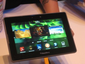
BlackBerry PlayBook
BlackBerry PlayBook

Most copied the iPad model with a grid of apps icons that you can select by touch. BlackBerry’s new PlayBook did something different and I liked it. There is a horizontal band of icons actual running applications [thanks to Peter Hansen, below, for this correction] across the middle and a dock of smaller favorite icons at the bottom. It’s a cleaner interface with much less on the screen. You can flick the band to left or right to expose more icons. When you want to activate an icon enlarge an application’s window you tap it and it fills the screen, but you can get back to a desktop by “rolling in” the edge from any of the four inner edges of the bezel. After a minute I was using it with ease. I wish RIM success with this device, although I’m a little nervous that they have not announced a battery life.

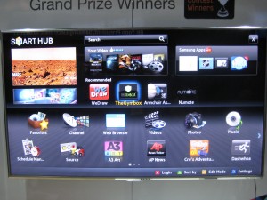
Apps menu on LG TV
Apps menu on Samsung TV

Less successful are the TV Apps I saw from Samsung and LG; I’m sure they are available from other brands as well. High-end “smart” TVs have a menu screen that looks like an overgrown iPad with big icons for sports programming, partner channels, and their own version of apps, mostly games and kid activities. The whole idea seems like a non-starter to me. How many people fiddle around with their TV menu instead of going right to the menu of the TiVo or set top box they’re familiar with? And tabbing among the icons with a handheld remote was awkward and reminded me how much more intuitive a touchscreen is.

A giant electronics company can absorb a mistake, but the same may not be true of  Anti Sleep Pilot, a device that mounts on your dashboard and monitors the driver’s performance and alerts you if it’s time to take a break. This is a very serious subject and a worthy thing to do but I wondered how they went about deciding how exactly to alert you and nobody at the booth could inform me.

The demo video shows a melancholy Dane who looks like he’s quite willing to cooperate but I wondered how it would be sold to Americans who are distracted to begin with. Here’s where the user interface makes a real difference. I’m told the warning sign, after you fail a certain number of tests, is a “chime”. Did they test that vs a buzzer or siren? I hope so. This is a product that truly will live or die by its interface. I watched it at ShowStoppers while munching my arugula.

Blogger preview: CES 2011

Tomorrow I head west for this year’s Consumer Electronics Show in Las Vegas. The word is that LAS is packed, hard to get a taxi or a hotel room just like in the glory days. I’ll be attending press events on Thursday and Friday night, visiting a couple of clients, and trolling the floor for new and noteworthy things to write about.

In last year’s preview post (inexplicably titled “On my way to CES 2009”) I talked a little about my philosophy of working this show. I also predicted that 3D TV would be a non-starter… you read it here, and many other places, first. This year is supposedly “the year of the tablet” which also happened in 2003; I am more interested in things you can do with the tablet, such as iGrill, the world’s first bluetooth cooking thermometer you can monitor from your iPad.

My task on the plane is to scan some 300 press release emails and see if there is anything promising enough to follow up. Tip to flacks: like most people who will be writing about the show, I’ve been filtering my CES emails into a special folder. So if you don’t say “CES” in the subject line, you’re not visible to us.

Wearing my consumer hat, I am going to find what the ^% is happening with the content side of streaming video. Was excited to get an HD Roku for Christmas. Not so excited to discover that Netflix has just 20,000 streaming titles available, NOT including anything by the Coens, or Dumb and Dumber, or the Southland series from TNT. I’ve read that the studios seriously underestimated the appeal of streaming and delivered their content to Netflix at a bargain price, but if they’re going to just pull it back then we don’t have a seamless entertainment experience, do we?

Stay tuned…

Are Groupon copywriters really worth $6 billion?

Groupon, which was featured in an earlier post and also in my social media presentation at the DMA in San Francisco, has recently spurned a $6 billion takeover offer from Google. Pretty cheeky…. considering that there’s nothing proprietary or patent-able about its business of delivering a daily coupon to your inbox with a big discount on a local business.

Indeed, Groupon is one of four coupon outfits I now hear from on a regular basis. BlackboardEats is doing something similar for San Francisco (except they don’t collect the money up front which is good for me but a poor profit model for them), Open Table has gotten into the act with discounts as well as reservations, and LocalSavings is giving Groupon a real run for its money here in the upstate NY area.

But Groupon’s emails are the ones I always open, and why? It’s the copywriting! Today, for example, in an offering for a Portuguese restaurant, the copywriter noticed it had small plates and delivered the following riff: “Small plates provide diners with a rare chance to act like a giant and yell “fee-fi-fo-fum!” at the waitstaff. Enjoy a make-believe growth spurt with today’s Groupon: for $20, you get $40 worth of Portuguese cuisine at Atasca in Cambridge.”

That’s the kind of extemporizing that used to get us yelled at by our bosses when we were cub copywriters… but as always it’s followed by solid research-based benefits including a description of menu items, a reference to its listing on a best-of directory, and a verbal capsule of the ambience:  “The in-house atmosphere is warm and romantic, bedecked with Portuguese art and fresh flowers, ideal for a smooch-inducing date or a platonic rendezvous with a band of surly Casanovas.” You can’t make this stuff up, at least you can’t day in and day out. I spoke to one restaurateur who was a happy Groupon client and he said yes, someone from Groupon did indeed call and interview him at length.

I have one worry for Groupon though, and that is its inability to attract quality advertisers in the hinterlands. In San Francisco and Boston, the specials are from recognizable establishments where I’d want to eat anyway. But in Dallas and Albany (all part of my quixotic geographical rotation) we tend to get tanning salons, car washes and second-tier pizza joints, the same folks who show up in Val-Pak.

If Groupon is going to grow beyond $6 billion they’re going to have to find a way to sell creative marketing to the late adopters. If Groupon should happen to implode, at least there will be a lot of good copywriters available for hire in the Chicago area (where Groupon is based).

Allstate creates Mayhem with negative ad campaign

Copywriters love to write negative ads… they’re so much more fun than bland positive messages. But early in our careers we have it drummed into us that negative doesn’t sell. The reason is that the ad itself has no credibility. Rather than absorb an unrequested negative message, the reader simply turns the page.

I had to prove this for myself with a negative direct mail package to test against my control for Long Term Life Insurance at Met Life. Your chances of needing long term care are hundreds of times greater than the possibility of a home fire. Yet everybody carries fire insurance. Similarly, you have maybe a 1 in 10 chance of getting in an auto accident but the odds of needing long term care are 1 in 2. Getting worried yet?

The package bombed. Nobody wanted to read it. And I have stayed on the sunny side ever since…. with the exception of a few forays for my financial services client.  But now comes the Mayhem campaign for Allstate… which seems to be working, based on the way the campaign has expanded and the fact they are now running a “clips” spot for the holidays.

Mayhem points out all the bad things that can happen when you don’t have insurance or enough insurance…. with humorous depictions by the entertaining actor (who plays one of the dead family members on Rescue Me) Paul Dean Winters. My favorite is “Large Expresso” in which the bigwig executive, upset about losing millions in the market, spills a large expresso on himself and slams on the brakes… causing you to run into him from behind, your fault.

So we have two shibboleths broken at once, negative advertising and humorous advertising. Thank you Allstate (and thank you agency Leo Burnett).

UPDATE: Allstate’s PR folks contacted me to correct the spelling of the star’s name and to point out that Mayhem now has his own Facebook page. You can find it lower right on this Allstate site.

Marketing to idiots

I had a client who was concerned that the information she was collecting on a registration page was going to be a potential problem because people are registering to win a prize and if they do win a prize then a/they might not want to receive it at work (which is the address we’re asking for, this being a B2B mailing) or b/they might have given a fictitious address as some people do because they don’t want to get advertising contacts yet they have to put something in the fields.

This same client had a problem at a previous company, which was the cause for her concern. She was giving away iPod shuffles (then selling for $59) to qualified prospects in return for their time to sit through a demo and apparently many people did not get their shuffles. I say “apparently” because it could also have happened that someone lied in order to get an additional shuffle…. dishonest, but hard to prove. Anyway, once bitten she wants to be sure this time.

My response (before caving, of course) was that there are always going to be a few idiots and outliers in your audience who are not going to play by the rules no matter what you tell them. And you should not do anything that is going to make your offer more complex to the vast majority, such as adding additional information on the reg page to deal with this issue by requesting an alternate shipping address in case they win. (Everybody who has ever designed an online survey or reg form knows that each additional field or question causes a certain number of people to drop out.) Suppose they fill in the form with their preferred address but, being idiots, they write it down wrong. What do you do then?

Along the same lines, I had a client back in my “suit” days who wanted to know if it was a good idea to pay a 1.5% commission based on the value of all sales paid by check in return for this supplier’s guarantee to make good any bad checks. This one was easy to figure out. Do bad checks cost more than 1.5% of revenue from all checks? No. Then this apparent insurance service is a money-losing sinkhole.  Plus, cheats are cheats. If a customer has it in their heart to trick you out of money, they’ll just find another way to do it.

Today’s moral is, the customer is not always right, not when they are idiots and outliers. Don’t screw up the rest of your promotion by making accommodations for a few wingnuts.

Marketing the moment: why “live” is the new “live”

Born in Dallas and a longtime San Franciscan, I have taken an unusual interest in this year’s baseball playoffs. As my teams climbed higher my viewing apparatus got correspondingly smaller. The first round was watched in a hotel suite with big screens, the early games of the league championships on a tube set in a hospital room, and by the time we got to the final game where Texas beat the Yankees I was using the live update feature on ESPN on my iPhone.

Glued to the tiny screen as I was, I barely noticed that there were advertisers who wanted me to click away to their websites. In these days when we TiVo everything I wanted nothing more than to be on the screen at the exact moment when the rangers got the final out. On the other hand, this is a great spot for brand advertising. Anybody who inserts themselves unobtrusively in the heat of the moment, as ESPN did with some of its own self promos, becomes part of the experience and is carried along with the ride.

Yet the final out in a baseball game is one of the rare times when you can know that the drama is about to happen. Most baseball excitement is unpredictable, a lull shattered by sound and fury. Many fans miss the moment because they are kibitzing or out for a beer, so they rely on replays or on announcers to tell them how excited they are. It’s rare to have an end-to-end nail biter like the Giants’ final home victory when I told myself, “I’m watching a game for the ages” before the commentators informed me of that.

And this is something we marketers can do something with…. remind consumers how excited they were at some pivotal point in the past and then offer some product with a real or imagined tie-in. I did this with a video continuity program for an old series called Highlander, asking people to remember where they had been when they saw the show for the first time. (Not having been there myself, I channeled the experience of watching the final episode of The Fugitive, as a wee lad at a youth hostel in Scotland.) Didn’t win a pennant but it got an Echo and, more important, sold a bunch of videos.