Sweet way to make a trade show impression

The annual Direct Marketing Association conference is a challenge for exhibitors. It’s a horizontal show, with many different categories of vendors represented from bankers to software to printers to agencies. And many of these have complex value propositions that are hard to convey with an elevator pitch.

Orange cupcakes = cloud computing, get it?
Orange icing = cloud computing, get it?

In this environment, the booth shown here stands out. Everything is orange, and they’re giving away cupcakes with bright orange icing. The cupcakes attract traffic, and when the sales force follows up after the show they can say “we’re the people who had the orange cupcakes, remember?” All good.

The marketing tie-in is a little more tenuous. The booth staffer explained that “we’re the only software-as-a-service solution at the show for migrating legacy systems” for order entry, customer records and other mail order chores. That’s a bit complex to convey in an elevator pitch so the company—named “swyft” and pronounced “swift” I will guess—decided to just go for being remembered. Some people might go to their website, but in any case there are these orange cupcakes.

A bit of research was done, consisting of looking at the collateral. The cupcake tie-in becomes clearer, though the copywriter unfortunately cannot resist a treacly flow of plays on words: “Sweet! Ripping and replacing legacy systems is about as fun as a root canal. It can be a slow, painful process and leaves a bad taste in your mouth. That’s why we built the Swyft Interaction Hub to sit ever so sweetly right on top of your existing customer systems. It’s like the icing on your customer infrastructure cupcake.”

I have the feeling the booth people either weren’t fully briefed on this platform or didn’t feel comfortable mouthing it. I pressed the booth rep on the tie-in between the cupcakes and the product and she said “we’re cloud computing” and we agreed the puff of orange icing was indeed like a puffy cloud. OK.

I’m giving them best of show for the DMA by default but you see how this could have been even better. Think through that metaphor of cloud computing and maybe there’s a better way to express it…. maybe cotton candy which was being given away at the next booth (not as a gimmick, just free candy). Or here’s an idea, how about tying into the name “swyft/swift”? Any metaphors come to mind for that one?
Gap shoots itself in the logo

I had been looking for a bad example of social media marketing to use in my DMA talk on Monday 10/11, when the good people at the Gap dropped one right in the lap of my denim jeans. Funny thing is, I don’t think they were aware they were involved in social media marketing which is part of the problem.

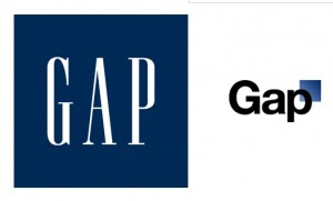
Gap old and new logos

Gap, as you may know, changed its logo last week. To my non-designer’s eye, the new logo looks like something I was offered free at a conference by an outsourcing design firm: I was asked to answer a few questions about my business, then come back in 20 minutes. Gap’s new logo is simply its name, set in the same font used for the table of contents in the New York Times magazine, with a little blue square at the side as homage to the old logo they’re getting rid of. On the face of it this does not seem like a particularly good change. Plus the old logo had a lot of recognition built up over 20 years; most marketers would consider that brand equity but Gap felt it was a problem. They’d had the same logo for 20 years, so it was time to get rid of it. Not evolve it, as many companies have done (think about how Betty Crocker, Uncle Ben and Aunt Jemima have morphed over the years in response to changing social mores). Just toss it out and start over.

The change drew over 1000 comments on Gap’s Facebook Wall, with the balance overwhelmingly on the negative side. (The Facebook page still displays the old logo as of this morning, by the way. Oops!) The critics tended to say either the new logo looked like an exercise from a beginning Photoshop class, or that they loved the old logo and didn’t want to see it go. And, not a few offered to redesign the logo themselves. That’s where it starts to get strange.

Gap's Facebook page still displays its old logo. Oops.

Gap President Marka Hansen wrote on her Huffington Post blog that “given the passionate outpouring from customers that followed, we’ve decided to engage in the dialogue, take their feedback on board and work together as we move ahead and evolve to the next phase of Gap. From this online dialogue, it’s clear that Gap still has a close connection to our customers, so tapping into this energy is right. We’ve posted a message on the Gap Facebook Page that says we plan to ask people to share their designs with us as well. We welcome the participation we’ve seen so far. We’ll explain specifics on how everyone can share designs in a few days.”

Aside from the condescending we-we language (“passionate outpouring”? more like “howls of outrage), what is really going on here? Is the lame new logo actually a placeholder and publicity stunt? Does Gap really want its customers to help design a new logo, and if so why did they not say that in the first place? And if they are indeed going to hold a design competition, what are the rules of the game and how will the winner be compensated? (Designers are already posting to warn their colleagues not to offer designs until copyright protection measures are made clear.)

Right now Gap’s getting a whole lot of free publicity. Problem is, most of it is negative especially for a company that would like to have a positive image for its design and customer interaction skills. It will be interesting to see how this unfolds.

UPDATE: on the evening of 10/11/10, Gap announced that it was going back to its old logo. Here’s their Facebook statement, thankfully free of we-weisms: “Ok. We’ve heard loud and clear that you don’t like the new logo. We’ve learned a lot from the feedback. We only want what’s best for the brand and our customers. So instead of crowd sourcing, we’re bringing back the Blue Box tonight.” And according to Ms. Hansen in their press release, “There may be a time to evolve our logo, but if and when that time comes, we’ll handle it in a different way.” Sounds like a plan.

Why baby carrots are evil

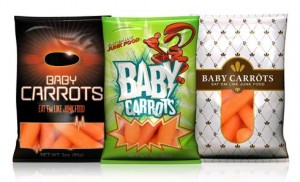
Maybe it’s too soon to call the campaign a runaway success, but the respected Middletown, OH Journal is reporting that at least some students at Cincinnati high schools are indeed purchasing baby carrots out of vending machines now that they have been repositioned as junk food.

Evil baby carrots in their vending machine jackets

The campaign was produced by Crispin Porter + Bogusky though I assume without the participation of Alex Bogusky, who pronounced he was sick of advertising and quit earlier this year.  It’s not a big media buy, $25M total, so in order to see their edgy commercials you’ll have to hit the right teen programming or just watch them on the web. The most popular seems to be a spot in which a woman fires baby carrots out of a Gatling gun at a guy who is trying to catch them in his mouth.

To me, baby carrots are kind of quease inducing to begin with. They are not actually “babies” at all but mature carrots with minor blemishes which have been tumbled and shaved until they are small and cute. (Thank goodness human babies are not made this way.) And apparently the process makes them last forever since they are typically sold without refrigeration in supermarkets and, I assume, in high school vending machines. Sometimes they get a white powdery coating with age, a kind of patina. But I guess that’s okay, right?

But what’s evil about this is the cynicism of the agency creatives, who seized upon this loophole in the creative brief: we don’t have to make kids eat them, just BUY them from the vending machine. And thus the pro bonos of the healthy school movement are satisfied even though most of the carrots are likely being used as projectiles, bookmarks, doorstops or god forbid this. (A demo of carrot warfare can be found in a fortunately timed V-8 commercial in which two kids are flicking baby carrots at each other across a table in the cafeteria but one of the kids is OK because he’s drinking a V-8… quite possibly containing some of the shavings that were a byproduct of those very baby carrots.)

Changing behavior through an ad campaign is hard, especially when it involves a pliable young audience with a shifting definition of cool. A campaign that did succeed was the “Truth” effort in Florida, aimed at reducing teen smoking by making it cool to attack adults who manipulate kids to smoke. See how many memes are encapsulated just in the description of that campaign? A villain… who may well be your own parent. A superhero… transformed from an ordinary teen. That’s your ad dollars at work.

By contrast, the Baby Carrot people took $25 million that could very well have been used to do something good and spent it on a smirk. Maybe Bogusky quit because he just didn’t want to work with these characters any more. Or maybe he just wanted to go off and be a farmer of great big, foot-long carrots.

Why context matters in your advertising

We’ve talked before about verisimilitude—the principle that, in addition to actually being true, an advertising message must appear to be true or the skeptical public won’t trust it. A parallel concept is context… in any given environment the audience expects to receive information in a certain way and you can either fit in with this convention, or startle and gain attention by doing the opposite.

Ads or banners that look like editorial content go down like butter. Direct mail packages that look like they are official notices get opened automatically. Of course, you need to stay in character or the audience may feel duped if your message turns out different than it appears.

Frost's fake bank book inserted in the Wall Street Journal

For the “startle” approach, a good example was inserted with a recent Wall Street Journal (home delivered in Dallas, where I was traveling): unfold the paper and a bankbook falls out. Whoa, a bankbook! But it’s not really a bankbook because it has a headline on the front: What we believe.

Inside, we have ten spreads containing statements of belief, most of them no more than a sentence. Example: “We believe you get what you pay for.” It’s not until the very last page that the advertiser is revealed along with a CTA: We believe there is only so much you can learn from a book. Call (tollfree). WhatFrostBelieves.com Frost (logo)

Now, there’s nothing terrible about any of this… for a corporate website, or an annual report. But this isn’t marcom, it’s ADVERTISING and quite expensive advertising at that. I can see the boardroom wheels turning: Wall Street Journal readers are well heeled influencers. Let’s impress them with our sincerity and maybe they will become our customers.

Not likely. There is just too great a leap between a statement of purpose and high mindedness, and the actual activity of deciding to do business with a bank.  A few readers may pass the bankbook around their office as a curiosity but very few are going to do the thoughr process of “these guys seem decent enough, they’ve proved it by not trying to sell me too hard, therefore I will get a loan or open an account with them.”

The thing is, there is a way this promotion could have potentially been VERY successful: make it look like a real bank book. With nothing on the cover so you don’t give away that it’s marketing… or, wait a minute, let’s put the Frost logo on. That’s realistic and establishes brand up front.

Inside, some stage management—fake transactions.  The account holder has built up a huge balance, earned some nice interest, then withdrawn it all. (This is Texas, remember.) Tell a story with the numbers. The Wall Street Journal reader will like this. Then on the last page, a call to action: save a point on your business loan when you return this bankbook to Frost. That’s how you buy business by being out of context.

Everybody’s a winner in Fast Company’s Influence Project

I signed myself up to do a presentation at the annual Direct Marketing Association conference called “How Twitter Killed Direct Marketing Copy (Just Kidding)”.  The idea is to show great examples and tips of how classic marketing techniques still work in new media, while also giving old-school copywriters some juice and inspiration as they attack assignments in the unfamiliar and slippery turf of Facebook, Twitter and their ilk.

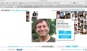
My page on the Influence Project
Click the pic to spread Otis' influence!

The conference is in early October in San Francisco, but my Powerpoint is due August 20 for “peer review” (WTF?) so it’s time to think about what I am actually going to talk about. One thing that’s definitely going to be there is Fast Company’s recently launched “Influence Project”.

Fast Company asked SF agency Mekanism for a pitch on how to make itself more successful through viral marketing. The ideas were brilliant and you can read about them all at http://www.fastcompany.com/finalists as well as download the actual presentation which is a great piece of work any creative practitioner can learn from. The chosen concept was what would eventually become the Influence Project.

The idea is that you register on Fast Company’s website, and get a special “influencer URL”. (Mine is http://fcinf.com/v/bf8c )Then promote that link by whatever method you choose. The more clicks you get (with bonus points if you get other people to join the contest), the more influential you are. The winner will be featured on the cover of the November issue as the most influential person in the world… but wait, there’s more.

The concept would have brilliant if it stopped at one winner. Maybe it would be Lady Gaga, or maybe an intrepid dark horse American Idol-style. However, in this contest EVERYBODY is a winner. Pictures of all entrants will be featured on the cover, with the size proportionate to amount of influence. If you’re too small for a dot of ink, you can still find yourself on the Fast Company website where there will be special magnifier tools and lots of cool analytics.

How this ties back to marketing is explained by the problem description in the Mekanism product brief: “Fast Company is the best thing that too few people read.” And the solution is to get people to interact with the website and hopefully stay around for other content as well as, of course, read that November issue.

To try this out, go to http://fcinf.com/v/bf8c then wait a long time for the server to load. Vote for me by clicking the “Spread Otis’ influence further” button or register yourself by clicking “Discover YOUR influence”.  Email me after you do either or both, and I’ll send you a complimentary copy of the DMA preso after the conference.

Chevrolet shoots self in crankcase, creates badvertising instant classic

You can’t make this stuff up. The VP, I mean Vice President of Marketing at GM, I mean General Motors, has asked all employees to stop calling Chevy by that casual name and refer to it by the formal “Chevrolet” henceforth. The request presumably extends to the brand’s new agency, Goodby Silverstein, but hopefully did not originate with them.

“We’d ask that whether you’re talking to a dealer, reviewing dealer advertising, or speaking with friends and family, that you communicate our brand as Chevrolet moving forward,” read a memo which was also signed by the Chevrolet Vice President for Sales and Service. “When you look at the most recognized brands throughout the world, such as Coke [they mean “Coca-Cola” of course] or Apple for instance, one of the things they all focus on is the consistency of their branding. Why is this consistency so important? The more consistent a brand becomes, the more prominent and recognizable it is with the consumer.”

Of course, you can also make a brand recognizable through generations of casual use until it becomes part of the national vocabulary as well as the title of several Facebook fan pages and the auto dealership of its chief NASCAR representative, Jeff Gordon Chevy. And presumably Don McLean will be asked to return to Café Lena here in Saratoga, where he originally penned “American Pie”, and revise its most memorable line to “drove my Chevrolet to the [whatever Chevrolet rhymes with] but the [whatever] was dry”.

The New York Times article which broke this story reports that there now is a “cuss jar” at Chevrolet headquarters and employees must deposit a coin every time they use the forbidden word. Once it’s full the proceeds will be used for a “team building activity”. Times reporter Richard S. Chang suggests that activity will probably not be a Mexican dinner at Chevy’s.

Thanks to Carol Maxwell to bringing this to my attention. And thank you America for making possible this badvertising epiphany. Your tax dollars at work.

Taking bad marketers to the woodshed

Did you ever get punished as a child for doing something naughty, because a parent or teacher didn’t believe you even though you were telling the truth? The problem here is a lack of authenticity—or, to borrow a favorite word from ace copywriter and gore movie maven Herschell Gordon Lewis— verisimilitude.

Consumers in general tend to be skeptical of marketers, which is why verisimilitude is very important. In addition to actually being true, a claim must APPEAR to be true or you break the spell and lose the sale. Today’s badvertising classic is a case in point.

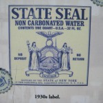
The original State Seal label
Original State Seal Label (from a plaque at the springs)

I live near the bubbling natural springs of Saratoga, NY. Folks have been coming here to “take the waters” for centuries and the greatest number of springs, as well as the classic bath houses, are located in a park which is owned by the state.

Early in the 1900s an entrepreneur had the idea to bottle the water and sell it nationally. To emphasize the official connection, it was called “State Seal” water and the antique-y state seal of New York was actually shown on the label. Millions were sold and FDR became a big promoter of the springs and the water.

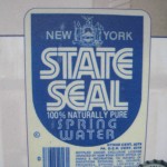
New State Seal Label
State Seal Spring Water label, c. 1980

Fast forward to the 1980s, and another entrepreneur had the idea to revive the brand. But he/she picked the wrong thing to revive. The new water is again called “State Seal” but the label design is bland and modern. Within a few years the revived brand was defunct.

The original State Seal water had verisimilitude. It looked like the kind of packaging a civic department might come up with if it had no clue about marketing but was simply trying to promote healthy water to its citizens. The revived water had none of this charm and authenticity. The revivalist probably thought the old design was out of date when in fact it was the essence of the brand.

Fetch me that paddle, ma. I think some marketer needs a whuppin’ here….

Good news from bad advertising

You know the economy is improving when the incidence of bad advertising and clueless products starts to rise. In tough times, every single product and marketing manager has to justify its existence. But today there’s a place for talent like the creative committee that came up with this slogan for Perkins: Our people deliver more.

Get it? It’s a delivery company. But when some copywriter (not a great one, but at least with a pulse) came up with the slogan “our people deliver” the committee was not comfortable. “Any delivery company can make that claim,” the CEO or CFO perhaps pointed out. “I’ve got it,” yelled a board member. “Let’s add a ‘more’ after the catchphrase and turn it into a USP.” Well he didn’t exactly say that because he doesn’t know what a catchphrase or USP is. But see what he did? Took a workable slogan and turned it into a generic statement.

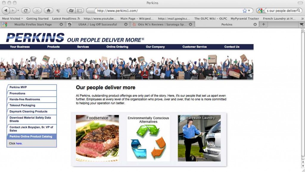
Perkins home page
Want some cleaning supplies with that sirloin?

This is a company with quite a tin ear for marketing.  Take a look at the Perkins home page pictured here. Does anybody else feel a little queasy with the juxtaposiition of the juicy steak and the guy with his foot on the bumper of the car linked by the recycling logo that makes it look like one is turning into the other? Turns out Perkins is both a foodservice delivery company AND a janitorial/sanitation/laundry company. I can see that the same hapless copywriter pointing out that these are rather dissimilar services that maybe shouldn’t be shown side by side on the page, and I see CEO barking “why the hell not?”

Lucky for this misplaced copywriter, a job will soon be opening up at one of the recognizable brands in America: Lysol. They are now advertising the “No Touch Hand Soap System” because—did you know—germs can get on the handle of the soap pump? Wait a minute, I thought that was why you have soap. Do people not know to use the soap after they dispense it into their hands? I think Lysol is underestimating its audience (even the people who are watching “All My Children” which is where I saw it advertised) and indeed, this product is already being remaindered at Overstock.com. The product is on its way out and the product manager may not be far behind.

Happy days are here again.

How to write a mission statement

This week I ran across the website of the Green Cleaners Council, whose “About Us” page states in part:

The Green Cleaners Council counts the many ways a professional dry cleaner can be ‘green’ by providing cleaners and consumers with defined environmental sustainability benchmarks to judge them by.

It is our mission to provide the necessary gravitas, which has been lacking regarding green marketing and greenwashing in the dry cleaning industry. We afford consumers a verifiable mechanism for judging how GREEN their cleaner is, while giving professional cleaners a vehicle to herald their genuine environmental accomplishments and strategies to help them achieve their green goals for the future.

In other words, this trade association provides consumers with tools to evaluate the environmental conscience of a dry cleaner, while providing the dry cleaner with marketing tools to show how green they are. This is what they do, but is it a “mission”? And are they helping their cause with grandiose words like “gravitas” and “herald”?

What went wrong here is that the Green Cleaners Council confused its mission with its marketing. A mission statement is not inherently a bad thing, but it should be primarily internally focused. Especially in a young and chaotic organization, it helps people keep their eye on the ball. It can remind them that their purpose is to serve customers or improve the world in some way, not just to make money.

A nice article on mission statements can be found on the FastCompany website, called “How to Write a Mission Statement that Isn’t Dumb.” The author, Nancy Lubin, points out that most corporate mission statements are like Hallmark greetings while a good one should encapsulate what the “Built to Last” folks call a Big Hairy Audacious Goal (BHAG for short).  Here’s a successful example, from Microsoft:

A computer on every desk and in every home, all running Microsoft software.

Here’s one that is more amorphous, and the company turned out to be less successful in keeping its eye on the prize:

Respect, integrity, communication, and excellence.

And here’s one that might well have been scribed by the marcom writer at the Green Cleaners Council in a former position:

It is our job to continually foster world-class infrastructures as well as to quickly create principle-centered sources to meet our customer’s needs.

A mission statement shouldn’t be written by the marketing department, but by the leaders of the organization who are responsible for living up to it. (Though I’d say it’s okay to have a professional writer on tap in case the execs get too full of themselves.)  And mission statements aren’t marketing and shouldn’t be featured in your marketing as a general rule.  It’s a lot easier to look silly than to effectively communicate or persuade, as the bad examples demonstrate.

By the way, the middle mission statement is from Enron Corporation. And the last one isn’t for a real company but was created by the “Dilbert Mission Statement Generator”. It isn’t available online anymore, unfortunately, maybe because too many real companies were using it to write their mission statements.

Google blows it with new layout

The other day I was talking about the Unique Selling Proposition and how valuable it is when a marketer can distinguish itself by claiming a benefit or feature that cannot easily be claimed by another marketer. I mentioned that often you can do that simply by staking a claim to a generic benefit nobody else is talking about… make it your own, and anybody who later says “we have that too” would look foolish.

Google, though we take them for granted today, has a pretty unusual marketing history: they climbed to the top in a competitive field (remember when we all searched with Altavista?) by just being better than everybody else. So it was so very appropriate that Google’s interface also looked different. So stark and simple, just that search box in the middle of a blank page. The drama of unused white space… never a better example.

So now we have the new Google interface that has left this behind. You get a busy page with results in the middle, Adwords on the right, and a menu of related results on the left. But more important, you get a page that looks like everybody else’s search results page.

Not many marketers can claim the high ground that Google legitimately appropriated with its old page. To voluntarily cede your USP…. for that is what they are doing with this new generic interface… is a bone headed decision.

It occurred to me as I was thinking about this that  grandfather was a proud member of the Dallas Bonehead Club. I am not sure of all they did but I know a core value was to be silly and irrelevant. Good for them in that straight laced Southern business community, maybe not so good in today’s competitive business envronment. Bad move, Google.