The right way to use sweepstakes in your marketing

I got an email last week from Citicard inviting me to switch to paperless statements and be entered for a chance at a $500 gift card. Well, I already switched to paperless but I’ll click the link and enter anyway. The link asks me to log in to my account and I do, and I’m told I am already signed up for paperless. No mention of the sweepstakes. D’oh! Now I am an angry camper.

There are several things that could have done better in the above example. First, clean your list so you don’t email people you don’t want to get the offer. Second, don’t piss off loyal customers… if they’re going to send me the invite, how hard would it have been to build a landing page that says “you’re already paperless, congratulations, we’ll enter you in the sweeps anyway”? Third, don’t break the law… which is what Citi may be doing with “consideration” in which some groups are ineligible for a sweeps drawing.

Sweepstakes are a great way to push people over the edge and make them respond to your marketing. They’re also very affordable because you can control the number of prizes. Instead of sending a $10 Amazon gift certificate to everybody who fills out a reg form (and paying for the fulfillment as well as the cost of the gift), it may be far cheaper to have just one $1000 certificate and everybody who fills out that form is eligible.

A good sweeps prize will have some relationship to the audience and the marketing message. I do a lot of lead generation promos to tech audiences and the chance to win the latest gizmo (the iPad right now, iPod touch last year, Palm Vx back in the day…) is like catnip. A bad sweeps prize is one your management comes up with that is goofy and takes lots of words to describe and distracts from your core selling message (an all expenses paid trip to your corporate meeting, even if it’s in Hawaii, is a good example).

The most basic legal rule is to avoid “consideration”…. you cannot have some requirement that people must go through a certain process to enter, or certain people are ineligible. The way to avoid it is to have in fine print in your sweepstakes rules that anybody can enter by sending in a 3×5 card. And you do need rules, and you need to put them in the right place, which is why you do need legal help if you’re going to do a sweeps properly.

Back in my magazine promo days there were several firms who offered a turnkey package of writing your sweeps rules, picking a winner and indemnifying you against fraud and legal problems for $10,000. I am sure the price is higher now but a service like this is still a bargain in terms of peace of mind. Even so, most of the small to midsize marketers seem to copy an existing set of rules, do their best to keep it honest, and keep their fingers crossed they haven’t done something illegal by mistake.

Finally, be prepared for the objection from your sales department that the leads are no good because they are sweepstakes-generated. In the one test I’ve been involved in where a client carefully monitored the process, they got way more leads with a sweepstakes but also a significant increase in qualified leads, as measured by their serious intent and qualifications as potential buyers.

It just makes sense that a sweeps is going to attract an incremental number of perfectly good prospects who were on the fence about registering, or simply too busy with too many advertising contacts, and this pushes them over. What’s needed is a prequalification process, through the questions on the registration form or a qualification precall from someone who is not an expensive salesperson or telemarketing firm, to see if they are really serious. If not, the respondent never enters the sales system but they still get to enter the sweepstakes. That’s the law.
Why you should send your copywriters and designers to trade shows

Colleague Carol Worthington Levy just wrote a great piece in the LENSER newsletter on the benefits of sending creative employees to conferences such as the DMA’s annual event. I’m a big fan of this and in fact I send my entire creative department, i.e. myself, to an average half-dozen trade shows per year.

But as Carol points out, most creatives don’t go to conferences because the management won’t let them. The suits are afraid of being caught short-handed while the lead designer or writer is out of the office, or maybe they’re just tight fisted. As a result, the few creative events the Direct Marketing Association has tried to put on have languished.

Here are four good reasons copywriters (and designers) should get to go to trade shows:

1. To see how the competition is advertising. In the petri dish of the exhibit hall you can quickly get a cross-section of images and messages your competitors are using to market… and better yet, you can see how the audience reacts by gauging the floor traffic.

2. To see your audience in the wild. I don’t know about you, but when I write I frequently have an imaginary picture of my prospect in my mind. It makes the copywriting task more focused. So what could be better than actually seeing real prospects to add detail to that visualization?

3. To see what hot buttons work for your audience. Hang back when a product demo is going… observe the phrases the demo person is using and how the recipient of the demo reacts. This is a great way to find out what is truly important about a complex product so you can use it effectively in your own selling.

4. To learn something new. I am generally pretty disappointed in the educational sessions at conferences (other than SXSW, and even that had some clinkers this year). But if you look at learning as a nice bonus instead of the focus, you’re OK. You’ll always learn SOMETHING new.

If you’re a laborer in the creative trenches, please pass the above list and Carol’s article along to your management. I’m doing a session at the DMA this October in San Francisco, and I’d rather not be alone in the room.

The Amish marketing miracle… sadly, debunked

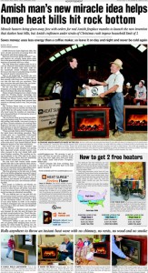
As a copywriter, I get goosebumps from promos like the “Amish Miracle Fireplace” full page ad which has been running of late. This is the Ronco/Popiel school of long form copy I pored over when I was learning my trade. (In fact, I once interviewed at the Ronco offices in North Hollywood. I recall they had the various examples of their direct marketing prowess… the Veg-o-Matic, Pocket Fisherman and more… lined up on a shelf like Teddy Roosevelt’s African hunting trophies). As a cub copywriter I felt these ads were more audacious than deceptive… they were so entertaining in their own right that no one should feel cheated if they didn’t get their money’s worth.

Ad for Amish Miracle Fireplace, from consumeraffairs.com

The Amish Miracle Fireplace copywriter would have old Sam Popiel sitting up in his grave and saluting. The miracle is the heater being promoted in the ad, which puts out a high level of radiant heat for such a tiny object and will be yours FREE as long as you buy a wooden box/mantle to house it, which is the part made by the Amish. A little sleuthing gets to how the marketer makes money: At $300 plus shipping, the price of the box is much more than the apparent value of the “free” heater. But still. So many marketing touchpoints here: thrift, American tradition, pride of ownership in something that makes your hope more cozy, who wouldn’t want one at the bargain price of free?

Unfortunately, the folks at consumeraffairs.com have burst our bubble. Their article is a miraculous bit of digging, and along the way they respond to such consumer queries as “I thought Amish people didn’t use electricity” and “I thought Amish people didn’t allow themselves to be photographed.” They also tell us why such endorsements as UL-approved and the Good Housekeeping Seal of Approval are essentially meaningless. And they point out that a device that produces the same level of electric heat (while sending your utility bill through the roof, by the way) can be bought at Target for $20.

The vice president of the company that makes the heater is interviewed in the article, and he is delightfully unrepentant. The “miracle”, he explains, is actually the imitation flames that are displayed on the front screen of the heater.  “These heaters are being called a miracle because they have what’s being called the ‘Fireless Flame’ patented technology that gives you the peaceful flicker of a real fire but without any flames, fumes, smells, ashes or mess. The patented ‘Fireless Flame’ looks so real it amazes everybody,” says David Baker, of Heat Surge in Canton, OH. I happened to have spent a weekend in Canton last fall and I wish I had had the presence of mind to check out this miracle for myself.

Is it time to reinvent your brand?

A friend and colleague made me fret this morning. He visited my blog and happened to read one of my posts about Toyota where I talked about “my recent issues” with a link to another article. He naturally assumed these “issues” were related to my own branding or marketing problems, since that’s what he reads me for, and was surprised to find an article about an automotive company.

I brought this on myself, more or less intentionally, by taking what is mostly a marketing blog and turning it occasionally into a bully pulpit for my rants on other “issues”. Though I have to say that the original Prius battery failure post has become the second-most read post ever on Otisregrets. And that my food posts draw a small but loyal readership who come for nothing but the food. So I guess I will be keeping it up.

The name of this blog is a bigger problem. “Otis Regrets” has been around a long time, since 2004 when it began as a venue where students in my copywriting class could exchange ideas outside of class. The thought of making it SEO-friendly was far from my mind… what was a search engine anyway? But I’ve since become painfully aware that “Otis Regrets” is buried by queries for “Miss Otis Regrets” and you’re not likely to stumble upon this blog by name unless you’re also looking for Otis Maxwell.

So here’s the lesson or moral for today. When you put up your website, transferring a meatspace or bricks-and-mortar personal or business brand to the web, you hopefully heeded the advice to provide useful content, not puffery. But it may not have occurred to you that your very brand needed a new look. The web was just one conduit by which people are going to look for you and identify you. Now we’ve got Facebook, LinkedIn, Twitter, maybe Yelp, and all the Namez, Plaxos, etc etc that are going to link to these larger communities and referral services.

Think, as an example, about how your Facebook identity might show up in the newsfeed of someone who is a friend of your own friend or fan, but so far has no idea who you are.  The brand needs to do some heavy lifting here. The new reader (who is a valuable referral because you’re connected through a friend) has to get an immediate positive idea of who you are and what you do. Traditional branding, even a traditional elevator pitch, takes too long.

The quality of your content… the news or activity that was quoted… has to do its part. But what about the brand itself? If it isn’t pulling its weight in terms of building instant appropriate comprehension, maybe it’s time for a change. I know I am thinking about this for my own brand, how about you?

Toyota’s epic PR fail

In spite of my own recent issues, I had thought Toyota was doing the best it could with its massive recall. James Lentz, president of Toyota USA sales, was all over the press shows last weekend with the two key statements considered essential in the post-Tylenol era: “we screwed up and are sorry” and, “we care about our customers and are very concerned.” (Tylenol took a similar open, earnest tack when someone poisoned some of its bottles in the late 1980s and, coupled with an intensive “get to the bottom of this” campaign [they never did, but they were obviously trying]  it saved a brand everyone was writing off. For how NOT to handle a PR disaster see “Woods, Tiger”.)

But today I read this Reuters article that points out Akio Toyoda, the REAL president of Toyota, has said not one single word on the recall problem. And that another Toyota executive blamed the problem on (presumably inferior) U.S. made parts, chosen out of a charitable desire to help struggling American economy! Meanwhile the recall expands to the Prius (different problem, but nobody’s tracking the details any more) and Twitter #Prius traffic, which I’d been following because of my own recent posts, goes from sleepy to through the roof.

Concidentally, my original post about my dead Prius battery has become one of the most-read articles ever on this blog. Lots of new readers are discovering it linked to articles on the Toyota recall as they lick their chops for other Toyota schadenfreude. Speaking of which, my request for some financial relief led to timely response and some nice talks with friendly people in the Toyota Customer Experience Center, but a firm turn-down. I was frankly surprised at that.

[UPDATE for new readers: Toyota has now paid for the replacement battery. Details here.]

My casual research suggested a hybrid battery failure at 70K miles was extremely unusual if not unprecedented. It would seem like a good investment to fix an anomalous problem and placate a good customer who’s been evangelizing your product. Instead, here I am writing another post about problems at Toyota. How is that good for their brand?

Early Prius owners get screwed on battery warranty

I wasn’t too incensed about the dead battery on my Prius, just surprised, but after a bit of research I’m getting my dander up. Turns out, according to this article in the Toyota Pressroom blog, that the Prius battery has a 10 year warranty… EXCEPT for the first three model years that have only an 8 year warranty. (Mine died at 8 years and 8 months.) In other words, the earlier adopters who put their faith in Toyota and spread the word and built the Prius brand potentially get a $3700 repair invoice while later adopters would get a free replacement for the same problem.

I predict there is a bit of trouble ahead for Toyota if more owners see their batteries go south* and discover the company isn’t going to replace them. This is a classic example (getting back to marketing which is what this blog is supposed to be about) of taking your best customers for granted and treating them worse than your marginal customers.

Speaking of marketing, there are some other not-to-do’s worth learning from the Toyota Pressroom post. They acknowledge that “battery replacement in a Prius is neither as simple nor as inexpensive as replacing the battery in a conventional car.” That’s disingenuous because the massive and complex hybrid battery has no basis for comparison to the battery in a conventional car; in fact the Prius ALSO has a “conventional” battery. And they quote a bargain $2,299 for that replacement battery without mentioning that installation and tax at your Toyota dealer are going to add another, oh, $1400.

In a day when anyone can and does have access to your press releases, glossing over the pesky details is not a good idea. What exactly is this article trying to accomplish?  How could anybody who actually has a battery problem not feel pissed? And how could any news source that picks it up, then later discovers the truth, avoid feeling duped?

* Fortunately for other early Prius owners, mine may be a fairly rare occurrence. According to the Driving Sports blog only 306 Prius batteries had failed as of 6/09, out of 750,000 installed. “The life of the battery pack is generally about the same as the life of the vehicle,” said Toyota’s Jeremiah Shown. Well, that’s good to know.

Ok, now I’ll stop. No more about Toyota. I promise. Maybe.

[UPDATE for new readers: Toyota has now paid for the replacement battery. Details here.]

Is this realtor guilty of cybersquatting?

As I mentioned, I am in the process of prepping our SF house for sale. Lots of realtors advertise with a website that is the street address of the home. Out of pure curiosity, I went my home’s URL… and discovered the domain had already been claimed and parked by one of the realtors I interviewed. NOT the one that got the business, by the way.

A colleague who referred this realtor says they do it as a matter of practice, in order to set up a great presentation. Apparently they were going to set up a website for me and surprise me with it, but I made my decision before they could do this. She says as a marketer she admires their moxie and intent.

I disagree. First of all, there is no need to have a live URL to develop a website. Millions of websites are under development right now using local files on the developer’s desktop which will eventually be ported online. At any rate, the URL was parked, not active. The only thing this accomplishes is to keep another realtor, or me, from getting rights to the domain. (This realtor later said they’d relinquish the domain name at no charge.)

We know that in the early days of the internet there were entrepreneurial cybersquatters who grabbed domain names of recognizable brands such as Panasonic, Hertz and Avon, in hopes of reselling them for a fortune. The Anti-Cybersquatting Consumer Protection Act of 1999 put an end to this practice. But how is grabbing somebody’s meatspace address any different?

I think by rights the domain name that corresponds to a street address belongs to the entity that owns the physical location. Am I all wet here?

Trends of note from Fancy Food Show 2010

This show didn’t have the excitement of June in NYC, which may be due to the fact that the west coast was harder hit by the recession than the Northeast. (Though many of the same vendors exhibit at all the shows in SF, Chicago and NYC, merchants tend to go to the show closest to them.) There were some empty booths, but good floor traffic. Three trends I noted:

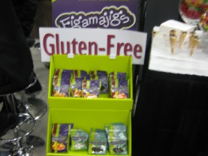
Gluten-free candy... who would have thought?

1. Gluten-free everything. People with celiac disease can’t eat gluten, but for most of the rest of us it’s the wheat protein enhanced during kneading that makes rustic bread chewy and delicious. But marketers seemed to have sensed a trend that “free” of anything equates healthy goodness, so there are many booths advertising “gluten-free” products that would never contain gluten in the first place.

2. Pizza. Lots and lots of frozen gourmet pizzas are on hand, designed to be sold at $6 or more for an individual-size pie. Also a lot of flatbreads that are advertising themselves as pizza foundations.

3. Old-timey packaging. There are an increasing number of packagers trying to make their product look like it has been around for 150 years, with accompanying benefits of heritage and nostalgia and old time values, even if it just came to market. Correspondingly, there’s less of the light and bright “lightbox” look (I call it that because the products are designed to look great when lit from below on a shelf) that has been popular in recent years.

I did a taste comparison of high end vodka pasta sauces, which were easy to find on the floor. I’d had the real thing, more or less, at Rao’s in Las Vegas last week, and the ones I tasted (included jarred Rao’s as well as Mario Batali) suffered in comparison less from being preserved than from being dumbed-down in flavor and salt. Marketers, no doubt with lots of consumer research backing them up, have decided that the product’s personality should come from the face on the label, rather than the actual taste.

This show is not blogger-friendly, by the way. I registered as a media “trade affiliate” which I won’t do again. Maybe guessing I am not a serious buyer, some boothers tend to pull back the sample tray as I approach. Or maybe they’re just worried I am going to suitcase them.

Web marketing tips for realtors

We’re putting our house on the market in San Francisco and I’ve been interviewing agents all week. Each neighborhood in San Francisco (ours is the Lower Haight) has its own personality and a corresponding base of people who want to live there, so a realtor’s knowledge of our area was very important. I prepped for this process in part by looking at names on “for sale” signs and visiting nearby open houses… which, it turns out, is a strategy almost nobody uses any more.

I learned that today most buyers start their home search on the internet and that the vast majority of sales in San Francisco are originally researched direct from the online Multiple Listing Service. That would be different in some areas, but in SF there is strong cooperation among agents and nobody has proprietary listings.

So, it follows that two things are critically important in choosing a realtor: a/the way in which they actually utilize the web to present their homes and b/their overall comfort level with the web in the way they market their services and the homes they represent.

Agents that don’t put multiple photographs of the property online, so prospective buyers can see what it looks like before they go to the house, are putting their sellers at a big disadvantage. I’d say the more information the better—floor plans, detail photographs, go for it—so long as they are organized so I know what I am looking at. And, don’t do it with a slow-to-load flash presentation on a third party website accompanied with a music track. One of our top choices did just that and it hurt them in the final decision.

Romancing the home is fine (and it can and should be done with good staging and good, well-lit photography—and of course a great verbal narrative!) but it can’t be at the expense of accessibility to the basic information that a buyer is looking for as they click through many listings.

As for web savvy, the realtor we went with didn’t have the flashiest (nor Flash®-iest) website but it was solid. He was one of two, out of 7, who was following me on Twitter prior to the appointment. (The other one sent me an email announcing that they were following me, which is not cool.) He had also researched me personally and knew, for example, of my lack of success in selling a screenplay. (Fortunately he did not offer opinions as to why that was.) And, after we met, he was one of the few who followed up with a PDF version of the presentation.

But this was also the only realtor who sent a personal thank you note via snail mail after the meeting. And he was totally and immediately attentive to follow-up contacts from me or my wife (who was 3000 miles away, making email accessibility essential). In the end, the day was won with smart selling using all the tools available, both old and new.

Bing Photosynth demo at CES (video)

Bing is the Mac OS of the search world. (Yep, that’s ironic.) It only has a small market share, but those users have become so loyal that it has to be considered in any search marketing plan. Succeeding against all odds when other search engines were becoming an afterthought, Bing did it the same way as Google: an innovative software algorithm.

Now, Bing is taking on another Google property with its enhanced Streetside which was introduced at CES 1010. This is like Google Maps combined with Google’s directory features, but with more information and better organized. If you’re looking at a restaurant, for example, you can see ratings from a variety of sources and an aggregate quality score.

Yet what is most cool is the Photosynth feature, which allows multiple users to contribute their own visuals of a landmark which are then stitched together to enable a 3D view that can be much more information-rich than Google’s Streetview. For a heavily documented site, like the Rome Coliseum in the example, you can zoom in on a detail and do a virtual walkaround.

I shot a video with a demo of Streetside by a Microsoft boother. The really cool stuff, demoing Photosynth, is toward the end.