Makin’ bacon at Fancy Food Show

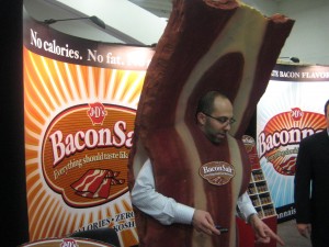
Bacon Man from Fancy Food ShowLike CES, the January 2009 Fancy Food Show is down a bit in both attendees and exhibitors. But there’s still room for people like Mr. Bacon here, and his product Bacon Salt which is based on the premise that “everything should taste like bacon”. It’s all vegan and there is a bacon survival kit including bacon chapstick, bacon flavored vegan-aise etc for converted vegetarians who miss the taste of bacon.

Footnote: Fancy Food is where food purveyors, mostly regional distributors or mom-and-pop shops, come to present their offerings to potential retailers or food service clients. There are also a number of international country-sponsored booths though those are really down this year.

OLPC: when marketing doesn’t work

Give One Get One promotion
Give 1 Get 1 billboard

I find this disturbing:  The One Laptop Per Child foundation repeated its “Give One Get One” program from 2007, apparently fixed all the problems from the year before (namely, virtually no promotion other than word of mouth and abysmal fulfillment/customer service)… and saw its sales drop by 93%.

This in spite of a mainstream ad campaign (including outdoor and television) and presumably seamless fulfillment through amazon.com.

The idea of this program is that you purchase two of OLPC’s mini-laptops and one is sent to a kid in a developing country and the other sent to you, allowing you to putz around and explore this approach to improving the world through technology. We did 2 G1G1s last year and it was a worthwhile experience.

But now, explaining the sales implosion, Nicolas Negroponte, the MIT professor who founded OLPC, told the Boston Globe “we’re not the newest game in town… the novelty has worn off.” Really? I would guess that the 2008 campaign reached millions of qualified donors who never even heard of the concept until now.

A better explanation is probably the economy. Most donation-supported organizations are having a tough year, and maybe the people who were most likely to be fascinated enough by the G1G1 concept turned out to be exactly those least able to afford $400 to participate.

But still… a 93% sales fall-off in spite of a marketing campaign that appeared to do everything right. For those of us who live and die by results, that’s a bunch of cold water in the face.

Macworld is dead

Trade shows are a bonanza for the tech-focused copywriter. In a couple of frenzied days you can see dozens of presentations, stuff several tote bags full of competitive literature, and eavesdrop to see what makes your target prospect’s face light up when the demo guy presses the hot buttons related to blade servers or email encryption or some similar arcane topic.

Sadly, in person trade shows are getting harder to justify when it’s so easy to just get information online and see demos on YouTube. Comdex was my favorite show but it took a hiatus after 9/11 and never came back. Networld/Interop kept shrinking to smaller and smaller spaces at the Las Vegas Convention Center and eventually moved to the Mandalay… still cool t-shirts, though. And now Apple announces it is pulling out of the Macworld show held annually in San Francisco in January.

Macworld was always an odd duck to me, being a Mac user. Back in the 90s when a guy nicknamed “Der Diesel” ran the company, it was mainly a place to pick up software bargains. (This was before online commerce.) There’s very little sold on the floor in recent years and it has a very cultish feel, with a huge Apple temple that occupies about a third of the space and thousands of people lined up to try the newest laptop or music device which they could just as easily find out about in an Apple store. The sponsor, IDG, says the show will go on without Apple but no way. Stick a fork in it, it’s done.

Meanwhile, I am off to the Consumer Electronics Show in a couple weeks which though down a bit from its peak, has prospered by absorbing castoffs from other shows. Now you can see many of the more businesslike IT vendors alongside the robots, gamers and giant screen TVs.

Meme marketing with Netflix

Meme marketing with Netflix
Meme marketing with netflix

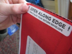
My wife’s always been in charge of our Netflix queue, but I recently got my own account. This gave me the opportunity to discover something most folks are very familiar with—what it feels like to peel back that red sheet as the first step toward a positive experience.

Opening the Netflix envelope is a meme—a cultural experience that can be readily understood and transferred from one individual to another. And it can be useful to marketers because when you understand a meme, you can piggyback on it to present your own message in a way that echoes that meme.

I paid close attention to how you deal with that end seal and the slight confusion (for that first-timer) of opening the flap in a way that would not destroy the postage paid envelope used to send the DVD back. I lingered on the tear-off sheet I was discarding, wanting to make sure I did not throw away something that might be either an order confirmation or a savings coupon.

So here’s an idea. What would happen if you sent out a direct mailing in a similar format to the Netflix envelope, maybe selling a magazine subscription? You wouldn’t want to fake the look of the Netflix… you’d get sued, plus recipients would be angry at the bait and switch. Rather, you’d echo key components of the experience—like the feeling of peeling back the flap.

You might get a positive subliminal reaction… the reader sniffing something good in the offering… that would translate to a better opening rate for your mailing and a more careful reading. If you did it right, people wouldn’t notice at all you were emulating Netflix. That’s good meme marketing.

Winning the control

Winning a “control” is a holy grail for direct mail copywriters (this old-school term has not morphed to the web and email as far as I know). The control is the standard mailing that others are tested against; it’s the one that has consistently performed best over time. Win a few controls and you can start raising your hourly or project rate.

But here’s the problem. Apart from publishers who mail millions, clients can be a bit flakey about “awarding” the control. One client in financial services told me a package could not become the control unless it beat the old control by 20%. That’s a huge edge in a regulated industry. But he was limited by his tight operating budget: a 15% lift in response might produce profits, but changing over all the forms at the printer and tracking cost money and he had to draw the line somewhere.

This month I’ve “won” two controls win a way that shows how quirky this process is. The first was a #10 envelope package for a Long Term Care insurance company that beat the old control by 100%. But what I did was to take the existing control, a self mailer that was also written by me, and change the copy slightly and put it in an envelope for better stage management. I’d been advising my client we should do this for years so my win is nice, but not a creative breakthrough.

The second win was for a company selling education in how to be a financial success. I’d written a package and they tested it and the results didn’t reach their threshold. A year later they discovered 10,000 unmailed copies of my package at their printer and decided to test it again. It beat everything. Voila, new control.

What makes a good advertising slogan?

If your business was here you'd be home now

When I was a cub account guy long ago, I got a presentation from the radio advertising folks. They played a reel with a bunch of familiar jingles and then delivered the punch line: all of them had been off the air for at least 10 years. The good jingles had the original “stickiness” (a term which, today, means a website or other communications vehicle where you’re compelled to stick around and spend extra time)—you couldn’t get them out of your head.

Another evidence of a good slogan—that’s a jingle that doesn’t necessarily have a soundtrack—is seeing it get morphed into variations by someone who knows the audience will remember the original and recognize the relationship.

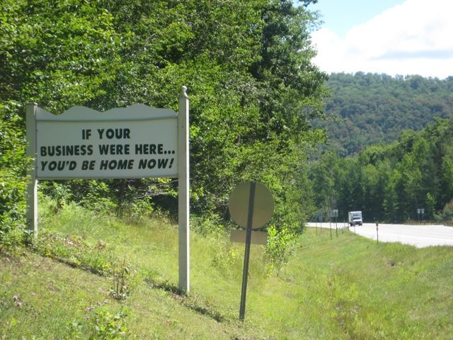
This photo of a roadside sign was taken on Route 30, a rural route that runs through the Adirondacks in upstate New York. The sign’s writer is using a variation of the advertising slogan “if you lived here, you’d be home now” which many suburbanites have seen while idling in traffic and passing a close-to-town subdivision. I’m pretty sure it is a piece of boosterism for the village of Speculator, a couple of miles north. Changing “home” to “business” makes it nonsensical, and putting the sign in this remote, tranquil and totally noncommercial location adds a rich helping of irony. I’ve just inducted it into my outdoor advertising hall of fame.

Best day to send and receive email?

I started to write this post because it seemed to me that Saturday, 7/12, was my slowest email day ever. I had some down time and checked email frequently, and there just wasn’t anything there. Makes sense… business folks are supposed to be taking summer time off now, and marketers follow the trend.

This brought to mind the evergreen discussion about “what is the best day to send marketing emails?” Ideally, you want your email to arrive when the prospect is in a mood to read it, is not overwhelmed by business and personal emails, and you are not competing with too many fellow marketers. That day used to be Tuesday… people have caught up with their work that piled up for Monday, but promotions for the weekend have not yet begun. But then MarketingSherpa did a survey (measuring the percentage of recipients who open their email) and the best day turned out to be MONDAY. Maybe because all the other marketers thought Monday was terrible and stayed away?

Also, who says that it is automatically a bad thing to be arrive when lots of other offers are in the consumer’s inbox ? In Econ 101 we learned the best place to open a liquor store is not in a community where there are no liquor stores for miles around, but across the street from another liquor store. The community defines the relevance of the offer, and the competition increases the consumer’s awareness of the shopping opportunity. Similarly, back in my days as a direct mail manager the most heavily rented lists were also the most successful… even though you knew your offer was going to be in the mail box with lots of others, you were reaching “mail order buyers” who welcomed lots of messages rather than opening their mail over the recycling bin.

Back to my experience yesterday, I counted up and there were 49 messages including junk email. Yes, that’s a bit slow compared to a normal business weekday like 6/25, a Wednesday, when I got 164 messages. But then I went back and looked at the count for 6/29, another Saturday, and I got just 20 emails. And 7/5, the day after the holiday, I got only 10 emails. So my perception is WAY off and clearly colored by the fact I was busy the previous two weekends, but looking for something to do on 7/12. If a marketer had hit me with the right offer, yesterday they could have sold me the Golden Gate Bridge.
I want to be an “environ-mail-ist” but I can’t!

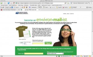
As an old time direct marketer, I like promotions that a/tie in neatly to the core value proposition being advertised and b/have a clear call to action. So I was bemused earlier this year when I started receiving a free publication called “Deliver” from the marketing department at the United States Postal Service, obviously designed by an unsupervised creative cadre, filled with tips like use email, not the post office, to save money!

Then came a highly personalized mailer with an invitation to send away for a free t-shirt so I can advertise that I am an “environ-mail-ist” because of my commitment to “greener direct mail”. The ironic possibilities here are endless, so I immediately requested my t-shirt and it was at my door a couple of days later. I will add that everything was impeccably produced, down to my name in the appropriate places and a unique code to enter on the website.

So today I open the package and… they shipped the t-shirt in the wrong size! Yes funny, everything right except the product itself. But I really wanted to be able to wear that t-shirt! So I start going through the fulfillment package looking for contact information and there isn’t any. No person to call, no email, just a loose invitation to go online to delivermagazine.com to find more about greener marketing.

Which I do, and I choose the contact me tab, and I am able write a message to them but there are only smirking choices for “Why are you contacting Deliver” like “not sure” or “bored I guess”. I go ahead and state my problem and click “send” and we’ll see what happens. Meanwhile, I’m reminded of David Ogilvy’s observation that “Every copywriter should start his career by spending two years in direct response. One glance at any campaign tells me whether this author has ever had that experience.” Indeed.

Personalized Landing Pages… how “personal” should they be?

Two of my agency clients have recently done extensive testing of personalized landing pages, in which a unique URL is assigned to each person on their mailing or email list and respondents click through to a web page that is just for them. The results have been very different.

Client #1 does primarily ecommerce sites, and their approach to personalizing the landing page was to offer products of specific interest to the customer based on purchase history. Client #2 does business-to-business leadgen. Their personalization was mainly about offering information that was versioned by industry.

Client #1 saw virtually no difference in response from their PURLs, while Client #2 saw a 20-30% increase in registrations. How come? I haven’t mentioned that Client #1 doesn’t make a big deal of the customization on the page, while Client #2 almost overdoes it with use of the name. (“Otis Maxwell, here’s your personalized offer!”) This suggests that, even in cynical and more sophisticated times, folks still love to see their name in print and to believe some care has been taken to respond to their unique needs.

Interestingly, the leader in personalized web marketing has backed off somewhat from its original approach, introduced maybe a decade ago. And we can be sure that Amazon.com does extensive testing. While at the beginning they’d say “based on your recent purchases we think you’d like… “ or some such now it’s always third person “people with your browsing history also viewed…” So maybe there’s a point where too much apparently intuitive knowledge seems creepy. And by allowing its plumbing to show, Amazon is letting folks know there’s no creepy surveillance going on.

Incidental Marketing

Contact lens wearers are a savvy lot. They know that once they’ve found the lens for the right eye, the other lens will inevitably fit the left eye. Thus there’s no reason to label the two sides of the contact lens case “L” and “R” as in the top example. You could call the second lid “not R”, or you could leave it blank… or you could use it for MARKETING, like the smart folks at Alcon in the lower example.

This example gets 100 points for incidental marketing, in which we use an available medium to communicate with consumers where otherwise an opportunity would be lost. Contact users see their contact lens cases every time they put in their lenses… what a great reason to remind them of the contact lens cleaner to buy next time. Unfortunately, this example gets 0 points for branding because the name of the brand actually isn’t Alcon. It’s “Opti-Free Express”. Oh well.