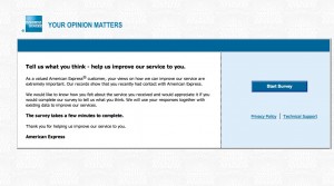
I got a survey invitation the other day from American Express that exhibited a number of worst practices. I’ll share highlights so we can hopefully learn from it.
1. The survey arrived too late. The email started, “Our records indicate you logged on to americanexpress.com on September 19, 2012, and we would like feedback about your on-line experience.” Problem: the email didn’t reach me till September 24. How am I supposed to remember something I did online 5 days ago?
2. The survey offered no incentive. It’s a sad but true fact that you have to give people a reward to participate in these days, simply because everybody else is doing it. It doesn’t have to be much … how about just a chance to win a $100 American Express Gift Card?
3. The survey is poorly written. The landing page starts, “As a valued American Express® customer, your views on how we can improve our service are extremely important. “ My views aren’t the customer, I am. That’s a dangling prepositional phrase and it’s distracting.
4. The survey doesn’t promise that it will be a quick and easy experience. The landing page simply states, in bold type, “The survey takes a few minutes to complete.” In context, that feels like a very long time.
5. The survey demands an explanation on each question of why I answered the way I did, written in free text. Eg, “What could have been done to make you more likely to recommend American Express to a friend or colleague?” (More bad or awkward writing.) Nothing really… I was just paying my bill! And it won’t let me leave the field blank. I have to type something, even if it’s nonsense, otherwise the page reloads.
6. The survey asks questions it already knows the answer to, in this case why I was on the website and what I did there. (It could have ben spun into a “do you recall what actions you performed while on the website” question which would have had more apparent validity since it appears to be testing the intensity of my recollection.)
7. The survey asks a question I can’t answer: “Please rate your satisfaction with the ease of navigating the American Express website, americanexpress.com.” Yo! The site I go to is called “Open Savings”. It does resolve (I just checked) to americanexpress.com but a consumer I shouldn’t be expected to know that. Why mention the URL at all?
8. The survey communication wasn’t sufficiently personalized. After I abandoned the survey for all the irritations described above I got an email “reminder” which was the same as the first email with this additional superscript: If you have already completed the survey, thank you and please accept our apology for the additional e-mail. But when I returned to the survey I was deposited where I left off.
What’s happening here is that they are automatically sending a follow up email to EVERYBODY who received the first email, and not removing or acknowledging the completions or people who started and then abandoned it. How irritating is that?
The “independent research company” that provides this survey is researchhq.com. Autofills on the search panel suggest they’ve also done surveys for Wells Fargo and Allstate. Good luck with that.