Best practices (and not) for recovering account passwords online

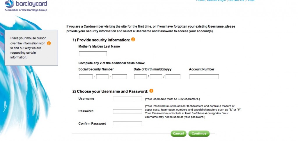
Barclaycard forgot password page
Barclaycard Ring MasterCard “forgot password” page

[THIS POST HAS BEEN UPDATED.] Yesterday I mentioned a problem I was having with the Barclaycard Ring MasterCard “forgot password” page. Today I’m taking the extra step of showing the page because this is something I don’t think has a lot of customer service advantage. They’re using the same page whether you are setting up a new online persona OR you have forgotten your password in which case you simply have to choose a new username.

What else could Barclaycard have done? Send an email at the user’s request, with a unique URL that expires after a few hours. That way the account is secure, but the user stays in control of it. This is the nearly universal practice, and it’s interesting to see an exception and mull the pros and cons.

Requiring a new username is particularly onerous for Barclaycard Ring because it’s supposed to be a social networking community. If I change my username, what happens to the badges and contacts I’ve built up under my old username? But I think it’s not a very good practice in general, and this big international bank must be somehow very stretched for programming resources.

While I’m at it, here’s another not-best practice: confirming the new (or old) password by sending out an email that contains exactly that password in unencoded text. Yikes! What if I’m reading my email in Starbucks or an unsecured wireless hotspot at the airport? Even if I’m in the comfort and sanctity of my home, I’m still going to have to delete that email now. The merchant or marketer probably thought they were doing me a favor by sending me a handy reminder. In contrast to Barclaycard, this is one we’ve all seen, probably several times. Don’t do it.

UPDATE July 3: got a call from Meagan in the Barclaycard digital marketing department and she had a little difficulty reproducing the above page on a test account; possibly I had done something like enter the wrong password too many times that caused the system to “clear out my account”. What I should have seen was a reset page with my security image and with her help I was able to get to that. More important, she and I discovered that if, instead of creating a new user name in the screen captured above, I entered my current one (after confirming who I was with the challenge info above) the system would accept it.

The GOOD news was that when I finally got into my account my screen name had not changed at all; must be different from the username the system recognizes. So all my badges, if I had them, would be intact.

Meagan says this is the password reset procedure used for all Barclaycard products but she does understand how it might be a good idea to present it differently (and tell people they can keep their current username if they like) for the Ring cardmembers. Will be interested to see what they come up with.
KISS: selling complex products with simple messages

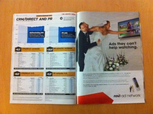
Rovi Bridezilla Ad
Rovi "Bridzilla" Ad in today's Ad Age. Thanks to client Bill Smith and his trusty iPhone.

I’m on a panel at this fall’s DMA called “K.I.S.S – Keys to Copy & Content that Generate Results”. My partners in crime are Dawn Wolfe from Autodesk and Philip Reynolds from pharma agency Palio. The idea is to talk about strategies for translating complex products or services into simple and universal human language that sells.

I’m thinking of using this Rovi promo, which appears in today’s Ad Age, as an example. Rovi does the ads that appear within onscreen television guides and other formats where the viewer is actively involved with a remote or other electronic device; viewers aren’t dozing or distracted so this is an attractive option for media buyers, our target audience. A bit complex so we boiled it down to this idea of the bridezilla who is so enamored of her remote that she can’t put it down even in the wedding chapel.

The antonym of this is the ads you’ll find in any issue of Wired or Fast Company for high-performance automobiles or audiovisual equipment. Those ads typically use visual metaphors of power and performance and expect the reader to be awed, not involved.

The session is happening on October 17, so plenty o’ time to noodle on this. If you have any thoughts or examples on this topic, please send them along!

Wrapping up CES 2012

The highlight of my final day at CES 2012 was a visit to Eureka Park, the area at the Venetian dedicated to new products and startup companies. Here are a few items of particular interest.

Cubelets. Designed for kids to learn programming, Cubelets are magnetic blocks that can be snapped together to produce complex reactions. For example, the brightness block determines the available amount of light and turns on the flashlight block, then the distance block tells the driving block to move the whole structure down the table. You can watch a really silly video since my photo didn’t work out well, and you can also preorder an (expensive) prototype kit to ship in March.

Postcard on the Run. An iPhone or Android app that lets you choose a photo, write a message (including your written signature) then mail it as a physical postcard to an address in your address book. I tried it out and the app was going to charge me $1.99 (including a scratch n sniff layer at 50 cents extra) which is not a bad price compared to buying and mailing a postcard from the post office.

Twykin.com. These guys are doing a mashup of bulletin boards, FAQs, Wikipedia type user written articles and using it to develop as a test case the world’s first crowdsourced customer service application. You’ll have to trust me (and I will have to trust them) on this one since their developer was in an accident just before CES but they promised to get back to me and I’ll do a full piece at some point in the near future.

Blippar. Instead of shooting a QR code with your smartphone that takes you to a website, the Blippar app allows you to interact directly with an augmented reality application. The examples shown by this UK company include a ketchup label that allowed you to turn the label into pages you can flip through, and a retail page in which you can order directly from the app.

SurfEasy.  This is a USB dongle that fits into a credit card-size carrier. On it are your browser preferences and passcodes with bank-level encryption so you can just plug into a public device and go right to work. There’s no storage on the device, but it comes with 2 GB of cloud storage. It’s a bit pricey at $60, but solves a problem for folks who use public computers in what looks like a complete and well thought-out execution.

That’s it for CES 2012. See you next year.

Bests of CES, 2012

Artist drawing with Samsung Note

Best marketing: Samsung Note. This is the new device that’s small enough to use as a phone yet big enough to use as a tablet, soon to be announced for AT&T. (I want one!) To show off its capabilities, they had two artists doing portraits of showgoers using the special pen that comes with the device, and all their advertising features examples of these portraits.

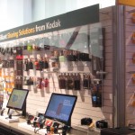
Kodak at CES 2012
Kodak "Sharing Solutions" at CES 2012

Best “dead man walking” imitation: Kodak. Even though they’re openly attempting to sell off their units to avoid bankruptcy, they were in their exhibit space maybe because they’d already paid for it. There was only a single wall of cameras, which they now call “sharing solutions”; more irony, they’ve now started packaging their inkjet cartridges in boxes that look like Tri-X film boxes.

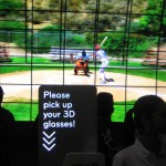
LG 3D TV at CES 2012
Intro to the LG display area at CES 2012

Best commitment to 3D TV: LG. They ask you to put on the glasses before you enter their space, and leave them on because there’s just one 3D TV after another. I still predict a short lifetime for this fad and think it will wither once everybody who wants a 3D TV has one. The summer Olympics are being broadcast in 3D, I learned at the show, so that will be a tipping point one way or the other.

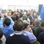
Biebermania at CES 2012
Biebermania!

Best waste of time: Justin Bieber. He was standing doing something in the middle of the Vody robotics booth, and a huge press of people were seeing nothing except the back of each other’s heads. The C/Net camera, a few rows back, did capture a wisp of his famous locks. Meanwhile, other showgoers were actually learning something about technology.

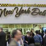
New York Deli at LVCC
New York Deli has great sandwiches

Best food without leaving the show: Uncle Joel & Darryl’s New York Deli, toward the back of the central hall. Real deli sandwiches with a pickle and excellent cole slaw and potato salad, for just a couple bucks more than you’d pay on the street.

Casio Bluetooth Watch demo
Casio watch tells you when your phone is ringing.

Best example of missing the boat: Casio. As the world switched to smartphones, they made a strategic decision to stick with watches. New this year, a Bluetooth watch that will alert you when a call is coming in. Hey, I have a phone for that.

Panasonic kicks eco-butt at CES 2012

Solar Racer
Panasonic's solar racer

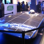
If you are at CES, be sure to check out the “eco ideas” section of the Panasonic exhibit. Once again, they score with irresistible concepts and catchphrases for ideas that may or may not ever become practical but should be. A racecar that rockets across the Australian outback under its own solar power, and beats its nearest competitor by an hour. A planned community in Singapore built within a solar/wind farm on the site of an old Panasonic factory, so energy is immediately available for use without being stored or transmitted. An electric car that is recharged wirelessly, and warms its passengers with its onboard heat pump.

Panasonic 3D screen at CES
Panaonic's 3D screen, in which the image is projected on building blocks
Panasonic demo queen Joey Lao
The indefatigable Joey Lao

Be sure you get your demo from the indefatigable Joey Lao, who was featured a couple of years in my still-popular post on the heat pump washer/dryer. And don’t miss the showcase video, a tour de force in which the screen itself, not the camera, is in 3D.

Marketing Makeover at CES 2012

One of my favorite events at CES is Steven J. Leon’s Showstoppers. Tech companies large and small rent a 6-foot booth space for 4 hours so they can convince reporters and bloggers (this is a press event) how cool they are in hopes of getting coverage.

A real niche product
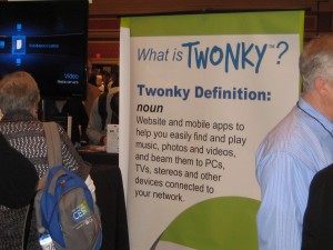
Some of these companies, like Twonky, have a real niche product.

Because I’m here to study how companies market themselves, I like to look at how good they are in their signage. With 100+ companies in a large ballroom, I’m not going to listen to everybody’s elevator pitch. It’s amazing how many just put up a sign with their name, giving no clue what they do. Others have slogans or graphics that are edgy or plays on words but, again, give no clue what the product or service is.

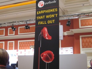
YurBuds
Creepy signage from YurBuds.

I’d like to do a marketing makeover of some of these guys, similar to the lightening rounds I used to do with Carol Worthington Levy at DMA events. Someone would bring up their catalog or mail pack or ad and we’ll have to fire off quick ideas to make it better. Some of our ideas were better than others, but it’s amazing how many obvious improvements are hiding in plain sight.

One company that could use a makeover is YurBuds, with its “earbuds that won’t fall out.” Please, don’t make them look like implants. Don’t make them red like blood. Don’t make the cords look like blood dripping from your ears. Change those things and your product will be less creepy and sell better.

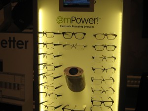
Empower
Glasses that look like glasses, from EmPower.

Another candidate is EmPower (note unhelpful jargony name), a company that makes eyeglasses with built in electronics in the earpiece that changes them from reading glasses to distance glasses at the touch of a finger. Invisible bifocal glasses that do this cost hundreds; these are $12 and available already at 1200 opticians. Nice story… but they miss the boat with a marketing display that features the fact they are glasses. Yes, we know that. It is the hidden electronics that makes them different. To demonstrate that, show them as anything BUT glasses.

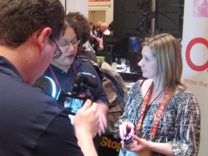
Nicole Messier demos Kogeto panoramic camera
Nicole Messier demos Kogeto panoramic camera.

The only truly new product I saw was from Kogeto: a camera that attaches to your iPhone and will take a panoramic photo which you can then upload to Facebook or a similar app; the viewer uses a slider to move the image around. It was so cool that, true story, I did not even notice it was my pal Nicole Messier doing the demo. Their signage could use some work however.

Marketers, don’t make Apple mad

If your company held a giveaway and said I could enter to win an iPad if I bought a product, that would be illegal. “Consideration” is one of the legal no-nos in a sweepstakes which is why the rules always say in big letters, NO PURCHASE NECESSARY.

illicit iPad image
Use of images from Apple's website is also prohibited.

If your company had a giveaway and said I could enter to win an iPad with no purchase required, that would be…. prohibited. Say what? By whom? By Apple, according to their new promotional guidelines.

Apple, which will soon be or already is the world’s most valuable company, has decided it has the right to tell people what to do with products they have already purchased. iPads may not be used in promotions of any kind, period. iPod touches are ok if you buy 250 units. And of course everything must follow guidelines provided by Apple and be submitted for Apple approval.

The use of third party trademarks in marketing is a grey area. It’s not the same as my writing about iPads in this blog (there I said it iPad iPad iPad) where the primary purpose is educational so I’m protected by something called “Fair Use”. But what is very clear is that Apple has a lot more money and a lot more lawyers than you do.

I can’t find evidence of any marketer who has actually been dinged by Apple for violating this policy, which was issued earlier this year but is only recently garnering attention. But I do know at least one of my agency clients will no longer use iPad promotions. They are going to instead give away, and give free publicity to, a competing product from HP.

Boingo and the Netflix effect

I don’t have a lot of love for Netflix these days. But at least they are upfront about wanting to put their hand in my pocket. A much more insidious example of corporate greed showed up in my email this week with the subject line: Exciting Account Info, Boingo in the Sky, and a Celebration in Your Honor.

I signed up for Boingo wireless a couple of years ago when you had to pay through the nose for airport wireless access. I noticed that Boingo was often one of the carriers. I signed up for a month on a free trial, then when I tried to cancel at the end of the month they quickly lowered the $29.95 monthly fee to $9.95. I’ve been a subscriber ever since, though I’ve been wondering why since more and more airports offer free wireless now and, when they don’t, the Boingo network less frequently shows up as an option.

So, okay, I could use some exciting account news, and here’s what it is: Boingo wants me to download a new version of their app and, as soon as they do, my account will be tied to a specific wireless device. You get two devices so my laptop and Droid are ok, but if I want to add a tablet or occasionally connect on another computer, that’s another $5 a month per device.

That’s not exciting news, that’s a price increase, and I’ve hopefully avoided it for now by not downloading this Trojan horse of a new app (“It only takes a minute!”)  However, Boingo promises “lots of surprises between now and the end of the year” and I would not be surprised if one of those is the disabling of the current software.

CES 2011: the chef has left the building

I did not have much luck finding a convection oven with multiple zones controlled from your iPad; in fact I had quite a bit of trouble locating the simple iGrill mentioned in my previous post on remote controlled household technologies. (If you happen to be at the show still, it’s in the Dr. Bott booth in the North Hall.)

Turns out there are just not a lot of technologies for controlling your home appliances remotely, not now and not in the immediate future. The closest I found to what I was looking for was a concept group from LG called the ThinQ; the ThinQ oven will tell you when its recipe is done and can be turned off or switched to warm from your handheld device. The ThinQ refrigerator knows what’s inside, so you can check in from the store if you forget whether you need milk or eggs. I also saw a Samsung refrigerator with a touchpad that accesses the internet and will check the weather or look up recipes; these are the key applications mentioned by a panel of working moms. But communication is one-way; you can’t input your own recipe for example. And all these devices are just ideas; they’ll never come to market in their current form.

If all you want to do is control electrical usage, we’re quite a bit further down the road as many manufacturers get ready for SmartGrid solutions that will adjust your power flow or delay electrical functions based on time-of-day metering. These devices talk to the utility’s smart meter via wireless or a powerline connection. Seems like it would be an easy enough thing to have the appliance accessible to the consumer, as well, via that same interface. And I hope some manufacturer or consortium of manufacturers will try that out soon. In the meantime, the IGrill looks pretty hip after all.

That’s it for CES; back to non-tech subjects in my next post.

Product wrapup from CES 2011

A product I didn’t expect to like, but impressed me, is the $449 neo-I from Optoma. it’s an iPod dock that has a sweet sound system and a picoprojector that projects a reasonable size image (say 3×5 feet) on a wall). They demo’ed it in a mocked up college dorm (beer bong not included) which looks like a great user case.

The product most likely to go nowhere: the Atrix suite from Motorola. In a year where everybody is selling a unified device in a do-it-all tablet, Motorola wants you to buy a component set that includes a phone that hooks into a dock that turns into a PC with a wireless keyboard that turns into a content input device for your HD TV. They call this a “PC in a phone” but it’s really an internet device with a few specialized apps; the demonstrated benefit was being able to show your vacation videos wherever you go. Nobody is going to want to buy and organize all these pieces of equipment. And to make it worse, their wireless partner is AT&T, master of dropped signals and a no-show at CES.

Under the radar technology that was getting the most attention: Hand gesture input for televisions. Like the Xbox Kinect, the Asus TV with PrimeSense has a microcam pointed at the viewer that reads your hand gestures so you can, for example, change channels by waving your arm up and down. A lot more elegant than yet another remote, even if it has a motion sensor like the Wii.