How social media floats the Oracle juggernaut

One of my first freelance copywriting clients after I moved to San Francisco was a very smart guy who had been direct response ad manager at Oracle. He based his strategy at his new company on what he had learned and done there, so I learned as well.
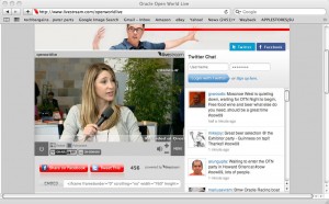
Screenshot of Oracle OpenWorld Live feed during the show.

In a day when most tech marketing was fairly dweeby and feature-centric, Oracle took the advantage by brute force. Every day in the lower right corner of the local edition of the WSJ, there was an ad with a bar chart showing how much faster Oracle was than Sybase, then their major competitor because then Oracle was mainly a database company. And I myself considered applying for an ad manager position that was advertised in Adweek. Most classifieds described the job and the qualifications; Oracle simply ran a huge headline that said PREDATOR and follow-on text to indicate that’s how they wanted you to treat the competition.

During and just after the dotcom era, Oracle discovered an even more effective strategy to beat the competition: buy them. First there was Peoplesoft, then BEA, then Siebel (founded by an ex-Oracle marketing guy), now Sun. Today Oracle is a conglomerate and Sybase, its original competitor, has shrunk to 3% market share in its single market.

I was thinking about this history as I walked through Oracle OpenWorld, actually the first time I have attended in spite of my long Oracle history. It’s the only event I know of the many conventions held each year at Moscone that closes a major street so the party tent can be erected there. The result is gridlock throughout downtown San Francisco—classic smash-face marketing because everybody who is stuck in traffic is thinking about Oracle.

The typical OOW attendee is a database administrator (DBA) in a large organization. A key purpose of the conference is to make this typically mild-mannered individual feel like the most important person in the world by identifying with the Oracle juggernaut. I’m writing this post in an absolutely packed ballroom with thumping music and flashing visuals where the faithful are waiting, not for Roger Daltry or Aerosmith (they’ll be at the Customer Appreciation Event tonight) but for CEO Larry Ellison’s keynote.

With such a loyal fan base, using social media for marketing is an obvious choice and the Oracle folks are doing it well. The best example is OpenWorld Live, a website where you can watch a live feed (often with a couple of guys interviewing passers by about how happy they are to be at OOW) and simultaneously keep up with the tweets rolling by with #OOW09 as the hashtag. At the bottom of the page are buttons to take you to the Oracle conversations on Facebook and LinkedIn and even some code in case you want to embed the video on your own site. All Oracle, all the time, even when your laptop is propped up on your lap in the hotel room.

Commercially, Oracle is pushing a concept called Social CRM. I attended a briefing where Tony Lye, Oracle VP for CRM, talked about the concept of a “Listening Post” which will be incorporated in future releases. His prototype can gather and monitor conversations about Oracle anywhere in cyberspace (Lye though he was the first to do this, which isn’t true) and feed them into a sales and marketing interface such as Salesforce.com where they can be parsed by sales territory or other factor and the sales team can hunt down opportunities or put out fires. You’ll need a big database to do this effectively, and Oracle has one to sell you.

how to make money with Twitter

I’m wondering why I and so many others were so ga-ga about Twitter at SXSW earlier this year. Maybe it was the new TweetDeck app that allowed us to chirp back and forth about the session that was happening in front of us in the same room. But anyway, I was expecting Twitter to change my life and it hasn’t.

If you want to make money with Twitter, what marketers are realizing is that it’s a great platform for communicating with your EXISTING customers—the same discovery we all made about email. Example: the Korean taco truck telling followers where it will show up next. A company letting its best customers in on a “secret” sale. And an organization like Zappos which has discovered Twitter is an effective vehicle for internal communications. I guess this isn’t really making money per se… rather, you’re saving money or expanding your base with an efficient means of targeted communication.

Best way to make Twitter relevant in your own life: go through your tweets and ruthlessly unfollow anyone who tweets frequently with info that is not fantastically interesting. If you are disappointed with what you read in Twitter, do this immediately then replace the unfollowed by going to http://wefollow.com/ and following a few media sources or people that seem interesting. Repeat on a regular basis, unfollowing those who aren’t interesting after all. Yes, this is work, which is the antithesis of what Twitter is supposed to be.

Twitter founder Biz Stone calls it “curating” your tweets, as if we all had a roomful of Hundertwassers instead of inane tweets about needing to go to the gym. Okay…

What makes Apple marketing insane (ly great)

Consistent and thorough (you might also say obsessive) are words that describe any Apple marketing effort. I got an example when I decided to treat myself today to the just-released Snow Leopard upgrade, speed and various new features for an affordable $29. Was near an Apple store (Knox Street in Dallas) so stopped in.

They had a little VIP line with a delicate white chain set up in the middle of the store. (Which, as Apple stores usually are, was packed. What are all those people doing in there? How many visits does it take to buy a computer or iPhone?) You move quickly through the line and an employee hands you your DVD case, shakes your hand, says “congratulations.” Another employee handles the receipt and puts a little payment confirmation sticker on the case that says “Lucky You”. And the door employee (who introduced herself by name as I entered) repeats the congratulations on the way out.

Compulsive and obsessive are signs of mental imbalance, right? Is that what Steve Jobs means by “insanely great?” But it’s also very effective marketing because it makes customers feel smart and special.

Back home from SXSW: some reflections

During the last World Cup commentators often referred to the “samba wave” or “samba style” of the Brazil team…. the idea being they were carried along by an undulating wave that propelled them forward and confused their opponents. I never did understand this as it related to soccer, but it’s a perfect metaphor for SXSW Interactive. Here are a few thoughts in closing.

The attendees:

  • Unlike the typical tech or marketing conference, everybody is here because they want to be here. This makes them more engaged and passionate.
  • Everybody I met is one of the smartest people I’ve ever met. It’s like graduating as high school valedictorian (not that I was) and going to a college where everybody is a valedictorian.
  • As a corollary, everybody is curious and wants to talk to you because they assume you’re as smart as they are. If you’re not, you get the benefit of the doubt. That’s a good thing.

The conference:

  • There’s no way to predict whether a session will be good or not or even whether it will be about the topic in the program. So sit on the end of the row and don’t be shy about getting up and leaving if it doesn’t work out.
  • Best events for me were the brilliant “Did Aristotle Twitter?” rhetoric panel with U Texas profs, the two food panels for personal interest, and most anything on Twitter including of course the now infamous #tweethall which wasn’t an event at all.
  • Core conversations are painful. You will be stuffed into a room like sardines and sit on the floor. Go to these only if you have a passionate interest in the subject discussed.
  • PowerPoints are over. With a couple of exceptions even the most visually brilliant presenters had basically no ppts at all, just a few text slides they barely referred to.

The venue:

  • The Austin Convention Center was designed by a lunatic, in a U-shaped configuration with the tips of the U 100 yards from each other as the crow flies but a 15 minute walk on the ground. And the SXSW management,with gentle humor, tended to put interactive events at the very outside with the film events in between.
  • When you go to the parties, pay attention to the music. You are likely to hear something seriously good. This is Austin, after all.

I hope to be back next year.

OLPC: when marketing doesn’t work

Give One Get One promotion
Give 1 Get 1 billboard

I find this disturbing:  The One Laptop Per Child foundation repeated its “Give One Get One” program from 2007, apparently fixed all the problems from the year before (namely, virtually no promotion other than word of mouth and abysmal fulfillment/customer service)… and saw its sales drop by 93%.

This in spite of a mainstream ad campaign (including outdoor and television) and presumably seamless fulfillment through amazon.com.

The idea of this program is that you purchase two of OLPC’s mini-laptops and one is sent to a kid in a developing country and the other sent to you, allowing you to putz around and explore this approach to improving the world through technology. We did 2 G1G1s last year and it was a worthwhile experience.

But now, explaining the sales implosion, Nicolas Negroponte, the MIT professor who founded OLPC, told the Boston Globe “we’re not the newest game in town… the novelty has worn off.” Really? I would guess that the 2008 campaign reached millions of qualified donors who never even heard of the concept until now.

A better explanation is probably the economy. Most donation-supported organizations are having a tough year, and maybe the people who were most likely to be fascinated enough by the G1G1 concept turned out to be exactly those least able to afford $400 to participate.

But still… a 93% sales fall-off in spite of a marketing campaign that appeared to do everything right. For those of us who live and die by results, that’s a bunch of cold water in the face.

CES 2009: down, but not out

Advance registrations at the Consumer Electronics Show were down 5-7%, but the real question, since most industry folks get in free, was how many would actually show up. Good news. Floor traffic is fine and it’s too packed to move in many places, just like regular years.

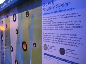
Environmentally-sensitive kelp speakers, from Panasonic

Most interesting for me from a marketing perspective were the home monitoring systems, including one from client Schlage locks. Via a low-power wireless mesh network you can lock and unlock your doors, turn lights on and off, and regulate your home entertainment system. With an extra subscription you can log on remotely and see if your kids got home on time (because each family member has their own code to unlock the front door), if you remembered to close the garage door, or preheat the oven. And because every product has to have an environmental angle this year, these systems also have energy components that can dim your lights when you leave the room or turn off the power if you forget.

A few other items of interest:

  • Finally, a flat screen TV that actually is as thin as a sheet of glass, from LG.
  • 3D televisions, complete with 3D goggles, were everywhere. My favorite was LG again, maybe because they had the best movie playing (a scary Korean animation about a kid, a robot, and a nuclear winter).
  • Minoru, The world’s first 3D webcam and Sergio iSpin, a sophisticated DJ remix station for your iPod, both not prototypes but selling right now for under $100 on Amazon.

    Minoru, the 3d webcam
    Minoru, the 3d webcam
  • Beatbot, a puffy robot containing a webcam which can be made to react to stimuli. This is used not for play but as therapy for children; they can interact with the robot directly and make it do things and the webcam can watch what they are doing and track improvements over time.

And this year’s favorite tcotchke: from Cirago, a solar powered LED keychain!

Macworld is dead

Trade shows are a bonanza for the tech-focused copywriter. In a couple of frenzied days you can see dozens of presentations, stuff several tote bags full of competitive literature, and eavesdrop to see what makes your target prospect’s face light up when the demo guy presses the hot buttons related to blade servers or email encryption or some similar arcane topic.

Sadly, in person trade shows are getting harder to justify when it’s so easy to just get information online and see demos on YouTube. Comdex was my favorite show but it took a hiatus after 9/11 and never came back. Networld/Interop kept shrinking to smaller and smaller spaces at the Las Vegas Convention Center and eventually moved to the Mandalay… still cool t-shirts, though. And now Apple announces it is pulling out of the Macworld show held annually in San Francisco in January.

Macworld was always an odd duck to me, being a Mac user. Back in the 90s when a guy nicknamed “Der Diesel” ran the company, it was mainly a place to pick up software bargains. (This was before online commerce.) There’s very little sold on the floor in recent years and it has a very cultish feel, with a huge Apple temple that occupies about a third of the space and thousands of people lined up to try the newest laptop or music device which they could just as easily find out about in an Apple store. The sponsor, IDG, says the show will go on without Apple but no way. Stick a fork in it, it’s done.

Meanwhile, I am off to the Consumer Electronics Show in a couple weeks which though down a bit from its peak, has prospered by absorbing castoffs from other shows. Now you can see many of the more businesslike IT vendors alongside the robots, gamers and giant screen TVs.

How we learn

I decided I need to learn some basics of electronic circuitry, a subject on which I was pretty ignorant. My path gave me some useful insights into how educators do, or do not, make learning interesting and successful.

Snap Circuits Lie Detector
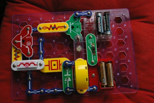
Initially, my curiosity was piqued by Elenco’s Snap Circuits Junior, a kit that allows kids to build simple projects by snapping together components onto a plastic board. It’s fun and my kids and I were successful in such achievements as a prototype lie detector. If your hands are clammy and you touch the connectors, it makes a loud noise and lights go off—fun! But we had no idea how it actually worked. We were connecting a series of black boxes to make a new black box.

Next stop was amazon.com, where reviewers heartily recommended Getting Started in Electronics by Forrest E. Mims III. It’s worth getting just to see the production value—every page is painstakingly hand-lettered (which makes for some interesting results when you tell Amazon to “search inside this book”) instead of typeset. But whereas the Snap Circuits have you doing projects without explanation, this book is much more telling than showing.

I put the Mims book aside when I moved on to “300 in 1 Electronics Lab”, also by Elenco, which was exactly what I was looking for. You get a console to work on with real wires, resistors, capacitors etc to assemble into projects on a breadboard. The manual directs you into projects that are just hard enough to be frustrating but ultimately doable and at the end of each, tells you what you’ve learned.

Why was 300 in 1 the best? First, the role of user feedback. You’d do something, test it, and if successful there was a verbal or audio response. That’s different from rote learning for its own sake, which has never worked for me. (I’m terrible at studying languages in the abstract, for example, but less terrible when I’m in a country and have to make myself understood.)

And second, there was a sense of accomplishment that motivated me to learn more. My initial projects were unsuccessful till I discovered I was misreading the marking on the resistors and hooking up parts that kept the current from flowing. Once I figured out that problem I was on my way. Capacitors, diodes, bring ‘em on… I’ll certainly be more likely to persevere next time I get a challenge.

This is stuff to keep in mind if you write user documentation of any kind. But it’s also applicable if you want to “teach” people to read the copy you write for any purpose. Good example: Hershell Gordon Lewis’ advice that you should always make the first sentence of a letter short, because people then assume the letter won’t be tough reading even if it is.

There’s learning at work here—the reader is throwing up the initial words against such screens as “is it worth my time to read this piece of junk mail that obviously wants to sell me something?” And it comes back with good marks for intelligibility and ease of reading. That’s user feedback… possibly augmented, if we’re really good writers, by a sense of accomplishment for having read something interesting or useful.

Trade Show Tactics

We’re coming up on January, which has become my big trade show month since the demise of Comdex. I’ll go to the Consumer Electronics Show first, followed by a quick stop at Macworld, and then the Fancy Food Show at the end of the month. What am I looking for, other than schwag and free food?

First, I want to see how companies I work with—or their competitors—get the attention of the audience through elevator pitches or booth design. And second, I want to watch other show-goers who may well be my audience at some point to see what questions they ask and what “hot buttons” cause their faces to light up. It’s also nice to put a face with abstract stats so I can have a mental image of my reader, next time I write to Dear IT Manager or whatever.

In my copywriting class we talk a little about trade show booth design for smaller companies—something that increasingly seems to be the responsibility of the marketing folks who are my students. It’s not easy to create a visual “home” out of nothing that can be erected and disassembled quickly. One thing I’ve noticed is that faces help—big photos of people who look like your users, making eye contact with the show traffic. Not enough companies do this so it’s very easy to make yourself stand out.

Also, too little attention is paid to booth traffic patterns. If you stand behind a high counter, you’re creating the metaphor of a store checkout—people will not approach unless they’re already committed to doing business, which eliminates most potential booth visitors. If you put up registration kiosks at the outside corners, or entry points framed by signs, you’ve created a boundary that may keep people out.

As a show floor troller, I tend to be wary of a big and empty booth—I assume that they don’t have much to offer and that if I go in I’m guaranteed to be hit with a sales pitch. But I find a booth with higher traffic irresistible, because I want to see what the buzz is all about. You can do this with good visual design and a seamless traffic pattern. Oh, and free samples of artisanal cheese will help.

In the middle of things

So, I finally got my website up. It’s no big deal, some HTML with a few images and links, and I will do more later. I’d planned to use GoLive, which I got as part of Adobe CS, but became baffled as soon as I started the tutorial. They wanted me to make a Site Diagram and I tried, but couldn’t make it like the examples onscreen. I then went browsing for simple HTML references and was delighted to find this nice tutorial on the w3.org website.

I then went hunting in “view source” on other pages for examples of how to construct links and open new pages to display my samples… the challenge, in an era where everybody uses javascript or, I guess, tools like GoLive, was to find a site to emulate with an author whose vision was as modest as mine. And then I went back into GoLive to edit the whole thing for publication. But I still don’t know what a Site Diagram is for.

This brings to mind what a student in my class last week said is the characteristic of good documentation: it talks to the user about the process they are in the middle of. Or, in the case of the CSS tutorial mentioned above, it puts the user into the middle of something and gives them logical, easy steps to take that will pay back with satisfying and tangible results. I certainly did learn from the CSS tutorial, as you can see if you go to my site. And if anybody has a good GoLive book to recommend, or simply wants to explain Site Diagrams, please drop me a line.