Smart homes and smart marketing at CES 2015

Oomi Smart Home system
What’s Oomi? Tell me why I should care.
“Smart homes” is a useful topic for a marketing review because, while it’s exciting (or maybe ominous) to think about gadgets turning out the lights, managing security or monitoring our baby’s heartbeat, it’s up to the marketers to tell us exactly what their specific products do. Witness a few examples, good and bad, from the recent Winter 2015 Consumer Electronics Show.

Smart Home famil
Generic smart home marketing
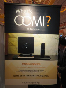
Oomi makes the mistake of thinking others are as interested in their product as they are. “What’s Oomi?” was the headline of their booth at the Showstoppers press event. Without a benefit or point of reference, it’s not likely many will stick around to find out. The subtext “the first smart home that’s actually smart” provides context but is too clever for its own good: I don’t know that there’s a perception of lots of smart home products that are stupid. It’s a solution for a problem that may not exist. And meanwhile, we haven’t learned anything about the product. (Like many others, it’s a set of modules that work together to handle various home automation functions.)

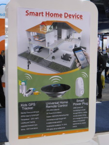
Not much better are a number of OEM booths I passed in the nether regions of the second floor in South Hall. By focusing entirely on technology, these importers make their systems generic. There’s a “home” graphic but otherwise they lean heavily on the “what” rather than the “why”. This is a common problem with marketing at the CES where thousands of new products and unfamiliar concepts jostle for attention simultaneously. In a few seconds as I stumble down the aisle you need to tell me not only what you are selling, but why I should care.
Teddy the Guardian
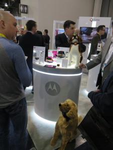
“Teddy the Guardian” baby monitor

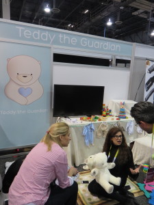
For smart homes, it’s obviously about emotion, and the shoestring display for “Teddy the Guardian” does this very well. In fact, the signage doesn’t even say what the product is but the baby tcotchkes make a strong emotional appeal and you hang around long enough to find out it’s a teddy bear with all kinds of baby monitoring built in. There was a lot of interest in this one.
Four WeMo examples
Can I wemo that?

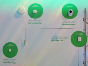
Finally, WeMo is a family of devices that monitor and automate activity in the home. Belkin created a mock home and then stuck devices all over the places with captions describing hypothetical problems and “can I WeMo that?” Compare this to Oomi, which seems to do the exact same thing, and you can see why Belkin’s marketing is so good. It’s a complete conversation that combines technology and the human factor and is fun to interact with as well. The booth was packed.
The Idiot of Things visits CES 2015 Las Vegas

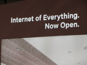
Internet of Everything Now Open
Qualcomm’s takeoff on the Internet of Things

I saw IoT all over Las Vegas on buses and billboards, and asked a booth staffer for an explanation. She said it stands for the Internet of Things and then proceeded to explain what that meant. I already knew the concept, just not the acronym but too late; I felt like a clueless Luddite. Anyway, it is indeed the Year of the Thing at the Consumer Electronics Show with heavy emphasis on apps for connecting mobile devices to all aspects of your daily life.

Pet monitoring gadgets
Lots of pet monitoring devices at CES 2015

Over two days I saw many gadgets for monitoring every aspect of your fitness, or your child’s, or even your pet’s. You can buy an electric toothbrush that has Bluetooth that connects to an app to show you how effectively you’re brushing. You can control your home remotely or turn your car into a nerve center for managing what will happen when you arrive while hopefully not getting into an accident due to distracted multitasking. (As a car company executive pointed out in a keynote, one thing that has to be sorted out is liability when a self driving car gets into an accident.)

3D family
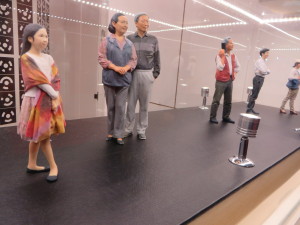
3D printing and printed 3D products are huge at CES. Here, your family miniaturized for posterity.

What’s hot this year, in addition to things? Drones, lots of drones. 3D printers, and products and services connected to 3D printing. Smart cars that can be controlled with hand gestures (Volkswagen), will park themselves (Hyundai) or run on fuel cells (several). Fitbits and other performance monitoring electronics on steroids, so you don’t have to be because your conditioning is so efficient and awesome. And endless lineups of 4k televisions and monitors, each more vivid and breathtaking than the last.

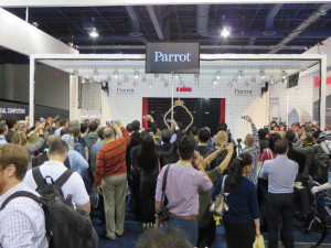
Drones, also totally hot

What’s not? 3D television. (I saw just one at the show, billed as the world’s largest glassless meaning you don’t have to wear goggles.) Google Glass is ice cold… again, just one showing. And very few laptops, tablets or conventional PCs…. This was a gadget show, and it’s fully returned to its roots as a “consumer” show with very little business spillover. (Microsoft, which had an enormous presence in years past, was behind closed doors with a single hospitality suite.)

I’ve got a few reports coming up over the next couple of weeks:

  • Some interesting “mobility experiments” described in the keynote by Ford President Mark Fields
  • Best and worst of CES: some niche concepts that fill a narrow but credible role and others that left me shaking my head
  • Marketing makeover: I look at how, and how not, to present the “smart home” concept based on examples from many exhibitors
  • A historical retrospective on CES—an institution that would seem to have no history, since it’s always looking for the next big thing
Google Glass
Google Glass, not hot

Stay tuned.

Is that an advertising specialty in your pocket?

What’s the difference between a premium and an advertising specialty? A “premium” is something that has perceived value to the recipient and can be used as a sweetener when you’re asking people to give you contact information or take some other action. An “advertising specialty” is just that, an ad: a tchotchke with a name, logo and contact info imprinted on it that is useful enough or novel enough that the recipient will not immediately throw it away.

Offer a premium when you want to boost response for a marginal or unknown product so people who would otherwise ignore you will click, call, or return the reply form. These days the most common b-to-b premium is probably the “free report” delivered electronically. For physical delivery, the good old Amazon or iTunes gift card reigns supreme.

We’ve talked previously about the pros and cons of using giveaways to boost response. Those points are still valid and deserve a second read. The topic is on my mind because of the recent Advertising Specialty Institute trade show, nicely covered in today’s Wall Street Journal.

It’s heartening to know that in our jaded era, people will still go out of their way to get something for nothing. Even the White House is getting on the bandwagon: after promoting a “Stop Swag” program to keep federal agencies from spending tax dollars on giveaway junk, the Obama re-election campaign has done an about face and is hawking such items as the “I meow for Michelle” cat collar (yours for a $13 donation).

The most popular item at the ASI Show? USB thumb drives in every imaginable configuration. This is a tchotchke hunter’s dream: cheap enough to be a trade show giveaway, yet valued sufficiently that you can use it as a premium. If you do use USB drives, be sure to put some of your content on there, if only a few pdfs of your brochures. (Great task for a summer intern!) The recipient will see the files every time they use the drive and they just might open them out of curiosity.

Bests of CES, 2012

Artist drawing with Samsung Note

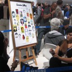
Best marketing: Samsung Note. This is the new device that’s small enough to use as a phone yet big enough to use as a tablet, soon to be announced for AT&T. (I want one!) To show off its capabilities, they had two artists doing portraits of showgoers using the special pen that comes with the device, and all their advertising features examples of these portraits.

Kodak at CES 2012
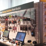
Kodak "Sharing Solutions" at CES 2012

Best “dead man walking” imitation: Kodak. Even though they’re openly attempting to sell off their units to avoid bankruptcy, they were in their exhibit space maybe because they’d already paid for it. There was only a single wall of cameras, which they now call “sharing solutions”; more irony, they’ve now started packaging their inkjet cartridges in boxes that look like Tri-X film boxes.

LG 3D TV at CES 2012
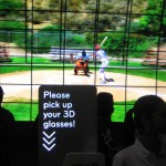
Intro to the LG display area at CES 2012

Best commitment to 3D TV: LG. They ask you to put on the glasses before you enter their space, and leave them on because there’s just one 3D TV after another. I still predict a short lifetime for this fad and think it will wither once everybody who wants a 3D TV has one. The summer Olympics are being broadcast in 3D, I learned at the show, so that will be a tipping point one way or the other.

Biebermania at CES 2012
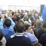
Biebermania!

Best waste of time: Justin Bieber. He was standing doing something in the middle of the Vody robotics booth, and a huge press of people were seeing nothing except the back of each other’s heads. The C/Net camera, a few rows back, did capture a wisp of his famous locks. Meanwhile, other showgoers were actually learning something about technology.

New York Deli at LVCC
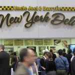
New York Deli has great sandwiches

Best food without leaving the show: Uncle Joel & Darryl’s New York Deli, toward the back of the central hall. Real deli sandwiches with a pickle and excellent cole slaw and potato salad, for just a couple bucks more than you’d pay on the street.

Casio Bluetooth Watch demo
Casio watch tells you when your phone is ringing.

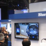
Best example of missing the boat: Casio. As the world switched to smartphones, they made a strategic decision to stick with watches. New this year, a Bluetooth watch that will alert you when a call is coming in. Hey, I have a phone for that.

Panasonic kicks eco-butt at CES 2012

Solar Racer
Panasonic's solar racer

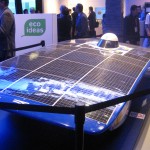
If you are at CES, be sure to check out the “eco ideas” section of the Panasonic exhibit. Once again, they score with irresistible concepts and catchphrases for ideas that may or may not ever become practical but should be. A racecar that rockets across the Australian outback under its own solar power, and beats its nearest competitor by an hour. A planned community in Singapore built within a solar/wind farm on the site of an old Panasonic factory, so energy is immediately available for use without being stored or transmitted. An electric car that is recharged wirelessly, and warms its passengers with its onboard heat pump.

Panasonic 3D screen at CES
Panaonic's 3D screen, in which the image is projected on building blocks
Panasonic demo queen Joey Lao
The indefatigable Joey Lao

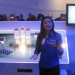
Be sure you get your demo from the indefatigable Joey Lao, who was featured a couple of years in my still-popular post on the heat pump washer/dryer. And don’t miss the showcase video, a tour de force in which the screen itself, not the camera, is in 3D.

Marketing Makeover at CES 2012

One of my favorite events at CES is Steven J. Leon’s Showstoppers. Tech companies large and small rent a 6-foot booth space for 4 hours so they can convince reporters and bloggers (this is a press event) how cool they are in hopes of getting coverage.

A real niche product
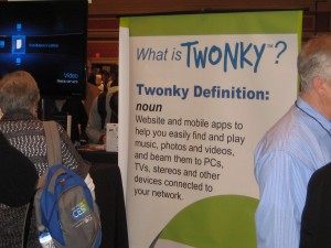
Some of these companies, like Twonky, have a real niche product.

Because I’m here to study how companies market themselves, I like to look at how good they are in their signage. With 100+ companies in a large ballroom, I’m not going to listen to everybody’s elevator pitch. It’s amazing how many just put up a sign with their name, giving no clue what they do. Others have slogans or graphics that are edgy or plays on words but, again, give no clue what the product or service is.

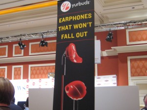
YurBuds
Creepy signage from YurBuds.

I’d like to do a marketing makeover of some of these guys, similar to the lightening rounds I used to do with Carol Worthington Levy at DMA events. Someone would bring up their catalog or mail pack or ad and we’ll have to fire off quick ideas to make it better. Some of our ideas were better than others, but it’s amazing how many obvious improvements are hiding in plain sight.

One company that could use a makeover is YurBuds, with its “earbuds that won’t fall out.” Please, don’t make them look like implants. Don’t make them red like blood. Don’t make the cords look like blood dripping from your ears. Change those things and your product will be less creepy and sell better.

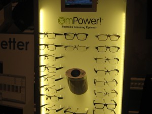
Empower
Glasses that look like glasses, from EmPower.

Another candidate is EmPower (note unhelpful jargony name), a company that makes eyeglasses with built in electronics in the earpiece that changes them from reading glasses to distance glasses at the touch of a finger. Invisible bifocal glasses that do this cost hundreds; these are $12 and available already at 1200 opticians. Nice story… but they miss the boat with a marketing display that features the fact they are glasses. Yes, we know that. It is the hidden electronics that makes them different. To demonstrate that, show them as anything BUT glasses.

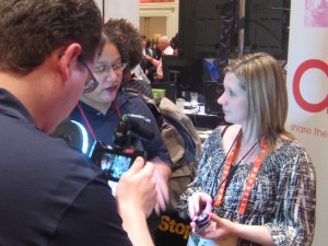
Nicole Messier demos Kogeto panoramic camera
Nicole Messier demos Kogeto panoramic camera.

The only truly new product I saw was from Kogeto: a camera that attaches to your iPhone and will take a panoramic photo which you can then upload to Facebook or a similar app; the viewer uses a slider to move the image around. It was so cool that, true story, I did not even notice it was my pal Nicole Messier doing the demo. Their signage could use some work however.

Copywriter slugfest at DMA2011… coming soon!

DMA2011, the annual conference of the Direct Marketing Association, starts in Boston the first weekend in October… that’s soon! I am on a panel with colleagues Nancy Wahl, Alan Rosenspan and Carol Worthington Levy at 3 pm Monday afternoon, October 4. The topic is “Mundane, Inane and Boring Creative” and evidently we are going to try and outdo one another by seeing who can put the audience to sleep fastest with campaigns that never should have seen the light of day or, if they did, succeeded in spite of themselves.

I just got a preview of my fellow panelists’ slide decks and there is some pretty outrageous stuff there. At the end of the hour the audience will be invited to vote on who was the most mundane, inane or boring and the winner will be doused in the chill waters of Boston Harbor just outside the convention center. It’s an experience not to be missed!

If you haven’t yet registered for the DMA, you can still do so here. Try entering “friends and family” code AN614 which will hopefully give you a discount on your conference price. See you there.

Blogger preview: CES 2011

Tomorrow I head west for this year’s Consumer Electronics Show in Las Vegas. The word is that LAS is packed, hard to get a taxi or a hotel room just like in the glory days. I’ll be attending press events on Thursday and Friday night, visiting a couple of clients, and trolling the floor for new and noteworthy things to write about.

In last year’s preview post (inexplicably titled “On my way to CES 2009”) I talked a little about my philosophy of working this show. I also predicted that 3D TV would be a non-starter… you read it here, and many other places, first. This year is supposedly “the year of the tablet” which also happened in 2003; I am more interested in things you can do with the tablet, such as iGrill, the world’s first bluetooth cooking thermometer you can monitor from your iPad.

My task on the plane is to scan some 300 press release emails and see if there is anything promising enough to follow up. Tip to flacks: like most people who will be writing about the show, I’ve been filtering my CES emails into a special folder. So if you don’t say “CES” in the subject line, you’re not visible to us.

Wearing my consumer hat, I am going to find what the ^% is happening with the content side of streaming video. Was excited to get an HD Roku for Christmas. Not so excited to discover that Netflix has just 20,000 streaming titles available, NOT including anything by the Coens, or Dumb and Dumber, or the Southland series from TNT. I’ve read that the studios seriously underestimated the appeal of streaming and delivered their content to Netflix at a bargain price, but if they’re going to just pull it back then we don’t have a seamless entertainment experience, do we?

Stay tuned…

Sweet way to make a trade show impression

The annual Direct Marketing Association conference is a challenge for exhibitors. It’s a horizontal show, with many different categories of vendors represented from bankers to software to printers to agencies. And many of these have complex value propositions that are hard to convey with an elevator pitch.

Orange cupcakes = cloud computing, get it?
Orange icing = cloud computing, get it?

In this environment, the booth shown here stands out. Everything is orange, and they’re giving away cupcakes with bright orange icing. The cupcakes attract traffic, and when the sales force follows up after the show they can say “we’re the people who had the orange cupcakes, remember?” All good.

The marketing tie-in is a little more tenuous. The booth staffer explained that “we’re the only software-as-a-service solution at the show for migrating legacy systems” for order entry, customer records and other mail order chores. That’s a bit complex to convey in an elevator pitch so the company—named “swyft” and pronounced “swift” I will guess—decided to just go for being remembered. Some people might go to their website, but in any case there are these orange cupcakes.

A bit of research was done, consisting of looking at the collateral. The cupcake tie-in becomes clearer, though the copywriter unfortunately cannot resist a treacly flow of plays on words: “Sweet! Ripping and replacing legacy systems is about as fun as a root canal. It can be a slow, painful process and leaves a bad taste in your mouth. That’s why we built the Swyft Interaction Hub to sit ever so sweetly right on top of your existing customer systems. It’s like the icing on your customer infrastructure cupcake.”

I have the feeling the booth people either weren’t fully briefed on this platform or didn’t feel comfortable mouthing it. I pressed the booth rep on the tie-in between the cupcakes and the product and she said “we’re cloud computing” and we agreed the puff of orange icing was indeed like a puffy cloud. OK.

I’m giving them best of show for the DMA by default but you see how this could have been even better. Think through that metaphor of cloud computing and maybe there’s a better way to express it…. maybe cotton candy which was being given away at the next booth (not as a gimmick, just free candy). Or here’s an idea, how about tying into the name “swyft/swift”? Any metaphors come to mind for that one?

Why you should send your copywriters and designers to trade shows

Colleague Carol Worthington Levy just wrote a great piece in the LENSER newsletter on the benefits of sending creative employees to conferences such as the DMA’s annual event. I’m a big fan of this and in fact I send my entire creative department, i.e. myself, to an average half-dozen trade shows per year.

But as Carol points out, most creatives don’t go to conferences because the management won’t let them. The suits are afraid of being caught short-handed while the lead designer or writer is out of the office, or maybe they’re just tight fisted. As a result, the few creative events the Direct Marketing Association has tried to put on have languished.

Here are four good reasons copywriters (and designers) should get to go to trade shows:

1. To see how the competition is advertising. In the petri dish of the exhibit hall you can quickly get a cross-section of images and messages your competitors are using to market… and better yet, you can see how the audience reacts by gauging the floor traffic.

2. To see your audience in the wild. I don’t know about you, but when I write I frequently have an imaginary picture of my prospect in my mind. It makes the copywriting task more focused. So what could be better than actually seeing real prospects to add detail to that visualization?

3. To see what hot buttons work for your audience. Hang back when a product demo is going… observe the phrases the demo person is using and how the recipient of the demo reacts. This is a great way to find out what is truly important about a complex product so you can use it effectively in your own selling.

4. To learn something new. I am generally pretty disappointed in the educational sessions at conferences (other than SXSW, and even that had some clinkers this year). But if you look at learning as a nice bonus instead of the focus, you’re OK. You’ll always learn SOMETHING new.

If you’re a laborer in the creative trenches, please pass the above list and Carol’s article along to your management. I’m doing a session at the DMA this October in San Francisco, and I’d rather not be alone in the room.