Yesterday at AdTech a panel moderator asked the question, “now that anybody can find whatever they want through search, is creative still relevant?” And a panelist, I think from MTV (I can’t read my notes because my hands were shaking with outrage) replied that sure, for example when people go searching for a band we’ll show them another band they’ve never heard of. She MIGHT have been talking about contextual targeting a la Pandora or iTunes Genius but I don’t think so; I think she was talking about selling product.
Later on I was checking TweetDeck before a session and the guy next to me muttered, “Twitter, what a waste of time.” And it occurred to me how different this conference was than the last few I’ve attended and posted about.
The “old media” here isn’t print; it’s MTV, AOL, Comcast and the other mass produced content that the advertisers who attend will put their marketing messages alongside. I saw some clever solutions for monetizing just about every square inch of the Internet, but the core content providers seem stuck in a 20th century attitude of “we will build it, and they will come”.
Apropos which, equipment failure forced a switch from my beloved TiVo to a generic Direct TV DVR this week and I was amazed at the arrogance of the DTV user interface designers in assuming they could get away with the absolute minimum of features and intuitive usability. Good example: in TiVo there’s a “Season Pass” that lists all the recurring shows you plan to record including what is in the queue. On my new DTV box, I select the show and then it disappears. The “list” function only shows what is already recorded, no positive feedback to reassure me that yes indeed 30 Rock will be taped tonight.
The “new media” is of course the self-broadcasting that the audiences of all these old media companies have learned to do by TiVoing, Boxeeing, YouTubing and mashing it up with applications so you can see and share exactly what you want at any time. And getting back to that moderator’s question about whether creative is still relevant when people can find “whatever they want” by searching… where does he think that “whatever” is coming from?
Right now thousands of people are re-installing Microsoft Outlook as they upgrade from XP to Windows 7. And the majority of these folks won’t touch the default settings which don’t load graphics within emails unless the user specifically asks to do so.
... but most recipients will see it in their preview pane like this.
Right now hundreds of marketers are designing emails that ignore this reality, by placing a big beautiful graphic at the top of the message that shows up as a blank spot superimposed with a red X instead of the desired image. Which means that most recipients will never see the graphic, or the message, because there is nothing visually compelling to pull them in. The “before and after” examples from Ace Hardware are proof positive. Inviting graphic and great offers, but most of the people who got this email will never see them. (I’m on a Mac so the red X’s show up as question marks for me, but the problem is the same.)
Better: REI newsletter has HTML text to tell the story before the graphics load.
So what can you do to fix it? Use HTML text creatively at the top of your email instead of relying on graphics to tell the story. The REI newsletter example is isn’t pretty, but there is a lot of REI identity here to pull people in, including the bar of clickable links.
Best: very little of this message is lost, even without graphic.
Better yet is the email from Beasley Direct that has a good ol’ compelling headline to pull people in, and places this to the left of the page so it will have maximum visibility on small screens. This email also includes ALT text—the words “Beasley Direct Marketing” over the graphic—which appear when the graphic doesn’t load. That’s another good practice. Better yet would have been a benefit message or call to action in the ALT tag, such as “request your complimentary landing pages guide”.
Make sure you’re following these simple steps next time an email goes out. Don’t get intimidated by your art director… the design can still look great, you just need a backup scenario when the graphics don’t load. And everybody will be happier with the higher open rate and, hopefully, more clickthroughs.
I have been getting cranky lately about products in my daily life that don’t work as well as they should. I’m cranky not just as a consumer, but as a marketer. Because if a product doesn’t work as it should, people are going to bring it back or not purchase again as surely as if you’d made false claims in your advertising. And since life isn’t fair, you may well end up with the blame.
So here are three ineptly designed mass produced products each of which richly deserves a middle finger salute—not just for their design flaws, but because those flaws are so obvious they would have been detected with the slightest hint of usability testing.
Glide in its unusable tube.
1. Glide dental floss tube. Glide is itself a success story of good design: Teflon coated dental floss, so it doesn’t get stuck and break off in your teeth. The idea worked so well that Oprah praised it on her show and stuck a package of Glide under every seat in her studio for the audience to take home.
Now we have an economy size in a tube, at about half the per-yard price and not much more bulk so it’s a no-brainer if you use Glide every day. But guess what: as soon as you start to pull out the floss, the top pulls off and the roll comes unraveled and it’s almost impossible to put back together. I guess they must have several billion of these tubes in stock because they’ve now come up with a Rube Goldberg fix: a disk of clear plastic over the top of the roll inside. The roll no longer comes out, but guess what: neither does the dental floss, making the whole delivery system inoperable. Middle finger salute.
How would YOU open this mustard bottle?
2. Nathan’s mustard plastic bottle. This is my favorite mustard, and it used to come in a sturdy bottle with a tip, anchored with a plastic strap to the rim of the top, that you could use to seal it. Now they’ve got a new design which is designed to self destruct on first use and render the seal inoperable, which I guess means you will want to buy another right away. Not.
Look at the picture and you’ll see it is not at all intuitive how to get the top off. Click on the picture to enlarge it. Oh, there it is, that flat area in front. But it’s hard to get your finger or thumb in and unless you lift it off carefully and perfectly that entire sealing lid is going to break off leaving you with an extra piece covered with wet mustard that is guaranteed to get thrown away. Also, Nathan’s has taken to not putting a label on the bottle and instead just prints on the shrink wrap. Maybe it is rebranded for sale in other countries or maybe they are just hiding from their ancestors. A second middle finger salute.
Wireless switch on my poorly designed Gateway laptop.
3. My Gateway laptop. I could go on for hours about all the things that are wrong with this budget machine that could have been avoid simply by copying a well designed laptop instead of randomly assembling parts. But here’s the thing that is most infuriating and ridiculous: a slider on/off switch on the side near the front which controls the wireless. You’re virtually guaranteed to slide the switch at some point if the laptop is on your lap, or if you simply brush it with your hand. It’s easy to do this without noticing and then you wonder why you can’t get your mail or why that Skype call was dropped. Why in the world do they even need a wireless on/off switch in the first place instead of controlling it from the control panel? Middle finger salute.
That adds up to a three finger salute: Control+Alt+Delete. These companies should get these products out of here along with the designers that created them.
It’s not often you get to see a completely new user interface come on the scene, but that’s what we have today with dual flush toilets. This affords us a rare opportunity to look inside designers’ heads as they figure out the process of making consumers comfortable and confident as they use the product.
A dual flush toilet has two settings that use differing amounts of water depending on what is being flushed. The designer’s challenge is a/communicating this fact to the user, who possibly has never seen such a device before; and then b/letting them know which switch is for which function. Let’s look at a few examples of how this challenge has been met.
Dual Flush toilet instructions at University of N. Carolina.
The University of North Carolina installed a very institutional toilet with a handle that goes up or down depending. Since you don’t know which is which way does what they put up a sign to explain. I would say this is not very good user interface design: if you have to include instructions for a toilet handle, it’s non-intuitive and too complicated.
A couple of companies offer retrofit kits that add dual flush capability inside your existing tank. To make this work, they replace the operating handle on the outside of the tank. Dual Flush also has a handle that goes up or down, and they include a decal in the package that you can stick on the toilet next to the handle to educate users. Again, not ideal but we’ll give them the benefit of the doubt since this device is a lot cheaper and more environmentally friendly than buying a new toilet.
Dual handle flusher from Flush Choice.
Another retrofit kit comes from Flush Choice. This one has two handles, a little one for a little flush and a big one for a big. I think I would figure this out without a guidebook, but it would look a little circusy in a home bathroom and might not be sturdy enough for institutional settings.
Other designers have abandoned the handle and flush the toilet with an entirely different mechanism: buttons. Making such a radical change in the interface is pretty unusual, and it can only work because people really, really want to flush that toilet, and will take the initiative to figure out how. Buttons can be attractively designed, and they’re sturdy because they connect directly to a plunger in the tank. And in fact, all the dual flush toilets I’ve actually seen in the wild have buttons.
Dual buttons in a public restroom. (SEE UPDATE AT BOTTOM OF POST!)
Of the three photos here, the big wide buttons are from a toilet in a public restroom. The buttons are of equal size but they have images on them to tell you which is for which. The image of the solid circle implies “all the water” but it also reminds of solid waste. Maybe too graphic? And using same-size buttons for different-size flushes doesn’t seem like an elegant solution; the designer missed an opportunity to communicate by making the buttons also different sizes.
Kohler’s new moon/outhouse buttons.
That’s what was done with the new-moon shape, which is my favorite. It hearkens back to outhouse doors and once you study it, it’s clear that one button is larger than the other and I think most people would figure out that small means less. I kind of wish they would make the “less” button green but maybe that calls too much attention to itself to be a successful home décor product. (Interestingly, the plunger underneath this inside the tank IS green; also interesting, the home fixit guy who installed it got the parts reversed so the green low flush plunger ended up on the high flush side. In the end, some human errors can’t be solved with design.)
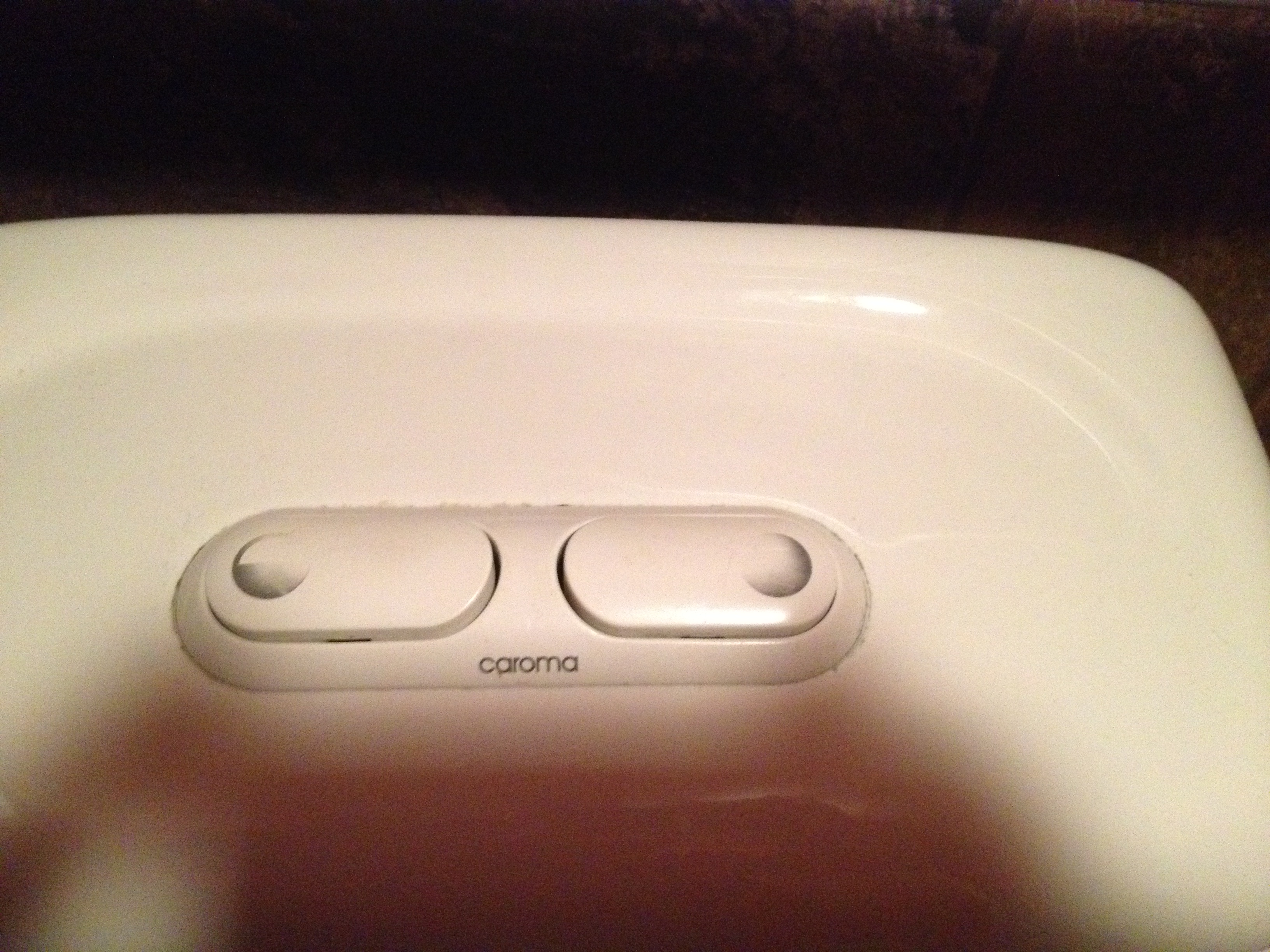
High end Kohler flush buttons.
The much, much more subtle split circle is from the same manufacturer, Kohler. This toilet is much more expensive than the one above and works a lot better. And I can easily see what went through the product manager’s head when they saw the new-moon configuration: “I’m not putting a picture of an outhouse in MY customer’s bathroom.” But it would have been an improvement.
Gotta go.
Which button should I push?
UPDATE: 4 1/2 years after writing this post, I revisited one of these toilets, located in a public restroom at my local coffee hangout. Take a look: with regular use, the legends on the two buttons have worn off so you can no longer tell which is which. D’oh!