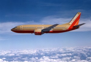
This past weekend I ran across a historical display for Southwest Airlines in a Dallas Museum. The promotional materials and “LUV Potions” cocktail menu from the 1971 launch look amusingly dated, but the planes themselves are a dead ringer for the 737 I flew home the next

day—same design pattern, same color scheme. They’re fulfilling one of David Ogilvy’s key tests for a good concept: will it last for 30 years?
It got me thinking about what a consistent brand Southwest has been over the years—not just in design but in its irreverent voice that pokes fun at itself, the flying experience, and especially mandatory FAA announcements. (My favorite example of this humorous approach was the air sickness bag with a recruiting message on it: “sick of your job?”) This is heavy lifting from the marketing department and a key reason people who don’t generally “like” airlines go out of their way to fly Southwest.
Interestingly, Southwest itself has itself gotten a little tired of its consistency recently and is moving things around. Its website was recently redesigned with a color scheme that is a reasonable evolution from its beginnings, but with broad horizontal elements and an anonymous san serif type face that remind me on one of those sites you wind up on by mistake where somebody is squatting on a URL and wants to make it look like a “real” website with links and search.
Advice to Southwest: don’t get bored with success. Remember Henry Ford’s alleged complaint to his marketing director: “I like that campaign of yours but does it have to appear so dang often?” To which the marketing director replied, “Mr. Ford, the campaign has yet to appear in print!”