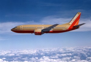
I love Southwest Airlines, especially since I moved to a remote corner of the world where SWA is my only conduit to the large markets where I need to travel. I set my alarm to exactly 24 hours before flight time to check in for the best seat (EarlyBird check in? That’s for amateurs) and I happily puddle jump my way across the country, paying little mind to the multiple stops.
As a marketer, I have also loved Southwest for their advertising, which has remained amazingly consistent for many years. A few years back, I visited a local history museum in downtown Dallas. Therein were displayed photos of early Southwest uniforms that were amusingly outdated—and Southwest planes that looked identical to the one I’d just arrived on.
But now all that’s changed. Southwest has a new logo, a new color scheme, new advertising and new skins on the planes—because, as CEO Gary Kelly joked, any Dallas woman over 40 is ready for a facelift.
I am very troubled. The “old Southwest” used humor to deflect and deal with the serious nature of its business. Flying is a technical challenge, and it requires some personal adaption from passengers and crew, so we might as well have as much fun as we can. I remember fondly the “Sick of your job?” recruiting message on the vomit bags, as well as my favorite among the many scripted flight attendant jokes: “We have someone on board who’s just celebrated his 100th birthday by taking his first airplane flight. On the way out, we hope you’ll say congratulations to… our pilot.”
The new messages do away with all this Texas-style horseplay. They’re all about People. Extreme close ups of people’s faces, Southwest team members, with “hit me hard” lighting and a band of color that echoes (but slightly changes) the classic SWA palette across the bottom. On TV, we have these talking heads making inspiring but very generic statements, often followed by a jump cut to a “candid” in which they are celebrating their own awesomeness.
SWA’s old marketing was unique and appropriate to its image. The new campaign, with a logo and palette change, could be switched to a rental car or hotel firm or most any can-do corporation. Who approved this mess and what were they thinking? (Here’s a straight-up comparison: watch the launch video for the new campaign above, then this one from a year ago. Tell me which does a better job of bringing a lump to your throat.)
Well, here’s a clue. FareCompare.com notes that the new campaign says nothing about “bags fly free” which was a cornerstone of Southwest’s marketing and became ever more prominent as other airlines started to charge for bags. The new Southwest doesn’t have a clear identity so I guess they can do anything they want including charge for bags. Sigh. I miss that “sick off your job” vomit bag.
