The Johnson box is named for Frank Johnson, who popularized it as a promotional writer for Time-Life books in the 1950s. In an era where most direct mail letters had the appearance of being typewritten, it would be above the salutation, usually centered, and surrounded by a row of asterisks at top and bottom and a line of asterisks down each side—in other words, a box.

The Johnson box has its equivalent in almost every HTML email today which, in addition to body text, usually has a graphic at the top and some kind of sidebar which is visible in the preview window. In print, it’s morphed into the “superscript”—a statement above the salutation in an attention-getting font that might be next to the address in a personalized letter, or even in the middle of the page with copy wrapped around it. The purpose in every case is to give the reader multiple entry points to increase the odds they will engage with the message.
The classic use of the Johnson box is to summarize the content of the letter—including the key marketing message, the offer and the call to action—in a paragraph. That way a busy reader needs read no further.
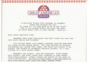
But I like to use Johnson boxes as a counterpoint—since your letter has two openings, they can be as different as you want them to be and the reader can decide which to read first. A good example is a letter in a package I did with Carol Worthington Levy for Great American Recipes, a continuity program that starts by sending a “gift” of several sample cards and a box to put them in. The Johnson box is all about the offer… but then I am able to squander the first three paragraphs of the letter without even mentioning the product. This was very useful because what we were really selling was the nostalgic experience of using the recipes. The package became Great American Recipes’ first non-sweepstakes control.
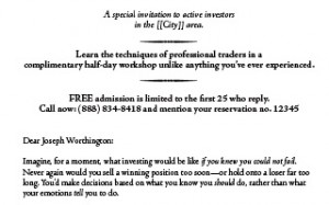
These days letters tend to have multiple calls to action (a URL and a phone number, plus maybe fax and mail-back instructions) which can swamp a Johnson box. So I’ll concentrate on one key element of the offer and then provide an abbreviated CTA. My control letter for Online Trading Academy does this. We tell readers they’re going to “learn the secrets of professional traders” and that this an exclusive, invitation-only event, and we’re done.

Herschell Gordon Lewis in one of his books provides an example of another use of the Johnson box: to incite curiosity. A subscription offer for Cat Fancy magazine starts with a quiz about cats. If the purpose of the letter is to engage the reader in a dialog, why not start at the top? A similar application is any letter or email that’s going to offer a series of numbered “rules” or “questions”. Pull out one example (always from the middle, never item #1) and use that to tease the reader into wondering what other secrets you have for them. E.g. “Rule #6: never drink water on an airplane unless you see the can it was poured from.”
You can tell I’m a big fan of superscripts/Johnson boxes, but they aren’t appropriate for every letter. Don’t use them for a very short letter which is meant to be consumed as one gulp. And since these devices immediately brand your message as advertising, they aren’t appropriate if you want to make the letter look very personal or formal. (Although there are exceptions, as always: the Online Trading Academy letter is supposed to be very exclusive, but it gets away with its superscript by using the fancy typeface of an engraved invitation.)
Excerpted from my new book, Copywriting that Gets RESULTS! Get your copy here.