47 reasons that specifics sell in copy

Herschell Gordon Lewis has a great example about the value of specifics in copywriting. It’s a fundraising headline to the effect of “about 200,000 children will die of starvation in Africa without your help.” The word “about” sucks the urgency and empathy out of the statement like a needle puncturing a balloon. If the copywriter didn’t care enough to find out a more accurate number, why should you care?

Specific numbers and statements help prospects visualize what they’re actually going to get when they respond to your advertising. Specifics are more believable and smell less like puffery. Specifics are also a kind of rite of passage for a copywriter… they show your bosses, your clients and ultimately the recipient that you’ve done your homework.

Which is more credible? 100% pure, or 99.44% pure? The latter, obviously. It’s also better than 99.99% (a number you frequently see applied to IT system uptime and other quality-controlled processes) because it’s so random it could only have been arrived at through careful research. (Bonus question: what is the product, and when was the slogan first used? You probably know the first answer but I’ll bet you’ll be surprised at the second. Proves that good copywriters have known this strategy for a very long time.)

Which is more credible? 30 days to a better figure, or lose weight fast? The first one, and 29 or 31 days would have been even better because of the apparent randomness as noted above.

Bad: many reasons to buy now. Better: 10 reasons to buy now. Best: 9 reasons to buy now. If there really are only 9 reasons, why pad it to get to a nice round number?

I realize I’m far short of 47 reasons, but I think I’ve made my point. And by the way, have you ever noticed how often the number 47 appears in narratives, especially science fiction narratives? One reason is that it appears to be the ultimate random number. But actually, it isn’t.
 

Are you still surprised?

Viewers of this year’s NCAA March Madness On Demand see two commercials over and over again: a Buick ad where Peter Frampton sits in for the missing guitarist in the bar band, and a Coke Zero where a guy about to be executed by firing squad gets his last wish “and … ?”

Both are great spots the first time you see them because they rely on the unexpected, and they continue to be enjoyable the next few times as the message sinks in… then they become really, really irritating. The fault is not so much with the creative as the media buy: who knew they would be played to the point of exhaustion? Well, somebody did, but they didn’t bother to inform the creatives.

But actually there is something wrong with the creative: in both cases it has nothing to do with the product being sold. I bet you didn’t know that was a Buick ad till I reminded you (I had thought it was Hyundai, till I went back and checked). A desire for “more” could be applied to any of life’s positive experiences. These ads never go beneath the surface which is one reason they get tiresome so quickly.

If you’re creating campaigns and messages, think about the implications. Is there a way to make your message evergreen so people continue to be receptive after multiple viewings or readings? Think of a book or movie you like that becomes more interesting the second time through. What is it that keeps you involved… a story twist you didn’t notice the first time? Maybe a subtle graphic detail? And the plot itself is probably deeply satisfying, like the stories that ancient peoples told over and over till they became part of their identity.

Is there a way to make your ad that good? It’s worth trying, at least.

You are in the top 2% of copywriters… now prove it!

At the conclusion of my 2-day copywriting intensive for the DMA, there is a graduation ceremony. I tell my students thanks to what they’ve just learned, they have a better chance of success than 98% of professional copywriters… and I mean it. By understanding some basic selling techniques, how to organize and present their work, and how to manage copywriting as a business, they’re way ahead of the game in terms of winning controls, getting promotions, or making a living as a freelancer.

There is currently a great opportunity for you to prove that you’re smarter than the average bear, at least as a copywriter. The Marketing Sherpa/Optimization Summit people are having a subject line contest! The email’s already written (to promote the event, obv) and you just need to add a subject line which you will do by entering it as a comment. A few semifinalists will be chosen by a panel of experts and then these will actually be tested in email transmissions, and the best subject line gets a free pass to the conference. (It’s in Denver at a great time of year, early June, and it’s worth $1900.)

And, since the submissions are in the comments field, you can read what your competitors are coming up with. (Not all of them though; there’s a glitch on the website that keeps some comments from being presented.) You may well think, as I did after reading a few of them, that you can do better. So go for it!

If you want to brush up your skills before packing your bags, read a few posts from the Copywriting 101 category on this website. Or better yet, buy my book. And yes, I plan to enter the contest myself, so bring your best game sucka!

I saw what you did

Years ago, around the turn of the millennium, I was walking near the Conservatory of Flowers in San Francisco’s Golden Gate Park when I saw an impeccably dressed man blow his nose and then toss his tissue into the manicured garden. I was outraged at this behavior and also by the realization that, since I myself was too meek to beard him, he was about to get away scott free.

I saw what you did, CVS...

It was at that moment I decided to create an online bulletin board where people could register outrageous things they saw other people do. On some level, miscreants like this could be brought to justice if only in the mind of the poster. I registered the domain name that day: isawwhatyoudid.com.

That was a nasty and brutish era where there was no Facebook, no Twitter (imagine!) which today could serve the purpose of venting my outrage. I never got around to doing anything more with the concept and after a couple of years I let my ownership of the domain lapse. It was immediately snatched up by Warner Brothers, probably as the website for a teen movie they were planning. But the movie never got off the planning stage, they in turn let their ownership expire, and I bought it back again.

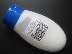
I think this website could still be useful today, for a somewhat different purpose. Above is a photo of an outrageously worthless product I bought at my local CVS pharmacy. It’s a travel-size bottle to be filled with shampoo or whatever, and it’s an abomination because the screw top doesn’t seal. If I had taken this on a trip it would have leaked all over and made a mess when air pressure changed on the airplane.

At $1.99 my reasonable response would have been to just throw it away, but instead I took it to CVS and got a refund and asked the cashier, a competent woman named Jodi, if she would report it to corporate and ask them to stop carrying this defective product. She said she would but I have doubts how much difference it will make. So let’s suppose I also record my story on isawwhatyoudid.com. In its new configuration the site is not going to be an organized BBS, just a soup of angst where people can post whatever they like (except there will be an adult content filter) and it goes into a searchable database.

Thus, months after my experience, when another customer has their Louis Vuitton toilet bag ruined by one of these bottles and sees that CVS was asked to stop selling them but did not, then they will have some fodder for appropriate action. Make sense? There will also be a tag cloud documenting the frequency with which certain words or phrases are used…. Unlike the tag cloud on this blog, which is created manually, it will grow organically like a boil to reflect current topics. Commonly used words will be excluded from the tag cloud and there will be extra weight for recency so it’s constantly changing and relevant.

Actually, I’m probably going to be too busy to do anything with this for awhile. If any of my readers wants to take this project on, shoot me an email.

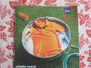
JC Penney “splashy march” promo

Splashy March cover
splashy march cover from jcp. The jcp logo in the shirt collar has been Photoshopped out but a loose thread at the botom right of the shirt remains.

I’m not a JCP customer nor prospect. I didn’t watch the Oscars so didn’t see the Ellen ads though I just now YouTubed them and thought they were great (unlike the majority of the TV audience apparently). Thus, like a lot of folks, my first exposure to the “NEW” JCP was the insert in today’s Sunday paper. If you have one, pull it aside before your partner or spouse puts it in the recycling because it’s worth a study.

JCP’s competition in my local mall includes Target, Old Navy and Kohl’s, all value brands that are trying to look cool and hip (Kohl’s less so than the others) while maximizing floor space. What’s going to make me take a fresh look at the “new” JCP now that former Apple (and Target) guy Ron Johnson has had a few months to get settled in?

How about an opening spread that announces the new “Fair and Square” pricing and uses a universal commodity, like polo shirts, to illustrate it? Red is everyday, white is month long values, blue is a markdown. Got it. So let’s show one example of each. Let’s also make a great offer to get people back in the store, like a free 8×10 family portrait with no strings attached.

This isn’t what happens. The opening spread sells nothing except the picture of a mom in heels (presumably purchased at JCP, but with the intent of looking like Manolo Blahniks) who is gearing up her toddler for a splash in their inground pool visible through the open doorway. Goofy, yes. JCP customer, no. We do get to the polos but not until the next spread, and without the pricing explanation. Further, they’re not on models and they’re still shots, wrinkled. Questionable choice since JCP’s new image seems to focus on “fun” people and models work very well later in the book while also showing off the product with bright hide-no-detail lighting.

I actually sat down to talk about the copy though. I wrote retail fashion early in my career and it’s hard. But at the core of the “look” there is always a human benefit to be found. The book title, “splashy march”, simply doesn’t make sense unless it’s an in joke about “merch”. The double meaning instinct moves into high gear a couple of spreads later: “when we say we’ve got you covered we really mean it… talk about a spring break!” (As in price, apparently. But wait a minute. Doesn’t JCP’s new positioning focus on the fact there is NOT always a sale going on?)

Adult supervision finally arrives at the soft goods section in the back: “This shower curtain is not only washable, it also resists mildew. What is it about spring that makes you want a fresh, clean start?” On message and it sells. What’s so hard about that? Watch and learn, JCP fashion copywriter.

And that free portrait offer? It’s here on the inside back cover (actually a hot spot that’s one of the most-read spreads in a catalog) but buried next to a wacky family portrait that again will probably make the JCP customer feel uncomfortable vs thinking “those are my peeps.”

I kept thinking about the great Lands End catalogs of yesteryear, before they were acquired by Sears. Great selling and great stories hand in hand, with the latter used to showcase the former. That was what JCP could have used here.

UPDATE: since this post we’ve seen three more Sunday flyers from JCP. The “mandarin orange” fashion issue was great. The home store this week not so much. Also, the binding was different: saddle stitched for fashion, loose pages for the home issue. What’s happening is a lot of territorialism between different creative directors and the different departments. For a messaging re-do like this to work, you really do need to have buy-in across the board.

World Wildlife Foundation bags it in new promo

I may have been a bit tough on World Wildlife Federation in my last diatribe. (Though it’s fascinating how many people search for “should we let the tiger go extinct?”) So instead of slamming their new direct mail deck, I’m going to assume there was a bit of slippage between the creative brief and the execution and suggest some ways they can tighten it up.

WWF outer envelope

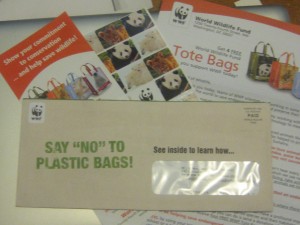
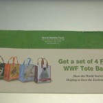
On the front of the OE (the most important part of the entire package by far) we have the teaser, “Say no to plastic bags! See inside to learn how….” There’s a WWF logo as a corner card but it could just as easily have been WTF since it’s a complete disconnect with the teaser. On the back we have…. Plastic bags! Four of them, your gift when you “Show the World You’re Helping to Save the Environment” (note the Needless Use of Title Case, a telltale sign that nobody is minding the store).

I can see the copywriter and designer brainstorming this concept… sort of like the songwriting team in Smash, sticking index cards on a board then standing back and regarding them with furrowed brow… while the account director mutters in the background like a hapless Greek chorus.

Back of WWF envelope

Copywriter: “Here’s an idea. Lots of people would like to stop using plastic bags but they have no idea how. Let’s show them!” Designer: “I love it! Plus, we’re giving away our own plastic bag as a premium. Since we know they’re into plastic bags, let’s send them four instead of one.” Account director: “Doesn’t that send a mixed message? And what does that have to do with saving wildlife anyway. Oh, never mind…”

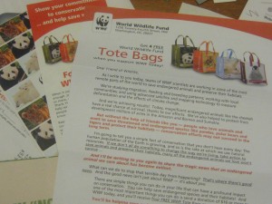
Inside, it comes together somewhat. There’s a buckslip that explains when you get your totes you’ll “carry them everywhere and help reduce the use of plastic bags.” And if you’re looking for the connection between wildlife and plastic bags, you’ll find it near the bottom of the first page of the letter, sort of: “The average American uses 350 plastic bags each year. And they don’t just end up in landfills… they end up in oceans, too. Every year more than 100,000 whales, seals, turtles and birds die as a result of plastic bags.”

Inside the WWF "plastic bags" promo

I turn the letter over, looking for details, and there are none. I know about the ghost sea of floating plastic in the Pacific off Hawaii, larger than Rhode Island. I imagine there are some ghastly Greenpeace-type tales to be told of birds getting their beaks caught in plastic bags, or animals choking on them. But the WWF copywriter does not bring it home with these details because they seem to have taken a vow about saying anything that may seem too harsh or negative. But wait a minute. Aren’t we raising funds for an environmental not-for-profit? Isn’t making people feel the pain what it’s all about?

I think the original assignment was “build a package around our free tote bags”. This is already a challenge because there is not an obvious and immediate connection between tote bags and wildlife. Somebody then decided to make it “educational” by helping people “learn” how to stop using disposable bags… that’s a rather condescending message to this audience which I expect is already environmentally savvy. And education in general (this package also has a “special insert” I am supposed to read called “10 Simple Things YOU Can Do to Help PROTECT the Earth”) is a deadly tactic for direct response. They aren’t going to stick around till the end of class, so you better ask them to reach for their wallet as soon as the tardy bell rings.

Really, the only way to make this package work is the simple logic of a/plastic bags kill animals b/here are some grisly ways c/you can stop the suffering by accepting our free gift. But the WWF’s creative team is into happy talk so they can’t do that. Time to bring in a new game warden.