How to use testimonials in your marketing

Testimonials can be a key element in your marketing copy. They help attract new customers by showing that others have had a satisfactory ordering. They help bond existing customers by demonstrating that you’re a “real” organization with real consumer relationships. And, if you’re a new or little-known company, they show that you actually have customers.

In order to work well for you, the testimonials you use should have these characteristics:

They should be specific. I remember a Land’s End testimonial in which the customer says she’s been shopping “since way back when you sold sailing equipment”. Jackson & Perkins used a detailed anecdote about the customer who put his roses through a torture test in a Texas Panhandle winter. Specifics sell. These testimonials are believable, and make interesting reading in their own right…as opposed to generic one-liners or one-worders (“outstanding”, “excellent”) which seem contrived.

They should be realistic. Never correct your customers’ grammar or edit phrases to fit the King’s English. Write like they talk. (I do, however, correct spelling errors. No reason to let your helpful customers embarrass themselves.)

Resist the temptation to crop and consolidate. Leave in the rambling, off-the- subject asides; these provide the veracity you are seeking. Use ellipses sparingly and only when absolutely necessary (for example, because the quote isn’t understandable without this editing).

They should be relevant. A business-to-business client gave me a series of “testimonials” from dealers who said they were happy to be selling the product. This is not what the customer is looking for. Testimonials should be about the buying process (how easy it is, or how a problem was solved) or about their personal experience with their purchase.

They should be signed. Testimonials followed by initials and no address appear to be faked…even where they aren’t. Whenever possible, I include a full name and city in a testimonial from a consumer; name, title and company for a professional. If you must use initials to protect the customer’s privacy, include the city and state to retain believability.

THE RIGHT WAY TO GET TESTIMONIALS: Some categories, like gardening and other hobbies, seem to generate floods of unsolicited positive comments from customers who want you to know how well they’re doing with your merchandise. If this situation applies to you, you’re lucky. Much more likely, you’ll have to ask for testimonials.

Start with a customer service survey (something you should be doing anyway). Follow up with phone calls to promising responses. When you talk to them, have a mental list of topics you’d like to touch on and gently lead the conversation into these areas. Try to elicit case histories or other specific comments and examples. Before you hang up, ask if it’s okay to use the comments in your advertising. (Don’t push it if the answer is no.)

My next step is write up a transcript of my call notes, followed by a sanitized version in which I try to make the comments more coherent and cogent without editing out the customer’s personality. At the bottom I write:

[Company name] has my permission to use the above quotation in its advertising and promotional material [ ] as is [ ] with changes.

___________________________ Signature_______________Date

In the olden days I would send this self-contained authorization form to the interviewee, via fax or by mailing with a self-addressed stamped envelope. In almost every case, I received it back right away and with no changes. Today I’d be comfortable using email and using their reply as proof of consent. I’m not sure this would stand up in court, but if the customer objects to the use of their name you’re going to withdraw the testimonial anyway, right?

And speaking of legal issues: the above approval language was written without the help of a lawyer. Your legal department might want to add some “hold harmless” verbiage. Resist. The more mumbo-jumbo your customer has to sign his or her name to, the less likely you are to get an OK.

In closing, here are two ways not to get testimonials. Don’t invent them and then sign the name of a willing friend or co-worker. It’s smarter, and not much harder, to get the real thing (assuming your company has at least one satisfied customer, that is). Second, sometimes a well-meaning customer will offer to compose a testimonial for you. Never, never accept. The customer will write what they think you want to hear—and the result will be about as hokey as you can get, but you’ll feel obligated to use it to avoid hurting the customer’s feelings.

I recently ran across several articles I wrote for Catalog Marketer, a newsletter published by the late Maxwell Sroge. I’ll be sharing them in updated form over the next few weeks in the Copywriting 101 section.

Dealing with copywriter’s block

I have been feeling very unproductive lately, looking for distractions and getting too few billable hours done in a day. Finally, today I tackled a project I had been putting off and finished it and afterward I felt like I’d dropped 10 pounds of mental fat. Though I didn’t realize it, I had been suffering from a chronic case of copywriter’s block.

Maybe it’s not as poetic as the creative seizings up of J.D. Salinger, Joseph Heller and other legendarily blocked writers. But copywriter’s block is a very real problem with freelancer hacks and scribes because if you aren’t writing, you aren’t getting paid.

I had a couple of real serious blockages early in my freelance career and will share what I learned from them. The cause of most of my episodes was that I hadn’t done enough preparation before sitting down to write. I was trying to think, and nothing was coming out. A far better strategy is to do so much prep work—in terms of research and rough, non-wordsmithed notes—that giving yourself permission to actually write the thing comes as a blessed relief.

Sometimes we stumble over something in the actual process of writing…. very often, the first paragraph in a letter or article. (And yes, editors will tell you your work can almost always be improved by simply removing that first warm-up paragraph after you write it.)

I still have a multi-page printout of my tortured attempts to write the first paragraph of a letter for a TPA—that’s a particular kind of consultant that handles a company’s health plan. What on earth could I have needed to say about TPA’ing that was so difficult? I can’t remember but I know I felt like a dog chewing on itself until I had the good sense to finally step away from it. I took a walk in the sun, then came back and worked on something completely different. The next day, the TPA letter was completed without incident.

This recent writer’s block had a new set of circumstances. It was for a good client, but I found it somehow very uninteresting, yet I knew I had to do it because of our relationship. The concept of “you must” is toxic to the independent and supposedly carefree freelancer, who has signed on to the concept that you can set your own schedule and work any 24 hours in the day that you like.  But finally, writing it became more appealing than not writing it, and the deed was done. Now I’m going to celebrate by going to the library.

Who pays for this mistake? Not the client.

I’ve been writing a complex series of emails for a client. I finished one series, then had to modify them for a new audience. The right way to do this would be to save each of the emails with a different name, then do the versioning. But I was distracted so I saved the new email over the old one without changing the name. I did this twice. It then took me about two hours to go back and recreate the original emails and fix my boneheaded mistake.

This is a retainer client: we agree to a certain number of hours each month, and I account for how I spend my time. So do I include these hours in my billing? I say no. It would be different if I were billing at minimum wage in which case I’d expect to get paid just for showing up.  But my client is paying for a certain level of professionalism, and this ain’t it.

Back in my suit days, I’d have to account for every hour of agency time. There was an “administrative” bucket where non-billable time would go but I better not use it too often. I’ve occasionally seen (not participated in) systems with no such catchall which means that inevitably every minute gets billed back to somebody.

If you’re hiring an agency or a freelancer by the hour, it’s fair to ask how they keep track of their time and if they have an accounting category where they put non-billable time. If they don’t, then you may end up paying for mistakes.

Are Groupon copywriters really worth $6 billion?

Groupon, which was featured in an earlier post and also in my social media presentation at the DMA in San Francisco, has recently spurned a $6 billion takeover offer from Google. Pretty cheeky…. considering that there’s nothing proprietary or patent-able about its business of delivering a daily coupon to your inbox with a big discount on a local business.

Indeed, Groupon is one of four coupon outfits I now hear from on a regular basis. BlackboardEats is doing something similar for San Francisco (except they don’t collect the money up front which is good for me but a poor profit model for them), Open Table has gotten into the act with discounts as well as reservations, and LocalSavings is giving Groupon a real run for its money here in the upstate NY area.

But Groupon’s emails are the ones I always open, and why? It’s the copywriting! Today, for example, in an offering for a Portuguese restaurant, the copywriter noticed it had small plates and delivered the following riff: “Small plates provide diners with a rare chance to act like a giant and yell “fee-fi-fo-fum!” at the waitstaff. Enjoy a make-believe growth spurt with today’s Groupon: for $20, you get $40 worth of Portuguese cuisine at Atasca in Cambridge.”

That’s the kind of extemporizing that used to get us yelled at by our bosses when we were cub copywriters… but as always it’s followed by solid research-based benefits including a description of menu items, a reference to its listing on a best-of directory, and a verbal capsule of the ambience:  “The in-house atmosphere is warm and romantic, bedecked with Portuguese art and fresh flowers, ideal for a smooch-inducing date or a platonic rendezvous with a band of surly Casanovas.” You can’t make this stuff up, at least you can’t day in and day out. I spoke to one restaurateur who was a happy Groupon client and he said yes, someone from Groupon did indeed call and interview him at length.

I have one worry for Groupon though, and that is its inability to attract quality advertisers in the hinterlands. In San Francisco and Boston, the specials are from recognizable establishments where I’d want to eat anyway. But in Dallas and Albany (all part of my quixotic geographical rotation) we tend to get tanning salons, car washes and second-tier pizza joints, the same folks who show up in Val-Pak.

If Groupon is going to grow beyond $6 billion they’re going to have to find a way to sell creative marketing to the late adopters. If Groupon should happen to implode, at least there will be a lot of good copywriters available for hire in the Chicago area (where Groupon is based).

Editing advice for copywriters

I am working on my first “long form” direct mail promo in quite a while. This one occupies an 8 ½ x 25 piece of paper, folding down to six 8 ½ x 11 sides. It’s a definite schlep writing this thing.

I have always used the “Michelangelo David” approach to such projects, creating a block of marble by putting everything that comes to mind into a Word document then gradually whacking away until a finished form emerges. Each day I attack the project anew and at the end I have a draft that is hopefully closer than the day before.

Yesterday was what might be thought of as my torso-carving day; I’m getting down to the point where I am not close to finished, but the final form is beginning to take shape. I worked very hard for maybe 8 hours.

Today I picked up the 11 page single spaced manuscript to review it. It was terrible. Significantly worse than the work I’d just criticized my kid for preparing for Mrs. Brooks’ third grade class. My heart sank.

But I read on, and it got better… as I should have expected. I had had a poor start the day before. My poor decision today was to review that bad introductory copy first. I should have started at a point further in the manuscript when I had a firmer footing, then doubled back to that beginning-of-the-day messiness when I kept hitting my thumb instead of the head of the chisel.

Don’t review your copy start-to-finish. Do anything but. If you are lucky enough to have a schedule that permits multiple rewrites, start your review in a different place each time. That’s my editing advice for copywriters.

Marketing to idiots

I had a client who was concerned that the information she was collecting on a registration page was going to be a potential problem because people are registering to win a prize and if they do win a prize then a/they might not want to receive it at work (which is the address we’re asking for, this being a B2B mailing) or b/they might have given a fictitious address as some people do because they don’t want to get advertising contacts yet they have to put something in the fields.

This same client had a problem at a previous company, which was the cause for her concern. She was giving away iPod shuffles (then selling for $59) to qualified prospects in return for their time to sit through a demo and apparently many people did not get their shuffles. I say “apparently” because it could also have happened that someone lied in order to get an additional shuffle…. dishonest, but hard to prove. Anyway, once bitten she wants to be sure this time.

My response (before caving, of course) was that there are always going to be a few idiots and outliers in your audience who are not going to play by the rules no matter what you tell them. And you should not do anything that is going to make your offer more complex to the vast majority, such as adding additional information on the reg page to deal with this issue by requesting an alternate shipping address in case they win. (Everybody who has ever designed an online survey or reg form knows that each additional field or question causes a certain number of people to drop out.) Suppose they fill in the form with their preferred address but, being idiots, they write it down wrong. What do you do then?

Along the same lines, I had a client back in my “suit” days who wanted to know if it was a good idea to pay a 1.5% commission based on the value of all sales paid by check in return for this supplier’s guarantee to make good any bad checks. This one was easy to figure out. Do bad checks cost more than 1.5% of revenue from all checks? No. Then this apparent insurance service is a money-losing sinkhole.  Plus, cheats are cheats. If a customer has it in their heart to trick you out of money, they’ll just find another way to do it.

Today’s moral is, the customer is not always right, not when they are idiots and outliers. Don’t screw up the rest of your promotion by making accommodations for a few wingnuts.

Sweet way to make a trade show impression

The annual Direct Marketing Association conference is a challenge for exhibitors. It’s a horizontal show, with many different categories of vendors represented from bankers to software to printers to agencies. And many of these have complex value propositions that are hard to convey with an elevator pitch.

Orange cupcakes = cloud computing, get it?
Orange icing = cloud computing, get it?

In this environment, the booth shown here stands out. Everything is orange, and they’re giving away cupcakes with bright orange icing. The cupcakes attract traffic, and when the sales force follows up after the show they can say “we’re the people who had the orange cupcakes, remember?” All good.

The marketing tie-in is a little more tenuous. The booth staffer explained that “we’re the only software-as-a-service solution at the show for migrating legacy systems” for order entry, customer records and other mail order chores. That’s a bit complex to convey in an elevator pitch so the company—named “swyft” and pronounced “swift” I will guess—decided to just go for being remembered. Some people might go to their website, but in any case there are these orange cupcakes.

A bit of research was done, consisting of looking at the collateral. The cupcake tie-in becomes clearer, though the copywriter unfortunately cannot resist a treacly flow of plays on words: “Sweet! Ripping and replacing legacy systems is about as fun as a root canal. It can be a slow, painful process and leaves a bad taste in your mouth. That’s why we built the Swyft Interaction Hub to sit ever so sweetly right on top of your existing customer systems. It’s like the icing on your customer infrastructure cupcake.”

I have the feeling the booth people either weren’t fully briefed on this platform or didn’t feel comfortable mouthing it. I pressed the booth rep on the tie-in between the cupcakes and the product and she said “we’re cloud computing” and we agreed the puff of orange icing was indeed like a puffy cloud. OK.

I’m giving them best of show for the DMA by default but you see how this could have been even better. Think through that metaphor of cloud computing and maybe there’s a better way to express it…. maybe cotton candy which was being given away at the next booth (not as a gimmick, just free candy). Or here’s an idea, how about tying into the name “swyft/swift”? Any metaphors come to mind for that one?

Gap shoots itself in the logo

I had been looking for a bad example of social media marketing to use in my DMA talk on Monday 10/11, when the good people at the Gap dropped one right in the lap of my denim jeans. Funny thing is, I don’t think they were aware they were involved in social media marketing which is part of the problem.

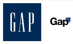
Gap old and new logos

Gap, as you may know, changed its logo last week. To my non-designer’s eye, the new logo looks like something I was offered free at a conference by an outsourcing design firm: I was asked to answer a few questions about my business, then come back in 20 minutes. Gap’s new logo is simply its name, set in the same font used for the table of contents in the New York Times magazine, with a little blue square at the side as homage to the old logo they’re getting rid of. On the face of it this does not seem like a particularly good change. Plus the old logo had a lot of recognition built up over 20 years; most marketers would consider that brand equity but Gap felt it was a problem. They’d had the same logo for 20 years, so it was time to get rid of it. Not evolve it, as many companies have done (think about how Betty Crocker, Uncle Ben and Aunt Jemima have morphed over the years in response to changing social mores). Just toss it out and start over.

The change drew over 1000 comments on Gap’s Facebook Wall, with the balance overwhelmingly on the negative side. (The Facebook page still displays the old logo as of this morning, by the way. Oops!) The critics tended to say either the new logo looked like an exercise from a beginning Photoshop class, or that they loved the old logo and didn’t want to see it go. And, not a few offered to redesign the logo themselves. That’s where it starts to get strange.

Gap's Facebook page still displays its old logo. Oops.

Gap President Marka Hansen wrote on her Huffington Post blog that “given the passionate outpouring from customers that followed, we’ve decided to engage in the dialogue, take their feedback on board and work together as we move ahead and evolve to the next phase of Gap. From this online dialogue, it’s clear that Gap still has a close connection to our customers, so tapping into this energy is right. We’ve posted a message on the Gap Facebook Page that says we plan to ask people to share their designs with us as well. We welcome the participation we’ve seen so far. We’ll explain specifics on how everyone can share designs in a few days.”

Aside from the condescending we-we language (“passionate outpouring”? more like “howls of outrage), what is really going on here? Is the lame new logo actually a placeholder and publicity stunt? Does Gap really want its customers to help design a new logo, and if so why did they not say that in the first place? And if they are indeed going to hold a design competition, what are the rules of the game and how will the winner be compensated? (Designers are already posting to warn their colleagues not to offer designs until copyright protection measures are made clear.)

Right now Gap’s getting a whole lot of free publicity. Problem is, most of it is negative especially for a company that would like to have a positive image for its design and customer interaction skills. It will be interesting to see how this unfolds.

UPDATE: on the evening of 10/11/10, Gap announced that it was going back to its old logo. Here’s their Facebook statement, thankfully free of we-weisms: “Ok. We’ve heard loud and clear that you don’t like the new logo. We’ve learned a lot from the feedback. We only want what’s best for the brand and our customers. So instead of crowd sourcing, we’re bringing back the Blue Box tonight.” And according to Ms. Hansen in their press release, “There may be a time to evolve our logo, but if and when that time comes, we’ll handle it in a different way.” Sounds like a plan.

Why context matters in your advertising

We’ve talked before about verisimilitude—the principle that, in addition to actually being true, an advertising message must appear to be true or the skeptical public won’t trust it. A parallel concept is context… in any given environment the audience expects to receive information in a certain way and you can either fit in with this convention, or startle and gain attention by doing the opposite.

Ads or banners that look like editorial content go down like butter. Direct mail packages that look like they are official notices get opened automatically. Of course, you need to stay in character or the audience may feel duped if your message turns out different than it appears.

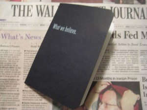
Frost's fake bank book inserted in the Wall Street Journal

For the “startle” approach, a good example was inserted with a recent Wall Street Journal (home delivered in Dallas, where I was traveling): unfold the paper and a bankbook falls out. Whoa, a bankbook! But it’s not really a bankbook because it has a headline on the front: What we believe.

Inside, we have ten spreads containing statements of belief, most of them no more than a sentence. Example: “We believe you get what you pay for.” It’s not until the very last page that the advertiser is revealed along with a CTA: We believe there is only so much you can learn from a book. Call (tollfree). WhatFrostBelieves.com Frost (logo)

Now, there’s nothing terrible about any of this… for a corporate website, or an annual report. But this isn’t marcom, it’s ADVERTISING and quite expensive advertising at that. I can see the boardroom wheels turning: Wall Street Journal readers are well heeled influencers. Let’s impress them with our sincerity and maybe they will become our customers.

Not likely. There is just too great a leap between a statement of purpose and high mindedness, and the actual activity of deciding to do business with a bank.  A few readers may pass the bankbook around their office as a curiosity but very few are going to do the thoughr process of “these guys seem decent enough, they’ve proved it by not trying to sell me too hard, therefore I will get a loan or open an account with them.”

The thing is, there is a way this promotion could have potentially been VERY successful: make it look like a real bank book. With nothing on the cover so you don’t give away that it’s marketing… or, wait a minute, let’s put the Frost logo on. That’s realistic and establishes brand up front.

Inside, some stage management—fake transactions.  The account holder has built up a huge balance, earned some nice interest, then withdrawn it all. (This is Texas, remember.) Tell a story with the numbers. The Wall Street Journal reader will like this. Then on the last page, a call to action: save a point on your business loan when you return this bankbook to Frost. That’s how you buy business by being out of context.

Everybody’s a winner in Fast Company’s Influence Project

I signed myself up to do a presentation at the annual Direct Marketing Association conference called “How Twitter Killed Direct Marketing Copy (Just Kidding)”.  The idea is to show great examples and tips of how classic marketing techniques still work in new media, while also giving old-school copywriters some juice and inspiration as they attack assignments in the unfamiliar and slippery turf of Facebook, Twitter and their ilk.

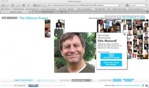
My page on the Influence Project
Click the pic to spread Otis' influence!

The conference is in early October in San Francisco, but my Powerpoint is due August 20 for “peer review” (WTF?) so it’s time to think about what I am actually going to talk about. One thing that’s definitely going to be there is Fast Company’s recently launched “Influence Project”.

Fast Company asked SF agency Mekanism for a pitch on how to make itself more successful through viral marketing. The ideas were brilliant and you can read about them all at http://www.fastcompany.com/finalists as well as download the actual presentation which is a great piece of work any creative practitioner can learn from. The chosen concept was what would eventually become the Influence Project.

The idea is that you register on Fast Company’s website, and get a special “influencer URL”. (Mine is http://fcinf.com/v/bf8c )Then promote that link by whatever method you choose. The more clicks you get (with bonus points if you get other people to join the contest), the more influential you are. The winner will be featured on the cover of the November issue as the most influential person in the world… but wait, there’s more.

The concept would have brilliant if it stopped at one winner. Maybe it would be Lady Gaga, or maybe an intrepid dark horse American Idol-style. However, in this contest EVERYBODY is a winner. Pictures of all entrants will be featured on the cover, with the size proportionate to amount of influence. If you’re too small for a dot of ink, you can still find yourself on the Fast Company website where there will be special magnifier tools and lots of cool analytics.

How this ties back to marketing is explained by the problem description in the Mekanism product brief: “Fast Company is the best thing that too few people read.” And the solution is to get people to interact with the website and hopefully stay around for other content as well as, of course, read that November issue.

To try this out, go to http://fcinf.com/v/bf8c then wait a long time for the server to load. Vote for me by clicking the “Spread Otis’ influence further” button or register yourself by clicking “Discover YOUR influence”.  Email me after you do either or both, and I’ll send you a complimentary copy of the DMA preso after the conference.