Personalized Landing Pages… how “personal” should they be?

Two of my agency clients have recently done extensive testing of personalized landing pages, in which a unique URL is assigned to each person on their mailing or email list and respondents click through to a web page that is just for them. The results have been very different.

Client #1 does primarily ecommerce sites, and their approach to personalizing the landing page was to offer products of specific interest to the customer based on purchase history. Client #2 does business-to-business leadgen. Their personalization was mainly about offering information that was versioned by industry.

Client #1 saw virtually no difference in response from their PURLs, while Client #2 saw a 20-30% increase in registrations. How come? I haven’t mentioned that Client #1 doesn’t make a big deal of the customization on the page, while Client #2 almost overdoes it with use of the name. (“Otis Maxwell, here’s your personalized offer!”) This suggests that, even in cynical and more sophisticated times, folks still love to see their name in print and to believe some care has been taken to respond to their unique needs.

Interestingly, the leader in personalized web marketing has backed off somewhat from its original approach, introduced maybe a decade ago. And we can be sure that Amazon.com does extensive testing. While at the beginning they’d say “based on your recent purchases we think you’d like… “ or some such now it’s always third person “people with your browsing history also viewed…” So maybe there’s a point where too much apparently intuitive knowledge seems creepy. And by allowing its plumbing to show, Amazon is letting folks know there’s no creepy surveillance going on.

Incidental Marketing

Contact lens wearers are a savvy lot. They know that once they’ve found the lens for the right eye, the other lens will inevitably fit the left eye. Thus there’s no reason to label the two sides of the contact lens case “L” and “R” as in the top example. You could call the second lid “not R”, or you could leave it blank… or you could use it for MARKETING, like the smart folks at Alcon in the lower example.

This example gets 100 points for incidental marketing, in which we use an available medium to communicate with consumers where otherwise an opportunity would be lost. Contact users see their contact lens cases every time they put in their lenses… what a great reason to remind them of the contact lens cleaner to buy next time. Unfortunately, this example gets 0 points for branding because the name of the brand actually isn’t Alcon. It’s “Opti-Free Express”. Oh well.

The middle manager

Early in my career I was direct marketing manager at a department store. The post office announced its first-ever presort discount (this tells you how long ago it was) but gave no instructions on how to prepare a mailing list to get the discount. An enterprising software company wrote an application to do the presort and they were willing to let me use it—for a finders fee of half the savings in postage.

I turned it down without a second thought, even though I could have still saved thousands of dollars. The prospect of looking like a sucker to my superiors far outweighed the financial gain. And of course the gain was to the company, while the looking foolish was on me personally.

I remembered this recently when a client wanted to do some email promotions. I did a bit of research and recommended several services that work with small lists. Then she came back to me with an objection that never would have occurred to me—what if somebody at the email service decides to steal their mailing list? Although highly unlikely, this was a big internal concern at the company and it stopped the email program in its tracks.

The concerns of middle managers are very different than those of higher up folks who have responsibility and maybe get a share of P&L. Managers are reviewed for being on time and on budget, with no unpleasant surprises. This is something to keep in mind in marketing, and also when dealing with them in person because often a direct marketing manager is your immediate client as a freelancer.

When writing a marketing letter to a middle manager, it’s a good idea to stress the absolute lack of negatives. Testimonials are priceless—your reader doesn’t want to be the first to take the plunge. Benefits like “make your job easier” and “stop users from complaining” are far more relevant than “help your company grow its revenue”.

And when you’re delivering your copy to the real-life middle manager, be on time!

Let’s all DISCOVER!

We want to love the Discovery Channel Store. The shows are great, and by implication the stuff they sell should be good clean fun for kids. Unfortunately, much of it seems to fall apart at the slightest touch.

Last year my kid got a remote controlled airplane for Christmas from Discovery. It didn’t work. We took it back to the store and exchanged it for another which… also didn’t work. By this I mean that the mechanisms that communicate from a controller to the plane to its moving parts had some kind of disconnect. Finally, on the third try we got a plane that DID work and we succeeded in crashing it ourselves, end of RC airplane trauma.

Just now we’ve ordered again, thanks to a gift certificate. Specifically, RC Anthropods! Three bugs which scutter along as controlled by a twig with a battery hidden inside. But one of the bugs was missing its charger connector out of the box, and a second lost its connector (the thing that powers its internal battery, so it will move) as well as its scuttering wheels within 24 hours. It was at this point I contacted Discovery Online (the stores are all now closed) and asked for a refund.

As with the store experience last year, the reply was prompt and extremely polite: they’ve credited me with the full amount of the purchase and I don’t even have to return the defective toy. Of course, if they did this on every toy that was defective they might quickly shutter their online store too. Could it be their profit model to flood the market with evidently poor quality, but very cheap, product and hope that inertia keeps customers from asking for their money back?

The flaw with this is the difficulty of getting repeat business, which may be why the brick-and-mortar locations shut down (including one which had just opened in a pricey location at SF’s new Westfield Center). Right now the web store is heavily promoting—the RC Anthropods were yesterday’s special. Let’s see what happens after Christmas.. As my solicitious email from the customer service department concluded,

Thank you for shopping with us and LET’S ALL DISCOVER!

Path of least resistance

I bought a vintage table saw last summer and almost immediately broke the vintage drive belts. Wonder of wonders, somebody had done the same thing and posted pictures of his repair online. However, my saw’s setup looked different than the photos. I spent a good 8 hours patiently jockeying the loose parts into alignment without success.  Then it dawned on me: it just can’t be this hard. I took a fresh look at my saw and realized one of the bearings had popped out of its housing. I cleaned the parts, popped it back in and was done in 20 minutes.

Another story with the same outcome: many years ago I was driving a VW bus on a very bad road in southern Mexico when a shock absorber came loose behind one of the wheels. I spent a couple hours trying to get it back on as a steadily growing audience of local indigenous men watched me. Finally one got impatient and pointed something out with sign language. The bolts that went into the top and the bottom mounts were different. And you could easily tell what was the bottom bolt because it had more road grit on it.

The lesson is, there’s usually a logical way to do things and people who are not bogged down by intellectual musings will find that way automatically by following the path of least resistance. Good designers of mechanical things know that and design accordingly (a notable exception being 1970s and 80s Detroit cars, where they’d often create special tools to make up for the fact their engine compartments were inaccessible) and ad writers should do the same.

If a reader has made the commitment to proceed through your letter or other body copy, they are fully intending to follow that path of least resistance. They know that A is followed by B, or supposed to be. Put a surprise in the road when they’re about to get to B—a special offer, or a new benefit—and it will get maximum attention. Change course without adding a benefit, and you’ll confuse and irritate and lose the reader. Keep this in mind when you’re framing out your next project.

“Will it last for 30 years?”

This past weekend I ran across a historical display for Southwest Airlines in a Dallas Museum. The promotional materials and “LUV Potions” cocktail menu from the 1971 launch look amusingly dated, but the planes themselves are a dead ringer for the 737 I flew home the next

The first Southwest Airlines plane.

day—same design pattern, same color scheme. They’re fulfilling one of David Ogilvy’s key tests for a good concept: will it last for 30 years?

It got me thinking about what a consistent brand Southwest has been over the years—not just in design but in its irreverent voice that pokes fun at itself, the flying experience, and especially mandatory FAA announcements. (My favorite example of this humorous approach was the air sickness bag with a recruiting message on it: “sick of your job?”) This is heavy lifting from the marketing department and a key reason people who don’t generally “like” airlines go out of their way to fly Southwest.

Interestingly, Southwest itself has itself gotten a little tired of its consistency recently and is moving things around. Its website was recently redesigned with a color scheme that is a reasonable evolution from its beginnings, but with broad horizontal elements and an anonymous san serif type face that remind me on one of those sites you wind up on by mistake where somebody is squatting on a URL and wants to make it look like a “real” website with links and search.

Advice to Southwest: don’t get bored with success. Remember Henry Ford’s alleged complaint to his marketing director: “I like that campaign of yours but does it have to appear so dang often?” To which the marketing director replied, “Mr. Ford, the campaign has yet to appear in print!” Continue reading ““Will it last for 30 years?””

“I want your free stuff. Please call me now.”

Would you like to put yourself in the shoes of a prospect receiving lots of marketing messages and deciding which ones to respond to? Try this: place an ad in the “free” stuff of craigslist.org.

I recently gave away a big kids’ playhouse and two perfectly good laser toner cartridges. Got over 40 responses in the playhouse (in about an hour), several each for the other item. So how did I decide who was the lucky recipient?

Some of the respondents disqualified themselves immediately with obviously automated responses that sounded like they might have been generated from some mailbot within the Russian mafia. “I want you item for my purposes. Please call my cell now 415-555-1212.” I don’t think so.

But there were lots of legitimate respondents who didn’t rise above the pack. I got a dozen or more “My kids/grandkids would love your playhouse!” so how to choose? Another issue was that I needed to know that getting rid of the item was going to be quick and easy for me. Some people said they had a van or a truck (mandatory and stated in the ad) to pick up the big playhouse; those who didn’t were automatically kicked to the curb.

The winners were a/a single mom who wanted the playhouse for her daughter who was just coming out of the hospital, and had a friend (a fireman!) who would come over right away with his truck; and b/another single mom who wanted the laser cartridge because her printer was streaking and making her kids’ homework look bad.

See the chosen motivations at work here? First they echoed the business proposition, then showed how they could uniquely meet my need to place my item in a good home. As writers, we need to be just as good at presenting our own products and services.

“It’s [still] not creative unless it sells.”


I’ve always followed David Ogilvy’s dictum, which means I never show work around if I know was not successful in the marketplace. But what if the market was wrong? Or, to put it less arrogantly, what if the lists got messed up somehow and my mailer or email went to the wrong folks? Shouldn’t you be allowed a free pass once every few decades on work YOU really like and think is good?

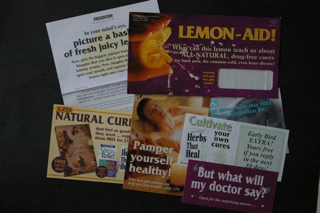
I was going to present the piece shown here as an example. It’s always been one of my personal favorites, though I hadn’t looked at it in a number of years. The client and I were very surprised at the time that it was not a big winner. But when I pulled it out today, I could immediately see what was wrong.

The outer envelope (upper right in the photo) is what kills this package. We’re selling a book of relaxing natural cures to women and I wanted to use a lemon to illustrate how our mind has powers to help us. (Really concentrate, think about a lemon and its taste, and your mouth starts to pucker up.) But where’s the reader benefit in this? I was also betrayed by my choice of visuals from a great designer… this stop-motion bursting lemon image is frenetic when it should be calming, and the background should be green not purple for a restful, natural cure. And yep, that reversed out type is pretty hard to read.

Inside is lots of good stuff which the recipient of this package never got to see. There are two headlines I like: “Pamper Yourself Healthy” and “Natural Cures that Feel as Good as They Work”. Either one of these might have given me a fighting chance if I’d used it on the outer.

Once again the marketplace—and David Ogilvy—are right.

The “Buffer” problem

Our San Francisco Chronicle TV critic, Tim Goodman, recently urged us to watch a new show on FX called “The Riches”. It’s about a family of “Travelers” (think Gypsies, without the ethnic implications) and how they outsmart and rip off mainstream Americans who are called “Buffers” in the show.

I like the acting, but I signed off about halfway into the current show, when Doug Rich BSs his way through an introductory speech to his new staff at the firm where he’s pretending to be a lawyer, then the family fails to BS its way into a private school. The problem is that we viewers don’t know whose side we are supposed to take. We don’t identify with the Riches who are not a particularly attractive or likeable lot, and we are smarter than the real estate office that Doug Rich BSs with his nonsense speech that is supposed to be a tour de force.

Aristotle figured this out a while back, by the way. Dramatic appeal in tragedies comes from the “tragic flaw” in an otherwise heroic protagonist, while the protagonist in a comedy, our representative in what can be a very chaotic tableaux, is an essentially good person of modest abilities who is striving for something better. (Thanks to the nice De Paul University syllabus notes I found to refresh myself on this topic. )

Ineffective advertising is often bad because of this very failing. Who are we in this scenario? What problem of ours is being solved? The audience is not given anything credible or of sufficient weight to identify with. A straw man problem is presented and then solved, but we don’t care because we never got involved in the first place.

Sorry, Mom. The art director did it!

I gave my mother the highly-touted new edition of the Joy of Cooking for her birthday, and bought a second copy for us to have at home. I like to leave the book open for reference when I’m cooking, and soon I noticed I was doing a lot of squinting and carrying the book into brighter light. Could it be that the type had gotten smaller?

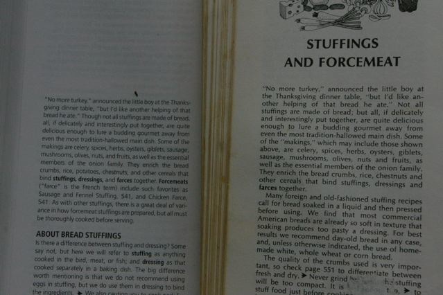
A comparison of two identical passages shows that’s exactly what happened—20% smaller in fact. (Count the characters in the first line of the new edition, at left in the picture, and compare to the 1975 edition, at right.) I can understand why they didn’t want to make the book too unwieldy with all the new additions. But I’m too preoccupied to memorize the recipe before I cook it, and too finicky to be satisfied when I misread and put a tablespoon of salt in when the recipe calls for a teaspoon. Sorry, but the type’s too small.

This is why I advise my students and clients to double-check the work of their designers. If it looks too pretty, it probably is—something’s been sacrificed for the sake of great design. If there’s a coupon, try filling it in to be sure there’s room to write—or better yet, have your art director do it.