Then and now: Planned Giving with the Salvation Army

Planned Giving letters (front)
Front page of the two planned giving letters, side by side (click the image to enlarge to a readable size)

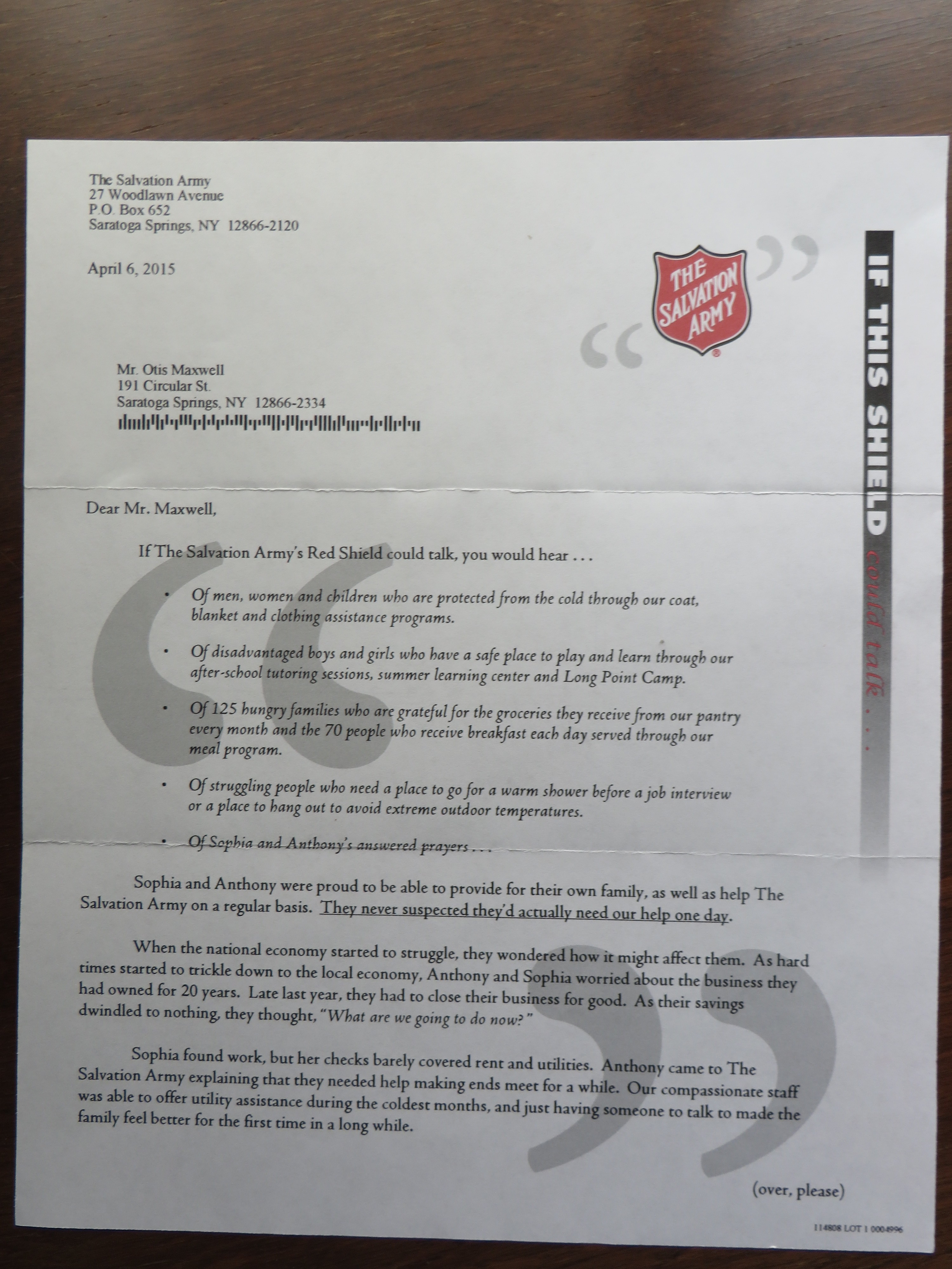
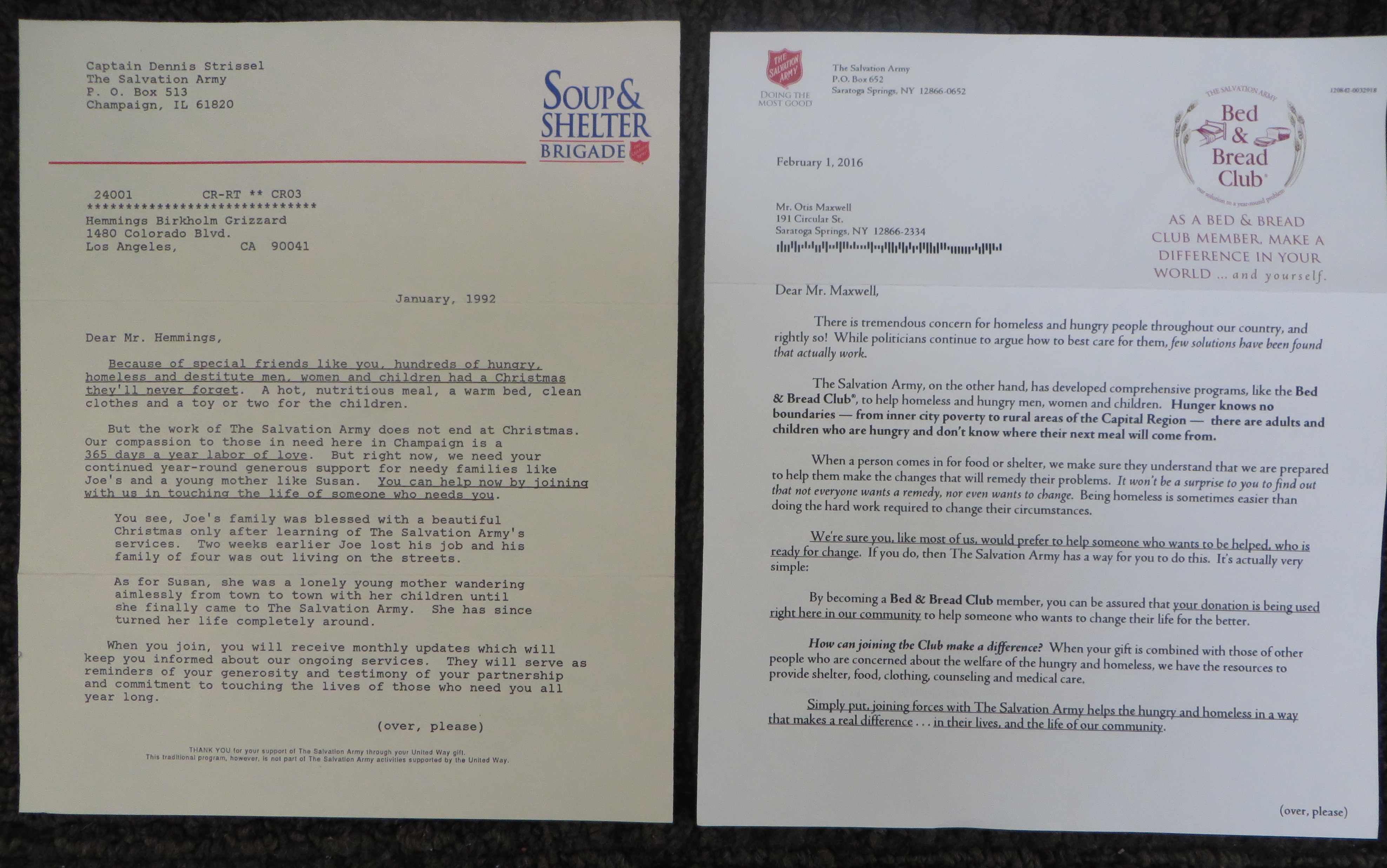
25 years ago I wrote a planned giving direct mail program for the Salvation Army. I recently received the current rendition of the same ask, and it was fascinating to see what has changed and what hasn’t. I’ve reproduced the letters from the two packages, which contain the key message, and you can read them by clicking on the images.

backs of planned giving letters
Back side of the two letters (click the image to enlarge to a readable size)

In both cases, the program appeals to high value donors and asks them to make a small regular contribution to fund community kitchens and shelters on a year-round basis. The vast majority of the Salvation Army’s donations come in fourth quarter, partly because of tax planning but also because holidays (Thanksgiving and Christmas) are a time when Christian donors are particularly sensitive to the needs of people less fortunate than themselves. The letters are sent in first quarter to people who made generous donations over the holidays.

Soup & Shelter complete
Soup & Shelter package, complete

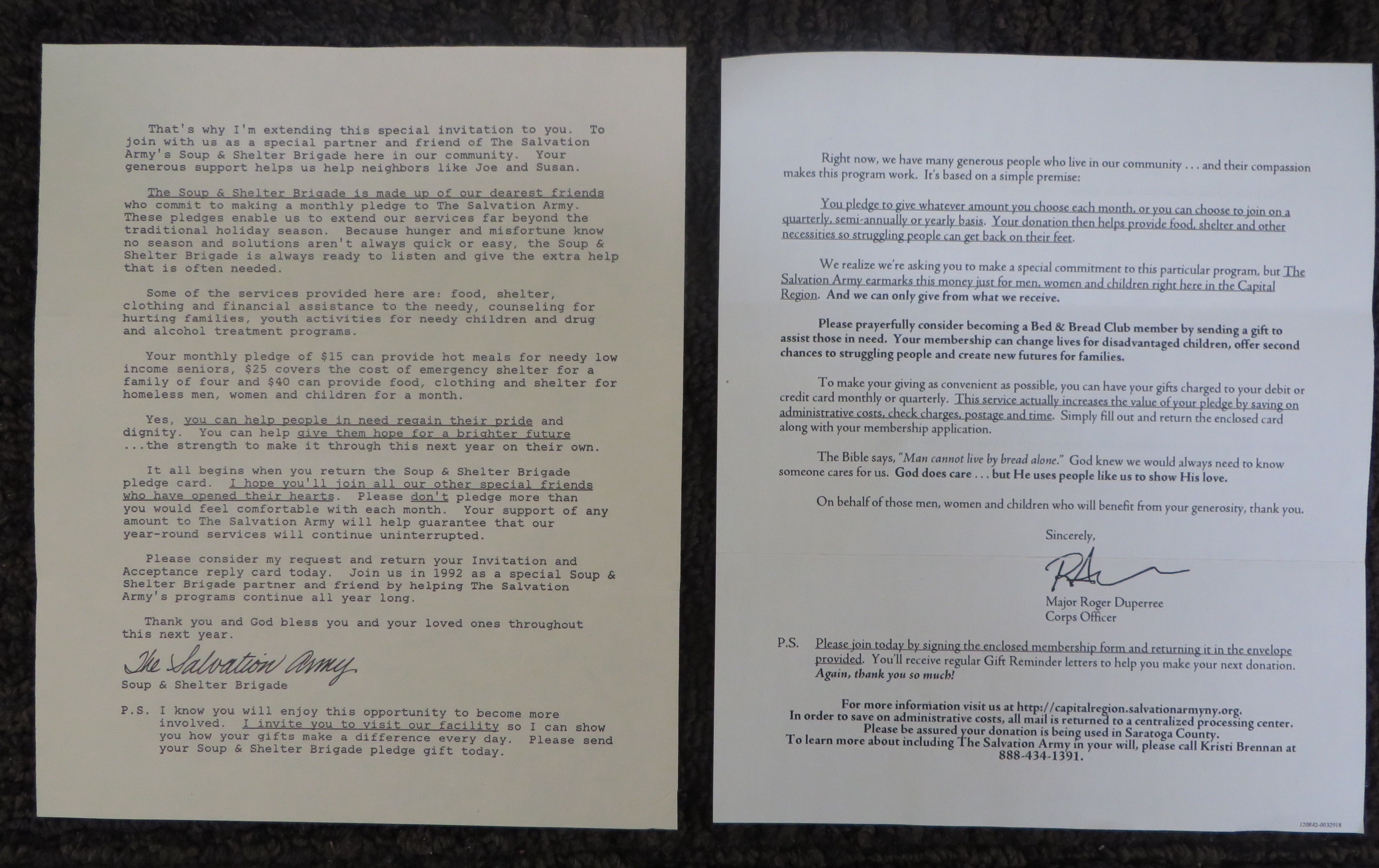
My pitch was called the “Soup and Shelter Brigade”. It thanks the reader for their generosity and paints a word picture of “a Christmas they’ll never forget” which they made possible. It goes on to present the year round need and provides two vignettes of people like the ones you’ll be helping—good people who have fallen on hard times, usually through no fault of their own.

The vignettes are important because we’re going to send you more vignettes each month as part of the program—here’s who you are helping this month. The monthly mailing is a reminder and a request for the pledged donation, since this was before the days when automatic credit card billing was an accepted practice.

Bed & Bread complete
Bed & Bread package, complete

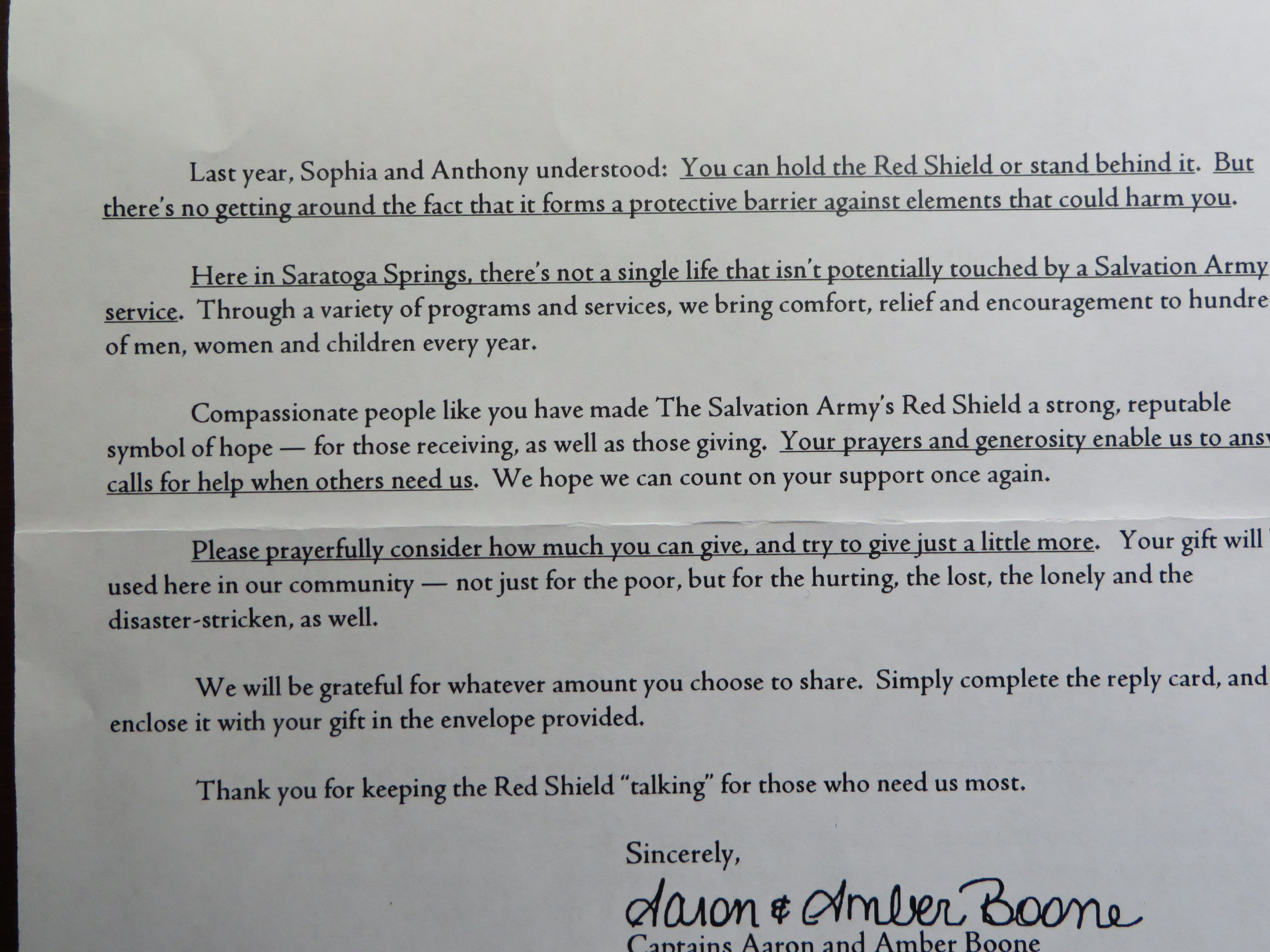
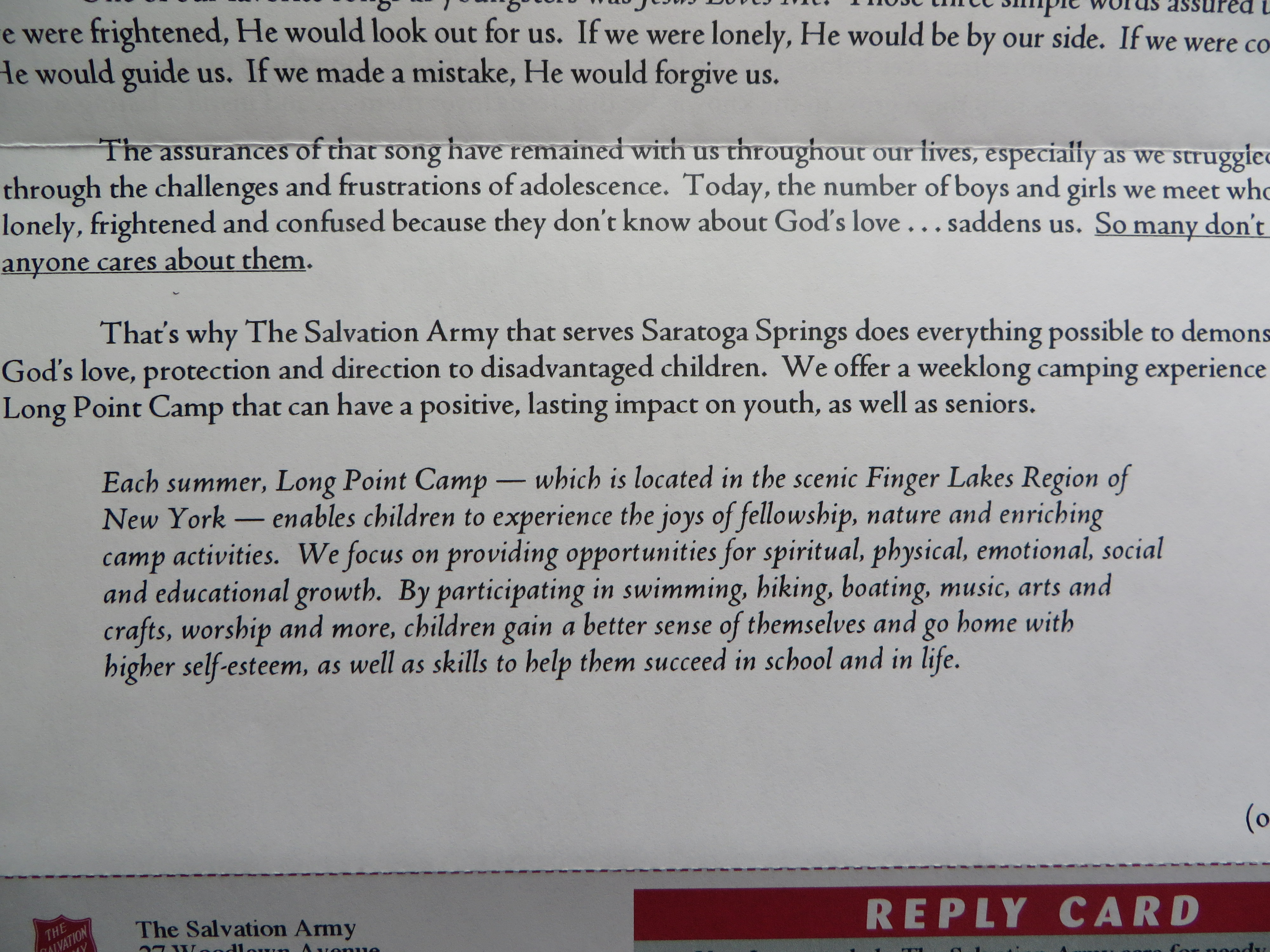
The new package is from the “Bed & Bread Club” and has a hard edge that surprised me—not to say it’s not successful. “Not everybody wants a remedy, nor even wants to change. Being homeless is sometimes easier than doing the hard work required to change their circumstances… We’re sure you, like most of us, would prefer to help someone who wants to be helped who is ready for change.” And the letter goes on to promise that your gift will be used to support this cohort.

So this is appealing to a donor who is fed up with the ineffectiveness of social programs…. Possibly because “while politicians continue to argue how to best care for them, few solutions have been found that actually work.” It’s an exhortation to take things into your own hands that leans as much on frustration as Christian charity.

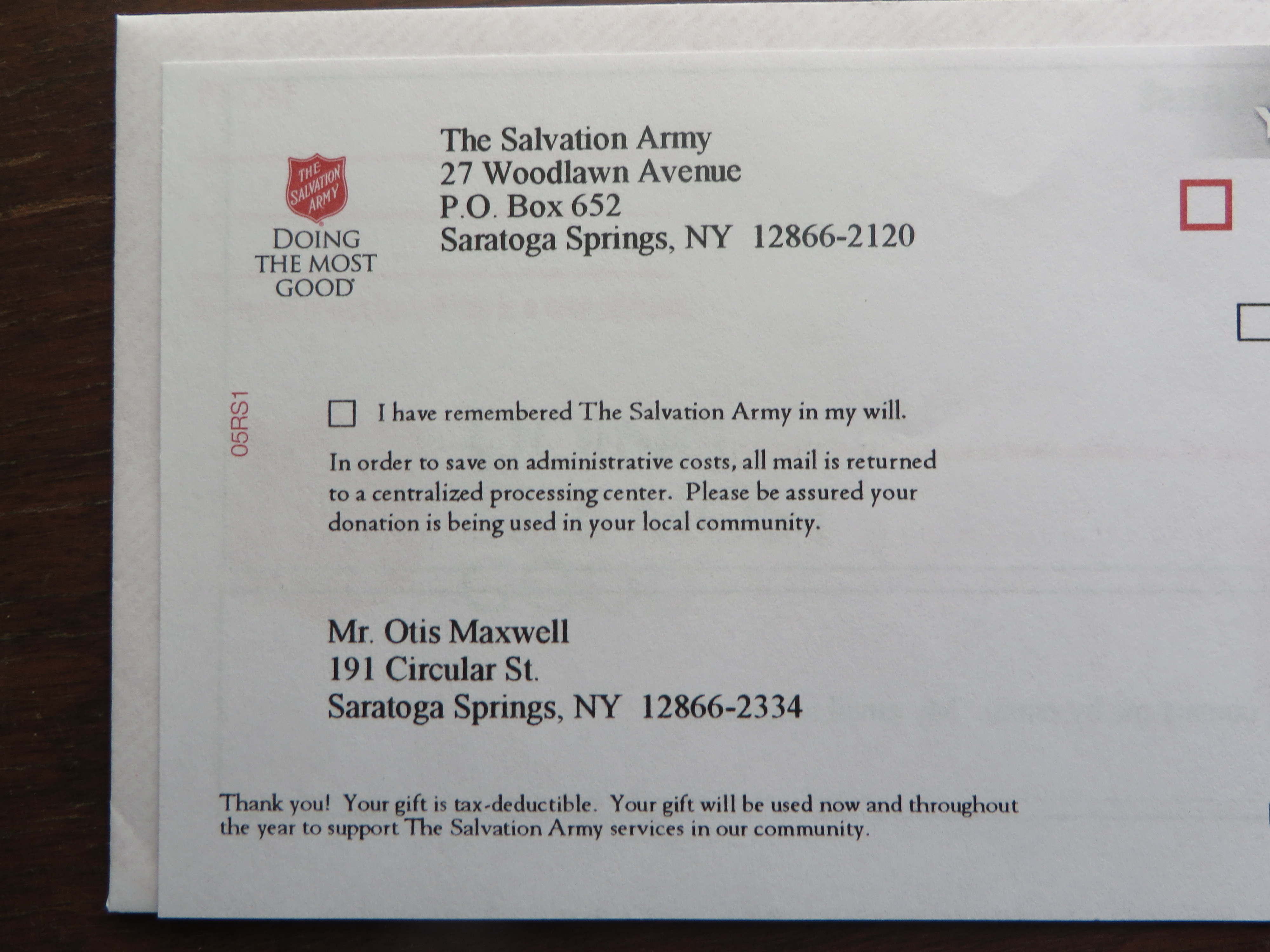
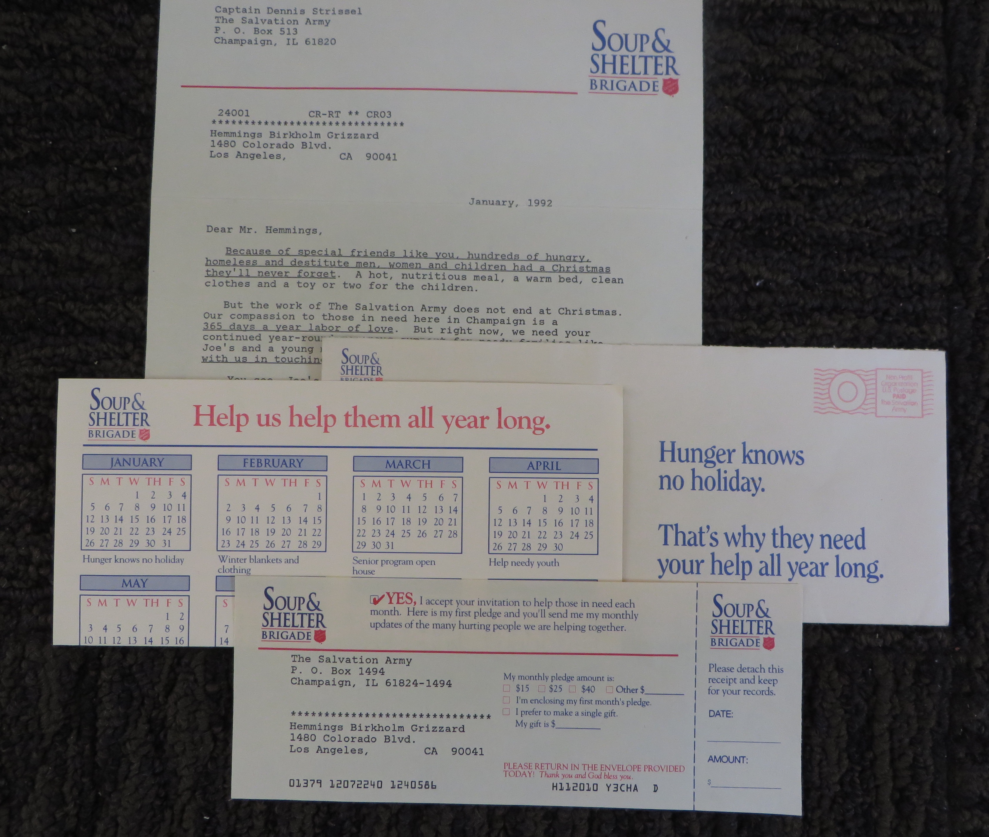
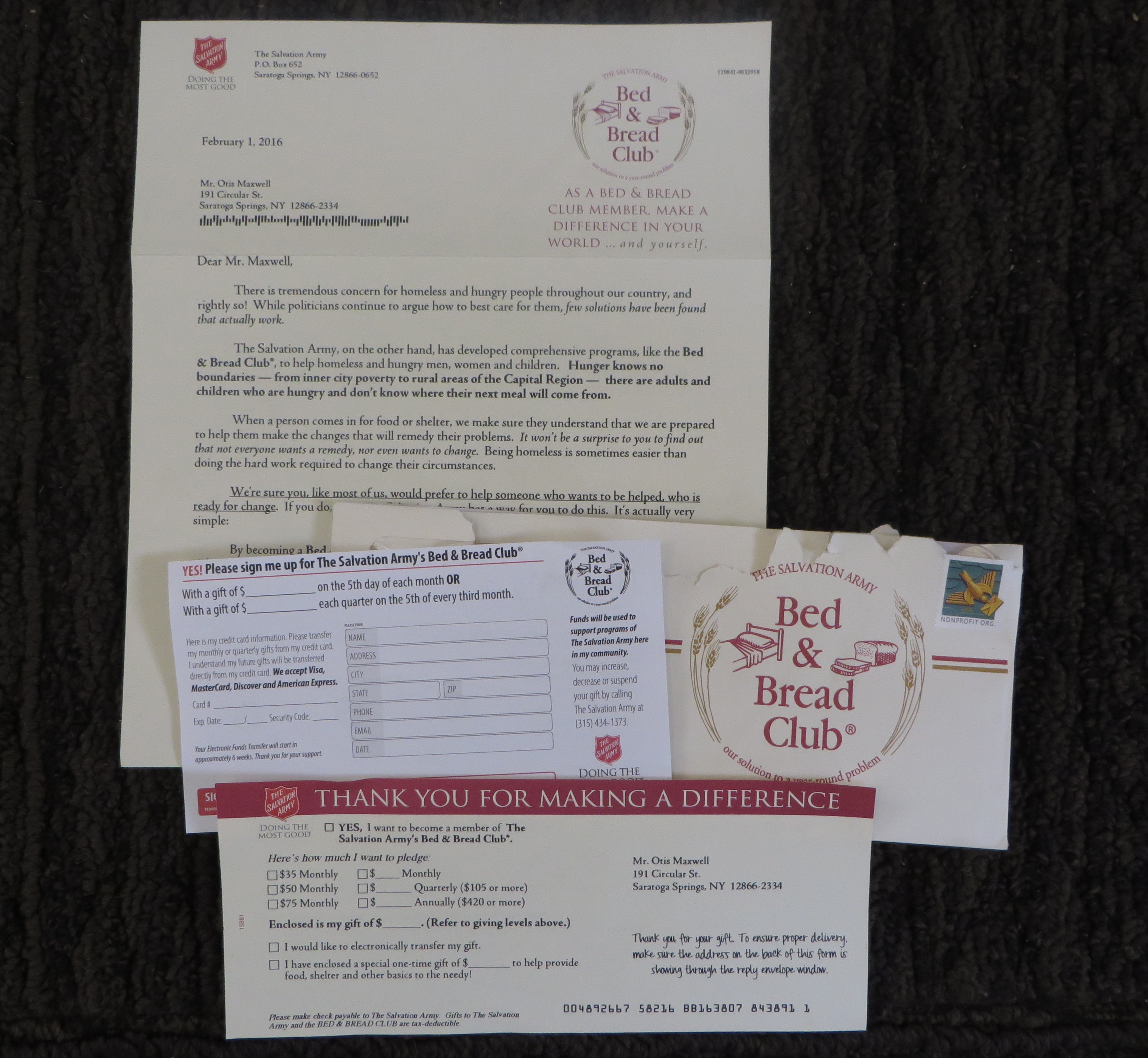
I’ve also attached photos of the complete packages (minus the return envelopes, which were blank in both packages). Mine includes a calendar with a theme for each month to illustrate the ongoing need “Bed & Bed Club” has TWO remit forms, one a standard ask and the other an authorization for automatic credit card billing. This makes me think the auto billing is a test which will be rolled into the main form if it works.

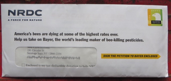
If it still works as in my day, local Salvation Army corps have access to several direct marketing agencies who offer them prepared promotions to choose from and then localize (mine isn’t localized because it’s an agency sample). “Bed & Bed Club” was the choice of the Capital District corps, and that’s really all I know about it. I hope it’s working, but I also hope (and believe) people still give out of compassion as much as frustration.

Standing up to the Department of No

NRDC Bees appeal
The “some of” is the result of an overzealous legal department; they were concerned that not all species of bees are dying at the fastest rate ever. But as we copywriters know, adding the qualifier waters down the teaser and weakens its appeal so that less money will be raised to save bees.

Not to get overly sentimental, but as a marketer you’re one of the good guys. By selling more products or services, you help create and maintain jobs. To the extent that they are of good quality, you may even be changing lives for the better by introducing people to your offerings.

Suppose there was a department in your company that kept you from selling as effectively as you could, and watered down strong marketing statements so they were less effective and sold less products and services and generated fewer jobs and changed fewer lives. That would be a terrible thing, right?

Yet there is such a department in almost every organization. It’s called “legal”. And in the name of protecting the brand, trademarks or whatever, they may be sabotaging your best efforts. You need to push back.

Here are some of the most egregious issues:

1. Being overprotective of your trademarks. You are asked to put an ™ after the first occurrence of a trademarked phrase (or, worse, after every mention which is completely unnecessary to protect your ownership_, or to only refer to a product by its full official name even though it’s too much a mouthful to say or remember. Legal feels this is protecting you, but it’s reducing response because people are distracted by all the foliage or simply can’t make sense of it. (As we’ve often pointed out in this blog, there is a certain percentage of your prospect audience that will bolt at the slightest excuse, and this exactly what they’re looking for.)

2. Being protective of OTHER brands. I never understood this one. You think Apple might sue you, so you’re sure to put a trademark after every mention of the Apple product compatible with your doohickey. It’s true that Apple is a very brand-centric and litigious company but if you look at all the advertising mentioning Apple you’ll see that most people violate their guidelines on a regular basis (by, among other things, giving away Apple products in promotions, which Apple says is absolutely verboten). Why should you be the one to kowtow, before being asked to?

3. Rewriting copy because of legal paranoia. You, the copywriter, have done your research or relied on solid background from the product team. If you say something, it’s true and can be supported. But legal is concerned about a hypothetical objection and makes you water it down. This is death.

4. Rewriting copy for reasons that have nothing to do with legal. This is a Lord of the Flies outcome, but it happens more than I would like to admit. Once all power is ceded to the legal department they think of themselves as the final arbiter of brand and they make you change things just because they can. If things have devolved to the point this is happening, it may be time to look for a new job.

But I said push back. What does that mean? First, don’t anticipate those legal objections by putting in all those qualifiers and curlicues before you’re asked to. Write the strongest marketing copy you can. Put a stake in the ground. Then water it down if you must. At least you’ll have the original draft to show your boss.

Second, when the legal changes come through fight back. If it seems like the requests are overreaching say so, or just ignore them. Make the nitpickers escalate it and see if their supervisors are more interested in jobs and sales than ®s and ©s. You just may win, at least once in a while.

P.S. This article is legally protected under Creative Commons. You are absolutely welcome to quote or misquote in any way you chose.

The age of the scary brand manager is upon us

Freelance creatives are familiar with the sales/marketing conflict at their client organizations: sales needs to generate business, while marketing needs to generate the maximum number of leads at the lowest possible cost. When good leads can be produced cost effectively, everybody wins. It’s an example of creative tension that produces a positive result.

But now there’s a new force to be reckoned with at many client companies: the brand guardian, who might be a product manager, an in-house creative director or some kind of special off-to-the-side position on the org chart reporting directly to the marketing VP. Unlike the sales and marketing folks, the brand manager is often not required to show measurable results. And their interference can do serious damage to your best work.

Companies have long been aware of the importance of a consistent identity, but social media has caused them to be ultra-vigilant. If you go off-brand in a way that’s tacky or politically incorrect or just counter to what your customers expect, you risk being excoriated like Gap with its new logo and Starbucks with its #RaceTogether campaign. The brand manager would appear to be a sort of flack jacket, taking a daily activist role to keep this embarrassment from happening.

The bad stuff occurs when setting and enforcing brand standards becomes a subjective process. These standards grew out of style guides and copywriting rule books, which were specific enough that they were easy to follow. You knew what colors you could and could not use, and you knew not to sound like J.C. Penney when you were writing for Neiman-Marcus.

But now, weighed down by “voice of the customer” screeds and “personas” for the various pilgrims you meet along the “buyer’s journey”, brand enforcement has gotten much broader and at the same time more arbitrary at many companies. (NOT all and certainly none of my clients—see below!) The only way you know for sure is when your hand is slapped for going off-message. And because they want to avoid this experience, many marketing managers are over cautious and will preemptively kibosh good creative because they think brand won’t like it.

Historically, good lead generation has had little to do with brand. If you want to start a conversation at a party, you don’t begin with your elevator pitch but with a statement you think will be of interest to the other person. If you’re DirectTV, a satellite provider with a huge brand investment, you trick people into opening your envelope by making it look like a personal invitation. Now that AT&T has acquired them, the difference is an AT&T logo on the back of the envelope. Brand can wait. Right now they just want to get leads.

Don’t take this the wrong way. Brand is good. I love brands. One of my favorite clients is an agency that specializes in helping companies define their brands. The damage is done when brand is apparently in conflict with good creative—something that should never happen because brand should not be “this is who we are” but “this is what we can do for you” or “this is how you feel when you use our brand”.

Brand is still about benefits, about you and not about me. But many brand managers don’t trust this. They’ll dial back powerful selling statements in favor of stilted, stuffy language that is somehow “brand-y”. This hurts your chance to win for your client by generating more customers and revenue through powerful copy. Same thing happens with graphics if you are shoehorned into a template that looks great but doesn’t follow principles of good eyeflow and doesn’t allow enough content to deliver a compelling message.

So what can you do? If possible, get an audience with the brand manager as part of your assignment. Ask them to explain why the standards are the way they are. Then, when you present the work, play back those explanations in the same way you quote from the creative brief. This gives the brand manager some skin in the game and may even win them over.

But that’s an ideal situation. At some companies the brand manager may refuse to even talk to you. They may argue there’s no need because the brand standards are already laid out. It’s obvious they’re being defensive—but the very reason you need to talk about standards is to be sure you interpret them correctly.

A brand needs to listen to its customers. It needs to evolve. Marketing is a key part of that conversation. As my sales training client Roy Chitwood says, “nothing happens till somebody sells something”. When a brand manager shuts you out of that conversation, everybody loses.

This post was inspired by conversations at my “Devilish Details” Ignite Session at the 2015 DMA conference, where over 100 creatives shared examples of good ideas gone bad. It has no bearing on any of my own clients, past, present or future.

American Red Cross blood donation marketing could use a shot in the arm

A family member died from a blood disease, so I’m sensitive to the importance of blood donations. I had not given in far too long when I stopped into an American Red Cross trailer a few weeks ago and donated a pint plus platelets.

The techs warn you at the time there’s no guarantee your blood will be acceptable, but I got a follow-up call a couple weeks later for another donation. I happened to be in a public place and the connection seemed to be poor. I asked them to call me back. Later, I reflected on the fact my blood must have passed muster or they would not have called me. Why didn’t they just tell me the good news?

Tonight, another call. Again the connection was poor, which I’ll now say is due to some budget choices on the equipment used by the telephone staff. There’s a drive this Thursday at Saratoga Catholic, would I prefer 11, 12 or 1 pm?

Wait a minute, I said. I understood there was something special about my blood from the previous call and I’d like more detail before committing. The rep read through a script about how important blood donation is. But what about my blood, what’s special about that? Well, you’re A Positive which is 34% of people but only 3% give blood. Further you’re able to give to A Negative donors as well.

I had to stop her there because I’m not available on that date but asked her to call again. I really do want to give blood and intend to, but this process is self defeating. Let’s see how it could be made better

1. On the first follow-up call, congratulate the donor on the fact their blood was found acceptable and is helping save lives right now. Why in the world would they not do this?

2. On the second call, don’t lead with generic blood donor motivators. Tell me what my blood type is and why that’s important, rather than have me ask for it.

3. Finally, don’t twist my arm. Calling me out of the blue and trying to set up an appointment right way is way too intrusive. How about a softer direct mail sell? And how about a secondary ask of a donation, which might help pay for the program?

DMA 2015 &then was a home run

&then2015, also known as #andthen2015 or simply the DMA Annual Conference, is in the books. The Boston event concluded with an emotional keynote from John Legend that wrapped up about 4:15 this past Tuesday, October 6. I would venture to guess that the event succeeded beyond anybody’s wildest hopes and dreams.

A huge format change had staff scrambling up to the last minute to get relevant information online. As a presenter, I was a bit worried about who might show up or if nobody would. But they came, and they were engaged, by a curriculum that somehow weeded out the self-serving promotional sessions of prior years as well as cutting a full day off the program by removing the Hall of Fame Luncheon, report from the DMA President and other excuses to take your client offsite for lunch.

I’ve rarely seen a mature organization give itself such a radical makeover and objectively the possibility of a failed event was pretty high. But these guys pulled it off and it really was the best of maybe 20 DMA conferences that I’ve attended. Special thanks and congratulations to my immediate contacts, Jeremy Ladson and Keith Baker of the programming committee. See you next year, I hope.

Get a free copy of my book at DMA2015 &then

Update: DMA &then website has now been updated with full schedule information. Go to http://dma15.org/schedule/ to read all about it. BE SURE TO USE THIS LINK; the “build your schedule” menu on the home page of dma2015.org still produces the old placeholder content.

Here’s the session I am leading on Monday, October 4, from 4:45-5:30 at the DMA’s revamped &then conference in Boston:

Devilish Details: Looking for an Advantage in Your Copy and Design
An interactive sequel to one of last year’s most popular sessions, “The Devil’s in the Detail”. Share clever tweaks and clumsy misfires that made a big difference in creative execution and bottom line results—good or bad. Veteran copywriter Otis Maxwell will kick things off with examples of a few gems and gaffes, then you join the fun. Fabulous prizes for the best ideas!

This is an “Ignition” session which is designed for attendees to interact in a town-hall environment. I’ll share some examples of copy and design decisions that had a negative impact on campaigns, then make suggestions for how to improve them. After a few examples I’ll open things up to the floor and ask folks to share their own experiences which can be a/creative home runs and pratfalls they’ve experienced in their own work and what they’ve learned from them, or b/third party examples similar to my own.

While copies last, everybody who makes a meaningful contribution gets a free copy of my copywriting book, Copywriting that Gets Results!

Note: As of September 27, there is still placeholder copy on the DMA15.org website. This is the session in the slot called “Concentrating on the Detail: Copy & Color Choice”. That’s the placeholder title; what I’ve described above is the real deal.

Why too many good ideas can sink your direct marketing campaign

Front of Save the Children OE
Save the Children outer envelope has lots of good ideas

It’s great that you are brimming over with good ideas. Unfortunately, your prospect is not nearly as enchanted with your creativity as you are. They’ll sit still for one powerful marketing statement, perhaps supported by a call to action subhead, then it’s off to the deleted messages folder or the recycling bin. When you put out too many good ideas, you run the risk of getting none of them across.

This Save the Children appeal is an example of too many good ideas. On the front of the outer envelope is this headline: “What if your donation had 4x the impact for children in need?” That’s a very legitimate teaser and it’s supported by the subhead “learn more inside…” Unfortunately, the reply-by date is a complete non sequitur. Does the 4x benefit cease on that date? Then there’s the free notecard statement which I’m aware is a popular fundraising technique in today’s society, but it appeals to greed which is a different motivator than wanting your gift to do the most good so it’s misplaced here.

Save the Children OE back
Still more good ideas on the back of the same envelope (click the photo to enlarge and read the quotes)

On the back there are MORE good ideas. Here’s a quote from Bill Gates that would support a package all by itself. When asked to recommend a top philanthropic cause on the Today show, he replied, “you can go to Save the Children—they help mothers have safe births… It’s amazing. You can be sure that [this organization] will put your money to good use.” A minor quibble, not everybody knows who Bill Gates is so I’d set the stage by saying he was the world’s richest man until he started giving away his money. Then we’d have a very nice setup for a direct mail pack or maybe a long form print ad.

Unfortunately, the Bill Gates quote is diminished by a quote from the Save The Children’s own president, in the same size type. Since she has maybe a tenth the credibility of a legendary philanthropist in this context, that should be the weight of the two quotes—or, better yet, leave it off. And we’re not done; the envelope needs to tell us that Save the Children has earned its 14th consecutive 4-star rating from Charity Navigator. For what? Hopefully it’s for using my money efficiently instead of spending it on administration and marketing. But tell me; don’t just show me the Charity Navigator logo.

Save the Children is a fabulous organization that really does great work; I was quite familiar with some wonderful packages written by my mentor Robbin Gehrke at Russ Reid. But this isn’t a winning effort. It falls victim to too many good ideas.

Coming to DMA &then in Boston? We’ll be talking about this and other examples of marketing milestones and miscues in my interactive Ignition session, Devilish Details: Looking for an Advantage in Your Copy and Design. It’s at 4:45 pm on Monday, October 4. See you there!

Copywriters, don’t spill your candy in the lobby

Bowtie Cinema urinal sign
Sign over the urinal at Bowtie Cinema, New York

Gore movie maven and direct mail copy guru Herschell Gordon Lewis had a great admonition in one of his books: “Don’t spill your candy in the lobby.”* It means that you should not give away the premise of your selling message too soon but instead should take the time to build up some interest and curiosity. I have a good example in a OE teaser for Investor’s Daily which I show in my direct mail class:

40% are millionaires
35% have portfolios over $500,000
60% are in management
37% own two or more homes
What are they all reading?

Now, think what would happen if they left off that final line. You’d be fascinated by these impressive stats and would be thinking “who are these financial overachievers” and would tear open the envelope to find out. But IBD (which does not identify itself on the OE; the return address is an anonymous street address) has to refine the discussion and let us know they are selling a publication. If I’m not a reader, out it goes. The marketer spilled its candy in the lobby and arrives at the loge seating alone and empty handed.

I was reminded of this advice when visiting an actual movie theater the other day, where I spied the pictured plaque above the self-composting urinal. The initial message is praiseworthy: These state of the art waterless urinals will save over 600,000 gallons of water in their lifetime. Which is great, and they should stop there. But then comes the spillage: That’s enough water to take 20,000 showers.

It takes 30 gallons of water to take a shower? I had no idea… shame on me for taking so many showers. A positive message has been turned into a negative, unless this is exactly what the management of the theater intended. And maybe it is. But think what would have been the effect if the final line had been left off. You’d be left with a positive impression of the theater’s conservation practices, and that would be that.

* Actually, I don’t know if he said it or not but he’s said a lot of other clever things so I’ll give him credit for it.

Salvation Army shows the perils of localized donor mail

Front page of Shield letter
Where’s my town in this localized letter?

I gave a fair-sized gift to my local Salvation Army this past holiday season, and was happy to do so. (I wanted a particularly enthusiastic bell ringer to get credit, so I found out his name, wrote it on the check, and dropped it off at the local center.) Inevitably, this has spawned a series of large donor mailings asking me to repeat with similar amounts.

I mentioned one of these mailings in an earlier post because the art direction on the outer envelope wasn’t particularly adept. But later I got a second mailing that caused me to dig deeper and I found some object lessons in what not to do if you’re a national not-for-profit and you want to customize mail for individual locations.

Why should you go to the trouble of localizing your appeal? Because local donors to a cause like the Salvation Army want to know their contribution is put to use in their community. Some years ago I did a localized campaign for the American Red Cross. It had an insert on emergency preparedness, which was variable. We didn’t talk about hurricanes in the Midwest, or rivers flooding in the Northeast. (With climate change, maybe we’ll soon have the same disasters everywhere and non-profits can save the money.) And there were statistics which were localized by county of number of people helped, first aid courses taught and so on. Even thought it was a national mailing, folks in Milwaukee would feel like it was about their local Red Cross.

Localization on page 2
Here it is… on the second page.

I expect the Salvation Army did some similar database research, but they don’t use it well in the copy. My own community of Saratoga Springs is not mentioned till the second page of the “if this shield could talk” letter. Who are the 125 hungry families and 70 people who eat breakfast? Is that in Saratoga? (To read this and other copy details, click on the images to enlarge them.) I suspect this is just a flub: the numbers are appropriate for a town our size, but somebody forgot to plug in the name of the town. As a copywriter I’m well aware that the story of Sophia and Anthony is not local, but blending in local statistics would have blurred that line and made for a more compelling narrative.

Processing Center
Institutional “processing center” language turns off donors.

I’m also not easy with the qualifying statement (on the letter and the response form) that “In order to save on administrative costs, all mail is returned to a centralized processing center. Please be assured your donation is being used in your local community.” Well, first of all, that processing center (bad word—as a generous donor I don’t want to be “processed”) is in Albany, the nearest big city, so I don’t have a problem with it. Second, why don’t you say “in Saratoga Springs” or “in Saratoga County” instead of “your local community”? I have a very strong hunch that including this statement, thus raising an objection where one might not have existed, results in fewer donations that a mailing without that statement.

Salvation Army Camp Mailing
Second Salvation Army local mailer

Then the second mailing arrived, which is about sending kids to Long Point Camp in the Finger Lakes. I’ve previously written about the difficulty of “send a kid to camp” programs—that’s a very hard sell compared to feeding a homeless family and you really have to paint a picture of the kid’s desperate situation. So now we have this outer with the message “Please Open!” (I think they could have come up with a better teaser, no?) and two white kids in a tire swing. Is this a variable picture? It’s true that my community is pretty lily-white so maybe so. But why a tire swing? Can’t they afford real play equipment at this camp, which probably isn’t very safe if they’re using discarded tires?

Salvation Army Long Point
Send a kid to Long Point Camp.. why?

Moreover, why are we sending them away to camp in western New York when Saratoga County is chock-a-block with camps and rustic destinations? Or to Lake George, next county up the Northway? I feel like this effort is probably designed for donors who live in a big city, so when you mail to a resort area it really exhibits a tin ear.

I don’t have it in for the Salvation Army. I love these guys. I wrote fundraising campaigns for them many years through the Grizzard Agency, and contributed a pro bono effort to get donations after the Los Angeles riots of the early 1990s. But they have offered up a picture perfect example of what can go wrong with a localized campaign, and I’m sharing it as a bit of advice as well as others who think about localizing their national campaigns.